Inclusive Design and Accessibility
In the words of Derek Featherstone, CXO of specialist accessibility agency Level Access: Accessibility is an outcome. Inclusive design is a process.
Accessibility is about creating products that are usable by everyone. Inclusive design, on the other hand, is a mindset that involves understanding user diversity. It is a methodology that is human centred and means including and learning from as many people as possible, with a range of perspectives.
Microsoft’s definition of the two are:
Accessibility: the qualities that make an experience open to all.
Inclusive design: a design methodology that enables and draws on the full range of human diversity.
Accessibility is an attribute of Inclusive design and whilst Inclusive design is about designing for diversity, it is more than meeting a set of standards.
Principles of Inclusive design
Below I have summarised Microsoft’s Inclusive design principles.
- Recognise exclusion
Exclusion happens when we solve problems using our own biases. Seek out exclusions as opportunities to create new ideas and inclusive designs. - Learn from human diversity
Human beings are the real experts in adapting to diversity. Inclusive design puts people at the center from the very start of the process, and those fresh, diverse perspectives are the key to true insight. - Solve for one, extend to many
Everyone has abilities, and limits to those abilities. Designing for people with disabilities actually results in designs that benefit people, universally. Constraints are a beautiful thing.
Disability affects all of us
“We all will have disabilities eventually, unless we die first.”
Gregg Vanderheiden
Disability is context dependent. It is not just about a specific health problem or aging but a person can be temporarily impaired, for example, if you have experienced life with a newborn baby you will know how quickly you have to learn to do things with one hand! Similarly, if you are walking and updating Twitter at the same time, you might just benefit from a design that has been optimised for partially sighted people.
“Disability is not just a health problem. It is a complex phenomenon, reflecting the interaction between features of a person’s body and features of the society in which he or she lives.” –World Health Organization
A few facts (UK based)
- In the UK, more than 12 million people have a disability (1 in 5 of the population)
- Only 1 in 3 disabilities are obvious. Users needs aren’t always apparent.
- Half of the UK’s population will be over 50 by the year 2020. Older age means a greater incidence of disability (by retirement approx 30% have a disability).
It all comes back to Empathy
For me, Inclusive Design is remembering that we are not the user and showing empathy for the constraints and limitations of the degree of disabilities that exist. This means thinking about the diversity of our users from the start of any project and including users with a range of access needs in user research and testing. It involves making sure no on excluded from using the tools, products and services we create.
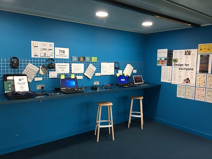
There are a range of assistive technologies that people with disabilities use including screen readers, voice controls and switch devices. The Government Digital Service have created their own Empathy lab (inspired by Facebook’s own one) to allow people to test some of these technologies and help create awareness of the diversity of users and their needs.
I love the UK government’s sixth design principle, ‘This is for everyone’ because it sets the bar high for inclusive design. It builds on the core principle of 20th-century architecture: principles of form follows function. First accessibility; allow everyone to use it, then elegance and aesthetics.
This is for everyone
Accessible design is good design. Everything we build should be as inclusive, legible and readable as possible. If we have to sacrifice elegance — so be it. We’re building for needs, not audiences. We’re designing for the whole country, not just the ones who are used to using the web. The people who most need our services are often the people who find them hardest to use. Let’s think about those people from the start. — GDS design principle no. 6
Designing for Accessibility
Below are some guidelines for designing and building products that are usable by everyone:
- Understand the main disabilities, their constraints and limitations.
- Include users with disabilities in user research.
Content
- Ensure content is in a logical order so that users who tab through content can do so in an order that makes sense.
- Make sure headings stand out and each section has their own heading.
- Links should make sense out of context and be front-loaded.
- Test descriptions and the order that elements are read out in on screen readers.
- Text should be a min of 16px font size.
- The text should be resizable and remains legible when resized.
Images
- Identify informative vs decorative images. Informative images require useful ALT text for screen readers. Decorative images need null ALT text assigned (i.e. alt=””).
- Make sure any graphics, data visualisations or time-based media have captions or descriptions.
- Don’t embed text within images.
Keyboard access
- Include a “skip to main content” link before the header for keyboard users.
- Check users can reach all interactive elements and trigger them with the spacebar, enter key, or arrow keys.
- Each interactive element should have a visible focus state. Include intentional styles for these states: focus, hover, active, and visited.
Forms
- Forms: ensure they are in single column, have descriptive labels, avoid placeholder text and include clear error states.
- Ensure labels are assigned to each form element.
- Placeholder text should sit outside of form fields and not rely on users recalling what was inside the text field. Nielsen Norman’s Placeholders in Form Fields are Harmful explains this in more detail.
Touch targets
- Touch targets should be a minimum of 44px.
- On mobile: primary actions should be doable with left or right thumb and touch targets at least 48px and separated by 8px.
Colour contrast
- Ensure that there is sufficient contrast between colours, 4.5:1 for small text and 3:1 for large text. There are loads of useful tools to check your colours quickly and easily such as Accessible Colours and Stark plugin for Sketch and Adobe
WAVE is a useful browser extension that allows you to test for Accessibility.
Mindset
Above I have outlined some of the elements that make up accessibility and how to achieve them. This makes up part of Inclusive design and helps us to achieve products that are usable by everyone. To truly practice Inclusive Design, the range of access needs that people might have needs to be considered at all stages in a project. Inclusive design is a mindset that means making sure no one is excluded, from initial conception, user research, prototyping and building of products and services.

