In defense of skeuomorphism
It’s not just about graphic design

Skeuomorphism gets a bad rap. Before the “rise of flat design”, speaking of skeuomorphism, the principle of emulating real-world items in interaction design elicited thoughts of reading apps with paper textures, and radio apps with faux brushed metal and large dials. Perhaps the company most synonymous with skeuomorphism is Apple, circa 2008. Opening the Contacts app on Mac OS X threw the user into a physical book, complete with pages, paper textures, and cheap-looking leather binding.

Given Apple’s strong embrace of emulative, graphical skeuomorphism, other companies followed suit. Soon, it would be hard to find an app that wasn’t resplendent in suede and PU leather.
But as apps hit “peak skeuomorphism”, designers started to feel differently. Designers (and even Scientific American) argued that users had grown to understand UIs to a point where there is no longer a need to simulate physical objects. Perhaps powered by Google and Microsoft, designers started to cut all the realism out of their applications and championed simplicity and cleanliness over simulation. Gradients and textures were kicked out of applications and deemed tacky. Even Jony Ive said that Apple’s realism was no longer necessary. (Disclaimer: I work at Apple, and my opinions don’t represent the company or necessarily the opinions of the company.)
The UI/UX industry hailed the death of skeuomorphism and proclaimed flat design as the new king. In doing so, designers threw away principles that would help make their applications understandable, and conflated a mimicry of the real world with a graphic design language.
What is skeuomorphism, really?
At its core, skeuomorphism is the design concept that items should represent real-world objects. In UI design, skeuomorphism argues that users can better understand a UI element if it behaves like a real-world analog, because users live in the real-world. This is thoroughly supported by cognitive science. If you know how to turn on a light switch at home, you would know how to turn on a light switch on your phone.
Here’s what skeuomorphism is not:
- A graphic design language. Skeuomorphism concerns conceptually emulating real-world objects. It does not require that objects look exactly like their physical counterparts — that’s just realism. Furthermore, skeuomorphism can be present in anything from haptic feedback and sound effect design.
- Outdated. While users might know how to turn on a light switch, at some point they needed to learn how. There are always users who are new to technology or new to a device, and light switches are still much more ubiquitous than iPhones.
As an industry, we have failed to divorce skeuomorphism from realist graphic design, and have discarded its benefits along unfairly. Yes, skeuomorphism and “flat design” can definitely co-exist. The linens and the textures we used to see everywhere were merely a visual expression of skeuomorphism.
The backlash has gone too far
One of Dieter Ram’s (in)famous ten principles of good design requires that design make a product understandable. Skeuomorphism is great for this. The backlash against skeuomorphism has pushed designers too far away from simulating the real world.

Let’s take a look at everyone’s favorite app from 2018, the new, “better designed” Snapchat. When first time users open up the app, they are greeted with a viewfinder, which signals camera functionality. Not bad! It’s all downhill from there (much like the indentation of this write-up).
Why is there a big circle in the middle of the screen? Why does trying to Touch ID in the circle record a video? Why do three dots represent “Stories”? Most importantly, why is does tapping the ghost in the corner take me to my user profile? Has opening Snapchat resulted in my death? Will anyone care?
Perhaps what Snapchat really needs is a dose of skeuomorphism. The camera button should behave more like a camera button. Stories should represent stories and not three dots. Tapping on myself, and not a ghost, should let me see my own profile.
The benefits of skeuomorphism
Here are some benefits of bringing some of the real-world back into your designs:
- More familiarity. By making a control or interface behave (and perhaps look) like a physical counterpart, users can draw on previous experience to understand how to use the UI. The digital crown on an Apple Watch moves the arms of the clock on the watch face.
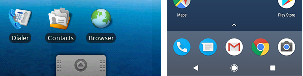
- Better affordances. Visual and interaction designs in 2018 lack affordances. As a result, a lot of functionality is unintentionally hidden. (For example, the Android app tray in Oreo). To make up for this, designers often shove in UI-cluttering chevrons, icons, and animations, when a pull-tab may be more obvious.
- Better feedback. The physical world generally provides a lot of feedback. If you’re in a car accident, you definitely feel it. Similarly, the haptic, rumble feedback in the Nintendo controller lets players know if they’re taking hits. Material Design uses shadows and z-index animations to show that something has been tapped or selected.
Bring it back
Skeuomorphism comes in many different forms: graphic design, interaction design, haptic feedback design, auditory design, and so on. However, the desire to get rid of gaudy, realistic textures resulted in skeuomorphism getting thrown out with the bath water. As the backlash against skeuomorphism continued, UI designs became increasingly confusing and less self-explanatory.
While we, as designers, don’t need to bring back textures of 2008 to the current decade, we shouldn’t forget the benefits of benefits of bringing the familiar, responsive real-world into our designs. As much as suede was form over function, nondescript rectangles are form over function as well.
hshieh.com | @chunggukpanda
