Improving the online queuing experience
A concept to make music ticket purchasing better
As part of the interview process with Songkick I was given the challenge to create a better music ticket queuing experience.
The problem
Currently, when there is a great demand for concert tickets, fans are placed in an online queue. Sometimes, the queues can take up to two hours and add a lot of stress to the ticket buying process.
We’ve all been there, our favourite artist is touring and so when tickets go on sale we head online to buy them. Only to be confronted with (queue movie voiceover)… the waiting queue.

Breaking down the problem
As at the beginning of all of my projects I like to dig deeper into the problem of the why. In this case I used the 5 whys technique to try to understand the reasons fans get stressed while in a waiting queue and mind mapping to visualise everything I could think of about the queuing process.
The 5 whys
- Why are fans stressed in a queue?
They don’t know if they will be able to get a ticket. - Why don’t they know?
They’re not getting any clear feedback that makes sense to them. - Why doesn’t the feedback that is shown help them?
It’s not telling them what they need to know. - Why do they need to know?
They are overloaded with unknowns and pressure. - Why do the feel overloaded and pressured?
They have feel they have no control or certainty over the process, but also this is something that is a big deal in their lives so there’s a lot of emotion and passion attached to the purchase.
Mind mapping
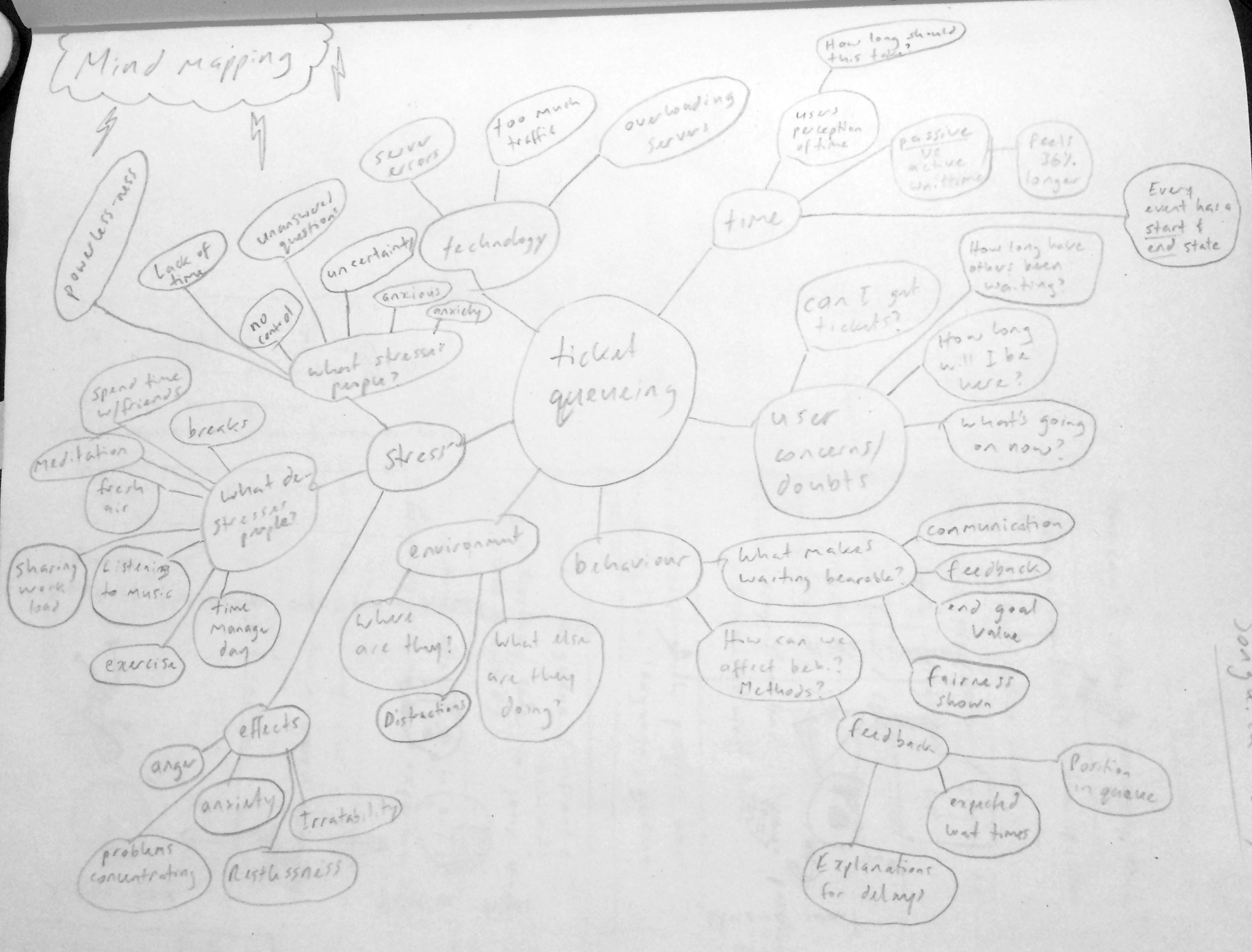
Getting an understanding of the problem led me to the challenges I would need to solve:
- What can I do to reduce the perception of wait-time in a queue?
- How do I make people feel they are in control, and alleviate their concerns and doubts, when they are feeling stressed in a queue?
These challenges then led me nicely into the research phase and what to focus on.
Active time vs Passive time
Time can be broken into two phases and people in each of theses phases experience time differently.
Active time
Time passes quicker in this phase as people are occupied with some kind of mental activity. This does not only have to be a pure thinking process though, like reading a map, but can also be a physical activity, such as running or riding a bike.
Passive time
Time passes more slowly in this phase as people have no control or choice over the waiting time. Examples of this are when you are standing in a queue or waiting for someone to come and pick you up.
People usually over-estimate the length of passive time, even if the time that has passed is the same as someone who is in the active phase. An example is if Chris takes ten minutes to cycle to Andy’s house and Andy is waiting for him to arrive, Chris will think it felt like a five minute ride while Andy will say it felt like a fifteen minute wait. Studies have actually shown that a passive wait feels 36% longer than an active wait.
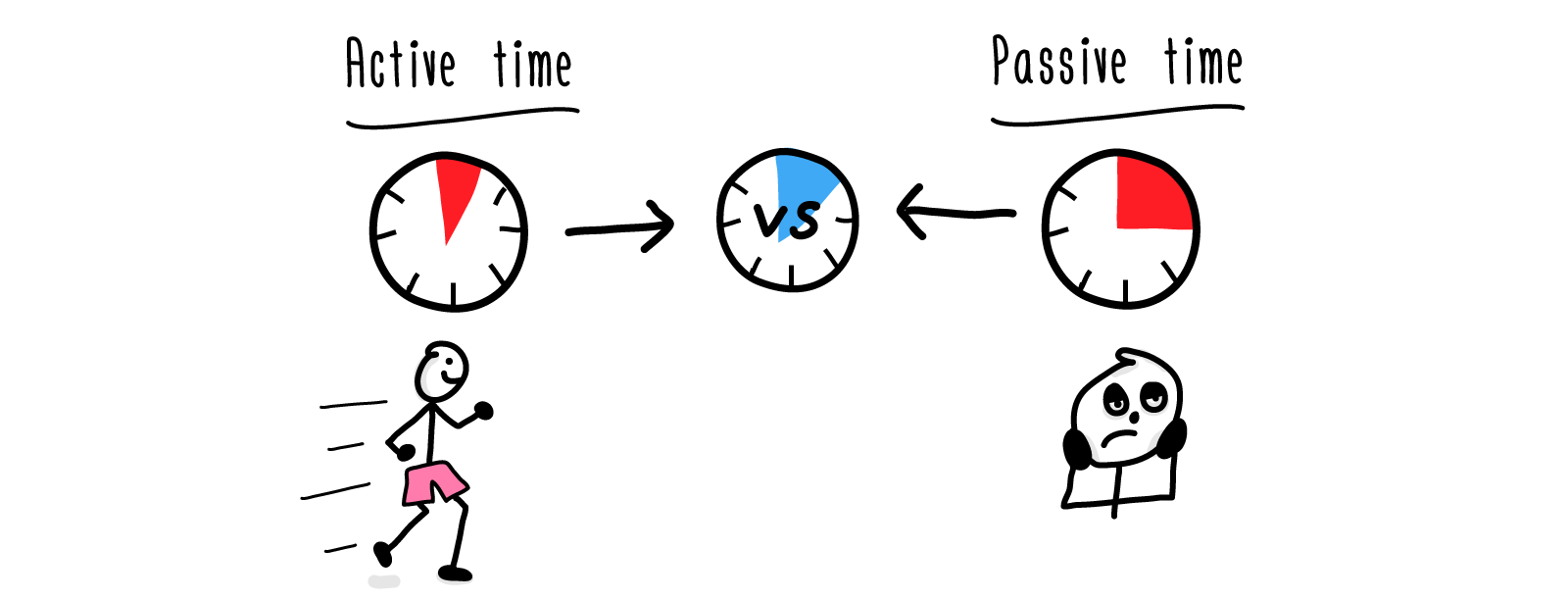
Currently waiting in a ticket queue was purely a passive wait: so I had to work out what active events I could place into the wait to make it feel shorter?
Amusement park queue design
Waiting in long amusement park lines is a very similar experience to waiting in a online ticket queue so I wanted to understand what methods were employed in the design of these lines.
After reading through a multitude of articles I narrowed the design of theme park queues down to three methods that I felt applied to online ticket queues:
- Waiting times are displayed
The expected wait-time shown is always longer than the real wait-time so people feel happier when they finish in a shorter time - There is always regular movement
This way people always feel there is a sense of progression - People are made to feel part of a story
Being made to feel part of a story is part of the experience — the ticket purchasing stage is just the initial phase, the main phase is the concert, and talking about and sharing the concert experience is the final phase.
“The memory for the line can be enhanced both by adding positive experiences during the wait and by making the event at the lines termination incredibly positive”
- Donald Norman
Reading through these articles also introduced me to David Maister and his work on the psychology of waiting times.
Maister’s list
Harvard school professor David Maister wrote the paper “The psychology of waiting lines” in 1985 (they still hold true today) and it lists eight propositions for the psychology of waiting in line.
- Occupied time feels shorter than unoccupied time
- People want to get started as soon as possible
- Anxiety makes waiting longer
- Uncertain waits are longer than known waits
- Unexplained waits are longer than explained waits
- Unfair waits are longer than equitable waits
- The more valuable the service the longer people are willing to wait
- Solo waits feel longer than group waits
Being able to answer each of these propositions I felt would be a great way to leave the ticket buyer with a positive and stress free memory of the queue waiting experience. So in what ways could I incorporate each of these propositions into my concept?
First though I needed to know who I would be designing for…
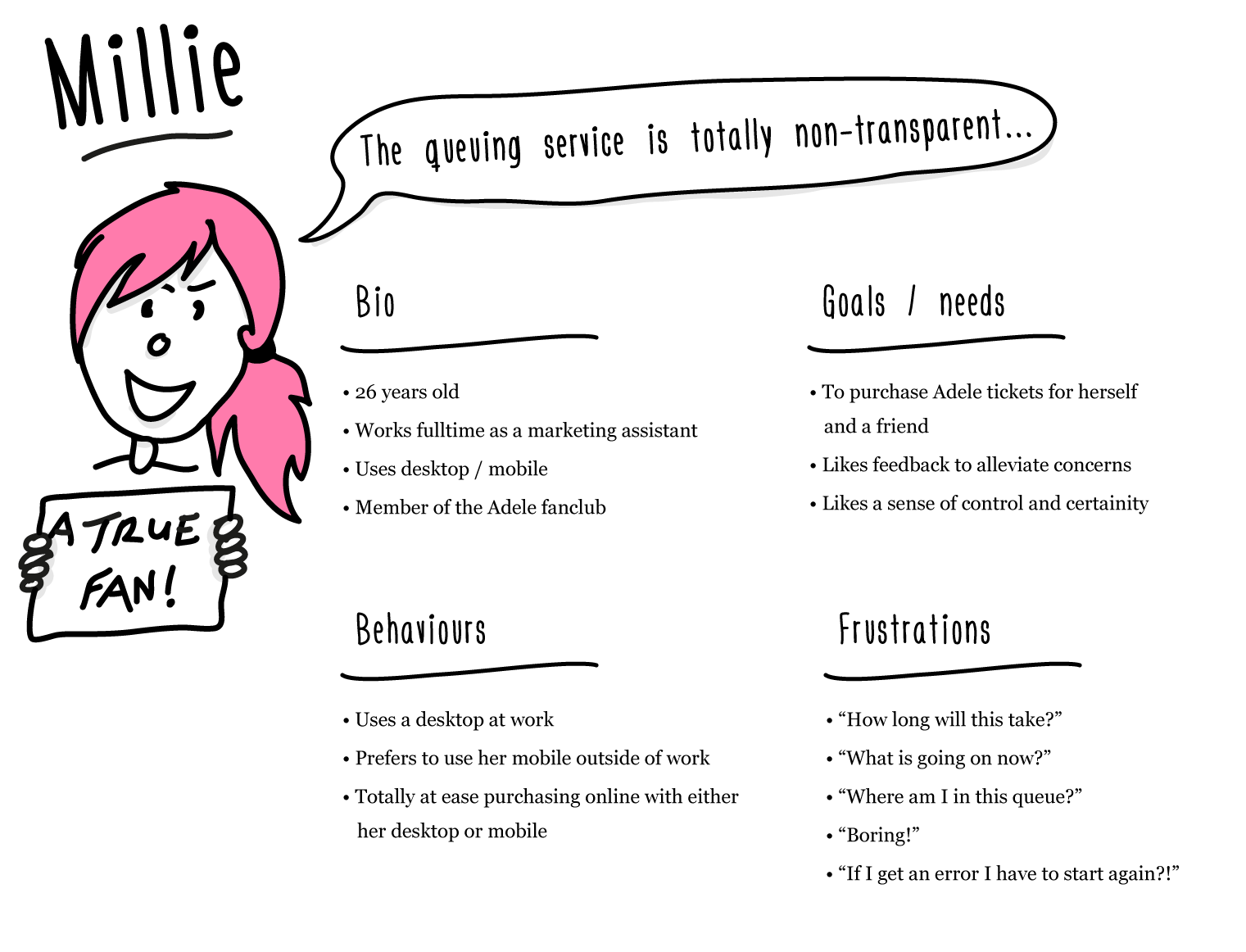
The creation of an assumptive persona
Songkick had only just been through the process of selling tickets to Adele concerts and throughout there had been numerous frustrations expressed online by fans.
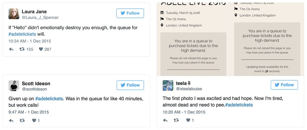
I spent some time going through tweets, Adele fan blogs, news stories, and reading reviews left by fans about the purchasing experience on the Trustpilot website. This helped me build up the assumptive persona of Millie and made sure that she was actually based on real people.
Meet Millie — A true Adele fan
Moving the flow around
Sketching out the current Songkick ticket purchase flow and seeing where the queue flow was inserted (when required) helped me gain an overview of the whole process and see if there were any changes that could be made.

Getting this high-level view allowed me to see that if I moved the purchase screen details to the beginning of the queue flow (instead of the ticket buyer having to do it at the end as currently done) then it would allow the queuing to start off with an active wait phase.
The ideas wall
As I was working through the research and discovery phase any ideas that I had I would quickly write on a post-it note and stick up on my lounge room wall (the wall’s fine Mr landlord!). At the end of this phase I added and removed ideas, then grouped all similar ideas together to come up with methods of how I would address Millie’s frustrations and needs and also Maister’s list.
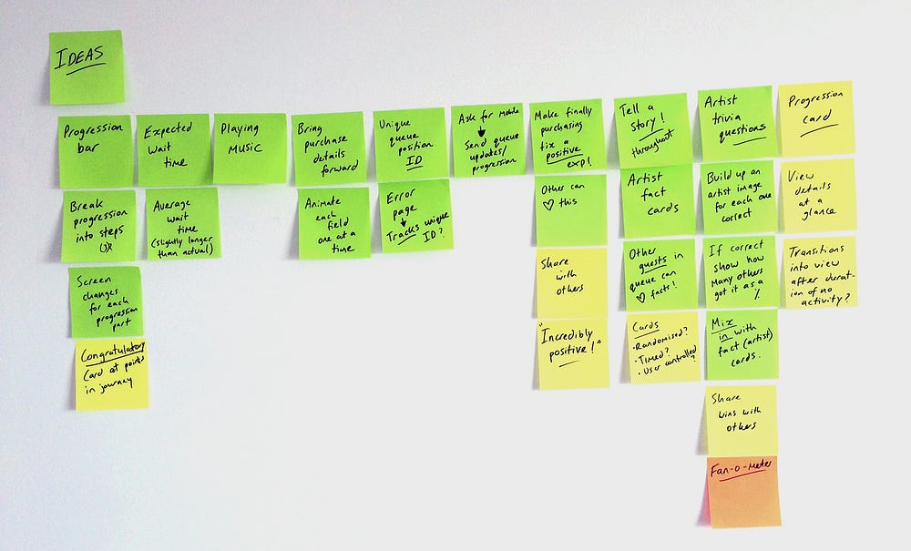
This wall of ideas became the features I would incorporate into my concept:
- Progression bar
- Expected wait-time
- Position in queue
- Bringing the purchase details forward in the flow
- Give each ticket buyer a unique queue position ID
- Ask the ticket buyer for mobile number to send queue updates texts
- Use artist fact and quiz cards throughout the wait
- Introduction of a character to bring an positive emotional feel to the flow
- Use positive affirmation messages at certain points in the flow to keep ticket buyer encouraged and alleviate concerns and doubts
- Finish with a positive ending to the waiting experience
Queue timeline comparison
Comparing the new waiting queue timeline to the current version shows how I implemented active wait phases into the original passive wait to help the time in the queue pass quicker.


Millie’s scenario
I chose to storyboard a scenario form Millie’s life to help define how the vision of the concept would work in a real-world situation. This helps to not only keep myself in-check (as I can continually keep referring back to this to make sure I’m not adding superfluous features), but is also great to help others understand how the concept will help their customers.

The waiting queue flow
Using the scenario as a basis I was able to sketch out user flows. These help me think about the ticket buyers decisions, the major parts of the concept, how these parts join together, and what happens if errors occur.

Sketching out the concept
Layout
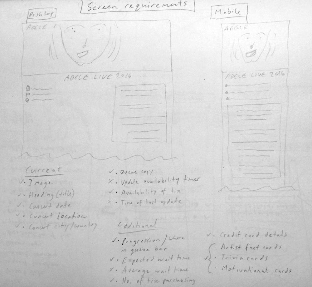
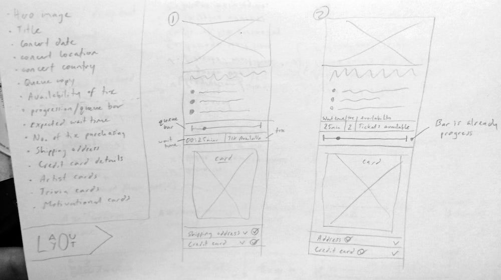
Using the current Adele page that Songkick employs I looked at what could be added or removed, what screen requirements would be needed for this concept, and how it could look on mobile and desktop.

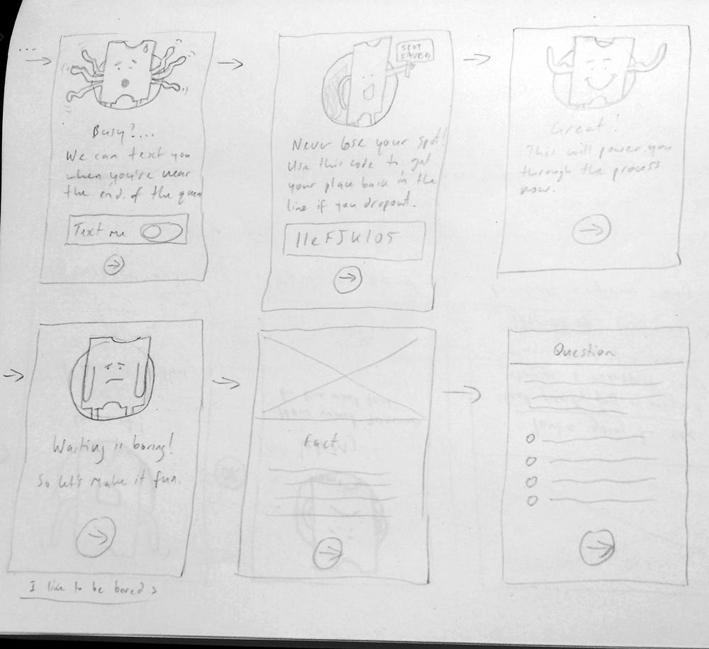
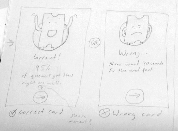
Card system
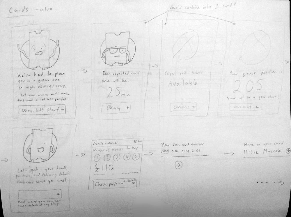
With the card system sketches I wanted to work on the layout of the cards, the language that could be used, and how the character I created would bring a positive feel to the flow.
Wireframing and Prototyping
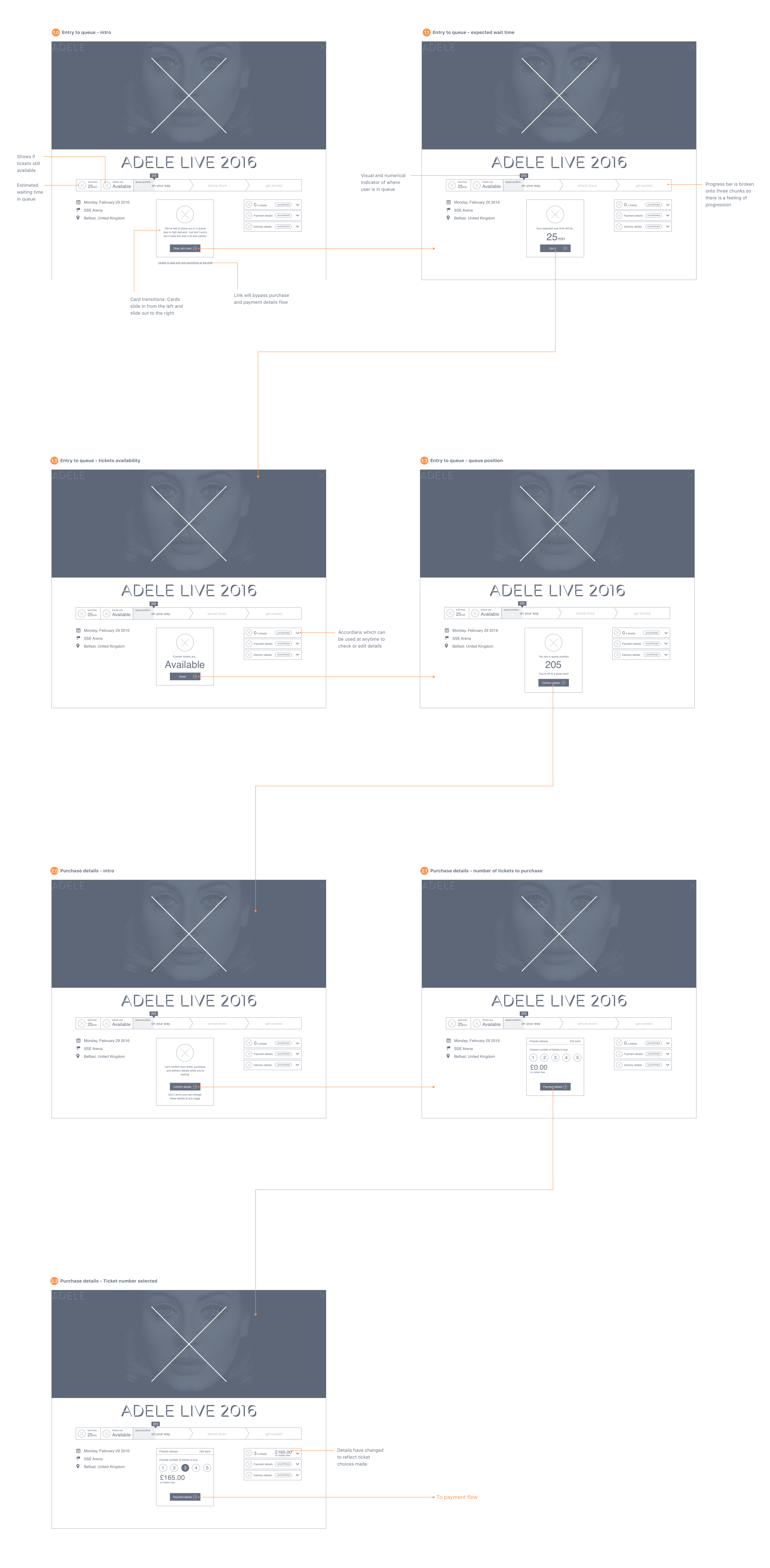
I made a low fidelity clickable prototype from the wireframes which could be used for usability testing to validate the concept and discover what ticket buyers did not understand.
Note: I have only shown the wireframes for the entry flow into the queue.
To see the full clickable prototype of the whole flow click here.
Testing and measuring success
As part of this concept I also thought about how I would test and measure success (via post-it notes on my lounge room wall again).
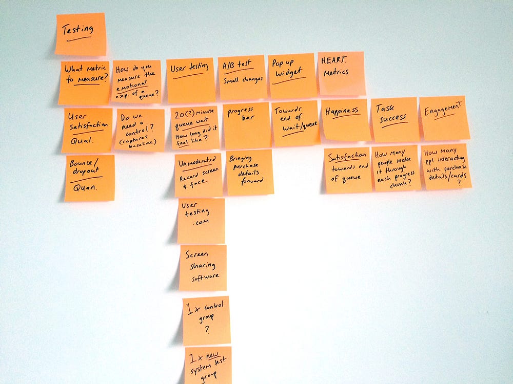
In my own personal brainstorming session I tried to figure out what would be the one qualitative and one quantitative metric I could use. Using the Google ventures HEART metrics framework I was able to get to three good metrics.
- Happiness of the user
How does the ticket buyer feel towards the experience towards the end of the process? This could be done by having a question asked on one of the cards to keep a consistency and flow.
I felt that measuring this after they had got the tickets would skew the results towards positive as they had just completed their goal. - Task success
How many users make it through or drop out at each of the three stages of the progress bar? - Engagement
How many user interact and engage with the payment details and cards while waiting?
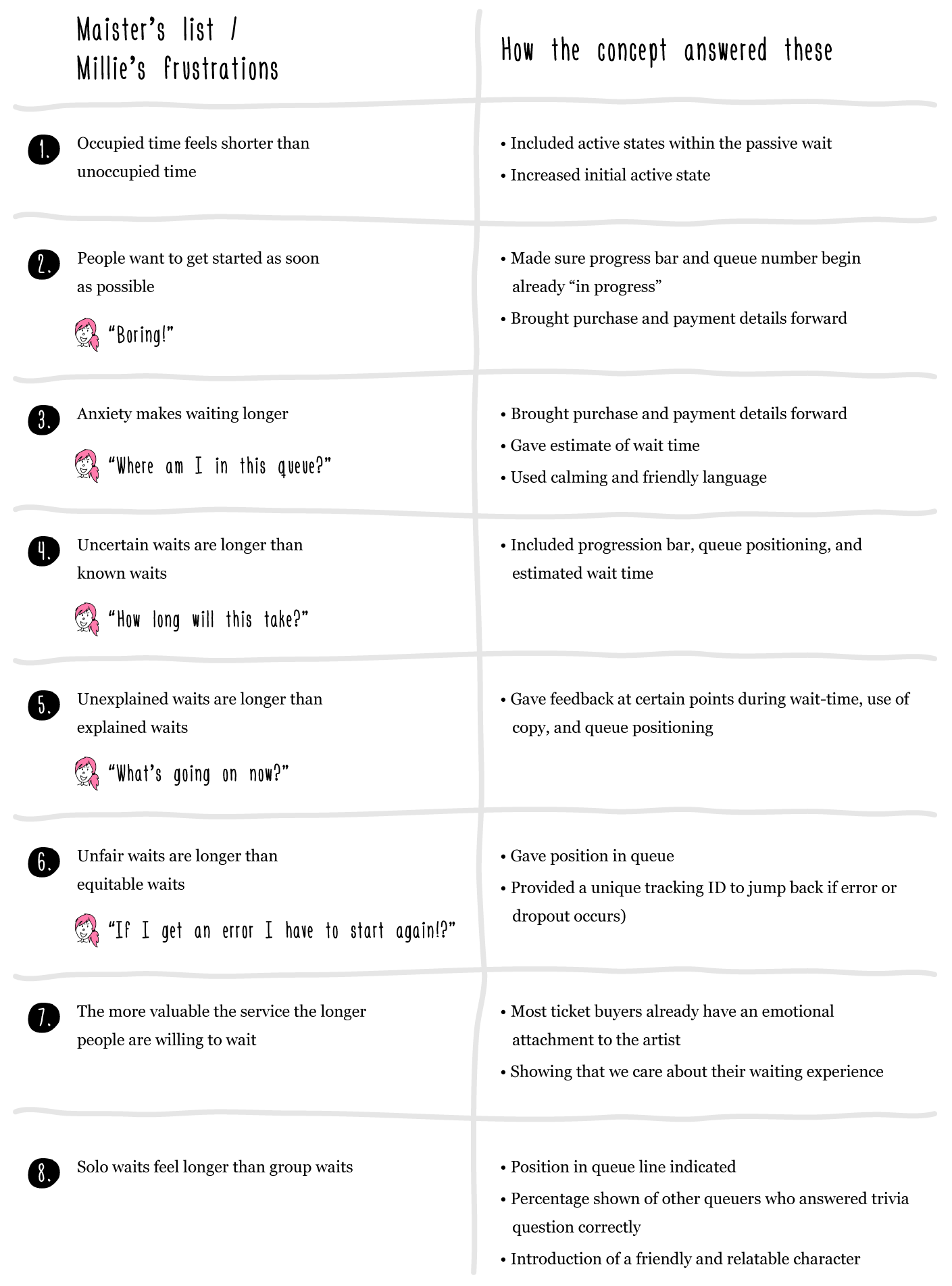
Answering Millie’s needs and Maister’s list
My ambition with this concept was to be able to overcome each of Millie’s pain points and to integrate each of Maister’s eight propositions into the queue waiting concept.
Moving the concept forward
All of this concept still had to be validated of course. By breaking down the whole concept into smaller chunks to validate first ideas that did or didn’t work would be able to be seen sooner and fixed or changed. For instance the purchase details being brought forward in the flow or the progression bar could be tested first.
There were also other questions and challenges that arose during this project that I never had the time to answer:
- How do you deal with people who have been waiting for tickets for two of more hours?
- What about people who are in the queue and tickets run out before they get to the end?
- How would using this on a mobile work?
- How could this work across devices? Eg. Millie has to leave the office and wants to continue her queue wait process with her mobile?
- What would be the best way to leave a positive ending with the ticket buyers?
Reflections on the process
Designing a concept by myself I find is an unusual experience, especially when I am so used to collaborating with other people when doing this in a commercial context. Without that external check on your own biases and introduction of other ideas there is always the danger of just designing for yourself. One way to combat this I find is to make time for discovery and research at the beginning. This allows a better understanding of the problem and who the users of the product may be, therefore cutting down on designing within my own personal echo chamber.
I’d also love it if online ticketing companies could come up with other ideas to rectify the queue waiting problem. Even an implementation of some of my concept ideas would make the experience slightly more tolerable. Show the customer that you actually do think about their experience and care enough to make it better.
I don’t work for or represent Songkick. I’m just a designer who likes to share what I’ve done with others — any critique or positivity most welcome :)

