Improving Roommate Communication: a UX Case Study

The Problem
Roommates get a bad rap. Yet, with rising housing costs, climbing student loan rates, and marrying ages trending older, many young adults have turned to living with roommates. In fact, according to Zillow’s assessment of the most recent census, fifty-four percent of 23 to 29-year-olds live in a doubled-up household.
It’s clear the benefits of having roommates outweigh the frustrations. But can something be done to decrease all the pains to make living with others a positive experience? Is there a product that could improve the lives of people in shared households?
The Team
I collaborated with a talented team of individuals to tackle this problem. Another user experience designer, Imani, and two iOS developers, Andriy and Greg. Imani and I executed the research and design work as a unit. We divided up tasks between us as necessary to complete our work in three weeks. We collaborated with the developers on project scope and feasibility.

Research
I developed an understanding of the problem by building a list of assumptions about roommates and countering each with a counter argument.

Search the Web
I then scoured the internet for articles about the rise in young adults living with roommates. I discovered:
· College students are not the only ones living with roommates. Many people living in shared households are older than twenty-two and trying to offset financial burdens.
· Some people choose to live with roommates for companionship. This comes with complex social dynamics.
· There are a few products on the market trying to ease the pains of sharing a home, but nothing has a complete solution.
Talk to People
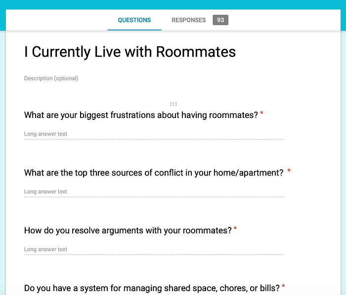
I wanted to learn what was going on in shared households from real people. Imani and I created a survey, which we shared on social media, to gather data. We asked people to name their biggest frustration and the top three sources of conflict in their home. We also asked them describe how they went about resolving disagreements in the home.
We sorted through our responses and found the top sources of pain were:
- Cleanliness
- Communication
- Privacy
Many survey responders had tried to alleviate these issues through conversation and notes but were often met with passive aggressive behavior and no improvement from housemates.
I also interviewed an apartment of girls I already knew got along well. I wanted to figure out what they were doing that made them such compatible roommates. I discovered:
- They identified their key to success as being flexible and caring about those sharing your home.
- They didn’t care about each other’s private space staying clean. Only the shared spaces needed to be maintained for someone to be considered a “good roommate.”
- Some of these girls classified themselves as messy, but because they cared for their roommates, they kept shared spaces clean.

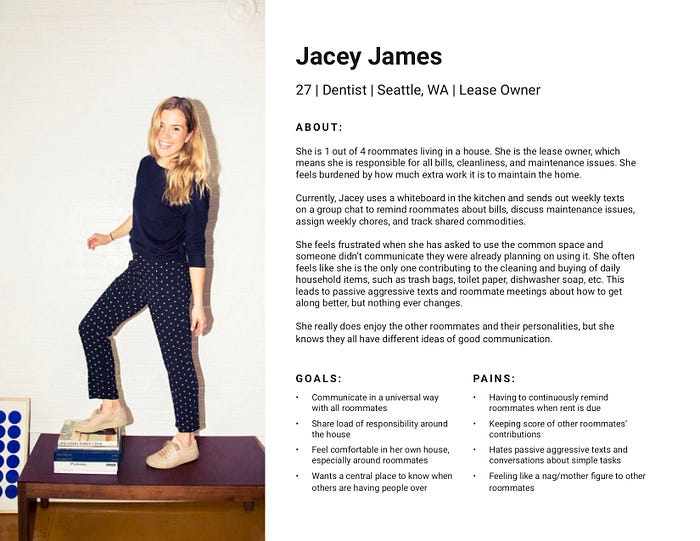
All our data and research helped us create our user persona, Jacey.
Define Product
We set Jacey’s ‘wants’ as the goals our product must help users accomplish. Imani and I led the developers through building a user story map. Together, we defined the tasks necessary to complete each of these goals. We established a calendar that showed everything happening in the home at a glance. There was also a place to display all information relevant to the home.
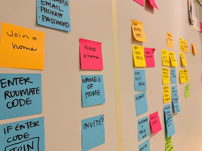
We determined Jacey needed to be able to establish a home and assign tasks to her roommates to share the load of responsibility around maintaining the home. But what if a user wasn’t a lease owner? Should everyone be able to assign their roommates chores? The answer was no, this would hinder the goal of improving communication. So we created a secondary persona, Jacey’s roommate, Hannah.
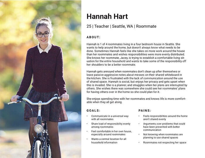
Two Views
In order for Jacey’s and Hannah’s goals to both be met, the product needed to allow for home administrators and standard users. This meant that everything we built into the product needed multiple views. For example, an administrator needed the capability of assigning tasks to roommates, and the non-administrators needed to be able to see these assignments and mark them as complete.
I used the user story map to build a sitemap for the product with views for an administrator and a standard user. I also used the sitemap to establish the flow through these views.

Build the Product
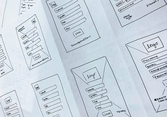
Wireframe
I then started wireframing by iterating in crazy eights. I shared my ideas with Imani, focusing on the iterations I saw as most successful. We discussed the tone of the product and how each view met that tone. We edited and reiterated the most successful designs.
We hit a stumbling block with how to set recurring tasks and reminders.
If a user wants to set something to recur on a specific day, what would that look like? And how can we word the selection in order for the user to be successful?
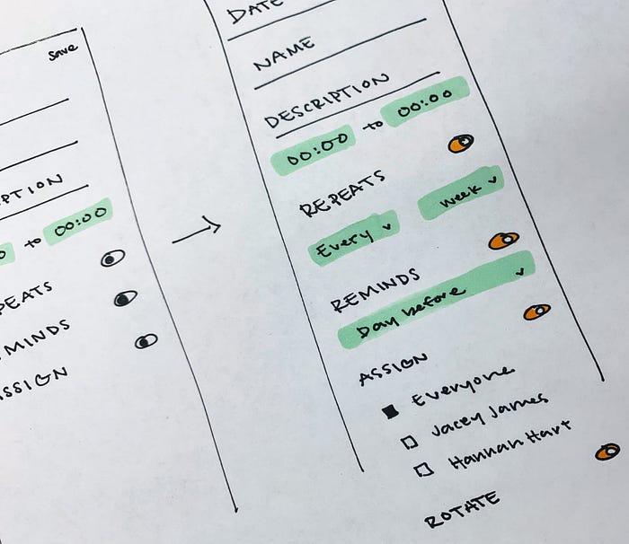
We researched current calendar applications and how they approached this issue. Some apps were more successful than others. We ended up with a toggle for whether this was a recurring event. From there, there were two drop down menus to decide when and how often a task repeated.
At this point, we finalized a wireframe of each view and divided them up to translate into low fidelity designs on Sketch. We added these to InVision and handed them off to our iOS developers.

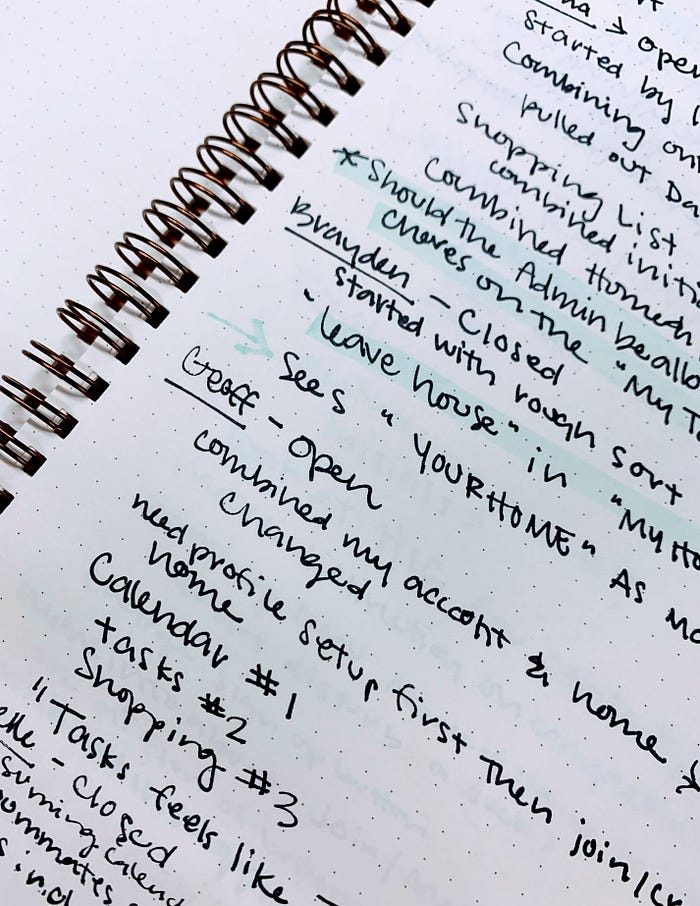
Developer Challenges
The developers challenged us on the design of the calendar views. There was not time to execute all the functionality we had designed in the project time frame. I took their feedback and designed three alternate options with varying levels of complexity. As a team, we settled on our top choice to implement in the first version of the product that satisfied the needs of the designers and developers.

We hit another stumbling block in our handoff meeting on the chore lists. There was misunderstanding on these views. After much discussion, we realized Imani and I had different mental models of how we execute chores. We solved this by mapping out each of our mental models and discussing the differences and similarities. We then mapped out a simplified model that allowed for multiple ways of thinking.

Usability Testing
Imani took these redesigns and implemented them into our wireframes. While she was working on the redesigns, I turned to usability testing in the form of card sorts. I had half of the testers perform open card sorts and the other half perform closed card sorts. The most common feedback from this exercise was where a user’s account information should live. We had initially designed it to be in the main navigation, but the testers placed it with the home information.
Based on this feedback, I made an alternate prototype with the ‘account information’ in the ‘home information’ view. I tested this prototype with no success. Not one user could find their profile information, so I moved it back to the main navigation.
Visual Design
At this point, we turned our focus to branding and establishing a design system. We started by discussing the tone of our product. Since we were working to improve roommate communication, we decided the tone needed to be kind and clear.
This helped us as we collaborated on color. We landed on a main color of light green with a supporting secondary color of orange. We added a few tertiary colors to color-code section on the calendar view as well. I sourced icons that matched the tone of our product and added those to the design system. Not everything we needed was readily available, so I also designed icons in Adobe Illustrator and imported them into XD. Imani used all these assets to begin transforming our wireframes into high-fidelity designs.

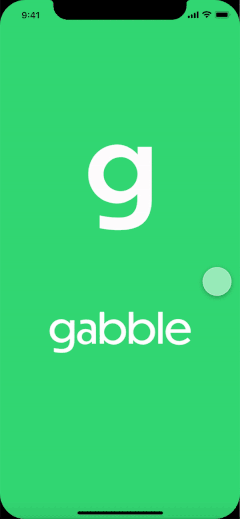
I started looking at branding our product with a name and logo. To come up with a product name, I listed as many words as I could find related to ‘roommate’, ‘home’, ‘talk’, and ‘communicate’. I shared the list with Imani and we started crossing off anything that was already used or wasn’t unique. We settled on Flattraq, gabble, Link, and Flatmate as the best options. I polled the whole team on Slack, and we decided on gabble. I iterated logo ideas to go with the new name and added this to our design system.

One of the many benefits of using XD, was the ability to prototype without moving to a new tool. So, as Imani translated pages into high-fidelity, I was able to test the prototype with users. This testing showed me what views were missing from the flow. I added a camera access prompt to the edit profile picture view, feedback for any changes saved, and the ability to logout.
At this point, Imani was struggling with how to add color to our product and make everything more playful. We collaborated on the best way to use our secondary colors and added a secondary typeface to give the product less of a business-y vibe.

We handed off the finalized high-fidelity designs to the developers at this point. We have been supporting them through their process.
Conclusion
In the end, we designed an app to help roommates communicate better. With the growing rates in doubled-up households, this product is a must-have. No more conflicting plans to use shared space. No more nagging roommates to do their share. No more forgotten chores.
I learned so much during this project. My main takeaways are:
· Misunderstandings may come from differing mental models. Draw out everyone’s mental model to understand each other better.
· Collaborating on high-fidelity designs can be difficult. XD was a good solution for this project, but I’d like to learn more about this part of the process.
What do you think of this product? Would you use it? Let me know in the comments!

