Importance of whitespace in good design
Visual and graphic design is not something that started with the rise of internet and the digital age, it has existed for more than three centuries, ever since the print media was commercialized. It obviously has evolved over all these years, now known as UI design and is a field of huge importance , now that communication, data sharing, entertainment, business are all happening online and everyone wants to retain their users by giving them the best overall experience. But one crucial aspect of UI or visual designing that has remained unchanged over all these years is the importance of whitespace. Read on to find out how whitespaces, which are easily ignored by users and website owners alike, can have a big impact on the effectiveness of the design.

What is whitespace?
When designers talk about whitespace, they actually mean negative space. In other words, the space between screen elements. It does not have to be ‘white’ in colour, but it mostly is. This space maybe a colour or texture but either way it is space within any design — newspaper, advertisement, website, application, magazine or any relevant form of media with text and pictures- that doesn’t contain any screen element and wont attract the attention of the user or reader .On a webpage it is between buttons, images, links and text. You might come across a client that may consider it a waste of space, but it is quite necessary. This begs the question — Why is it so important? We will come to that shortly.
Classifying Whitespaces
Based on its usefulness in a layout, whitespace can be divided into 2 types
· Active White Space — This is the space that you make a conscious effort to add to your design for emphasis and structure .It is left out intentionally to give more focus to the content and to delimit one element from the other.
· Passive White Space — This is the white space that occurs naturally, such as the area between words on a line or the space surrounding a logo or graphic element.
When dealing with white space, you will mostly be concerned with the active white space and should devote more resources to it, however, you still have to pay attention to your passive white space and how it works with your overall design.
An alternative way to differentiate between white spaces is by their size and density relative to the content.
Micro whitespace
We call the small space between design elements micro white space. You can find it between lines and paragraphs. It includes the space between grid images and that used to separate menu links.
Micro white space has a direct impact on content legibility. For example, marginal white space surrounding paragraphs affects the user’s reading speed and comprehension. If text appears in margins outside regular paragraphs, people read it more slowly. They find it harder to understand than text without such margins.
Macro whitespace
Macro white space is the large space between major layout elements, and the space surrounding the design layout. You’ll find macro white space to the right and the left of most websites’ content, and in the space between a website’s content blocks. Unlike micro white space, macro white space acts as a container of the overall design. It’s “big picture” white space — easier to notice.
Importance of whitespace
Whitespace is an important element of design for good reason. If used well and correctly, it can transform a design and provide many advantages to your website. There is a need to develop and deliver layouts that are easy on the eyes and make people want to keep reading and stay engaged. The difference between a good and average product lies in its design. Your job as a designer is not just to deliver to the needs of the client, but to also keep the average user in mind when creating your product.

- Focusing where it matters

A good designer should be able to guide the users’ attention to the content and make the message standout . As easy as it can be to over-design, it is important to avoid needless clutter to achieve the objective of the product. Clarity doesn’t mean boring design; a strong design will speak for itself rather grabbing for the audience’s attention. Consider Apple’s branding and advertising. It utilizes large areas of white space to communicate a sense of simplicity and to reflect the user-friendliness of its products.
2. Easy on the brain and bandwidth.
A cluttered design is a like a cluttered desk. If a design is simple and clean, it will be attractive to most users. Cluttering your webpage with a lot of graphics and animations may look fancy to you as a designer but studies have shown that it can overwhelm a lot of users which may lead to them never visiting your site again and it is also slower to load on a not so good internet connection. White space can have double advantage in such situations as it brings a sense of calm with it and is also makes your page lighter and menus snappier.
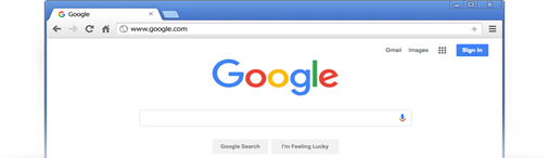
A great example that implements white space intensively (and effectively) is the homepage of Google.com. Google’s iconic look is beautifully simple and has a calming effect. Because there’s no clutter, there’s less work for your eyes and mind. You can focus on what you came for- searching for something.
There’s a great story behind why Google ended up this way. Google.com was one of the first websites to make extensive use of white space. When they started out, Internet connections were far slower. Participants in user tests would wait for the page to download despite everything already being on screen. They were not used to seeing so much white space! From these user tests, designers at Google decided to add the copyright notice at the bottom of the page for users to know that the page was fully loaded!
3. Improved comprehension
Using white space evenly makes the content in design easily scan able and significantly improves legibility. A study conducted indicates that proper use of white space between lines of paragraphs and its left and right margins can increase comprehension up to 20%. This is where micro whitespace helps.
4. Guide the user through logical grouping
In this world of visual chaos, one of the aspects our mind uses to organize visual information is the Law of Proximity, established by Gestalt psychologists. It states that objects near to each other appear similar. One of the highly practiced principles of design, whitespaces help users to make logical sense of the information presented to them. Margins and gutters between grids are some ways to handle logical grouping of layout elements.
5. Invokes imagination
When we see white space in a design, it allows our imaginations to roam free, which results in a stronger emotional response. Our brains have an innate need to figure things out, which creates a sort of narrative between what you see and how you process it.
In the image below, we have a woman trimming a bonsai tree in what looks like complete emptiness. However, we know she’s can’t actually be floating , so our brains create a story to tell us what’s happening. Maybe you imagine her working at the back of a greenhouse or maybe she’s trimming the bonsai in a white-walled office on a sunny day. Maybe your brain even imagines her as a model for a picture posing in front of a white back drop.
What your mind imprints onto that white space doesn’t actually matter; what matters is that thinking about it engaged your mind. If you’re engaged, then you have a personal investment in the design. Having a personal investment in the design makes it more likely to create a good first impression.

6. Implies luxury and sophistication
.
White space can actually become a central element in a design when it’s used to create a certain mood or look. We associate a large amount of white space with luxury and sophistication, so using it effectively may be a way to bring these associations to your design.
Consider eating out at a five-star restaurant versus a cheap family diner. At a fancy restaurant, the food is arranged neatly on the plate with plenty of white space, while the family diner piles all the food onto one plate with little room for anything else. The same idea goes for your design — too many graphic elements cheapen the overall look. Rather than trying to improve a design by adding more and more imagery, let the white space do its job so that you can simply focus on making the graphic elements look their best.
7. Adds emphasis

What happens when you separate a design element using white space?
As you can see from the text above, our brains tend to put emphasis and importance on design elements that are surrounded by whitespace. This is because the negative space is giving you visual clues about where you should be looking, providing plenty of buffer room around an element so that your brain can quickly process it.
This is why important design elements like logos are often surrounded by white space, so that they are emphasized and clearly visible. The space helps keep your logo separate from other elements, so that the viewer is drawn to your branding and doesn’t confuse it with other images.
Some Common Challenges
With all of these great benefits, we also need to understand that even with the best intentions, whitespace can often be crowded out of a design due to lower priority in client preferences or clashes with the developers. In order to prevent this, we need to understand why it happens and how to resolve it.
An all too common scenario is- A designer creates a wonderful layout. The layout is passed on to the developer who hands it back to the designer, although now the layout looks totally different compared to what the designer originally intended. Or maybe if the developer is okay with it, whitespaces are often reduced by the clients because of the cost and time overheads. More use of white spaces mean less use of content per fold which means more folds or pages to be developed to cover up content. So it becomes a costly affair especially in print design projects.
During these times, it is duty of the designer to facilitate meetings to make the client and others involved understand and prioritize the features and content to try and establish a balance between white space and the content.
Concluding
Whitespace not only creates harmony, balance, and helps to brand a design, it can also be used to lead a reader from one element to another. The main goals are to make the website look simple and uncluttered and to deliver information that our readers will enjoy and appreciate. Whitespace should not be considered merely “blank” space — it is the element of design that enables the objects on the page to exist. It is the space that balances things out and reminds us that designs are beautiful. You don’t need to create a layout overcrowded with text and images to deliver a clear message.

