Implementing Dark Theme in Android

Dark theme, nowadays, is one of the most demanding features that interests the audience of an app or a website. It is an healthy option as it emits less blue light (and people like me find it cool as well 😺). So today I am going to explain you how you can implement dark theme in your app in the easiest way possible by giving a short and to the point example.
Getting Started
Go ahead and create a new Android Studio Project.
Once the project is ready, clear the boiler plate code in activity_main.xml and paste the following code in the same file.
<?xml version="1.0" encoding="utf-8"?>
<LinearLayout android:layout_width="match_parent"
        android:layout_height="match_parent"
        android:orientation="vertical"
        android:gravity="center"
        xmlns:android="http://schemas.android.com/apk/res/android" >


        <TextView
                android:layout_width="wrap_content"
                android:layout_height="wrap_content"
                android:layout_gravity="center"
                android:textSize="16sp"
                android:text="This is dark theme example project"
                />

        <TextView
                android:layout_width="wrap_content"
                android:layout_height="wrap_content"
                android:layout_margin="4dp"
                android:layout_gravity="center"
                android:text="This is just another text view"
                />


</LinearLayout>
It doesn’t really matter what the layout is. Only reason I told you to paste the same code as mine is to make sure both of us are on the same page and the rest of the tutorial makes perfect sense.
Before we actually begin with our dark theme implementation, let us see the usual way we set colors(highlighted in below snippet) to widgets and layouts.
<?xml version="1.0" encoding="utf-8"?>
<LinearLayout android:layout_width="match_parent"
        android:layout_height="match_parent"
        android:orientation="vertical"
        android:gravity="center"
        android:background="@color/white"
        xmlns:android="http://schemas.android.com/apk/res/android" >


        <TextView
                android:layout_width="wrap_content"
                android:layout_height="wrap_content"
                android:layout_gravity="center"
                android:textSize="16sp"
                android:textColor="@color/colorAccent"
                android:text="This is dark theme example project"
                />

        <TextView
                android:layout_width="wrap_content"
                android:layout_height="wrap_content"
                android:layout_margin="4dp"
                android:layout_gravity="center"
                android:textColor="@color/colorPrimaryDark"
                android:text="This is just another text view"
                />


</LinearLayout>
This approach directly binds the color of widget or layout to a specific color which makes changing of colors with change in theme less flexible.
In order to change the color depending upon the current theme (broadly speaking light or dark), our approach has to be dynamic. So let’s now dive into actual dark theme implementation.
Dark Theme Implementation
Create a new values resource file inside the directory res/values (Right Click or Alt + Insert on values folder) and name it attrs.xml.
You should see something like this
<?xml version="1.0" encoding="utf-8"?>
<resources>
</resources>
Inside attrs.xml file we created, we will be specifying some attributes of our own which then will be used for setting colors for widgets and layouts. It will make more sense as we proceed.
Right now, you can think of attributes as controllers for colors (in our example) which can then be set to widgets and layouts.
We’ll be adding three attributes in our attrs.xml file where format of each attribute tag is as follows
<attr name={YourAttributeName} format={AttributeType(color,dimension etc)}/>
Paste the below snippet in your attrs.xml file
<?xml version="1.0" encoding="utf-8"?>
<resources>
        <attr name="bgColor" format="color"/>
        <attr name="textColor" format="color"/>
        <attr name="metaTextColor" format="color"/>
</resources>
So we have created 3 attributes (controllers) to control the colors of the LinearLayout and its two TextViews in activity_main.xml .
Now, we need to create two themes, light and dark in our styles.xml (you can find it in the directory res/values ). Paste the below two styles in your styles.xml .
<style name="LightTheme" parent="AppTheme">
        <item name="textColor">#000000</item>
        <item name="metaTextColor">#606060</item>
        <item name="bgColor">#ffffff</item>
</style>

<style name="DarkTheme" parent="AppTheme">
        <item name="textColor">#ffffff</item>
        <item name="metaTextColor">#aeaeae</item>
        <item name="bgColor">#000000</item>
</style>
As you can see, in both the themes we make use of the attributes we created in our attrs.xml to set colors. Now in our activity_main.xml, we will make LinearLayout and the 2 TextViews point to these attributes instead of some fixed color.
So update your activity_main as the code shown below (higlighted in black):
<?xml version="1.0" encoding="utf-8"?>
<LinearLayout android:layout_width="match_parent"
        android:layout_height="match_parent"
        android:orientation="vertical"
        android:gravity="center"
        android:background="?attr/bgColor"
        xmlns:android="http://schemas.android.com/apk/res/android" >


        <TextView
                android:layout_width="wrap_content"
                android:layout_height="wrap_content"
                android:layout_gravity="center"
                android:textSize="16sp"
                android:textColor="?attr/textColor"
                android:text="This is dark theme example project"
                />

        <TextView
                android:layout_width="wrap_content"
                android:layout_height="wrap_content"
                android:layout_margin="4dp"
                android:layout_gravity="center"
                android:textColor="?attr/metaTextColor"
                android:text="This is just another text view"
                />


</LinearLayout>
This approach makes widgets point to attributes instead of a specific color which makes the process of setting colors completely dependent on the current theme and the colors associated with that theme are specified in styles.xml (just like we did before).
We are just one step away from what we want to achieve 👏 👏 👏
Now the last step is to set the theme using setTheme() in our MainActivity.java. This step needs to be done before setContentView() is called in onCreate() .
@Override
protected void onCreate(Bundle savedInstanceState) {
super.onCreate(savedInstanceState);
setTheme(R.style.DarkTheme);
setContentView(R.layout.activity_main);
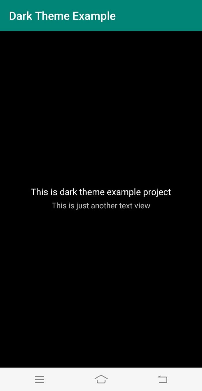
}And we’re done. Go ahead and give your project a run. You should see a layout like below
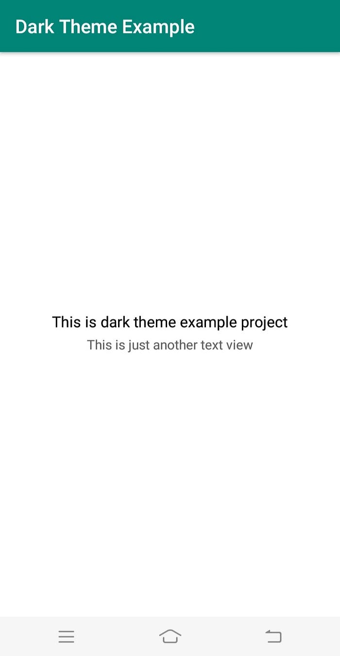
Similarly, we can set Light Theme for our app
@Override
protected void onCreate(Bundle savedInstanceState) {
       super.onCreate(savedInstanceState);
       setTheme(R.style.LightTheme);
       setContentView(R.layout.activity_main);
}
Hurray!!! 🏆 🏆
We have successfully implemented both themes, one last thing remaining is to change the themes on runtime on some action (like some click event).
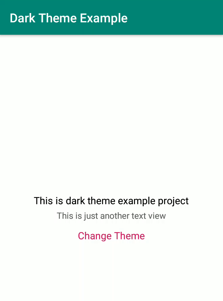
We’ll add another TextView to our LinearLayout in activty_main.xml and setup an OnClickListener on it in MainActivity.java . On the click of this TextView , we’ll toggle the theme.
<TextView
        android:id="@+id/tvChangeTheme"
        android:layout_width="wrap_content"
        android:layout_height="wrap_content"
        android:textColor="@color/colorAccent"
        android:layout_margin="8dp"
        android:text="Change Theme"
        android:textSize="16sp"
        />
And listener like below
TextView tvChangeTheme = findViewById(R.id.tvChangeTheme);
tvChangeTheme.setOnClickListener(new View.OnClickListener() {

   @Override
   public void onClick(View v) {

   }});
Now the approach for toggling the themes at runtime is that we will first check which theme is currently set and then update the theme to the other one. And before setContentView() , we can check which theme is currently configured, accordingly we can set that theme. We can do this via SharedPreferences but we have something that can make our lives easier and that is AppCompatDelegate.
AppCompatDelegate is a class in support library of android that provides us with methods specifically to deal with Dark Theme implementation.
So it has a static method called setDefaultNightMode(int mode) to which we can pass the current mode which has to be set. It can take different modes as paramters like
AppCompateDelegate.MODE_NIGHT_YES: for night mode as enabledAppCompateDelegate.MODE_NIGHT_NO: for night mode as disabled or other mode as enabled.AppCompateDelegate.MODE_NIGHT_AUTO: In this mode, the device’s timing is taken into account and then the mode is decided.
We’ll be dealing with the first two for brevity.
As mentioned earlier, we need to change the theme on click of TextView.
Apart from changing the theme, we also need to restart the activity (by destroying and setting an intent back to itself) after changing theme settings.
1. Changing theme on click of textview
2.Setting the current theme (After activity restart)
We now have to set that theme which is currently configured before setContentView() using setTheme() .
We’re good to go. Give it a run
We’ve successfully toggled the theme at runtime. The complete example is there on my github:
In this example we implemented just light and dark themes. We can obviously scale it up to many more themes in similar way.
Thank you for reading my article. If it was of any help to you, please make sure to leave a few claps. Follow me for more content like this.
Checkout my Medium Clap Animation in Android
Let’s become friends

