Illustrations! when, where and why (Part 2)
This is Part 2 of an article about the advantages of illustrations in web design. If you were looking for part 1, you can find it here.
How should I use illustrations?
In part 1 we talked about the advantages of using illustrations.
In this part, we will discuss how and where we can use illustrations across our product.
Illustrations as the identity of your brand
The most common method of using illustrations is when they dictate the brand’s identity.
In those cases it’s more likely the illustrations will appear in the site and marketing materials of the product and in more rare times, in the product itself as well. The connection between brand and illustration helps create a more memorable product who stands out against the competitors and offers a better user experience.
Those illustration are not there to “decorate” the brand, but rather to be a part of the experience and help users understand the product and the product’s values. (Remember delight? This is exactly what illustration should help us achieve in this case). We also don’t want our illustration to grab attention from our product, they are their to help, not to seize the user’s attention away from the function or information.
To create that special experience, there must be a unified language between the illustration and the UI. It’s also important to keep all the illustration in the same language, otherwise things can get messy.
One of the more interesting examples is Oscar.

Oscar is a health insurance company, not the most exciting product in the world. But by using illustrations, Oscar were able to set themselves apart from their competitors and be memorable with their fresh take on healthcare.
Oscar are far from being the only company to use illustration. Let’s view more examples of companies who uses illustration as a core element in their brand:

Mixpanel — an analytics tool. They introduced this illustrated redesign about 18 months ago. Many other brands were quickly inspired by it and followed in their footsteps.

Shopify — A platform for online stores. Shopify went through a redesign which included their illustrations. In their site you’ll see original and unique illustrations that follow the content and strength it

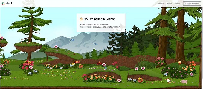
Slack — An IM platform for internal office communication. Their new branding was just released a few weeks ago and it really suits the slack experience. If you ever used slack you probably noticed the light tone of the content and their young vibe. Their new and illustrated website helps communicate those important values.
An illustrated Mascot
A good mascot is a symbol we identify with and the face of our brand.
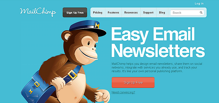
The mascot gives life and character to our product, helps our users connect to it and creates a memorable user experience. One of the most known examples is Freddie, the friendly chimp we all know from mailchimp. Freddie appears in different pages, helps us learn how to use the product and even tells a few jokes here and there.
As any other illustration, our mascot should be used thoughtfully and benefits the experience. It should help the user rather than distracting them.
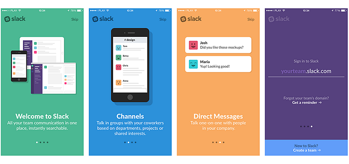
An illustrated Onboarding experience
As I mentioned before, explaining something with clear visuals makes it easier for our users to understand. One research found that with written or oral instructions, after just 3 days users only remembered 10%-22% from the information they learned. When we have a product with a dedicated onboarding experience, using visual elements might be a crucial in helping users understand the product. Instead of creating a long tedious experience that will cost us in the loss of many users, we can create a fun and clear experience.
If we were able to create a good process, we won’t only explain the product but we will also showcase our product as approachable and easy to use, and increase our retention while doing so.
Illustrations in Social Media
When we promote our product on Social Media, whether it’s through adds, posts or tweets, we want obviously want potential users to notice them. Using illustration can increase our chances by A LOT. Buzzsumo found that Facebook posts with images get 2.3x more engagement than without an image. A similar behaviour can be found on twitter, buffer found that tweets with images got 150% more retweets than those without an image.
Illustration in Social Media provide more artistic approach. The decisions we make here won’t affect the product and don’t have to follow our style guide. This allows you to try out different illustration and styles to see how your target audience responses to them.

When illustrations go bad
Illustrations are awesome. They are powerful tools and cary many advantages that we can incorporate in various ways across our product. Now let’s forget all that and talk about when to NOT use illustrations.
Illustration won’t work with every product in the market, they should compliment the experience we want our users to have.
Let’s take a radical example, do you think illustrations will work on a website such as ‘save the children’? Do you think illustrations could emphasize the values and message of that site? In that case illustrations might come across as disrespectful or might even harm the image of the site.
Illustrations can work very well with serious subjects but they should be used thoughtfully.
After months of researching and creating illustrations, my manager and I stopped to examine the results and we realized this is not going to happen. We weren’t able to create the right illustration to support our idea and emphasize our core values. Although I really wanted to incorporate illustrations, it’s important to know when it doesnt’ work and not to force it.
But don’t worry, I still love unicorn onesies and I hope you too.
This was Part 2, if you are looking for part 1 you can find it here.