
I redesigned Asos Careers
During another shopping spree on the Asos website, I took a quick look at their Career section. To me, those pages felt out of tune with the Asos Brand. Asos usually have great UX, but the Career section had a very difficult navigation, and felt under designed, almost like a wireframe.
Seeing this made me want to jump in, and try to redesign those pages
while creating a better user experience.
This is a concept redesign project of my own decision.
I wasn’t asked or hired by Asos to create this.

So, what are the problems with the current design?
- Non responsive design
- Old and outdated styling, that doesn’t align with Asos’s cool vibe
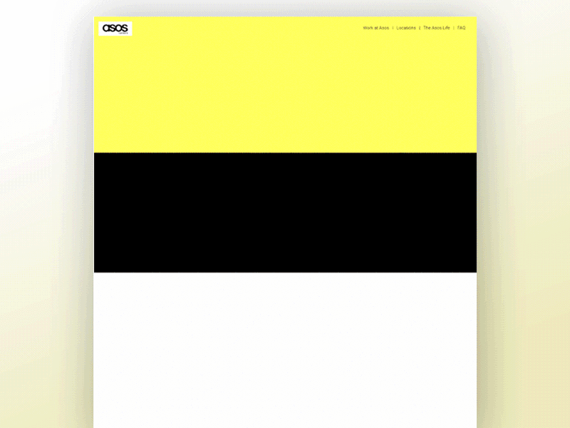
- Page width was 1024px, with a plain white grey
- A big portion of the main screen is filled with a single image
- Both the “Home” button and the Asos Logo have the same function
- No visible search or filter options while viewing open positions
- There are over 37 pages, which I strongly believe is too much
- Category arrangement is confusing
The goal: create a new information hierarchy and a new design for the Asos career pages, While focusing on the jobs page as the most important part.
Creating a new information hierarchy
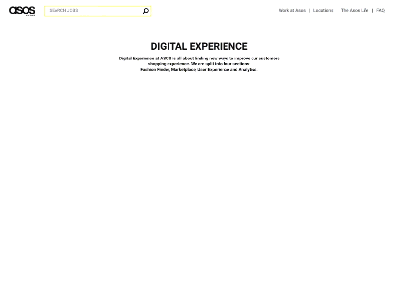
When building the new hierarchy my main focus was on the jobs, and making them accessible to those who look for them. I also kept most of the existing content, and took out only what I felt is not relevant for the new design. I ended up with this main categories: Work at Asos, Locations (given the company size, I felt this is crucial), Asos Life & FAQ.

A new layout
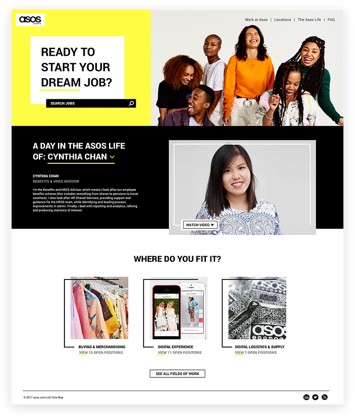
My objective for the wireframes was very specific — create excitement among job seekers, and make them absolutely want to work for Asos. To achieve this, I added the “Day in the life” category to the homepage, to show potential candidates how great it is to work for Asos. I significantly reduced the amount of text, which gave way to embed videos about working at Asos.
When a user arrives at the career home page, the first thing
he sees is the search bar. For users who know what they are looking for, this creates a faster and more efficient experience. I also kept the search bar visible in the inner pages, to insure candidates have quick access to any content they want, from anywhere in the site.

A unique identity
When working on the re-design, I tried to connect to the Asos brand and styling as much as possible. My designs are usually filled with shadows and gradients, but the Asos styling is very different, with a flat approach and bright saturated colors.
The color scheme I chose was Black, Grey, White and Yellow. In the existing Asos styling, Black and white are very common, which is something I wanted to keep. I decided to use a saturated yellow as it creates a fun and joyful atmosphere, which is the experience I want users to have.

When I found the right hero image to use, I realised I would have to change the original layout and move the search bar. Asos images are fun and filled with emotions, hiding them behind a search bar would just be a mistake and will hurt their aesthetics.
The micro-copy has a big part in the brand’s identity. I kept thinking “what Asos will say if they were here?”. It made me wonder, how should this page welcome visitors? should it just say careers?. Asos is the definition of a B2C company, they are all about the people. So I decided to make the micro-copy all about the future employ.
Ready to start YOUR dream job? Where do YOU fit it?
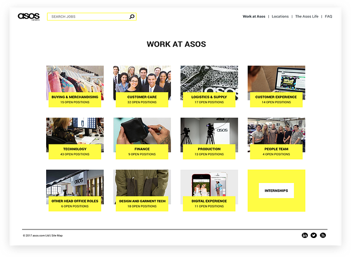
Where do you fit in?
In the original site, the work categories are very confusing and hard to find.
They actually appear twice in two different locations around the career site. Once with information about each category and second if you want to see the open position at that category.
In the redesign, each category received its own image, and the open positions were added next to it. This way, if there are no openings in a specific category, candidates won’t click on it and be disappointed.
Due to its different nature, the internship category received a different look that makes it stand out.
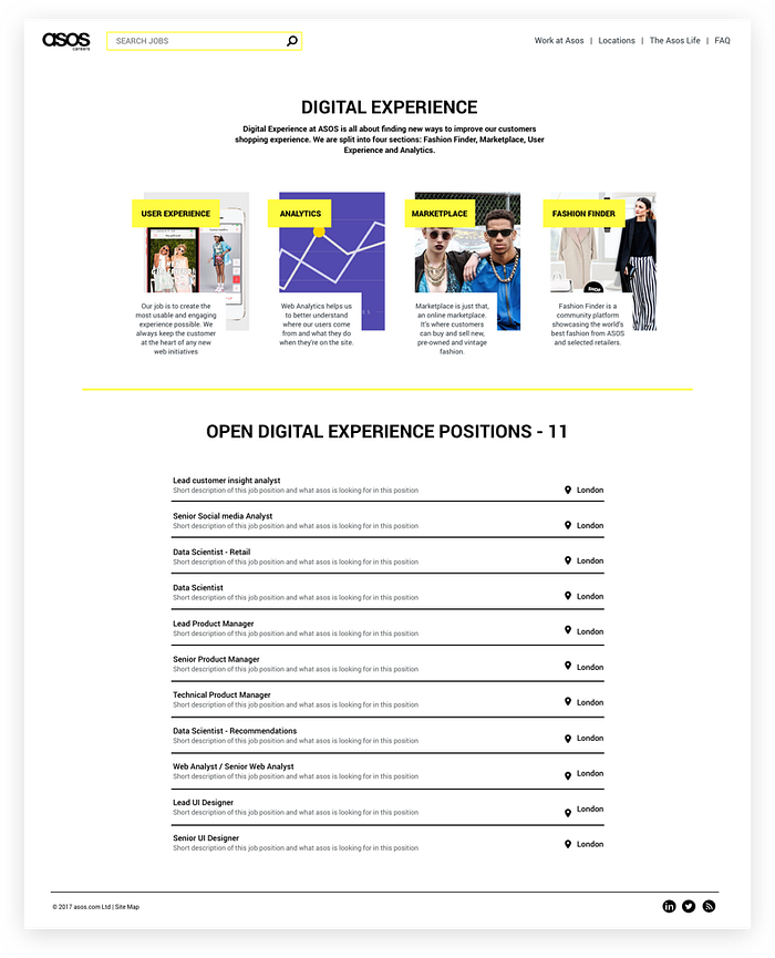
Find your perfect position
As I mentioned, I decided to place the open positions and the information about the category on the same page, to make it easier for candidates. Because jobs opening change all the time, I kept the open positions as a list so it will be easy to update quickly. The Search Bar is always available at the top.
Reaching every person
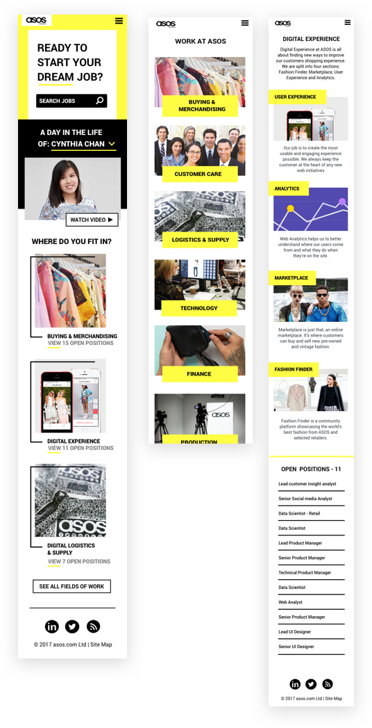
The original site is currently not responsive.
Even if only 10% of the visitors enter from a mobile device, those 10% can be hundreds or even thousands of people.
So In the redesign, I made sure all my mocks have a simple layout and can easily work well in small screens and in mobile devices.
One last touch
This was a really fun and quick project. I made a lot of assumptions that in ‘real life’ I wouldn’t allow myself to make, and that just made more fun.
For the last part, I went a little crazy with animations, trying to really create a site that will make me smile. I hope I was able to make you smile as well. :)
Let me know what you thought in the comments!

