I was bored so I decided to “judge” Facebook and Instagram
* Everything in this post is mainly based on my experiences and my feelings so… yeah, I might be right, I might be wrong so don’t take it personal eh?!
**I’m also a newbie, young and dumb. Please tell me if I use the wrong words to express or misunderstand any cases/situations. Thanks to your pokes, I will grow up and be able to poke other newbie so they can grow too. 😆
***I experienced these cases on 2 devices: iPhone 6s (iOS 12) and Samsung Galaxy S8+ (Android 8.0)
****I begin to write this story on Oct 29th, 2018. Until it’s finished, there could be some bug that you cannot find yourself anymore because they might get fixed already.
It’s been a while since I released my very first story on Medium. Thanks to it, I got a great start on my UXUI journey and I am currently drowning with my workloads, but today, I have no mood to do anything relating to design tool so I decide to “judge” Facebook and Instagram, 2 social apps I use a lot, by the way how they work that I don’t really like.
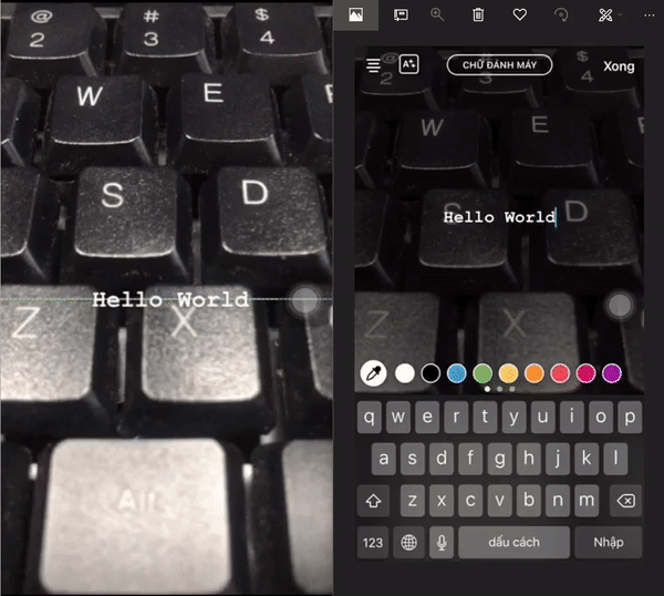
Elephant 1: “Who will see this post” option : transition effect (experienced on iOS)

As you can observe, the motion flow of this action is very nice, smooth and easeful.
But yeah, it annoys me many times. The situation here is, when I try to share a post for later check, it would be nothing if I do it once or twice but I am a “SHARER”, I mean, I share a lot, share everything that I find interested and doing sharing process is something so familiar to me that I often do it with the speed of sound *smile*. I am aware that motion effect requires time to be smooth, moreover, the transition between sharing box and privacy selecting box takes a while to perform, all of these things cause mistaken clicking or pressing.
For example, I don’t want anyone to see my shared posts but the Privacy sub-screen goes up so slow I usually make a mistaken pressing on the opt Friend except “Mark Zuckerberg,…”. The purpose of doing it fast is to save my time and somehow I have wasted a lot of my time on editing “who will see this post”. Ha — ha — ha 😠!
Solution: This one is not a bad case of UX tho, it’s just because I am a no-chilling patientless *ssh*le :’( but I’m still one of your customers right? It would be nice if you decrease 0.3 secs on the transition effect delay time. ❤
or…
how about making a full sub-screen for Privacy selection. Android is doing the popup effect well. Because the screen is sliding from aside and the motion effect delay time is slow enough to be smooth but fast enough not to wait for so long, it helps me not to press mistakenly ❤

Elephant 2: Sharing Steps (Experienced on Android)

If you just share any post by default with privacy = Friends or Everyone, it will be 3 steps, but I often change my privacy option so I have to pass through 4:
- A small popup to choose to Write a post / Send a message / Copy link
- Writing caption and some other information like Tag / Feeling / Check-in
- Editing privacy (optional)
- Clicking / Pressing Post Button
The thing is, I have been using iPhone a lot and I found that the Facebook iOS version makes this flow much better by reducing into 3 steps and I think it would be a great solution:
>A small popup to choose 3 options: Writing caption / Send a message / Copy
> Editing privacy (optional)
>Click / Pressing CTA “Share Now”
Example? :’) Please scroll back to Elephant 1
Elephant 3: Sharing Button State or Color while watching video (experienced on Android)

I was watching a vid and I found it interested so I wanted to share. I put some words into the post but when I finished, the button was still faded. In a few seconds, I thought that the problem came from the wifi connection but it was fine. Then I rechecked again to find out if I missed something that the sharing process required but in the end, I found it was not my problem. The button was clickable. You guys might think that why I didn’t try to click the button at the first attempt. I could, but I wanted to explore the problem in another way, not just to skip it.
Solution: This might be a bug and I hope it would be fixed in the next update of the Facebook app on Android. Just let the button at it original color — ready state of a CTA button so people can understand it’s ready to be pressed at any time.
Elephant 4: Object Alignment Feature on Instagram Story(Experienced on Android)

I post a dozen of story a day on Instagram and I think it’s so fine using iPhone to do this but I, recently, have switched to Android for a new experience and the very first new experience I have found turned out a not-good experience.
First, tilting alignment here (on Android) is weird. Every time I tilt an object like a text to a nice angle such as 0, 90 or 180, the device will vibrate as it just made an announcement. There is also a sudden stop at those nice angles but… why? If my device vibration system broke and my finger thumbs got 1.5 times bigger, it would be hard to know if the text was aligned or not.
Second, there is no center alignment feature on Android (I don’t know if any other Android devices have had those features replaced yet but mine… neh 😢)
Solution: I think both iOS and Android versions of Instagram should have the same way to express the alignment feature so people like me don’t have to learn how to use again when switching to the other one.
Android: “I need a solution, mate”
iOS: “Say no more fam” ❤
Elephant 5: Picking image to post on Instagram (experienced on Android)

When I was about to upload a new photo to my wall, I accidentally discovered one thing: when clicking an image on second or third row, that row will jump up to the top, the previous top rows will go up and be hidden.
Assuming that at first, I choose an image on the third row, and then I want to select a second one that’s above, that means I have to scroll to show that second one again.
I believe it’s supposed to be users who decide to scroll and hideout the content that they don’t need to interact any more.
Solution: 💻 delete the lines of code that make the image container slide up automatically. :lol:
*it could be helpful for someone else, 😢 but I find it non-sense AF, sorry Instagram developers*
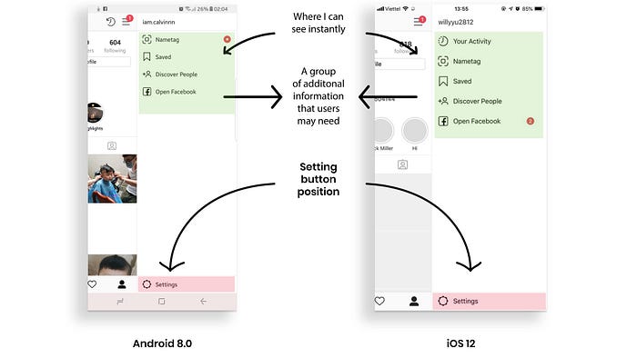
Elephant 6: Setting Button of Instagram App (experience on both OS)

I may be called stupid sh*t because of spending almost 5 mins on finding out the setting button location :) Judge me not! I have also found many users got into the same situation like me.

Translation:
Nguyen Thuy Duong: “Does anyone know where the setting button is, I spend forever to find it out, wonder why they put it there”
Nguyen Anh Quan: “Dafuq! I have been using Instagram for 2 years and now I know that button exists”
Ron Bich Che: “lul, I almost lost my eyes finding it”
Nguyen Manh Quan: “Once, I fumbled about finding it out, even though I had looked for it before already…”
Analyze eh?!:
There are a bunch of information, buttons standing together in a group on top of the side bar. Naturally, when I am looking for something, I would stare right at a place where information gathering and I believe many people would do the same.
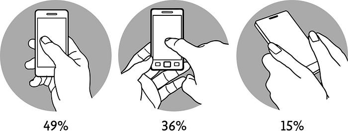
Furthermore, one-hand user may accidentally hide out the setting button with their thumb. if you notice you will see, your thumb play a role as a cursor on your desktop, your eyes will follow your thumb and if your thumb rarely reach the location of setting button, and yes it’s hard for it to do, then how can you find it easily?
Instagram knows it, believe me, they know it. But what is so dangerous being inside setting section that they decided to hide it out? why?

Because I don’t know it lel, I suppose it is a bad UX case :haha: sorry Insta-mate. And a bad case needs a solution:
1. You can group it with other button, then using lighter shade of the default black so users may be distracted in daily acting but when they need, they know where it is instantly.
2. You guys can also group it with other button, then color it red. Why? Because red stand for hot, spicy and dangerous, insecure. Red has its own character and it may affect users’ attitude so they won’t press on it unless they need to.
3. If you aim to get the button out of reach, so make it out of reach, not out of sight. 😢
I blame you guys for wasting my 5 mins on looking for it, and a day to write a story to blame you
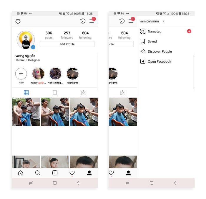
I brought the Switching account feature inside the sidebar and brought the setting button to the top-left position of the screen. It may look ew but yeah, it can probably solve my problem now.
Haha this meaningless story’s over.
Thank you for your timeeeeeeeeee ❤
Little note: I named what I saw Elephant because I suppose they are problems and they are big enough to be noticed but I see no one talking about them, do they?!


