How we used UI/UX to confront the climate crisis
There’s no easy way to talk about the climate crisis. But what if there was a better way to present it?

Why is this about the climate crisis?
When we started this project, we had one goal in mind: to tell a compelling story about an unsettling and difficult subject in a palatable and engaging way. We wanted people to fully immerse into a subject — one that genuinely inspires them to dive deep — all without feeling intimidated.
We had a strong inclination towards climate change because of all the things going on in the world today, it’s the one issue everyone can relate to. It’s a global emergency that transcends our differences as humans — everyone and everything is affected. No sides taken.
Humans. Animals. Microbes. Everything.

And the crisis is only getting worse. Yet, for such a heated issue, most of our reactions still remain lukewarm. How is it possible that we are not all more aware of how the planet is quickly depleting? Then again, who can blame us when the actual problem feels so distant to us?
The climate crisis has always been viewed as this massive problem only politicians and world leaders are eligible to solve. Us regular folks? Totally out of our league. We just don’t feel like we can make a difference because our daily efforts seem so insignificant. And nobody is interested to be a part of a problem they don’t think they can solve. Or at least that’s how we’ve been taught to believe.
It doesn’t help that it is a difficult topic to have a casual conversation over. The doom and gloom vibe doesn’t always sit well over coffee and it’s probably not a good idea to share that depressing picture of a starving polar bear before your main course.
So, we know the climate crisis is never easy to talk about. And the distressing materials we have now hasn’t exactly helped either. But if we’re going to encourage more people to talk about it, then something has to change.
And this is where we asked ourselves…
What if we can change how we present it? And change how we share it?

This portfolio project is designed as a microsite aimed to pique people’s interest and encourage conversation in this dire situation via modern UI design. We wanted to explore the possibility of juxtaposing a deeply pressing issue with an approachable aesthetic, hoping to turn apathy into inspiration and ignorance into knowledge.

Since harsh facts and horrific data hasn’t worked so far, we thought: why not captivate them into absorbing more information instead? We approached this as we do most designs by translating and distilling complicated data into beautiful, digestible forms.
We wanted to cut the fear, the distance, and the helplessness and replace it with hope, relatability, and power so people can start realizing how much more they can actually do for the climate.
Full disclosure though: we are obviously not climate experts and this is purely experimental. We simply wanted to do something that challenged our skillsets while delivering an important, meaningful message. So, to many people’s dismay, this is not an actual website although we believe it should be.

So, what’s our design approach?
Let’s break down our key points:
- Horizontal scrolling
- Parallax
- Geometric + organic shapes
- Style and colour
- Typography
Horizontal scrolling
The idea of horizontal scrolling was heavily inspired by Apple’s iPad Pro product page. It felt like a fluid storytelling experience and we wanted to emulate that same explorative feeling too.
One of the most challenging implementations of horizontal scrolling was on our Animals list page. Our intention was to create something cool, fun, and interesting but we quickly realized we were bulking on too much. We benched the first version because it felt more like turning chapters than pages. There was too much going on visually but with little valuable information. And the white space was just imbalanced. And you all know we love a good white space.
When we dialled back and honed in on the true concept of lists, we found that less was definitely more. The static info headers punctuated the continuity, the white space is balanced, and the overall page is more informative and charismatic than before.


Parallax
Parallax is trendy for a very good reason and we were so excited to experiment because it offered so much room for things to get real crazy. But instead of the usual parallax made of layered images, we decided to take it up a notch and layered flat illustrations. We honestly weren’t sure if it was gonna work (or even be a hit!) but we took a risk to combine them to create something with a sense of depth and realism.
We got many questions asking how our parallax was done on Adobe After Effects and as simplistic as it may sound, it is based on one basic principle: the object/layer closest to you moves the fastest.
Here’s a simple breakdown of our layers:
Top: Background; moves from left to right; slowest layers.
Center: Mid-ground; stays almost always centred; mid speed.
Bottom: Foreground; moves from right to left; fastest layers


You’ll see that when the background and the foreground move at different speeds and directions, it creates this camera panning illusion like it’s turning at 180 degrees.
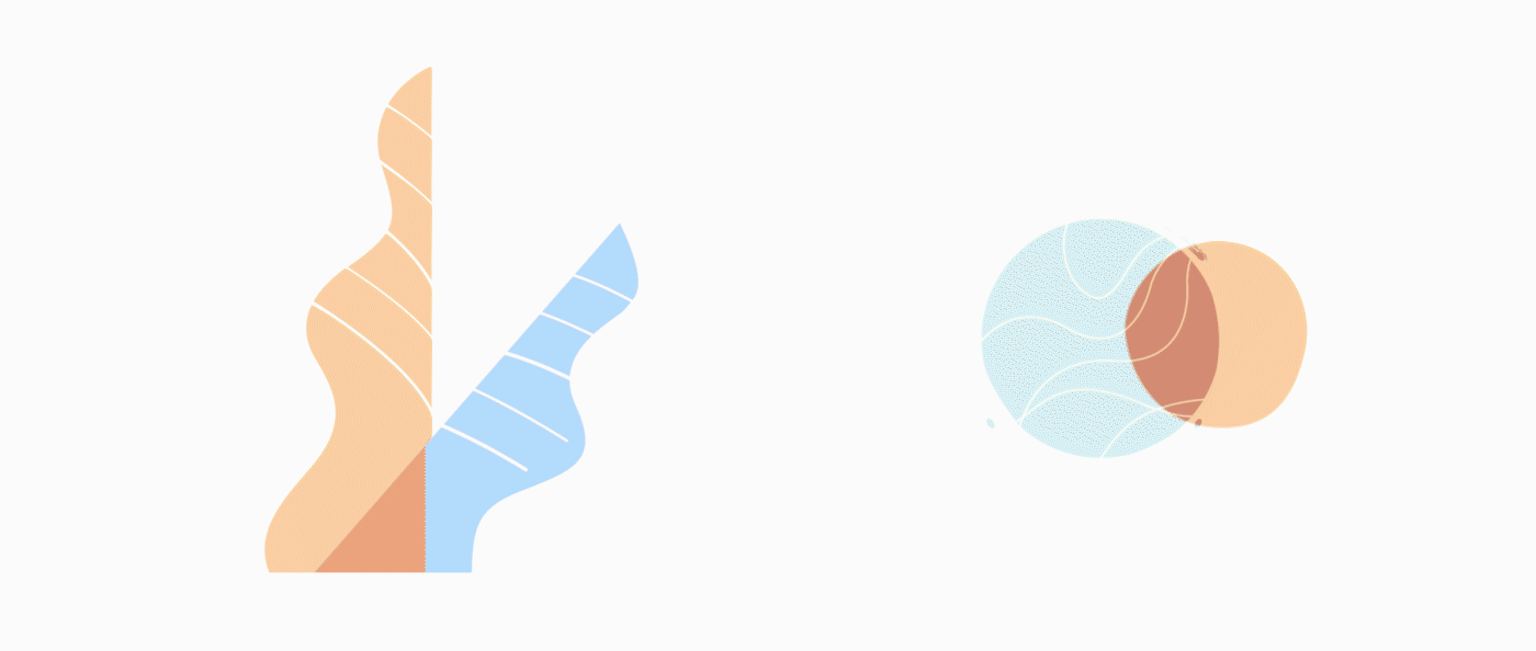
Geometric + organic shapes
Taking inspiration from our environment, we balanced the contrast between geometric and organic shapes to represent the coexistence of man-made structures and nature. But we had to be careful with how we used them; we had to weave approachability with structure and too much of either will end up with something too stiff or too playful.

For example, one way we’ve subtly incorporated structure into the site is through a fixed grid layout. Everything deliberately follows the invisible grid so the UI looks organized without adding any unnecessary weight.
Even in our visual data, the strong straight lines are contrasted with roughly drawn circles so while the data remains orderly, the page doesn’t lose its friendliness.

The animals are actually a perfect example of this contrast balance. They’re all made of a combination of basic geometric shapes — circles, rectangles, trapeziums — but thoughtfully used and manipulated to keep their natural forms and curves while still holding a strong, distinctive structure.


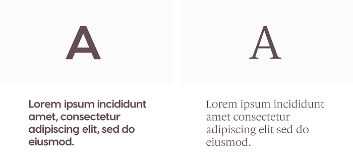
This balance trickles all the way to our typography selection. You can see they are also contrasted against each other: one is a rounded, energetic sans serif font and the other a classic, elegant serif font — but used together, and they somehow play to each other’s strengths.

Style and colours
Because we were dealing primarily with flat illustrations, we had two main problems to address in our style and colour choice:
a) Dimensions
b) Colour harmony
Dimensions
With the parallax effect as one of our main concepts, it seemed ideal to play with the overlapping technique to push the parallax envelope further. Combined, they create an illusion of space where elements on the same x and y-axis can exist on the same plane.
This illusion has the potential to create dimension, depth, transparency, and even reveal hidden elements. It adds the sense of whimsy and wonder that we were looking for to sprinkle over this dark subject.
The cherry on top of this is a layer of random, organic textures to add even more dimensions to a 2D space. All without the use of any shadow effects.
Colour harmony
Balancing the colours in this project feels a lot like walking a tightrope across a canyon. We had to keep in mind how each element interacted with each other, making sure everything was visible and didn’t get lost in the mix.
So, instead of trying to cope with a limited handful of colours, we kept our palette open to accommodate the infinite colour schemes in nature. It was a process of thoughtfully pairing colours within a certain page without going too far from its natural representation.
Key takeaways
The first key takeaway we hope you’ve gotten from this is to always push the boundaries of design despite the limitations of web development. When we do portfolio projects, it’s our chance to answer “What if” questions. At the rate tech and design is advancing, there’s no way we can gauge what’s impossible anymore.
The second key takeaway is how we deliver a message or a story sometimes matters more than the content itself. It’s like they say: it’s not what you say, but it’s how you say it.
The last and most important takeaway is we hope you’re inspired to learn more about climate change. We, humans, are responsible for 99% of the current mass extinction so it’s time we claim responsibility for our actions and figure out what we can stop or start doing.
Here are some links we found helpful during our research:
Greta Thunberg “Our house is on fire” speech
Humans cause 99% of climate change
IUCN Red List of Threatened Species
Climate change an existential threat by 2050
The extinction crisis
WWF Carbon Footprint Calculator
7 Ways to Reduce Carbon Footprint
35 Easiest Ways to Reduce Carbon Footprint
Thanks for reading 🎉

