How We Built the Swell iOS App
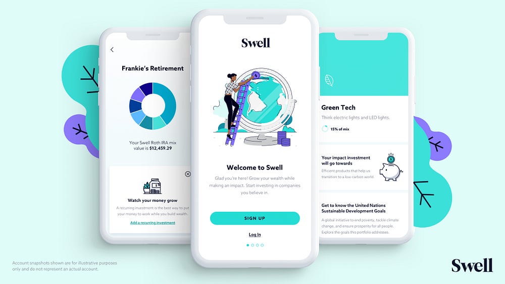
At Swell Investing we are on a mission to make sure every dollar you invest has a positive impact on the world. Since we launched our web app in 2017, we’ve been working hard to make impact investing transparent and accessible to everyone. We’re really excited to launch our iOS app and wanted to share a bit about the design process and our approach to building it.
Many financial brands are dry, technical, or overly complex. Swell is designed to be the opposite of all that. We wanted this app to feel like your personal investing friend.
Our team spent the past year talking to hundreds of Swell users — and people we hoped would become Swell users — to learn how we could improve on the existing experience in our web app. We started to see patterns emerge in our conversations and watched for places where our users hesitated, got stuck, or had questions. These conversations helped us focus on creating an experience for the iOS app that offered users:
- Guidance — more help making major investment decisions
- Transparency — a better understanding of what they’re investing in and the impact it’s making
- Inclusivity & Accessibility — an experience that made finance feel less daunting
Guidance
Let’s face it, investing can feel complicated. Novice investors we spoke to were overwhelmed by all of the charts, acronyms, account types, and performance numbers… the list goes on and on. When new users join Swell, their first step is to create a “Mix” or a customized combination of Swell portfolios. In our web app, we give users complete control over how to allocate their Mix, but deciding where to invest your money can be a daunting process. This is especially true when you’re trying to invest in line with your values. Even veteran investors found it hard to make a decision about where to invest:
“ [I] honestly don’t know which one I’d rather invest in and I don’t have time to look into the performance right now…” — Conner, Colorado
Our solution was to offer a bit more guidance by giving users a more thoughtful place to start. With the help of our Impact Team, we introduced the concept of predetermined mixes — The Tech Optimist, The Environmentalist, and The Generalist — each designed to offer exposure to specific impact investing themes.
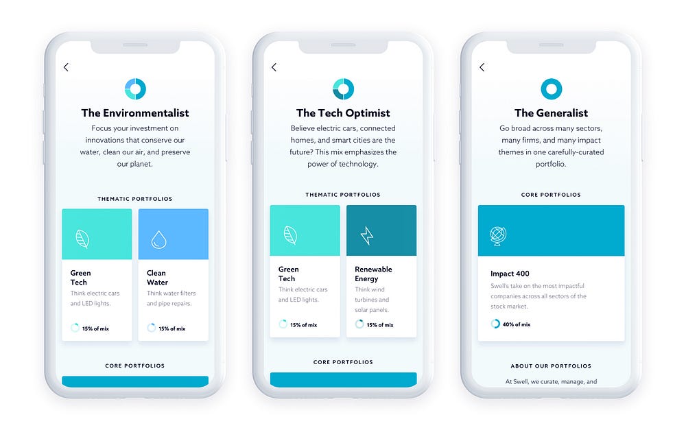
While a place to start is great, part of offering more guidance also means keeping you informed. We wove in explainer modals and informational details throughout the sign-up process at moments where we observed the most hesitation and confusion. These screens are designed to break down some complex investing topics and empower our users to feel more confident in their decisions.
Transparency
Investing in line with your values means knowing what you’re invested in.
“I’m curious about these companies… I’ve never heard of some of these. What makes these companies impactful?” — Shane, California
Questions like this came up a lot. To keep you informed and up-to-speed with everything in your Mix, we built out detailed info pages (aka “Deep Dives”) for each of our portfolios. These Deep Dives break down the portfolio’s historical performance and areas of impact.
All of the companies in Swell’s portfolios go through an extensive evaluation process to look at how the company conducts business and whether its product or service aligns with the UN Sustainable Development Goals.
Our iOS app lets users dive even deeper into every single company they are invested in to learn more about that company and some of its key impact initiatives.
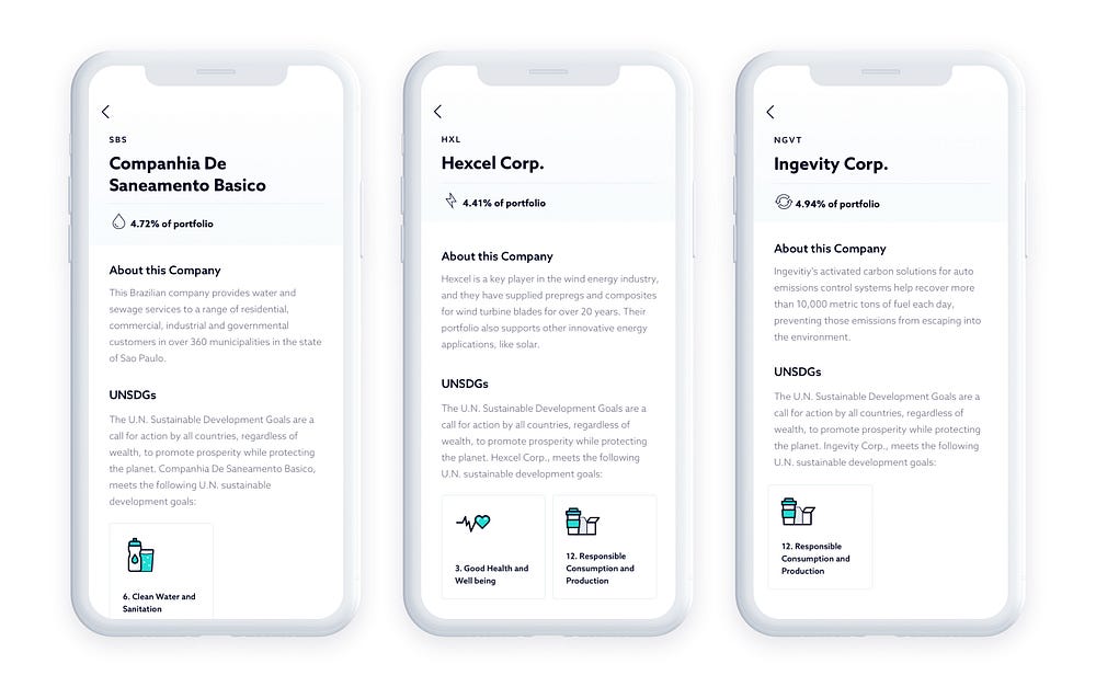
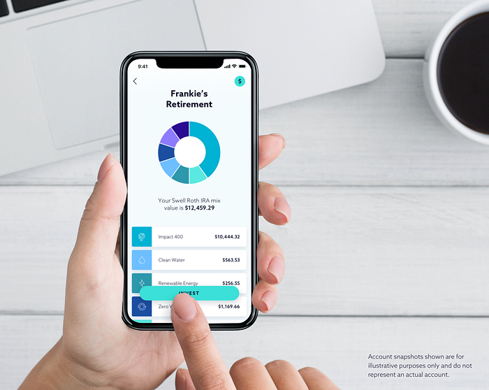
In some cases, being more transparent meant bringing important information to the forefront. The account experience was thoughtfully redesigned to simplify the account details and bring relevant information front and center — no more searching for account values and manually calculating earnings. In other cases, being transparent meant cutting back. We opted for a lighter, minimal aesthetic that lets users focus on their money without distracting them with excess information.
Inclusive & Accessible
We had two major goals when it came to making the app accessible and inclusive. The first was to make sure the app was usable for those with impairments and disabilities. We paid special attention to accessibility features including Apple’s VoiceOver Support and even updated our color palette to improve contrast for readability and legibility for people with visual impairments.
Our second goal was to make the app to feel accessible. It’s getting better, but finance still has a bit of an old-school “boys club” reputation. It’s hard to forget what one user said to us during one of our early user tests:
“When you think of investing, you think of rich old white guys in suits…. I don’t have a lot of money…this just doesn’t feel like it’s for me.” — Caitlin, Tennessee
This comment really stuck with us and reinforced the need to create an experience that felt accessible to people regardless of financial status, race, religion or anything else. We wanted everyone to look at the app and think, “This is for me!”

Our illustration style is meant to be as inclusive as our app. We deliberately chose to include a diverse group of people (and dogs, of course). It’s a great feeling to hear someone say:
“I’m glad there are some people in the app who look like me! That means a lot.” — Jermaine, California
We’ve still got a lot of work to do but we hope the app makes it a little easier to start investing in companies that align with your values. We’re still listening, by the way — and we can’t wait to hear what you think!
The Swell iOS App is available for download! You can find out more about Swell on our website at www.swellinvesting.com.
On a personal note, I am very proud of this team and excited to be a part of it. Special thanks to Cristina Stutz, Arianna Savant, Yasmine Molavi, Michael Traquair, Chris Arellano and the rest of the incredible Swell team!


