How Uber Conquered UX Design
From the time it launched to the public in 2011, to the billion-dollar giant it is today; Uber has faced some huge hiccups that were solved by the magic of what we call — UX design!

1. Focusing on just the basics
Uber’s first app and website focused on just getting the basics right. At the time, people didn’t understand the concept of app based on-demand cabs. So instead of pushing hundreds of fancy features, they only pushed 1. This was the “set destination” or “set pickup” interaction.
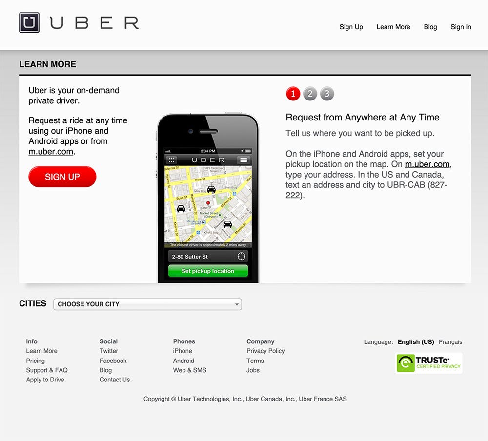
This easy-to-understand language and interaction made it easy for anyone to book a cab. On top of that, Uber focused heavily on guiding and explainer messages. They often used solid UX writing and compelling content to make the process of booking an Uber sound easy to do and focused on convenience and ease-of-use.
The only hiccup I can notice here is the use of the color red for the Sign-up button and info labels. Using the same green, as can be seen in the app would have been a better decision.
What is cool that Uber used SMS text messages to allow people without the app to book cabs as well. This is still a feature they boast in countries like India.
2. Using animations to engage users
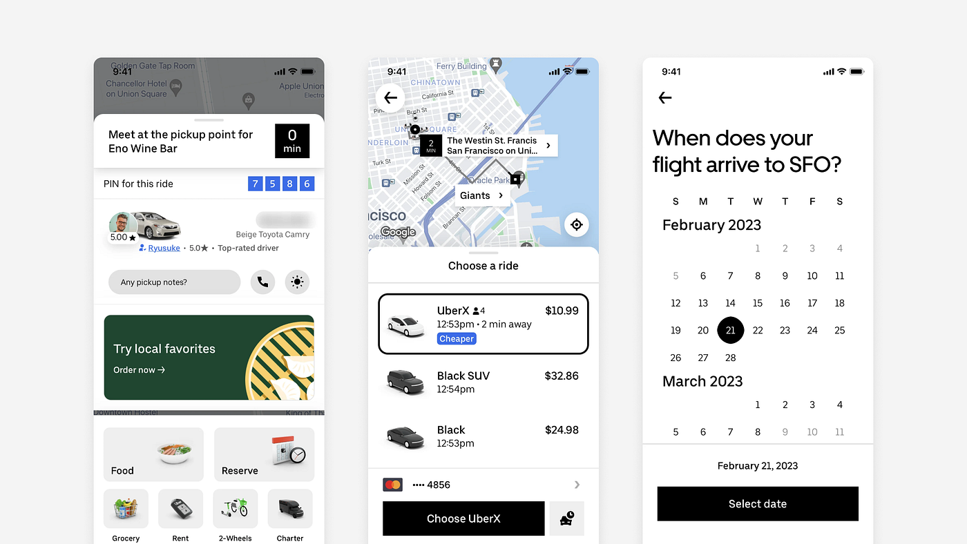
In most cases, the Uber app solves a purpose, which is letting you book cabs on demand. However, there are 3 major problems with their cab booking process:
- You sometimes have to wait for long for a driver to accept your request. At times, not being able to find a driver near you can be frustrating.
- Users might need to quickly and precisely change locations on the map.
- Users need a sense of surety and confidence in the route being taken. They also want proper feedback on the app, without which there is a chance of drop-off.
To tackle these real-life problems, the Uber design team took the interaction design of the app into their own hands.
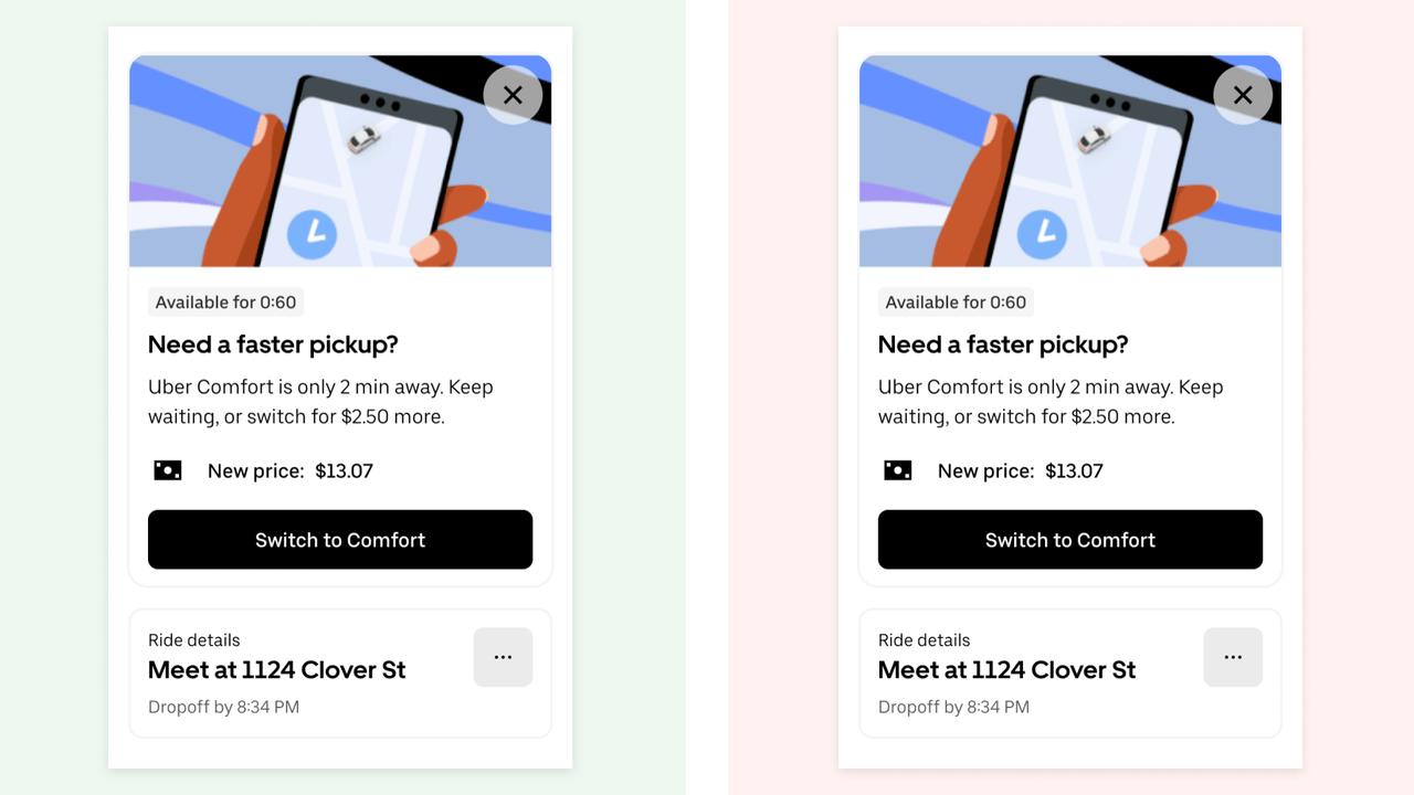
The team devised interactions and animations that are now well associated with the app and brand. Everything from map route animations to changing price modals. They had it all covered:
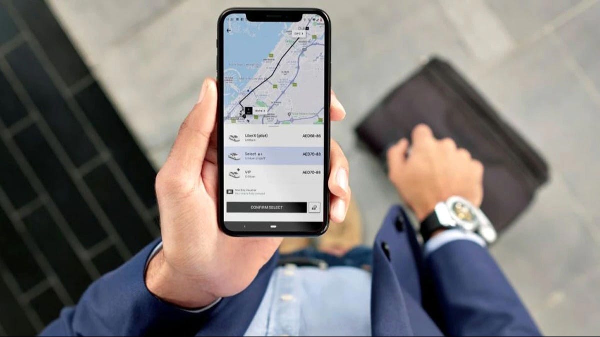
You can see the rider coming closer (often with a smooth map animation):
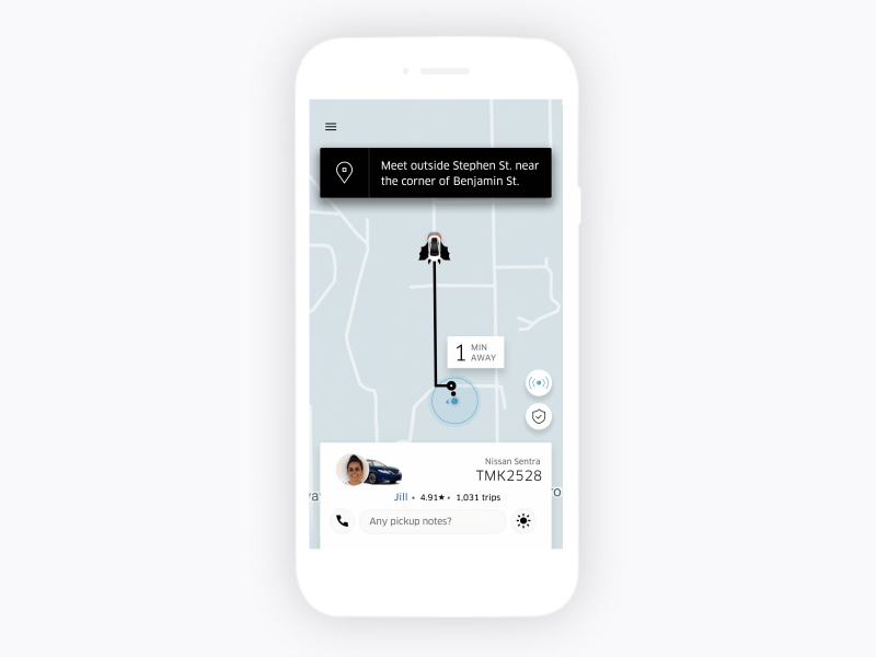
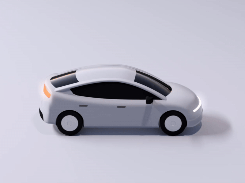
They employed 3D designers to add 3D elements to the app:
Uber implements great feedback and motion to communicate with users:
3. Black & White, With a Purpose
Ever notice how ‘colorless’ the Uber app is? The buttons are black, the backgrounds are mostly white, the UI is very straightforward and to the point. This is a similar trend adopted by apps like Notion, Instagram, and even Medium!
There are some huge benefits of having a simpler and rather colorless UI:
- Lesser confusion and cognitive load for users. Users can hence take quicker and efficient decisions.
- No issues with readability. The UI is easy to access with a great accessibility score. This helps even the visually impaired, to be able to use the app.
- Culturally, Uber is a global app and needs to fit into every countries’s individual needs. Having one color fit one culture is difficult to find, however black and white goes everywhere and fits everything. It’s one of those “safe” colors.
- Designers also find it easier to create black and white interfaces, since little-to-no thought goes into the color selection process. This makes projects faster, easier, and cheaper for the company too!
While most of the app is plain jane, the company tends to use colors with illustrations and map elements to highlight important components, while adding a little bit of flavour to the app.
4. Breaking The Surface of Research
Uber does go above and beyond for research and data, that it doesn’t surprise me that they have a successful design team.
Whether it is roleplaying drivers, or become the user for a day, the Uber team has a very hands on approach for find the real problems and loopholes in their system. I can only assume that the research process is long and deep, with dedicated researchers collecting and organising real data.
Uber also tests its features in an almost “sprint” like format. These design sprints allow them to build and test out features quickly and gather feedback at the earliest. These sprints could last anywhere between 1–3 weeks.
Once again, Uber publishes a lot of their findings to the public. Including certain advance level principles they utilise in UX research and R&D.
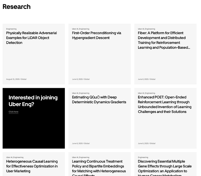
You can find these research case studies here: https://www.uber.com/blog/research/
5. Creating a Super-App

Uber is now transitioning into something called a “super app”. Such apps encompass a variety of services on one single platform. Amazon is a great example of this type of application. They boast deliveries, payments, entertainment, grocery delivery, and even a built-in social platform.
This approach allows companies like Amazon and Uber to use an already popular app to promote other services and businesses that they might own. Imagine having to build one app for all your businesses, alleviating huge costs, marketing budgets, and even the tech behind it all. This also helps with building trust with customers. Users tend to lean into purchasing services from a brand they already trust, rather than a completely new app which might seem to be a separate entity.
Here are some of my thoughts about this as a UX designer:
- User retention is a huge challenge to overcome. Having multiple services neatly clubbed into one can help bring back users to the same app, hence reducing their chances of deleting or quitting the app.
- It is easier to maintain one design system that works across different services or offerings. Creating separate brands or designs would take a long time. We’ve already seen how simple and direct Uber designs are, so this approach fits very well into their current ecosystem.
- In the long run, Uber can become an e-commerce platform and it will be easier to pivot into different directions. This helps target different markets and countries well, without the need for a lot of research or individual testing. Since the app is well established, there is so much data and analytics to work with.
6. Adding Much Needed Personalisation
We’re definitely in the era of customisation and personalisation. Apps and systems need to be personalised to our preferences, life choices, and even our search history! Uber understands this and has made sure your experienced is tailored to you.
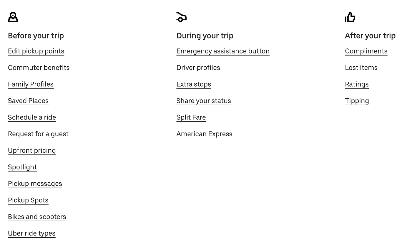
As the Uber brand grows, they realise they need to keep creating value to retain users in the long run. They’ve introduced features like saved addresses, previous locations, family profiles, sharing your ride, and more.
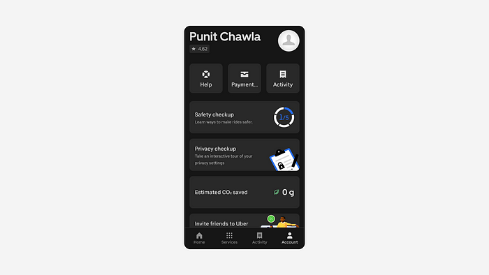
The Uber app is now full of features that keep your experience tailored to you, including a CO2 saved meter for electric cabs, safety checkups, payment options, and an activity tab.
However, where the Uber app truly shines is the overall experience of seamless communication and riding.
Localisation for Personalisation
One of the major challenges for an app like Uber is localisation. Make the app personal to your location or your language is always a tricky feat to achieve.
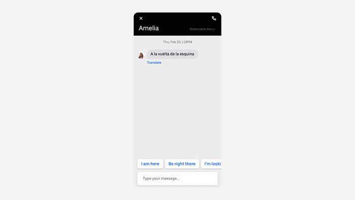
The first step was to activate translated chat in the Uber app. You can chat in your own language on the app, and it instantly gets converted to the drivers language. This is an almost invisible feature, where the translation happens before the message reaches you, reducing any sort of confusion or break in the user’s flow.
Building Trust in Drivers
A huge part of an app is to make the customer trust the vendors — be it drivers, restaurants, businesses. In Uber’s case, they act as aggregators between drivers and riders, and this is where giving a personal touch to the interface is important.
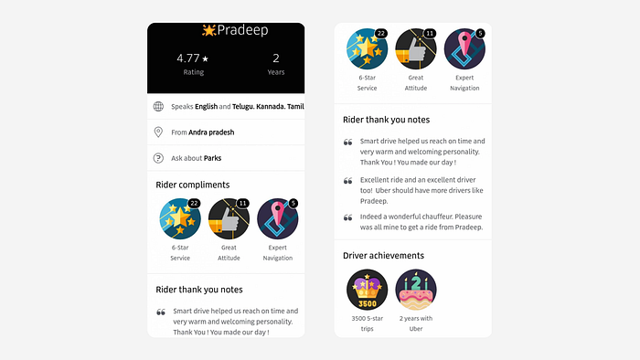
This added information about the driver is shown to the users to build a sense of trust and connection between the users and drivers. It also encourages the drivers to maintain their ride quality and earn these “achievements” to boost their performance.
7. The Design Team Behind The Designs
A design team for a design-centric company with a user-centric approach (such a mouthful) is one of its biggest assets. When well designed features becomes a major selling point, the people who work on these can become great mentors for all of us.
Most of their designers come from varied product companies that foster design growth. To foster a sense of growth, Uber has taken a “build in public” approach. This means that the design philosophy, principles, and even their design components are available for the world to look at and learn from. At this point, you can pick up their design systems and public assets for your own app or website, and utilise their expertise for your own gain. Check out their resources: https://www.uber.com/in/en/careers/teams/design/
I am also fascinated by the fact that apart from different sub-products or various apps, they also have dedicated design teams focusing on different crucial user flows and parts of the app. Their is a design job listing with the title of Product Designer for the Payments aspect of their apps. This shows their awareness of the importance of each little detail of their app.

They also publicly showcase their internal design philosophies and lessons that they implemented for a successful product design — 77 things.
Check out 77 things — https://medium.com/uber-design/77-things-about-uber-design-4621516e495c
Liked this writeup? Then give it a big CLAP! Also, feel free to checkout other articles around UX design on my profile.