How to use typography in UI Design
Practical tips and tricks

Design System for Sketch and Figma — www. visualsystem.co
🇹🇼 Chinese(Traditional) translation by Lin Simon — 如何在介面中設計排版
Introduction
It would be fair to say that typography is the hardest part of the UI Design. It is with us for a very long time in various forms. Thanks to that we have a lot of rules, practices, and theories for whom hard to keep up. In this article, I will give you a few practical tips and tricks that you can use in your projects.
Practical examples over theory
Although typography is a fascinating topic to talk about I will not bother you with a theoretical part. Rather than talking about letter anatomy and ligatures we will dive straight into practice.
Buuut if you want …
Think about the users
We should remember that besides aesthetics we have users. You are designing not only for high-resolution flagship devices but for a little bit more…

The font you will use need to be flexible. Your font should offer a variety of weights, a wide range of special symbols and it needs to render very well not only on the retina. It’s important to pay attention to these aspects so your users will not suffer from your ignorance. Good typography is “transparent” to the reader but the bad one will scream from the display.
Understanding what makes letters readable gives us a better overall view on what we should look for when choosing a font for our UI.
Legibility
Legibility is a measure of how easy it is to distinguish one letter from another in a particular typeface. It’s micro-typography that focus on the typeface, letters, and details. Naturally, this is one of the most essential factors. Not all typefaces are created with legibility as a primary design function. The most common problem is lack of distinction between capital I and lowercase l. You need to avoid this kind of fonts because people will have problems reading them on small displays.
X-height
95% of the letters we read are lowercases. Larger letter proportions between uppercase and lowercase tend to result in a more legible typeface.

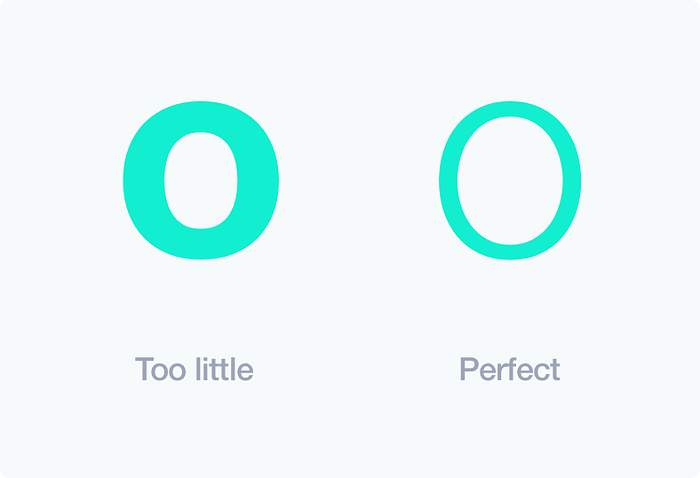
Counters
We also have white space within the letters. For example look at “o” “u” “d”. Those spaces are called counters and typographic professionals believe that more of it help us to easier recognize the letters.
Weight
Lighter typefaces are usually more legible than heavier weights of type. It’s related to counters and allow for non-modified character shapes.
The best character stroke thickness is about 18% of the x-height.
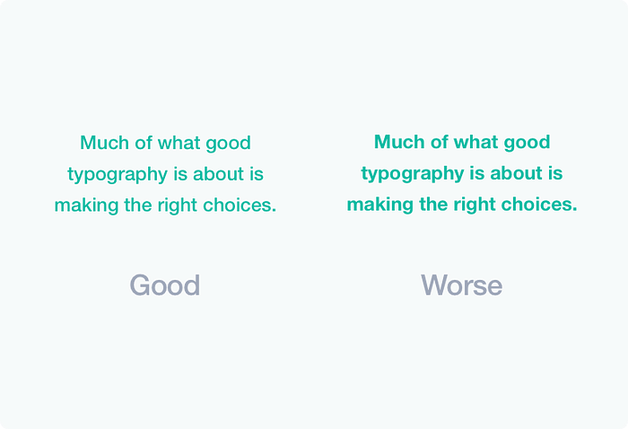
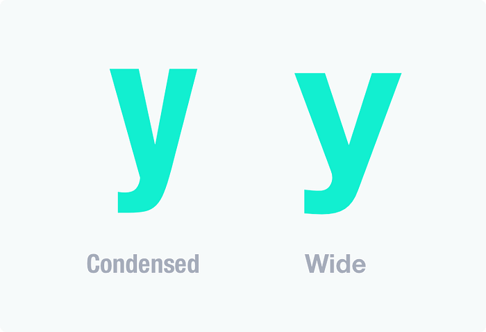
Wide proportion
The width of a character in relation to its height is described as the proportion. Generally, you want a wide letter over condensed one for better letter recognition and thanks to that for better legibility.
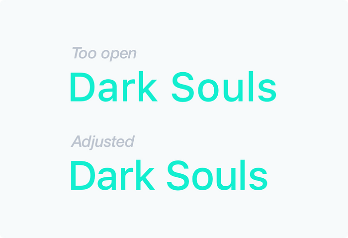
Letter spacing
There is no ultimate way to calculate letter spacing but most of the time the bigger text size you have the less letter spacing you will need. Typeface will appear too open and you need to manually adjust spacing. For UI design it applies usually to headers.
Readability
Readability is about the overall reading experience. How easy can we scan text layout, distinguish heading, subheading, paragraphs, and blocks. It’s macro-typography that’s about making the text more visually appealing in order to make it more encouraging to read. It’s really an art of contrast, color, size, composition and small details that results in better reading experience.
Serif vs Sans Serif
History tells us that serifs are more legible. They were used in print for a long time and they really improve the reading experience for large blocks of text. Serif allows the eye to flow more easily over the text.
The story is different on the web and mobile. There are several sans-serifs that are readable and current state of visual design prefer simpler letterforms. On the web and especially on mobile we see much more sans-serifs. Furthermore, the display is not paper and usually, we are not reading long texts on the web. Especially in apps.

It all depends on your project and how users will consume your content. For example on medium, we have serif because most of the time you will read something longer. That’s a good design approach.
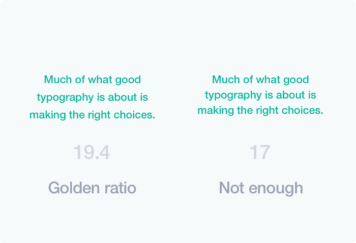
Line height
When it comes to leading I highly suggest to use golden ratio.
Multiply your letter size by 1.618 and you will get perfect line height.
Small calc to play with — http://jsbin.com/todidu/1/
If you are more experienced then you can manually adjust this outcome. Of course, there are exceptions to this rule and you can always break it if it’s necessary.
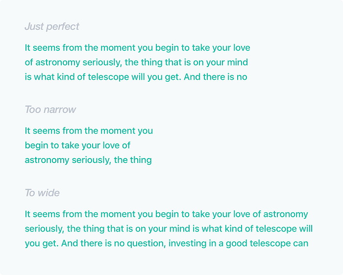
Text block width
It’s like treading on thin ice. Too wide text blocks will cause our eyes to have a hard time finding next line of text. If the lines are too narrow the eye will need to jump from line to line too often breaking the reading rhythm.
Our subconscious mind is energized when jumping to the next line (as long as it not so frequent).
To energize your readers and keep them engaged, your text line should have between 50 to 75 characters.
Colors
This, of course, depends on the project but there is one trick that I would like to share. Instead of using pure gray colors (or black) pick your main color and work somewhere here:
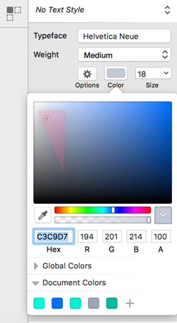
It will be more attractive and unique than using common #CCC. The small detail that will make your visuals better.
Whitespace
That’s a vast topic with many books and great publications but when it comes to typography you need to remember this one:
The basic role of white space is to reduce the amount of text visitors see all at once.
This makes our layout more scannable and it doesn’t overload us with content. White space guides our eyes through the layout and creates the feeling of order, sophistication, and elegance.
Hierarchy
The hierarchy defines how to read through the content. It tells us how to distinguish header from subheading and body text. We can achieve this by using different contrast, text sizes, paddings, margins and so on. It’s an important technique that needs to be mastered in order to achieve good readability.

Separators
A good way for dividing content into sections is to use a separator. The most popular is a simple line. It’s a subtle tool but still plays a big role in readability.
Another way is to use popular right now cards. They are really good when the content within is not related. Great for mobile and big thumbs but also improve our layout scannability.
Repetition and rhythm
This is the most time-consuming part of UI design (at least for me). Any element that is repeated provides unity. The repetition may be positioning, text size, colors, padding, margins, use of rules, background and boxes. For example, I’m usually rounding size of the padding/margin to 5 so it looks even more consistent (that’s one of my rules). Repetition produces rhythm.

Conclusion
Learning typography is a fascinating journey with it’s entire hipstery, fancy words and satisfying view at your skill progression. Skills don’t come from reading articles on medium but from learning and practicing. So open your Sketch (sorry PS dinosaurs) and create something awesome.
“The greatness of art is not to find what is common but what is unique.” — Isaac Basvenis Singer (1904–1991)
ps. This topic was brought by Viki G as a comment to my last article.

