Member-only story

Shadows are everywhere in modern UI Designs. They are one of the most essential part of the UI elements right behind the fill, stroke, and cornder radius. 😉
Completely flat design is no longer a significant trend. With this short tutorial, you will learn how to create stunning shadows for your cards, buttons, or whatever UI control you want.
So, grab the mug of your favorite coffee, and let me show you 6 easy steps for impressive shadows!
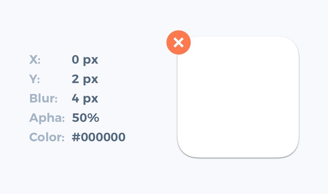
1. Do not use shadow defaults
It does not matter if you use Sketch, Figma, or Adobe XD. All default shadow presents from design tools are awful. Do not use them! If you want to make them look clean and modern, you always have to modify their appearance.
2. Make Shadows Look Soft
Most of the nice shadows are the soft ones. To enhance their look — lower opacity (10–30%) and set the higher level of blur (16px-40px). Now look at your shadow — this setup instantly improved its appearance.

3. Consider Creating Shadows As a Layer with Blur
Standard shadow style is easier to implement, but if you would like to stand out, try to make a separate layer with a blur as a shadow. Thanks to this technique, you will gain more control over the shadow position and its size.
I know… developers may hate this technique, but you may help them with this site! 😎

4. Make shadow color more natural
100% pure grey never looks good (except pure black-white theme). Look, the real-world shadows always got a subtle color. Add the tone of your UIs neutral color to the shadow, and it will look much better.

