How to Make a Dot
A non-definitive guide on how to make a strokes-intact dot for outline style icons.
Sometimes you need to make a dot in Adobe Illustrator. And sometimes it takes you so long to figure out how to make said dot that you begin to contemplate the benefits of giving up design entirely and living as a hermit in the woods. To save others from this path of existential angst, here’s a quick tutorial.
Intact Strokes vs. Outlined Strokes
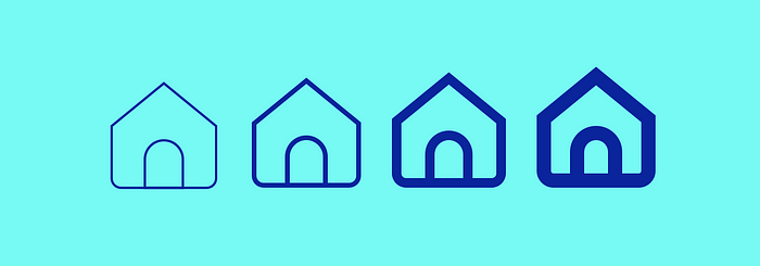
If you follow me on social media, or live within a thirty mile radius of me, then you’ve heard about Symbolicons Pro — my new icon family with three unique styles: solid, line, and color. The solid style is available now, and I’m hard at work on the line style. Unlike standard solid glyph icons which rely on filled shapes and negative space, line (or “hollow”) icons are characterized by their use of strokes.

There are two ways strokes in line icons are typically dealt with. They are either left intact, or outlined. Outlining results in more vector points, but ensures that the final icons remains exactly as you designed them.

That said, one of my goals with the line style in Symbolicons Pro is to make it as flexible as possible, which is the reason I’m including strokes-intact versions of all icons. End-users will have the ability to scale the icons to whatever size they’d like and still have control over how thick (or thin) the lines appear.

Which brings us to the problem…
The icons in Symbolicons Pro Line are all being built on a 24px grid, so space is limited. One design element that recurs throughout these icons is the use of single dots. Little circles to convey meaning.

With the original stroke weight of 2pts, each dot occupies two points on the pixel grid.

If using outlined strokes, this is no problem. The dot can simply be created using a circle shape. But if the strokes are to remain intact, it becomes a little trickier.
It seems logical that a stroke could be applied to a single dot, or node. A node with a 2pt stroke would appear as a 2pt dot.

But in reality, at least in Adobe Illustrator, this doesn’t work. Single, unconnected, nodes are treated as strays and ignored. The reason for this is simple: vector shapes and lines in Illustrator all have a width and height, but a single dot has neither.
The Workaround
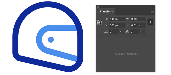
Since Illustrator ignores single nodes, the workaround solution is to treat the dot itself as a very, very short line. To achieve the desired result, simply create a stroked line of any length and move one of the nodes so that it overlaps the other. If you have ‘Snap to Grid’ turned on in Adobe Illustrator, this is quite easy. You can also accomplish this using the transform palette (simply give the line a width of 0 and a height of 0. The two nodes will now occupy the same X/Y coordinates and essentially be stacked on top of one another. The end result is the elusive dot. Important note: you’ll need to have the “cap” setting in the stroke palette set to rounded.

But there’s a minor catch, especially if you plan on using your strokes-intact icons in Sketch. Just as Illustrator ignores single nodes, Sketch seems to ignore single, overlapping nodes. To account for this, simply adjust the length of your line by a very small amount (example: width of 0 and height of 0.01). The end result may not be a perfect circle, but the difference is so small as to be almost imperceptible.

And there you have it! Just a minor work-around I’ve discovered to simplify my process and that allows my icons to work in both Illustrator AND Sketch. Hopefully it can help others who may stumble across the same issue.
If you have any icon-related questions, let me know by responding to this story. I’ll do my best to answer them. And if you have a better solution to the above problem, I’m all ears!


