
How to have different interaction states within one symbol
Use nested symbols inside a master symbol to show different interactions like hover or selected on things like bricklets and cards
This tutorial is for people who are just about getting the hang of nested symbols. It will allow you to keep your layer list clean and makes symbol management nice and tidy, and should help speed up your workflow and allow you to make changes more quickly.
Note: while working on this tutorial I had major problems with Sketch duplicating my symbols, so watch out for that!
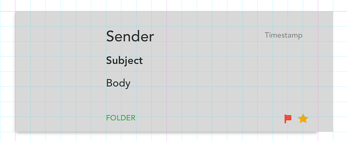
Our Goal
Have four different interaction states for our example email bricklet, using the same symbol for each state, so we cut down on the number of symbols we have.
Downloadable content: Source Sketch file!
Download this file👆 to see the finished product!

Part One: Setting Up


First we create our basic bricklet. Then we change our placeholder text to the label we want to use for that string, so it’s easier to understand what content needs to be filled in when it’s a symbol. Layer list order = Override order so sort your layers by how you want to enter content in the symbol overrides panel.
Emojis at the start of the string can help with indicating what needs to be done — for example ✏️ indicates a text field, and 🤔 indicates “do I need this or not?” You can also use 🎨 for fills, 🎚 for toggles, whatever works for you.
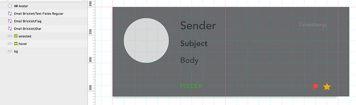
Part Two: Symbols
Now we make everything a symbol. Use a / to make nested folders for your symbols — the part preceding the / will be the folder name.

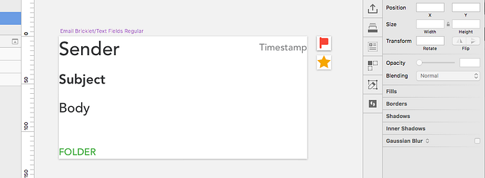
I put all the text fields into a single symbol, called Email Bricklet/Text Fields Regular…

…and then made the flag, star, and avatar into a symbol.
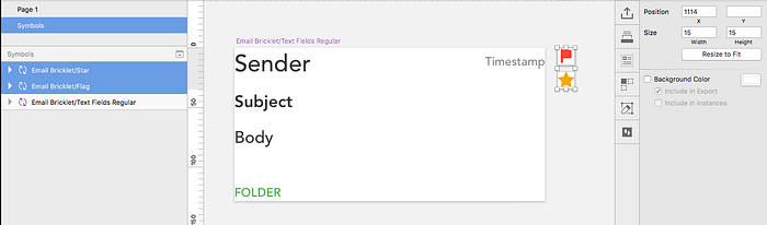
Note that I made the “star” and “flag” symbols the same size. This means they can be easily swapped if I wanted to, say, show the flag instead of the star for some reason. Symbols can only be swapped if they are the same Artboard size.
Inverse Mode
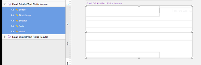
I want to make the selected state of my email bricklet appear with a dark background, so I duplicate the Text Fields Regular symbol, rename it to Text Fields Inverse, and change all the text colours to white.
Avatar
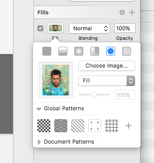
I forgot to do this while setting up my avatar so had to do it towards the end, but to make images like avatars into symbols, change the Fill option to Image (it’s the button that looks like a flower), choose an image as a placeholder, and select Fill in the pattern fill dropdown. You’ll then be able to choose a different image when it’s a symbol, just like changing text.
Fills
Now we need to set our background colours for the hover and selected states. I will have a light grey background for hover, and a dark grey background for selected.
First, we make a rectangle for each state, and fill it with our desired colours. The rectangles should be the same size, but not the same size as any other symbols, to avoid confusion.
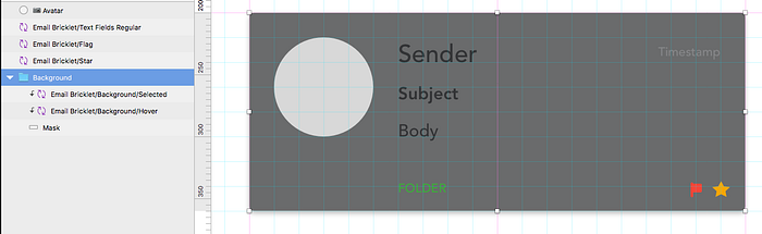
Next, we make the rectangles into symbols. I made the background shape of the bricklet into a mask for these two symbols so I can keep my rounded corners and drop shadow.
Note: You should now delete one of these symbols from the layer list, as you’ll have the option to swap between them later. If you have multiple symbols of the same size, you only need one of them inside another symbol to enable you to swap between them.
Put it all together
Once you’ve made all the compenent symbols, put them all together into a master symbol!

Here’s what our symbols page looks like, for reference:

Part Two: Adding Data
Now we have our master symbol, we can add data to it using the symbol overrides on the right hand side. For text symbols, you can change the text value. For image filled symbols, the background image can be changed. For symbols that are the same size, you can swap between those symbols. You can also set a value of None to just not show that symbol.

Part Three: Different States
Now it’s time to create our different states.
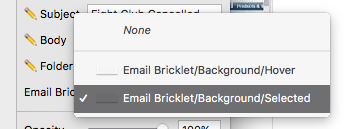
To create our Default state we need to keep the text dark grey but have no background colour. We can do this by selecting the correct value for the Email Bricklet/Background/… symbol. To have no background, we select None.

To create our Hover state we need to change the background to light grey. We can do this by changing the value for the Email Bricklet/Background/… symbol. To have the dark background, we select Email Bricklet/Background/Hover.
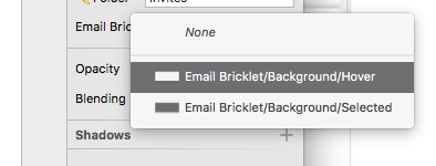
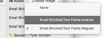
To create our Selected state we need to change the text to white and the background to dark grey. We can do this by again changing the value for the Email Bricklet/Background/… symbol. To have the dark background, we select Email Bricklet/Background/Selected.
We also want to change or text colour. We can do this by changing the Email Bricklet/Text Fields Regular symbol to Email Bricklet/Text Fields Inverse.
Bonus
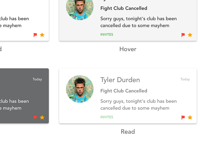
Let’s make a fourth state, for Read emails. The design for this is slightly faded text on a white background. All I need to do is make another copy of the Email Bricklet/Text Fields Regular symbol and change its opacity to something like 60%. I can then swap in this field to have my lighter text.
…but wouldn’t it be cool if…?
…I could make a nested symbol of the Email Bricklet/Text Fields Regular symbol, and just change the opacity of that?

Unfortunately, doing it this way means that the values of the text fields aren’t preserved. So if you swap the symbols, the data in the text field overrides gets wiped out. Just seems to be the way Sketch works I’m afraid!
Prediction: Sketch will make it easier to override the attributes of text symbols, so it’s easier to manage colour, weight, alignment etc.
Summary
I hope this was a useful post, as always you can find me on twitter https://twitter.com/irishstu for any questions or feedback!

