How to Draw Your Face in CSS

With the job hunt season well underway, my weeks have been filled with touching up my portfolio and looking at job applications. So when a job application for IDEO has a special section asking to “Make a self-portrait in CSS only”, I dropped everything to make my face in CSS as fast as possible.
Step 1: Knowing the Rules
Drawing in CSS comes with a multitude of limitations, and if we want to draw in CSS, we need to know these limitations.
For this project, I limited myself to using only div HTML objects, editing only the following CSS variables:
widthheightlefttopborder-radius
To give the image a bit more flair, I utilized the following properties of transform:
rotate()skewX()
I limited the amount I used the transform variable as we will see later that converting this from Illustrator to CSS is a bit less straight forward.
Step 2: Time to Draw!
I used an illustration of my face I made for a previous project as my reference. I wanted the challenge of making something that wasn’t perfectly symmetrical and facing straight towards the camera. Also, I love how darn happy it looks.
For your own, you can use any drawing or photo of yourself. Just ensure it accentuates your key features that can be easily drawn in a minimal style.
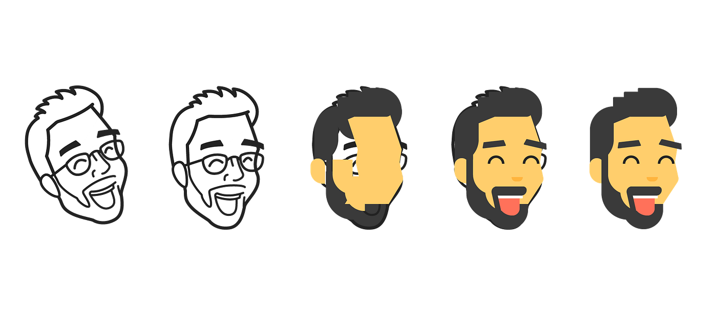
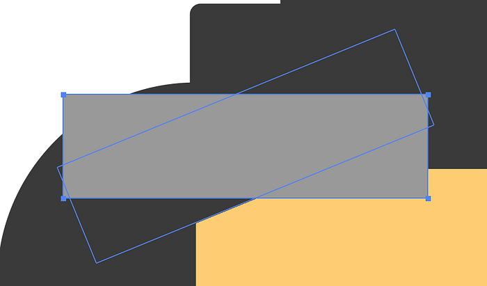
I rotated my image 20° so that most of the lines were 90° or parallel with the y-axis.
Then, keeping in the mind the CSS rules, use the Rectangle tool to draw rectangles over the image. This step is where your creativity shines the most. Play around with your rectangle shapes, corner radius, skewing, and rotation to create a look you like. Also, color is your best friend, so go ahead and have fun.
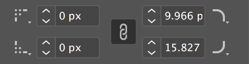
Pro tip for this part, be mathematical with your skewing. You can get your rotation, width, height, and position values in the Transform and Shape Panel as we will later, but Skewing value is not recorded, so proceed with caution.z
Step 3: Setting up the HTML
In HTML, create a div named faceContainer. All of your shapes will be confined in this box. Set the width and height of this div to that of your artboard, and your canvas is now ready to go!
.faceContainer {
  position: absolute;
  height: 400px;
  width: 259px;  //centering the canvas in the screen
  top: 50%;
  left: 50%;
  transform: translateX(-50%) translateY(-50%) rotate(-20deg);
}
From here, categorize each shape in your Illustrator drawing based on color and layer. This way, we can put all these shapes in same div to reduce redundancy in defining background-color and z-index
<div class="faceContainer">
      <div class="hair head">
        <div class="tophair left"></div>
        <div class="tophair middle"></div>
        <div class="tophair right"></div>
        <div class="bread-jaw"></div>
        <div class="bread-chin"></div>
      </div>
</div>
Now, let’s go back to Illustrator and get things ready for CSS
Step 4: Setting up for translation from Illustrator to CSS
Going into this part of the process, I was nervous that it would be too complex to translate to CSS. I did not use exact numbers for the width, height, and rounded corners, and I was a bit ambitious with my skewing. Thankfully, after getting started, I realized that this step was just a lot of repetitive work.
Our best friend for this step: the Transform Panel
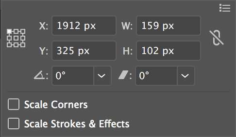
With the Reference Point set to the upper left corner, the X & Y values can easily be reproduced in CSS with the left & top variables. And of course, W & H can be reproduced with width & height.
Note: Make sure to either move your Artboard in Illustrator to X: 0 and Y: 0. This will ensure that the X & Y values are correct.

Step 5: Brute Force CSS
As I mentioned prior, I wanted to create this image as quick as I could. This may not be the most elegant solution, but it definitely works.
Color
As I kept my drawing minimalistic and the color palette simple, I used the parent div that I placed my shapes in in order to change the color. As all of the hair in my drawing is of the same color, it was as simple as this:
.hair div {
  background-color: #3A3A3A;
  position: absolute;
}
Position, Width, and Height
With the overall faceContainer being position: absolute, we can move child div’s to any X-Y coordinate relative to faceContainer by using the left and top variables.
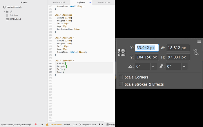
Going down your list of HTML divs, select the shape in Illustrator and open the Transform Panel.
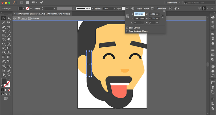
With this, simply type in the values. X for left, Y for top, W for width, H for height.
Tip: For my workflow, I split my screen between my text editor and Preview where I pasted a screenshot of the Transform panel. Positioning and scaling was definitely the most repetitive part of this project, so limiting the amount of switching screens made the process much more efficient.
Rounded Corners
For all of your rounded corners, the process is almost identical, except this time, use the Shape Panel. This holds all your exact values for your border-radius.
Transform (Skewing and Rotating)
For skewing and rotating, ensure that you position the shape in CSS using the object prior to skewing or rotating. CSS’s transform will rotate from the center of the shape by default, so make sure to account for this.
And boom! You’re done!
The process of translating from Illustrator to CSS was pretty time consuming, but it is highly satisfying to create an entire image out of CSS, especially if you add swanky animations to show off its div-yness.

If I were to do it again,
- There are many more CSS variables to explore, such as
drop-shadow,clip-pathandopacityto create some really great effects and possibly, more shapes. In addition,border-radiushas some more power to it. If you use%instead ofpxon a div, theborder-radiuscan create something similar to a bezier-curve. But be careful, mimicking this in Illustrator properly seems pretty tough - Find a more efficient way to translate values from Illustrator to CSS. Brute force typing is definitely not the most efficient, and it would be exciting to explore some more creative ways to translate these values
- Get crazier with the image! There is so much potential with this process, and with lots of today’s graphics having this minimalistic look (ie. Gregory Hartman’s character design for Duolingo), there is so much to draw in CSS!
If you are itching for more CSS drawing, check out these awesome articles from Coding Artist and Prototypr.io
For code, check out my repo on GitHub
For the live example of mine, check it out on my site
Special thanks to Matt O'Hagan, Gonzalo Nuñez, Nikhil Thota, and Jacob Ville for the editing help!

