How to design for large screens

Mobile designers, here are 5 tips for designing large screens that keep thumbs happy. Read our how-to guide now!
With a rise in chat and photo sharing apps like Snapchat and Instagram, big screen smartphones are taking mobile users by storm. And with the iPhone X and Samsung Galaxy S9 Plus making headlines as killer flagship smartphones, you can’t help but notice their roomier displays.
So what does this mean for mobile app designers? It means it’s time to jump on the big phone bandwagon and start designing according to larger dimensions. When designing for large screens, designers need to re-think how users move around the display. Content, navigation and gestures are all changing.
Sounds daunting, but don’t worry, we’ve got your covered. Recently we’ve been looking at ways designers can optimize their apps for larger mobile screens without skimping on the user experience. So read on for some handy tips on large screen design that you can get started with right away!
How large screens impact mobile user experience
Whereas the ‘traditional’ smartphone has a screen display in the area of around 3.5 inches high, big screen phones can reach a massive 6.9 inches, a fair doubling of the typical interface space. For instance, the Samsung Galaxy 9 Plus packs a whopping 6.2 inch display, with the Samsung 9 not far behind at 5.8 inches.

Yes, screens are getting bigger. But that doesn’t mean our hands are. One of the biggest challenges for mobile designers in 2018 is designing apps that are not only compatible with large screens, but that are also accessible for users.
So how do you create apps for displays with the functionality of a tablet but the experience of a mobile device? Mobile UI designers who hope to create delightful mobile user experience need to focus on designing large screens that are easy on thumbs.
Respecting the “thumb zone”
The term “thumb zone”, coined by Steven Hoober, is an important factor for anyone designing for large screens. As Hoober discovered in his oft-quoted research in UX Matters, 75% of people use their thumb as their primary phone digit, and 49% favor a one-handed grip.
The so-called ‘thumb zone’, the area across which a human thumb can move comfortably while cradling a mobile device, is hugely influential on mobile interface design. After all, if your UI element is out of reach it’s out of play.
Four years on and not much has changed. One-handed and one-thumbed interactions on mobile devices have become the norm. The problem is, trying to cover almost 7 inches of screen space one-handed puts the humble thumb under a whole lot of pressure.
As designers focus on maintaining good UX and happy healthy thumbs, finding creative user interface design solutions is key to improving the user experience of large-screen smartphones. So let’s look at some key things to keep in mind when designing for larger mobile screens.
Designing for large screens: content hierarchy
When designing for larger screens and tired thumbs, make sure key controls are in thumb’s reach. Users performing one-handed gestures respond faster and more accurately when the target is in the center or towards the bottom of the screen, than when the target is at the top edge of the screen. Luke Wroblewski explains that this is because the thumb doesn’t have to stretch past its comfort zone.

By placing important content and UI elements in the center or towards the bottom of the screen, users will find it easier to work one-handedly with your app on their large screen devices.
With Justinmind, you can use the alignment tools features to help you line up UI elements on the canvas in relation to your device’s edge and in relation to surrounding elements. The rulers, guides and grids will also help you arrange your prototype’s content and place elements in the exact spot you intended.
Designing for large screens: navigation patterns
We can’t stress enough the importance of using the right mobile navigation pattern. Getting users from Point A to Point B effectively should be number on your mobile app to-do list, because only discoverable apps get used.
Here are a few ways to make sure that your large screens displays are accessible to users:
Bottom navigation
Bottom navigation is a great navigation option for large mobile screens. The bottom navigation bar allows you to place your app’s most frequently-used actions at the bottom of the screen, making one-thumbed interactions easy to implement.

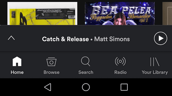
Take Spotify for example. Spotify is one of the most popular music streaming apps out there — claiming 100 million mobile users worldwide not too long ago. But despite its success, there have been some functionality blunders.
Spotify’s controversial use of the hamburger menu meant app navigation was non-intuitive and slow, and getting to playlists took users on an endless journey of taps — not what you want when on the go. For users with large-screen smartphones, trying to get to their music one-handedly was less than comfortable.
Luckily, Spotify ditched the hamburger in favor of the bottom navigation bar in 2016. By moving the menu bar from the top to the foot of the app, the app’s navigation has been transformed. The most important navigation destinations — Home, Browse, Search, Radio and Your Library — are now all just a single tap away, and very much reachable by the thumb. Aces! No wonder big-hitters like Facebook and Dropbox have also made the switch down south.
With Justinmind, it’s quick and easy to create a bottom navigation bar. Our collection of basic widgets allows you to create your own from scratch. To reduce fatigue, your bottom navigation bar should have between three and five destinations for quick access and show only the most important destinations.
Alternatively, save yourself some time with our readymade mobile or tablet screens with bottom navigation for Android and iOS. Simply drag a screen to the canvas in Justinmind to get started.
If you’re looking for other alternatives to the Hamburger menu, this is the next post you should read.
Floating navigation buttons
Bottom navigation has its benefits when designing for large screens. But it’s not the only navigation pattern for your big-screen mobile apps.
If the bottom bar is going to interfere with the native device navigation bar, you’re going to risk some mis-taps. Luckily, there are alternatives.
As Luke Wroblewski suggests, try using Google’s floating action buttons. Based on the most commonly performed actions within a given app, Google allows designers to promote the action in a floating button.
Treat your floating action buttons as a powerful call to action for the user; they should stand-out visually and guide the user to performing the most popular, most common action on that particular page. They provide an opportunity to direct user flows and streamline your interface.
Want to see more search patterns? Get them here.
Designing for large screens: interaction
In his UX Matters article, Steven Hoober noted that the center of the screen is where people tap fastest and with most ease. But that doesn’t mean to say that they don’t or can’t use other parts of the screen: as Hoober points out, they just change their grip a little and carry on.
As a UI designer this frees you up to think about what kind of gestures you can use in different areas of the screen. Centrally placed icons will work best with an On Tap gesture, while those on the far left could be designed as Swipe Rights. Since the explosion of Tinder on the online dating scene, many apps have adopted the Swipe as their primary gesture — you can even Swipe right to adopt a puppy thanks to BarkBuddy.
With Justinmind, you can create gestures for that will increase reachability for one-handed operations. To get started, take a look at our Events system, which comprises both web events and mobile gestures, including swipe, pinch and rotate triggers.
Designing for large screens: split screens
Split screens have been around since the dawn of the phablet way back in 2012, when Samsung’s Galaxy Note 2 introduced the feature. Allowing users to divide screen space between two different apps, split screening is a relatively simple way to combine the capacity of larger screens with our insatiable love of online multi-tasking.
However, split screening could be utilized when designing for large screen mobile displays. Instead of running two apps side by side, take advantage of the extra space by showing two features of the same app at the same time. It does wonders for multitasking.
Users see this all the time on their tablets or web browsers, as mail apps show our inbox overview on the left while opening out individual mails on the right. Of course, successful split screening requires thoughtful designing or your users could be overwhelmed with information.
If you want to give this a go, check out Justinmind Dynamic Panel feature. Dynamic Panels are containers for UI elements and allow you to place multiple content elements in the same region the screen. Move them around your mobile canvas and create split screens in no time!
Start designing apps for large screen devices now. Download Justinmind!

