How to design dashboards with great UX

A world of big data is a world that needs data dashboards. Here is how to create effective and user-friendly dashboard UX
We live in a world of big data. The rise of social media and the internet has turned us all into a metric. But this data has always been there in some form or another, it just wasn’t used on such a large scale as it is in today’s technologically driven world.
With the rise of machine-learning, automation and robots, data’s never been so important or prevalent. And almost gone are the days when CEOs would make decisions on a whim. Now, almost everything is backed by data. Even design.
But, what about how that data is presented? Well, that’s where dashboard UX comes in. In this post, Justinmind will give you the information you need to design dashboards with great UX.
So, what is a dashboard?
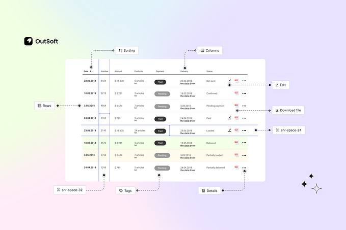
A dashboard is simple a way to present information. Inspired by the car dashboard, a data dashboard will provide an at-a-glance view of KPIs relevant to business processes. They’re usually populated with numbers, charts and other types of data visualization.
A dashboard is useful because it can provide relevant information which can be turned into action.
And what should my dashboard UX include?
Dashboards will vary depending on the company and people using them. A web developer might need one to see how well a website is performing whereas a salesperson might have their goals displayed before them.
Essentially, your dashboard should be easy to read and include only the information necessary for the person reading it to do their job.
It’s best to give must-see or critical information priority placement and stronger visual treatment. Since most people in the Western world read from the left hand side to the right, think about the flow of your user’s focus as you design.
Emiliano Cosenza wrote an awesome piece on designing dashboards without reading the users’ mind. This can definitely help when it comes to how to present the information on your dashboard in the best way possible.
The different types of dashboard
There are 3 different types of dashboard that you might have to design:
Strategic dashboard. This will be used by executives to monitor progress related to KPIs and business goals.
Operation dashboard. This is to do with how things are functioning on the operational side of business.
Analytical dashboard. This type of dashboard can be similar to the previous two but will have a higher level of information included.
What makes a dashboard UX friendly?
It’s quite the task to transform abstract numbers and concepts into a dashboard that summarizes important information that users want to read. But here are a few tips for ensuring that your dashboard UX is not only friendly but welcoming:
Group relevant data together
When you design your dashboard, if you see that there are multiple metrics which are related to one another in some way then group them together. This will make it easier to comprehend when your users glance at the dashboard. That’s the law of proximity for you.
Keep all information on one screen
Dashboard are meant to provide an at-a-glance view. If you have too much information on your dashboard it can overwhelm (and potentially bore) the user who has to access this data.
By grouping all the metrics onto a classic one pager, you’re more likely to achieve better engagement with the dashboard because users won’t have to sort through multiple pages. Balance the metrics with suitable white space to create breathing room for the data.
Don’t go overboard on the data visualization
Data visualization is immensely useful. By transforming numbers into line graphs and bar charts, we’re able to comprehend that information in a more pleasant way. But be warned. Even though data visualization will boost the dashboard UX, you want to use them only when appropriate. Sometimes certain data visualization elements create more work for a user. We’re looking at you, pie charts.
Now we’ve covered dashboard basics and some useful pointers, it’s time to make our very own.
How to design a UX friendly dashboard in Justinmind
Let’s get into what you came here for. Designing your very own dashboard in Justinmind. You’ll have it made in no time.
Step one: To keep this as painless as possible, start by downloading Justinmind and opening it. Create a web prototype.

Step two: Grab our free Charts UI kit, it’ll come in handy when you want to enhance your data visualizations. You can install this in the widget palette in the application.
Step three: Create a login screen
Encryption and data security are serious business. With that in mind, we can quickly prototype a login page. In the screens palette, add a new screen and name it ‘login’. While you’re there, add another screen and rename this one ‘dashboard’. We’ll get to it in a second.
In the widgets panel, you’ll need to drag and drop a couple of text widgets for your copy, 2 input fields for, well, inputting. And a button. Now with these widgets, you can construct your login page with a username and password field.
Go wild with the customization, too. You can make your own widgets and change the color and style so it’s suited to exactly what you want to prototype. Oh, and since you’ve just created your own login screen, take it to the UX limit by simulating error messages.
Step four: Build your own dashboard using Charts UI kit
Go to the other screen your created earlier, the one named ‘dashboard’. Now you’ll have a blank canvas before you. It’s time to build the dashboard.
With the charts UI kit you grabbed, you can use the UI widgets in there to represent any number of different data points and visualizations. Experiment and play around to find the right aesthetic you’re going for.
Our UI kit comes fully loaded with:
- Bar charts
- Line graphs
- Bubble charts
Not only that but there’s compasses, maps and speedometers. All of these elements can enhance the dashboard UX. The charts are a useful way to present lots of data that’s easily digestible for even the most number averse among us.
The line graphs can be used to show the rising rate of conversions over time, or product revenue.
You’ll have a better idea than us what sort of metrics and KPIs you want to include but using a combination of text widgets, graphs and charts should help you get there easily.
A little tip: To make your chart more visually appealing try to stay consistent with the design and color palette. If your design distracts from the point of the dashboard, it might end up joining the pile of hundreds of other dashboards that never get used out there.
Step five: Populate your chart with real data.
Prototyping never felt so powerful, right? With Justinmind, you can populate your data dashboard with real life information. Why would you wanna do that? Well, it gives stakeholders and other team members a better feel of what the final product will look.
Never underestimate the power of using real data and copy in your rough and prototyped designs. It’s a good way to get stakeholder buy-in and useful when it comes to user testing.
Conclusion
Data dashboards presents an opportunity for UI designers to solve multiple problems at once. It’s a lesson in balancing too much information with too little information. Be sure to categorize it properly and create breathing room between metrics using white space and before long you’ll have an awesomely designed dashboard.