How to Create a Content Style Guide

I listen to a lot of podcasts.
I have a long commute, two little kids, and I can’t keep my eyes open past 9pm (ok, 8), so podcasts are pretty much the only way I consume content these days.
I listen to podcasts on everything from how to apply concealer to racist algorithms (bonus points of you can spell algorithm on the first try because I sure can’t) to the whereabouts of the Donut King.
Lately, I’ve been listening to a lot of podcasts about UX writing. There’s the new Writers of Silicon Valley (my current favorite), the Content Design Podcast, The Content Strategy Podcast, and you’ll also find UX Writers and Content Designers pop up as guests on other UX and product design podcasts.
A topic that comes up over and over again is the content style guide: what it is, how to create one, and what should go in it.
I can’t say there’s a perfect formula for this. Over the last ten years of my career I’ve worked with several different style guides, each with its own special something.
But this topic is near and dear to my heart at the moment, as we are just about to launch a new content style guide at ServiceNow. The team, made up of a handful of different people from across an 8,000+ person organization, has been working for months on consolidating several style guides created over the years along with some recent (re)branding work.
So, I thought I might share some of our work with you because it’s hard to know where to start when you approach a project like this. And sharing is caring.
Take what you want, leave what you don’t. Hopefully this can serve as a place to start in what can feel like an insurmountable task.
Let’s get started.
What goes in a content style guide
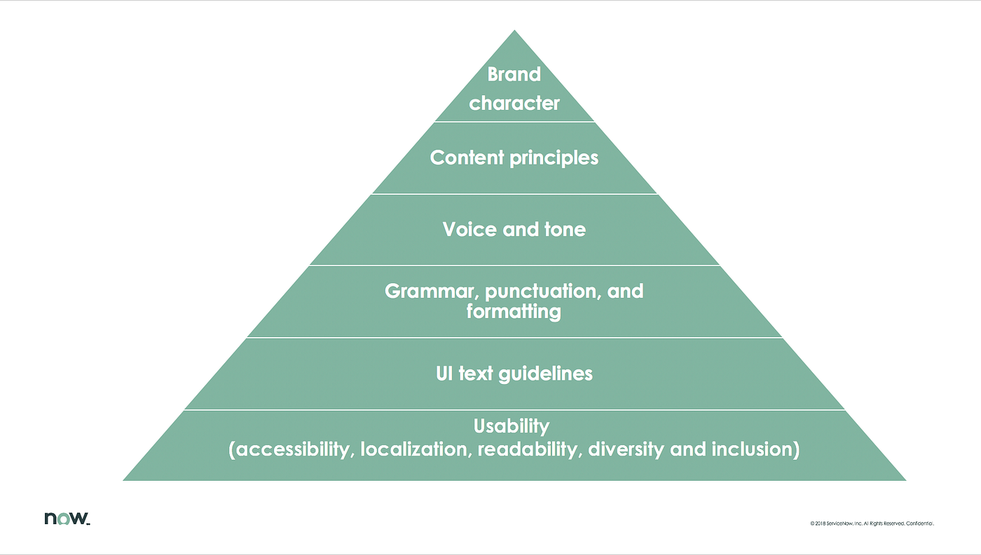
A content style guide is part of a larger content strategy that should be unique to your users, their needs, and what the business is trying to accomplish.
In general, it should contain some key areas that include: brand character or persona; content principles; voice and tone guidelines; grammar, punctuation, and formatting; UI text guidelines; and usability guidelines.
I’ll go over what each one of these means.
Brand character
This is also known as the brand persona. Different brands handle this, well, differently. I’ve created content style guides where the brand was modeled after a person, complete with a headshot and favorite movie. I’ve worked on style guides where the persona was modeled after a role the brand plays in the customer’s life, like a mentor, friend, or co-pilot.
As I mentioned before, when I started at ServiceNow, the company had gone through a fairly recent rebrand, so there was some incredible work to use for this project. Honoring and preserving the brand is so important because everything we do should ladder up to it–it’s our true north. That’s why it’s at the top of the pyramid up there.
However, the brand characteristics weren’t quite enough to execute on from a Content Design perspective. We knew who or what the brand was, but not exactly how it sounds or comes across in different parts of the product experience (aka: voice and tone).
But before we could even expand on the brand’s voice and tone, we needed to align on something else first:
Content principles
I love writing content principles because they are the reason we do what we do. They embody our purpose and provide meaning to our work. Customers interact with content across many different touch points and content principles make sure we’re aligned and working toward shared goals.
So, whether a customer is interacting with a social media post, a landing page, help content, product flows, or something else, the content is always working toward the same objectives.
The ServiceNow style guide has five content principles–I personally would not use more than that. I won’t share them with you here, because strategic advantage and proprietary info and all that, but here are some examples of what content principles might sound like:
PS: I like to use power verbs to really drive home the aspirational element of this. I don’t see content principles as purely practical, like readability guidelines. These should feel earnest, but lofty.
- Empower customers to make good decisions by giving them the right information, in the right format, and at the right time.
- Simplify the product experience by speaking in a straightforward and human way.
- Show respect for everyone by relating to them and honoring their whole selves.
OK, these are really general, but hopefully that’s enough to get the wheels turning. Let’s keep going.
Voice and tone
This seems to be the topic everyone obsesses over. What’s the voice? What about tone? How are they different? Are they the same? What are they exactly?
I have to be honest with you, voice and tone is incredibly difficult to nail. It takes a ton of practice and skill to get right. The good news is, you don’t need to be an expert yet to get voice and tone right…enough.
Voice and tone humanize the product. And, just like humans, voice and tone changes over time. You have to play around until something feels right. And then if it stops feeling right, you evolve.
It’s perfectly OK to play it safe until you know your customers and product well enough to take risks with voice and tone. Or maybe you never take risks and that can be a perfectly reasonable decision, too. We can’t all be Slack or Pinterest, nor should we.
Let’s start with voice.
Voice is what the brand principles sound like when you apply them to writing. Voice is who the brand is at its core and it doesn’t flex like tone does. We want the voice to stay the same so no matter what content the customer is interacting with, it always sounds like it’s coming from the same person.
Give your brand’s voice human characteristics that are unique. Think of how you would describe your favorite person. You wouldn’t just say they are human, because duh. The have distinct qualities that make them, them.
Here are some human characteristics you can use to start building your brand’s voice. I wouldn’t put more than 4–6 in the content style guide, even if you work on a huge product:
- Approachable
- Kind
- Empathetic
- Brainy
- Charismatic
- Sincere
- Spiritual
- Rebellious
- Creative
- Ambitious
These are all likable qualities, but they aren’t for everyone. And hopefully your brand isn’t either. Don’t be vanilla when you can be caramel balsamic swirl. Even mint chip is a predictable, but solid choice.
You can’t be everything to everyone, so just focus on being true to the brand. As the kids say, “You do you.”
Moving onto tone
Tone adds feeling to the voice. It’s what allows us to express and respond to a range of emotions. It should flex according to the emotional state of the person you’re talking to.
I would start with a range of 6 to 10 tones for your content style guide (this also largely depends on how big your product line up and audience is).
Because tone is flexible, you need to put guardrails on it. It’s really easy to veer into negative territory if it gets applied too heavily. Try something like this:
- Smart, but not arrogant
- Clever, but not patronizing
- Neutral, but not indifferent
- Caring, but not affectionate
- Savvy, but not slick
Note: Be careful of applying the following tones to your writing. They are hard to get right and can offend the audience, especially if you work on international products. I’m not saying don’t do it, just proceed with caution.
- Snark
- Sarcasm
- Humor
Grammar, punctuation, and formatting
I think this is pretty self-explanatory, but you need to include the nitty gritty of all the rules your writers and content creators will follow. This includes controversial subjects like AP style, the Oxford comma, and exclamation points.
When your grammar, punctuation, and formatting is inconsistent, you lose credibility with the audience. However, it’s perfectly acceptable to break these rules for the sake of clarity.
I stress: clarity over correctness. Always.
We keep a running list of these items to add to the ServiceNow content style guide. It just never ends. Here are some things we’ve recently added that you might want to consider, too:
- Acronyms and abbreviations
- Bold
- Capitalization (headings, labels, and proper nouns)
- Contractions
- Commas
- Em- and en-dashes
- Exclamation points
- Hyphens
- Italics
- Lists
- Semi-colons
- Word list (we keep this in a separate document because it’s so big)
An important note about accessibility: You should include alt-text and other accessibility guidelines for some of the grammar, punctuation, and formatting guidelines.
For example, a common acronym like ID will read as “id” unless you specify the alt text to read as “identification.” Bold, if used to create visual hierarchy or group items, will not be identified as such by a screen reader unless you specify the alt text.
However, screen readers also have grammar settings the user can control, so things like semi-colons or hyphens most likely don’t need extra guidance.
When in doubt, consult your company’s accessibility expert (if you’re lucky enough to have one), collaborate with an engineer who knows the guidelines, or check out the Web Content Accessibility Guidelines (WCAG) online.
You can also use the hashtag #A11Y on social media to find information or connect with experts.
UI text guidelines
UI text includes content for all the parts and pieces that make up a product experience. It’s good to have basic rules to follow here, but context also tends to dictate a lot of this stuff, so we almost never apply hard and fast rules to UI text. Instead, we’ll make a recommendation, but the Content Designer always makes the final call.
Your content style guide should include a lot of visual examples of both what to do and what not to do here. These elements are too hard to explain with just words.
This is also a never-ending list that includes things like:
- Empty states
- Notifications: Alerts, errors, and info messages
- Radio buttons and checkboxes
- Simple buttons
- Tooltips
Another accessibility note: Follow the same advice in grammar, punctuation, and formatting.
Usability
Usability includes designing for accessibility, readability, localization, and diversity and inclusion. They are distinct approaches, but most effective when used together.
We should never assume we have arrived when it comes to usability. This section of your content style guide should continue to grow and change over time, just like people do.
Accessibility
Your content style guide should include specific accessibility guidelines in the grammar, punctuation, and formatting section, as well as the UI text section.
This area should have high-level accessibility information, like writing for top-down and left-to-right screen reader navigation, assigning alt text to icons, images, and color, and how to check your content in a screen reader, like VoiceOver or JAWS.
Readability
I could write an entire blog post dedicated just to this topic. It’s HUGE. Readability helps solve for so many things, including accessibility (because it’s not just about screen readers), localization, and even voice and tone. When readability improves, everything gets better.
Sarah Richards and Lizzie Bruce from Content Design London just published a free Wiki with research-backed readability guidelines. I used almost every single one in the ServiceNow content style guide. You should, too.
Localization
If your product gets translated into multiple languages, you need to consider localization. Your readability guidelines should cover localization, but here are some other things to know:
- Contractions don’t have a negative impact on localization. I believe in using contractions.
2. Don’t omit the word “that” from sentences. Example: The taco that I ate yesterday had too much guacamole. Technically, you can leave out “that” and it still makes sense (even though there’s no such thing as too much guac). It’s harder to translate though.
3. You can’t win them all. Readability tells you to use short, concise sentences of 15–25 words. However, certain countries, like Russia, prefer longer sentences. It’s OK to leave it up to the translators to make those changes.
Diversity and inclusion
Last, but in no way least, is diversity and inclusion. I could also write a separate article about the importance of this.
We all create product experiences that meet the needs of a wide range of users. We also (hopefully) work with a diverse group of people. We need to make a conscientious effort understand our differences, value the importance of those differences, and show respect for the people we serve and each other.
The work to create a more diverse and inclusive experience for everyone is never done. It requires constant evaluation of our blind spots and shifting to meet and exceed cultural expectations.
Your diversity and inclusion guidelines should cover:
- Ability and disability
- Age
- Gender and sexuality
- Nationality
- Race, ethnicity, and religion
- Medical conditions
- “Other” as an identifier (hint: don’t use it)
Make sure you put a lot of “do this, not that” examples in this section. These topics may be new to some and they can be sensitive to many, so we need to get it right.
What’s next?
Phew! That was a lot of content, right? Well, I have just a little more for you. I would also love any words of advice or thoughts you have on this.
I’ve said it a bunch of times already, but a content style guide is really never done. It is a living, breathing thing that requires love and care.
We’re already looking at what the next wave of work will include. Here’s what we’re thinking:
- Playbooks
These will define the specific guidelines for individual products, content experiences, and/or customer personas.
The current content style guide includes the rules we all follow. However, many content groups need to include guidelines specific to their work. I’ve used these on other large products I’ve worked on and they are a great tool to make sure all the writing teams have what they need without creating an eleventy-billion-page document.
For example, marketing will likely need benefit messaging guidelines, the technical writers will need info about formatting and content hierarchy, and our media team will need guidelines that cover writing scripts for video.
2. Customer personas
Since the ServiceNow product line up is so big, we may need to define which personas use which products and then define how we talk to each segment. This makes sense at face value, but we still need to think through whether or not it’s scalable or is the right solution for what we’re trying to accomplish.
3. More grammar, punctuation, formatting, UI text, words, and usability. Always.
4. Process
Right now, we have a Slack channel where people can give us feedback, make suggestions, and help contribute to the content style guide. We need to think through a more formal process, including governance.
If you have any ideas, let me know!
5. A permanent home
Version control can be a nightmare with content style guides. That’s how we ended up with so many different documents in the first place.
The style guide belongs to everyone, so it should have a universally accessible home, but we don’t want everyone to copy, paste, and edit it either.
Again, I’d love to hear how you’ve handled this issue!
6. Evangelism
Creating the content style guide was the easy part. Now we need to do a whole lotta writing workshops to catch everyone up on the changes and help get the word out.
Stay tuned for more content about facilitating workshops!
Tell me about your content style guide journey: What did you include in yours, what’s missing from ours, what have you learned along the way, or what do you hope to learn in the future?
Also, if you liked this article, I’d love a hand-clap. It helps other people interested in this topic find it, too.
Morgan Quinn is a Senior Manager of Content Design at ServiceNow. Before she joined the company, she designed content for brands like TurboTax and Mint.com. When she’s not writing, she stays busy wrangling her two small children, avoiding her inbox, and perfecting the art of the power nap. You can follow her here, on LinkedIn, or Twitter @morganmquinn.


