How Netflix Used UX Design to Win 200 Million Paid Users

It is one thing to get free users for an app, but utilizing UX design to acquire 200 million paid users is another game all together.
In the past 27 years of Netflix being in business, they have completely changed their business model, where they’ve gone from physical DVDs to a digital OTT platform. They have kept their loyal customers hooked for more than two decades, and have also acquired millions of new ones.
I did my research and found a large number of UX principles and practices being used to acquire and keep users hooked to their paid plans for a long period of time. Let’s take a look!
“Cancel Anytime”
A simple term which won over millions of people. Netflix uses smart choice-architecture and some clever patterns to win the trust of users.
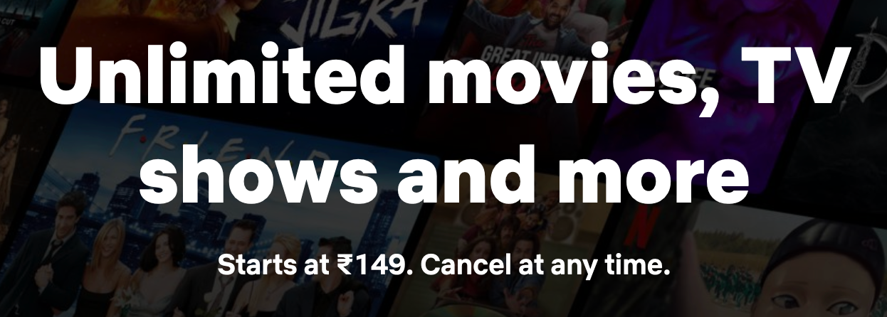
The cancel anytime policy makes Netflix look less of a subscription, and more of a one-time purchase with a low level of financial commitment. In an era where almost every subscription has a minimum threshold or locks you in for a term, this makes marketing the pro plan easier and friendlier.
Now, what happens if you try to cancel your Netflix subscription?
Netflix uses the following clever design principles, to make it trickier for you to unsubscribe:
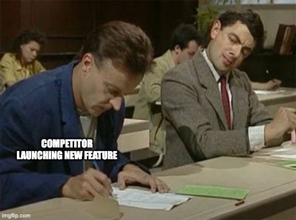
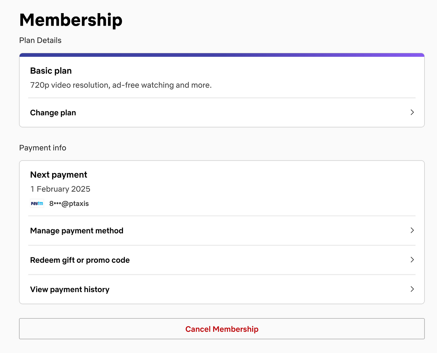
- To unsubscribe, you have to go to your account settings, and then go deeper into your memberships. The more clicks involved, the more chances of users deciding to stay or to delay canceling their subscriptions. This isn’t always true, but even a decline of 1% unsubscribing users, can greatly benefit Netflix.
- The “Cancel Membership” button is at the bottom of the page after the “Change plan” action, which gives it the least importance on the page. Also, the cancel button is a very simple ghost button, making it harder to spot on screen.
- The image below shows how Netflix tries to drive the user back by giving them multiple options — change to a cheaper plan, watch before you leave, and even a pause subscription button! They also play on your emotions by showing you the content that you will be leaving behind and all the “great moments” you’ve had with them.
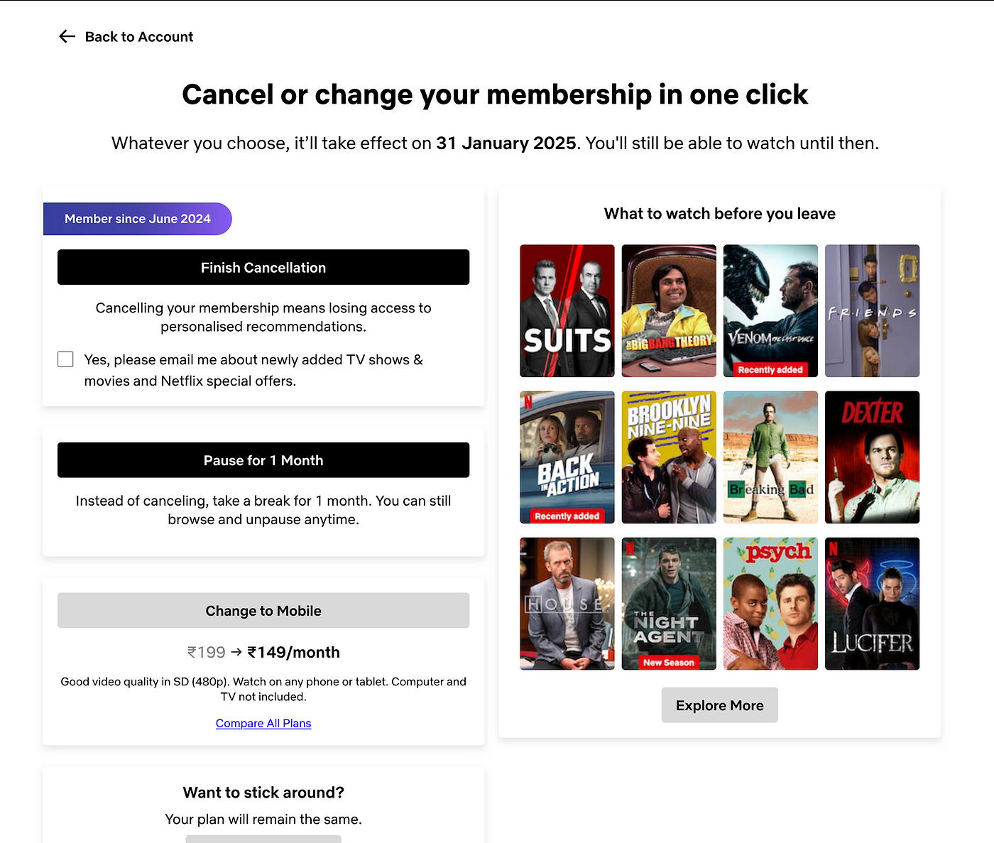
This flow is called a “cancellation flow” in UX design terms. In such flows, UX designers and information architects try to make the cancellation flow harder and to give more reasons for users to come back to the service. They often have to walk the thin line between dark and irritating UX patterns, and a seamless cancellation flow.
“Retaining customers is cheaper than acquiring new ones” — Harvard Business Review
Immersion & Auto-Play
Binge watching has become a standard with Gen-z and millennials to the point that we often forget what time it is. UX design is at the core of this human mess.
Thanks to some clever tactics, people just want to keep watching:
- Large poster with highlighted content on top.
- Trailers auto-play on top and trailers auto-play while hovering over them.
- Indicators show how much you’ve watched a piece of content, which reminds you to continue watching.
- Tall/large cards are used to capture attention at different parts of the websites.
- Recommendations & suggestions of new shows and movies pop up every time you finish watching content.
- Netflix auto-plays the next episode of a series you’re watching.
Immersion is similar to what you see on Tik-Tok, Instagram, and Youtube. Scrolling to the next content or keeping the users on the app is key for such platforms to get and keep business. In fact, user retention is directly associated with converting casual users to serious paying users.
Netflix With Ads — A New Era of OTT
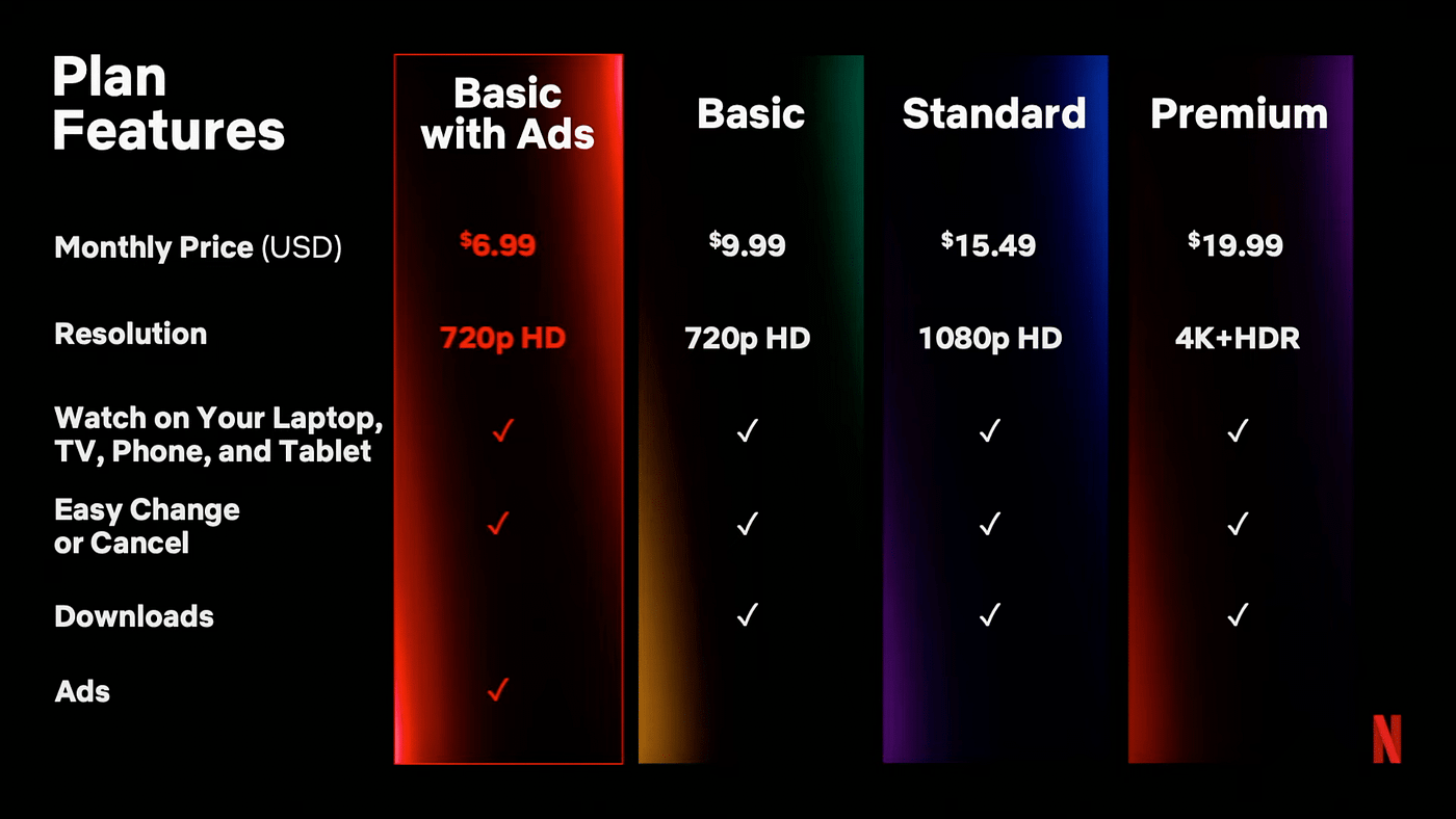
Currently in a few countries Netflix is testing out a new pricing plan with Ads. This move is to provide a plan at a lower cost to users who find it hard to pay $10 per month.
Now this shift in plans can be due to the following user behavior changes:
- Users are now used to longer and larger number of ads on platforms like Youtube, Twitch, etc. So another online platform with a fewer number of ads won’t come as a shock.
- They are providing ads as a trade-off for a cheaper plan, which means users will see value in the subscription regardless of the ads.
- They are using the concept of Price Anchoring, where they can show a lower starting price to allow users to see more value in their service. They can also use “starting from $6.99” in their marketing material to pull more conversions.
Unlimited Touch-points
How did you reach the Netflix app today? Did you watch a cool shorts video on Youtube showcasing a scene from a new movie? Or, did your friend send you a new show to binge watch?
Touch points are the source of where users or potential users land up on your app/website.
Netflix uses a clever marketing strategy — creating short form content around their movies and series with popular content creators to drive traffic on to their platform. UX designers cleverly use this data to create smart FAQs, builder a way to serve content, and improve engagement.
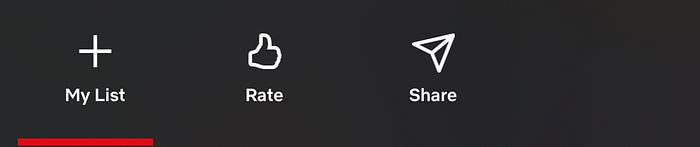
Having a solid social sharing feature allows friends and family to recommend shows and movies, bringing people back and keeping them engaged. A lot of other companies like Spotify and Medium have their own stylized stories for Instagram which allows their shared material to stand out online.
A smart set of UX designers can easily recognize that UX is heavily affected by what happens off the app than what happens on it.
Seamless & Contextual Navigation
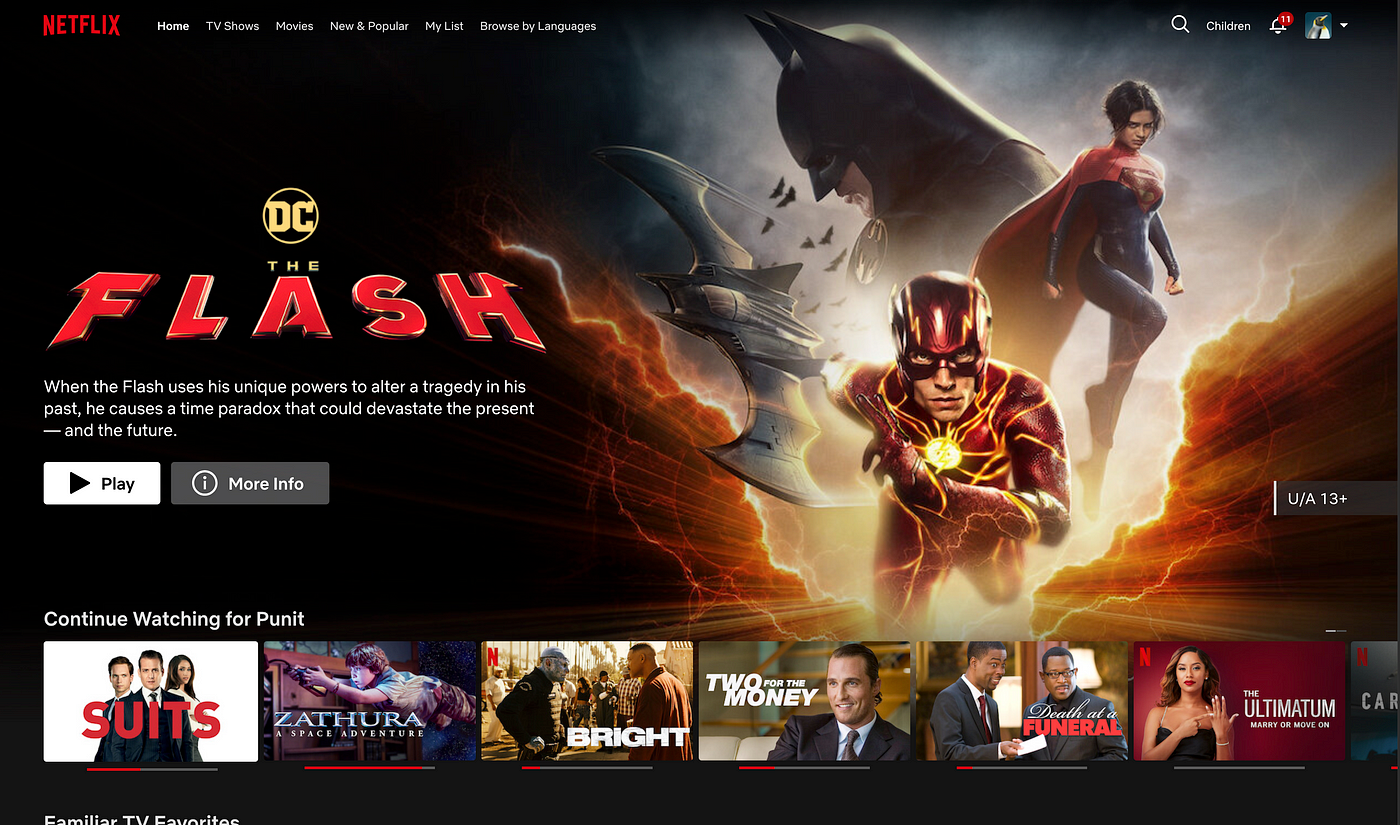
In a pool of 8,000+ titles, it will be hard for people to find their favorite ones without any friction. Netflix seamlessly solves this issue before and after you buy the subscription.
Before you purchase subscription:
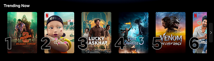
Netflix presents the top 10 trending shows and movies in your region on their landing page. You can click on them to read a description or watch the trailers. They give you a CTA at the end to nudge you to start your subscription and start watching that show.
Unlike Amazon Prime, they don’t let you browse the library before you purchase. The only way to do that is by directly searching for a movie or genre on Google, and then navigating to Netflix directly. I believe this is the only place where Netflix lacks in navigation.
After you purchase subscription:

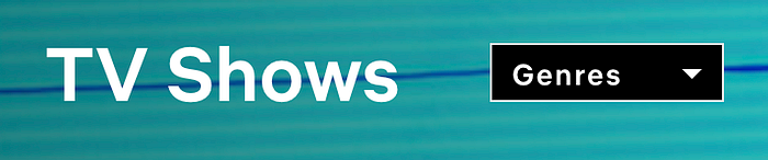
Netflix has a rather simple navigation on top of the page. Tv Shows, Movies, New & Popular, My List and Browse by Language. When I was reading through these, I could easily understand where I wanted to go, and there was no ambiguity at all.
Ps. Browse by language is so important for countries with multiple languages like India. Every state has a unique language and entertainment industry for which the user might come to Netflix for.
Netflix realizes that big drop-drown menus can be tricky to navigate, so they just take you to another page where you can easily view sub-items. Such effective navigation bars can be created if you know your users well. You know exactly what they like searching for and what is important for the general Netflix user. Prioritizing elements is key to an effective navigation.
They have separated the children option, the notification menu, and the profile to the absolute right. This makes it less distracting and provides a clear hierarchy.
They also provide a genre drop-down pertaining to each category, which lets you filter out based on your favorite style of content. If you select a genre, they don’t take you to an endless list of shows, but instead show you genre specific content tailored to a particular user, while maintaining various title hierarchies like — “Recommended for you”, “Today’s top picks”, “New on Netflix” and more.
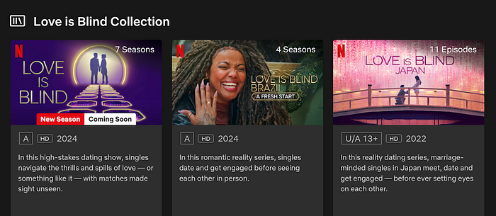
Netflix’s staff is also constantly creating new collections which help you find similar content allowing you to binge watch a particular type of content. It acts a lot like playlists on music streaming services, but this one’s for movies and shows.
Now you might wonder why something like this might affect subscriptions? For most users, it is important for them to find the right content to continue seeing value in Netflix as a service. If they feel they no longer can find good shows on Netflix, they might jump off the service.
Personalization At Its Core
Netflix uses various techniques to provide a more personal and “tailored” experience to its users. If you like comedy movies with Adam Sandler, you can bet that Netflix will show you similar movies in the coming weeks. At the end of a movie, you will also get recommendations personalized to your watching habits.
But personalization algorithms are common, what is the UX design personalizations that help them retain users?
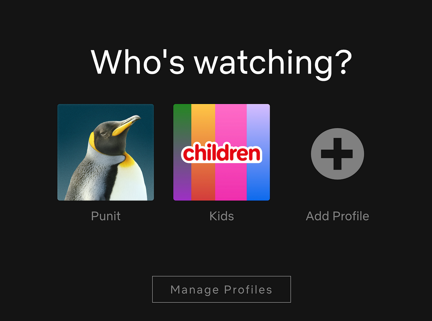
Netflix allows you to create multiple accounts for different family members, so everyone gets their own personalized recommendations and let’s not forget, a cute avatar!
These avatars seem like a simple touch, but we’ve seen how humans are eager to differentiate their profiles and avatars from examples such as games (Fortnite and the like) and social medias (Instagram and WhatsApp display pictures). So while these avatars are a tiny change, they can still impact how personal a user can make their experience.
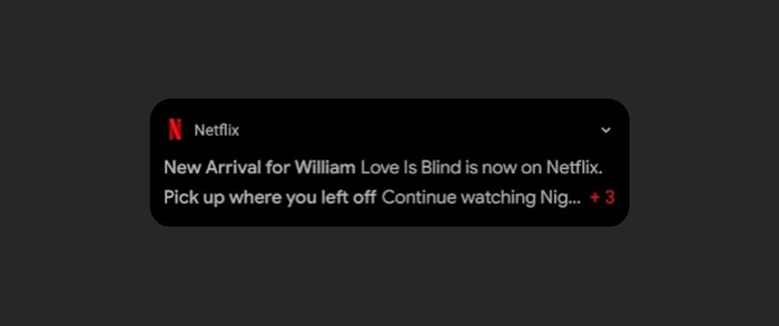
Personalization also slips into notifications for the key purpose of bringing a user back. They use your username (generally your own name) as a suffix or prefix to make a robotic sentence a little more personal. They also use your previous activity to remind you to continue watching. Notifications truly let companies like Netflix to make marketing seem more organic and let the content teams be more creative with the copy. However, notifications can also be annoying to many users, so they always have to tread with care.
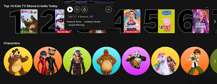
A dedicated “Kids” section allows children to watch their favorite cartoon characters on shows and movies, with categories focused to what children like. This section can also be controlled and monitored by parents to ensure safety and confidence with parents. I think this is very smart. Children do view content differently, with bright visuals that pop, and UX copy that attracts them are just some things Netflix does to engage children.
Content Driven Design
At the end of the day — content is king. Netflix depends of the movies and series it hosts to keep people entertained or to bring new users in.
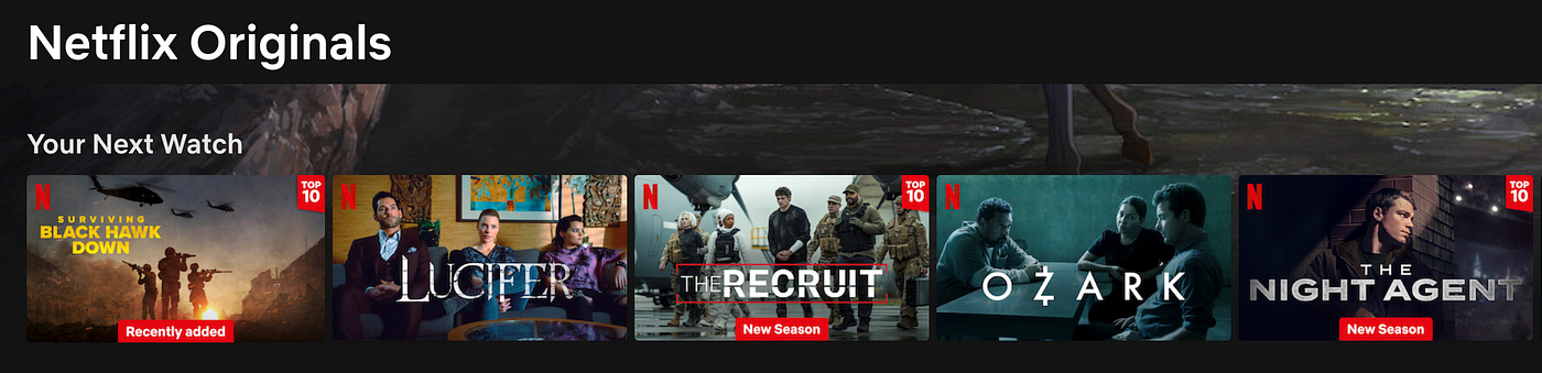
Enters “Netflix Originals” or “Only on Netflix”, which is their strategy to differentiate themselves from the competition. Some Netflix hits such as Squid Games, Lucifer, Stranger Things, Money Heist and others have defined Netflix for some people and that can often be the reason to keep subscribing.
This is very similar to what we notice on platforms like YouTube or Instagram, where the UI often isn’t the factor for people to stick, but basic essentials.
Moving With The Times
With short form content coming to the forefront and changing habits, it has forced many companies to shift focus over time. Netflix is definitely one of these companies.

Netflix recently included a “Moments” feature at the bottom of each eligible content, that allows users to find important moments from a show or movie and allows users to skip to it. This is a very risky move from Netflix, since it can make users spend less time on the platform. On the other hand, it allows some users to watch more content without spending too much time on the platform, in turn allowing them to see more value in the content being put out.
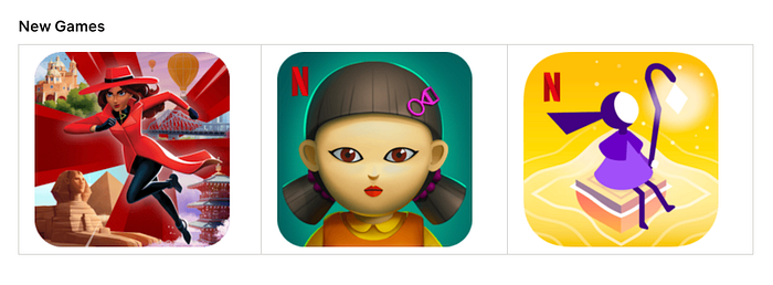
To attract a new set of users and keep them engaged when content gets stale, Netflix has purchased the rights to some popular mobile games which they provide to their users at 0 extra cost. So, games that would cost anywhere between $2-$10, are now free for Netflix subscribers. This isn’t a design decision for sure, but this adds to the illusion of value.
Accessibility For Everyone Else
According to the WHO, there are approximately 2.2 billion people on our planet who have visual impairment of some kind. This means that that Netflix needs to address these problems for people in order to attract even the visually impaired.
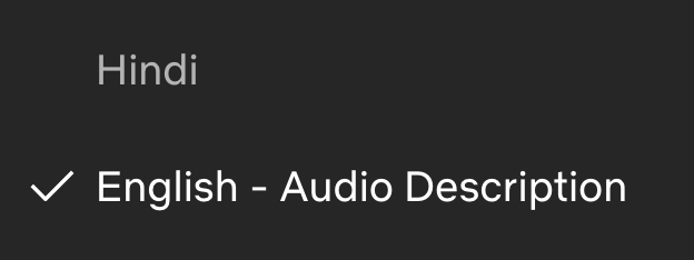
Almost every new movie or series on Netflix has an “Audio Description” option that lets people with visual impairment to watch their favorite content with ease. Even for someone who just wears glasses, I was surprised by the accuracy of this feature, almost as if I could watch a movie without opening my eyes. The female voice guides you through the movie scenes one by one and is almost meditative in nature.

They have covered many other areas of accessibility, including changing the subtitle settings to be more visible or easy to read. As a user you can adjust various visual and non-visual settings which you can read about on a page dedicated to accessibility — https://help.netflix.com/en/node/116022.
I hope you enjoyed this article and learnt something new from it. Leave a “clap” if you’d like to support my writing and leave a comment if you have any thoughts on it.