In brief: this article shares the unique experience we’ve stockpiled while developing and testing various dashboards for cryptocurrency exchange platforms.
Interface testing isn’t a new thing and constant exploration is targeted at improving user interaction. In our view, the last serious investigation was undertaken in 2004 by Steve Outing and Laura Ruel. Technology and UX trends have made a leap forward since then, and the tech landscape has shifted, altering user attitudes in relation to interface design.
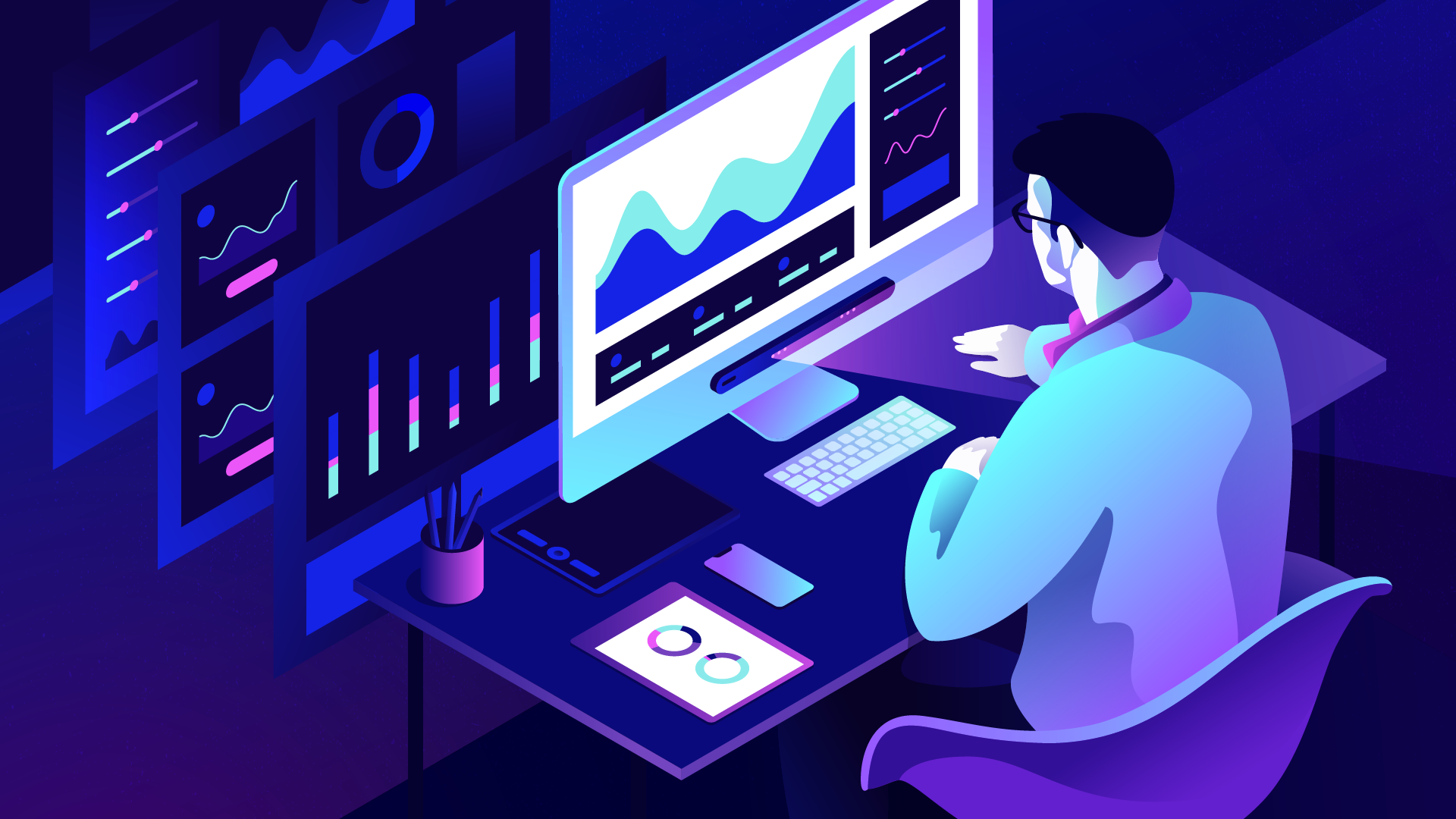
Cuberto has been developing trading platforms since 2010 and we’ve amassed a store of invaluable experience we’re happy to share. Since the headline-grabbing explosion of cryptocurrency, we’ve been tapped for design and development of cryptocurrency wallet interfaces and cryptocurrency exchange platforms. These platforms typically involve an uber-complex functionality component and a massive amount of dynamic data. To streamline interaction with the platform’s multiple functions, dashboards are essential. Many designers trust their gut when developing dashboards, tossing functional elements into separate blocks and haphazardly assigning priorities to them. It’s great if an entire team hops onboard, enabling at least minimal internal testing and making the dashboard more relevant to a target audience. A better approach, however, involves testing the dashboard in a focus group, collecting stats, and adding finishing touches with usability enhancement in mind.
So what are the dashboard must-haves for any cryptocurrency exchange platform?
- Visual lightness of touch.
- Displaying crucial content in one view, no need to scroll down.
- Quick and easy-to-grasp information regarding exchange rate changes, balances, and other data.
The functionality component of a cryptocurrency dashboard includes the following blocks:
- Portfolio
- Chart
- The best currency exchange offers
- Verification block
- Exchange rates
- Balance
- Recent activity
Clearly, cryptocurrency exchange involves a multiplicity of functions enabling users to track their portfolios and follow changes in exchange rates. Often, you’ll encounter an additional section with the best up-to-date offers. The designer’s job is to place emphases and accents where they can generate profit for the owners and empower users to fully manage their own funds.
So we’ve got two highly motivated parties pursuing the same goal — making money. The service benefits when users’ cash remains in the system for as long as possible and continues to circulate, while users aim to make a profitable exchange and withdraw funds.
This article will highlight an entire series of different designs for cryptocurrency exchange dashboards, all tested on a focus group with the aid of an eye tracker.
First things first. Here’s how eye trackers work:

Dashboard v1.0

Focus Group Tasks:
1. Determine the price of Ethereum.
2. Purchase Bitcoin.
3. Purchase $500 worth of Bitcoin.
4. Open the menu.
5. Access profile.
6. Determine what currency chart the dashboard shows.
7. Determine how to change currency.
Testing Dashboard v1.0: Results
The first step involved figuring out the cost of Ethereum. 20 out of 26 respondents had no trouble, and after figuring out the price, users turned their attention to the right section of the dashboard which has thumbnail graphics and a search for relevant currency pairs. The small font, however, used up a lot of search time.

Buying Bitcoin didn’t present any difficulties, since the attention-grabbing “Buy” button is the brightest accent on the entire dashboard.
Purchasing $500 worth of Bitcoins caused some perplexity, and it took 10–15 seconds to find a solution.

Opening the menu, accessing the profile, and determining the currency on the left-side graphic posed zero problems.
Figuring out how to change the currency turned out to be the biggest challenge. The search took the maximum allotted time (15–20 seconds) for most respondents. We had some conjectures about the source of the confusion:
a. The title “Popular pairs” may not effectively convey meaning and communicate clearly enough that it’s a graphics controller.
b. The active pair isn’t highlighted in any way, so it isn’t obvious that the pairs are clickable and multiple choices are available.
Most users were searching more readily accessible sections of the dashboard, those similar to BTC/USD, and tried clicking on them (the majority of attempts were in the graphics region).

Dashboard v1.1

When fixing errors and improving dashboard interaction, we switched up the arrangement of the graph control panel. The dashboard’s left was definitely attracting attention, so that’s where the 1.1 version featured currency pairs, since these posed the biggest obstacles. We also increased the pair title font, which reduced search time.
The graph generates enough attention as it is, so changing its arrangement didn’t raise any issues among respondents.

The next step involved purchasing currency for pre-established amounts of $500 and $1,000. The previous dashboard version presented some uncertainty when users tried to complete this step, possibly because the function lacked a button. The solution? Add a “Buy” button. Subsequent testing saw all respondents effortlessly completing the task.

The final step in changing currency was resolved by emphasizing the active pairs. All respondents intuitively checked the dashboard’s left, where a click resulted in the selection of the needed pair, while the selected pair were displayed on the right.

Dashboard v2.0
The next dashboard is also for cryptocurrency exchange, but obviously features different visual components and slightly divergent functionality from v1.0.

We put together the following sequence for this dashboard:
1. Add balance.
2. Determine the content of the large graph.
3. Switch to a different portfolio.
4. Sell Monero cryptocurrency.
5. Trade USD for BTC.
6. Locate the cryptocurrency pair Ripple/USD. Determine the cost of Ripple in relation to the dollar.
7. Figure out the user’s total BTC.
Testing Dashboard v2.0: Results
In initial tests, not all respondents could locate the add balance function. Everyone immediately found the current balance and searched that section of the dashboard for the familiar “Add Funds” function without results.

The next task also caused difficulties: users could not accurately identify the displayed graph. Some assumed that it showed annual balances, but nobody noticed the column titles or the relation of the graph to the currencies on the right, which is the design’s crucial component.

Switching portfolios was a hurdle for respondents, the majority of whom could not complete the step. Their gaze centered on the currency section of the dashboard.

Selling and exchanging currencies posed no problems. These eye-catching functions are well presented and were the most accessible sections of the dashboard.
Finding the Ripple/USD currency pair had users completely stuck, since this task had not been accounted for in the current dashboard version, and the respondents’ reactions were instructive. It didn’t occur to anybody to use the system’s search, but some noticed the Exchange section, which is a step in the right direction.
The most difficult and time-wasting steps were related to switching portfolios, adding balance, and the connection of the graph with the currencies on the dashboard’s right. Focusing exclusively on visual elements in the first iteration, the designer accented the wrong places and unharmoniously separated the dashboard in two, even though the entire top section is one whole and is the functionality of the portfolio, where users can see and top up their balance, and switch to a different portfolio. As a result, the dashboard was scattered among functionality blocks, and the primary development goal of version 2.1 was unifying the disparate sections and creating links between them, making them easier to navigate.
Dashboard v2.1
The second iteration included a series of changes. First, we moved the “Add Funds” button closer to the actual balance.

Tests showed that users easily topped up their balance now.

The next upgrade targeted the graph and its relationship to displayed currencies. We added color codes and the graph’s columns shared the same color as their respective currency icons. The test results demonstrated that respondents immediately recognized the designer’s intent and linked the graph’s relation to the currencies on the right.

We increased the size of the button to change portfolios and placed it at the site of the first version’s awkward separation of the dashboard. The sense of disharmony vanished and users quickly recognized the name of the current portfolio and the option to switch to a different one.

Our final goal was to indicate the most efficient way to locate the currency pair, something which the current dashboard didn’t feature. We moved the search option from the header and when tasked with locating the Ripple/USD currency pair, respondents’ gazes shifted to the currency section, then down to the search area, where they discovered the solution.
Dashboard v3.0
When developing the third dashboard version, we changed up not only functionality, but also shifted the color scheme from light to dark.

The testing tasks were as follows:
1. Change the display of the main graph.
2. Add balance.
3. Fill account with Ripple cryptocurrency.
4. Determine the number of portfolios in the user’s account.
5. Determine the second portfolio’s most profitable month.
6. Add an account with new currency.
Testing Dashboard v3.0: Results
Throughout testing, all the respondents succeeded in changing the linear graph display, taking between 5–7 seconds.
Refilling the balance was painless. Users easily located the contrasting Add button on the dark background.
27 out of 28 users found the list of profiles. One respondent took a long time to locate it, confusing it with accounts.

Everyone was able to locate the second portfolio’s most profitable month. The only hurdle was caused by an incomplete display of values along the month axis, which inflated search time.

The addition of a new account went smoothly, but it took some time. This was because certain details lacked emphasis and there was a too-tight arrangement of dashboard components.
Dashboard v3.0
Even after the fairly positive dashboard 3.0 test results, we implemented some improvements.

To polish up interaction, we added more negative space. The amount of functions remained the same, but it cleaned up the dashboard’s visual aesthetic.
Buttons for altering the displayed graph were aligned with the main graph’s grid, allowing users to complete the first step more efficiently than in the 3.0 version.

We increased the profile title font and added a caption which made the section easier to find. We indicated all the months on the graph.


Conclusion
Drawing on what we know about how eyesight functions, we can see thanks to contrast between light and dark objects and their surroundings. Saccades, which are rapid, extremely coordinated eye movements occurring simultaneously in a single direction, lined up exactly between the dashboard’s brightest spots. Based on the test results, we can conclude that bright elements on a dark background create more contrast and are easier and quicker to read. Saccade charts show that the gaze switches very clearly, and resolution time speeds up.
Space is extremely important. If the dashboard’s interface is cluttered, the user’s nervous system will perceive one indistinct mass and will frantically scan the screen for something to grab onto. Tests demonstrate the effectiveness of negative space. A minimalist layout with space between functional components improves user flow.
Cuberto sets the trend in creative websites and mobile apps. Digital and mobile expertise powers our award-winning designs and innovative high-end products. info@cuberto.com

