
Member-only story
How Airbnb approaches design
4 Airbnb Design Principles that can be re-used infinitely
Airbnb operates on four simple design principles and I recently got a chance to revisit them and understand a bit more about what the principles are all about and what we can borrow from them.
Unified
Each piece is part of a greater whole and should contribute positively to the system at scale. There should be no isolated features or outliers.
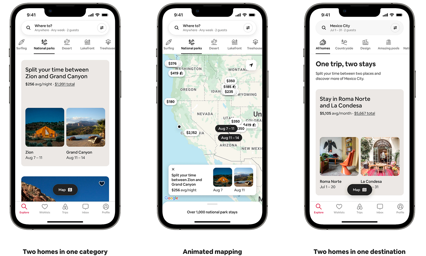
Airbnb largely has an invisible design. I wrote about it in detail the last time. But what Airbnb means here by unification is to design parts or components that are tied together to multiple parts of the product. That means that no component is designed as a one-off case for special scenarios. This principle is particularly interesting because as a systems designer I have seen new “special” components being added to the libraries way too often. These components don’t get used too often and usually are designed and used by a maximum of one or two squads. For unification as a theme to succeed in a large company like Airbnb, you can expect the design system managers to be quite strict about the process of adding new pieces to the puzzle and approving only the ones that have proper documentation highlighting the reusability of the component across different screen real-estate.
Universal
Airbnb is used around the world by a wide global community. Our products and visual language should be welcoming and accessible.
For companies like Airbnb, accessibility is not just important but necessary. Airbnb is used by people with or without accessibility needs. This means everything from their website to mobile apps needs to support people worldwide. Here are a few things that Airbnb does to cover achieve accessibility —
- Usable focus states: Focus on the focus indicators around links, inputs, and buttons.
- Instructions with input fields: Make sure it’s easy to understand what input fields are about once the label is gone
- Color Contrast: Support people with low vision who have difficulty…

