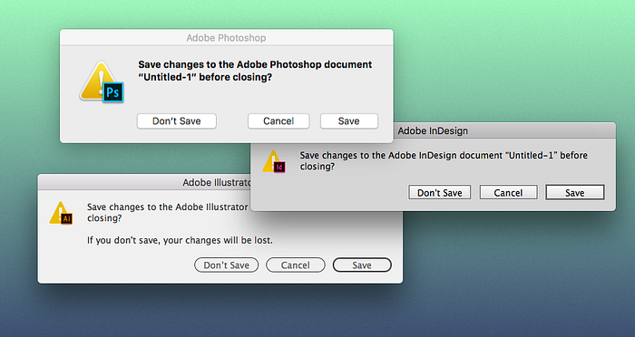
Every designer’s double-edged swords: Photoshop, Illustrator, InDesign.

Adobe and its powerful software are every designer’s best friends. The products are so powerful that the creatives — even the Sketch users — simply cannot live without them. Heard of the law of duality in marketing? F*ck that, Adobe owns the whole market (at least for now).
However, how many times have you Googled to figure out the easiest tasks? Creating a mask, creating an artboard, finding out shortcuts…and then you ended up being either brought to Adobe’s documentation with only 7,331 words on the page or somehow watched a 40 minutes tutorial from a 14-year-old Youtuber.
So why is everyone still using Adobe?
- Users often blame themselves when they encounter bad UX and that’s why you often hear “Of course! How could I not see that?” “Stupid me, trying to use InDesign’s shortcuts in Illustrator”.
- It appears that we live in a world where functionality is bigger than design. One can provide a product with great UX but die from lack of functionalities while the others provide better functionalities with crappy UX tend to survive.
Though, this is no excuse for Adobe to produce counterintuitive software with the resource they have.
Adobe earned a revenue of 4.8 billion last year, and it even has one of the best workspaces to recruit great talent. What is stopping it from producing good UX? As an outsider, I can only assume Adobe’s overgrown company structure has limited its design flexibility. When everyone is following the same procedure, it becomes harder for someone to walk up and say something like “Hey, what if we actually make the toolbar make sense to people?”

A creative director recently told me how he is amazed by after being in the industry for so long, he is still learning all the features he didn’t know existed. Hey, wouldn’t it be better if you just knew (at least most of them) from the beginning when you learned the software?
It is a shame that users have to constantly spend time learning Adobe’s products. To Adobe, it is a waste of product development efforts. To the design industry, it is millions of hours wasted.
Just like the existence of IE, it has caused countless houses of human labor. It could also potentially “teach” the future UI designers how not to design an UI. After all, these are software used by almost every new designer.
With software this impactful, changes are indeed needed. To start, these are some problems I have noticed that need to be resolved.
Problem #1: No hierarchy
Adobe’s UI design is very formulated with its precisely-divided tools and panel. However, everything ended up having the same hierarchy. Adobe needs to rethink structurally if the UI that worked 15 years ago still works today. With all the newly introduced features being added and treated the same way, users are likely overwhelmed since several versions ago.

For example, in Photoshop CC 2017, there are 67 tools in the toolbar. 67, people. Good luck finding that 3D Material Drop Tool. Furthermore, to limit the height of the toolbar, Adobe nested most tools under the other ones making it even more frustrating to locate a tool.
So what can be done? Hierarchy.
With a software this powerful and popular, it is no easy task. You hide one feature and you piss hundreds of thousands of users off. But that’s why product designers exist. We know better. Users are important, but in a way that acknowledge the product designers what their goals are, not what they want. They will always want more. They would want Adobe to stuck 100+ tools to the toolbar if possible.
“If I had asked people what they wanted, they would have said faster horses.”
— Henry Ford (I don’t care if this is a fake quote. It’s great.)
My initial though is to leverage plugins. Just like every iPhone comes with the basic apps–Clock, Weather, Messages and such, it also allows gamers to download games, TV addicts to download Hulu and Netflix. Using Photoshop as an example, Photoshop will come with the basic tools that satisfy most users. The painters, the animators, the 3d artists (which I assume are some of the minorities) can go and download their desired plugins if needed. I do not know how well this approach is, but I will need more data from Adobe and some paychecks for further investment.
In short, it’s all about hierarchy. Hide the features the users barely use and highlight the ones that are their favorites. It is extremely important when it comes to software as powerful as Adobe’s.
Problem #2: Inconsistency
If you want to learn about “design debt”, just launch an Adobe software. One common issue that Adobe’s software have is having design debts everywhere. From time to time, Adobe adds new design styles to its products. It ends up with inconsistent colors, buttons, typography and more.
Introducing new design styles to a product can be fun and refreshing, but the inconsistency builds up. It eventually makes it hard for the end users to learn your products.
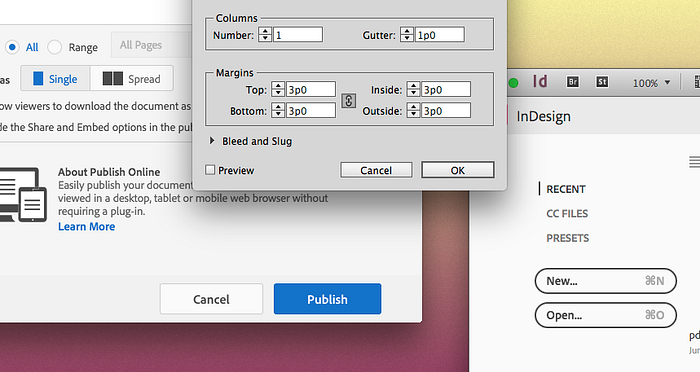
InDesign for example currently has at least three UI themes applied. A new theme is the last thing Adobe should invest now. And certainly not two. Making buttons have round corners will not help save any designer’s time.
“Design is not just what it looks like and feels like. Design is how it works.”
— Steve Jobs
We talked about Photoshop toolbar earlier. It is also a result of design debt. A design debt that should have been paid off a long time ago before it ended up with 67 tools in the toolbar.
Problem #3: Redundancy
Design debt not only affects visuals, it also sometimes causes redundancy from a functionality standpoint. Redundancy could provide a good UX when done right. It is however particularly hard to do when a software has this much to offer.
Every time a new feature is introduced, Adobe creates something new (being a new tool, a new dropdown menu, or a new panel) instead of merging it into where it makes sense to the users. Do we really need this many ways to select a color, Illustrator?
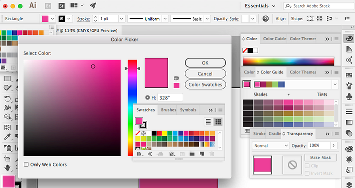
Sure. All these boxes are slightly different from each other. But if you’ve ever used Sketch, you know there is a way to handle Fills, Gradient, Transparency, Swatches all in one window. Not saying it is the best way to do it, and I am also aware of the extra capabilities of Illustrator, but with a similar approach, what you see above can be much streamlined.
In this case, a color block in a dull UI is already the most prominent element in the whole interface. The users can find it. No need for redundancy.
Once simplified, the users can then easily pick up “If I need to a color tool, I should click on that color box” instead of trying to expand every panels and dropdowns to look for a tool. Now when Adobe comes up with a new color-related feature, it should be attached to the color block window. Clean interface. Happy users.
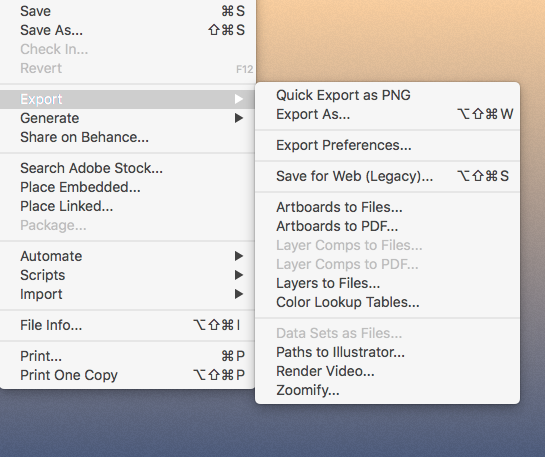
Same approach can be applied to Photoshop. There are 14 items under the “Export” dropdown menu. If your “Export” requires a dropdown menu at all, it is worrying considering how simple the concept of “Export” is. Each of the item apparently serves a different purpose with a whole theory behind it but the users shouldn’t have to go through the trouble to figure out which one will work. Adobe should.
Problem #4: Not respecting the operating systems
When you don’t respect the operating systems, you don’t respect the users. If you are a guest in someone else’s house, be polite and follow the rules. Respecting the operating systems is not an option. Even if you don’t like it or think it doesn’t make sense, it is what your users expect you to do.
Here are some examples:
- The Shortcuts
Do not discard the default shortcuts that came with the OS and replace them with shortcuts users are unfamiliar with. For example, in Photoshop, to duplicate a layer is command + J instead of command D. To escape from a tool is V and sometimes command + D instead of Esc. After Effects, however, is doing a much better job comparing to the other Adobe software. Copy, paste, duplicate, and even renaming a file name all work accordingly with the default shortcuts. - Recent files
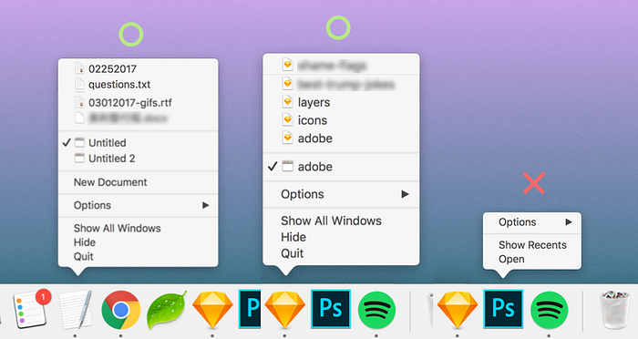
In mac OS, it is a standard for a production software to offer a view of recent files for the users to pick from when right click on the app icon. Most Adobe’s software does not include this feature.
- Over-customized UI
Unless you can do it right, don’t do it. Adobe builds its own UI that requires users to learn and adopt. It is unnecessary and should only be done by a team of genius who can outsmart the designers of the OS. For example, Adobe let their users pick their own color themes while none of them outperform the default theme (in mac, in this case). All dark themes have poor contrast. The light theme uses pretty much the same color as any other unselected programs running in the background. You can’t tell which window is at the front and being used.


Problem #5: Inconsistency between Adobe products
Many famous Adobe products are acquired and merged into Adobe’s product suite. Therefore, it makes sense to not have consistency shared between their products…but not after this many years, especially when Adobe is selling all software as a bundle.

Building consistency is more than just applying the same kind of app icons and splash screens to the products. It is about providing a shared user experience across the products.
And of course, besides the look, the way pen tool works, the way artboards work, the way you export a file…all these should be built out systematically.
Let’s also not forget the shortcuts. While each software specializes in different things, there is no reason to create different shortcuts when they have the same features, such as Duplicate. If Adobe somehow really thinks “Command + J” is a good shortcut for Duplicate, apply it to the other software. In case you are curious: “Command + J” currently duplicates layers in Photoshop, joins layers in Illustrator, and go to a page in Indesign.
Problem #6: Lack of user empathy
These are random thoughts that I do not know where they belong. I decided to put them under “Lack of user empathy”.
Icons are widely used across Adobe’s products but most icons are no longer self-explanatory. It is almost guaranteed that a first-time Photoshop/Illustrator user will have no clue what these the icons below do without relying on the tooltip, or even worse, having to interact with them.
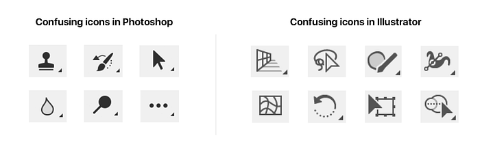
And if you are a user, you know some of the tools above are significantly fundamental. If users are relying on the tooltips to understand your icons, write them out instead. Sure, some icons above actually represent tools that ancient designers used before things went digital, but no user is going to research the history to figure out what those symbols in the icons mean.
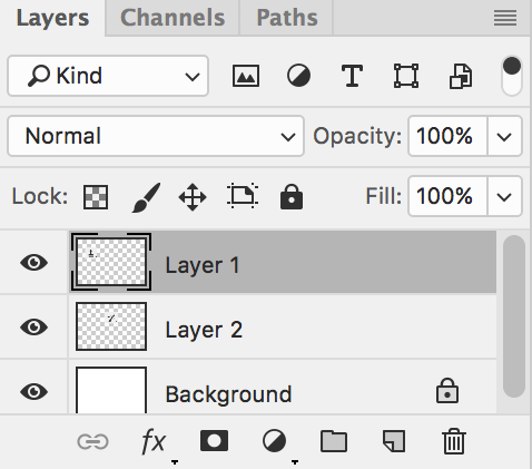
Let’s look at the Layers panel in Photoshop.
We see icons everywhere. It is more confusing then seeing them in the toolbar because we can’t even assume they are tools. What are they? How do they work? The only way to find out is to interact with them.
In the bottom row, it is also bizarre to see Effects, Mask, and Styles made it to the same bottom row where Create, Delete, Group, and Link a layer are as if they are all the same type of features.
We also see two bars with no label. One has a search icon but says “Kind” instead of “Search” and has a dropdown icon. One just says “Normal”. Again, what do they do? How do they work?
The only elements that make sense around Photoshop’s Layer panel is Opacity: 100% and the delete icon. Almost every other element requires you to click to find out its capability.
For several Adobe’s products, it is also worth to revisit: are Move Tool and Selection Tool really considered “tools”? Probably not. In every desktop GUI today, we are able to use our mouse to “move” and “select”. Why does a user have to select “tools” to perform these most basic functions? Is it too much to have tabs everywhere to represent panels? Speaking of panels, do we really want the users to customize their own panels like what they did to MySpace? Imagine a Photoshop user turning off the layer panel (“Hey, if Adobe let me do so, it must be optional!”) and imagine what kind of user experience the user will get.
Adobe needs some fresh eyes to answer all these questions and discover the ones that are not yet mentioned above.

The ultimate “3-in-1” is possible
Yes. I said it. To push it even further, I want to propose the idea of combining Photoshop, Illustrator, and InDesign.
One of my assumptions is:
Once Adobe streamlined its UX/UI, Photoshop, Illustrator, InDesign will end up somehow similar. Likely, two or all of them can be combined into one.
The core of the three software are similar: laying out text, inserting images, drawing vector shapes, applying effects, and picking colors. These will likely get you through 90% of your design jobs: web design, illustration, photo retouching, banner ads design, and more. Imagine using artboards as pages in Photoshop, what else do you need for it to do InDesign’s job? Sure, setting up crops and bleeds is confusing in Photoshop, but it is only because the current UI design is not streamlined yet.
Think it’s too ambitious? No one was expecting a 49MB software (Sketch) to take down Illustrator and Photoshop like that either. Photoshop and Illustrator are about 3GB in total, that’s about 60 times bigger than Sketch. Design makes everything possible.
Though, will Adobe want to combine them into a 3-in-1? That’s another story. Base on how Adobe reacted to Sketch by creating Adobe XD, they may only consider combining them when Sketch starts to pressure Adobe by increasing its photo editing ability, adding CMYK support, and adding more features that may threaten Illustrator and InDesign.
Bottom Line
With what Adobe currently have, there is plenty of room to improve. And every improvement will be a bliss to the users, or dare I say it, to the whole human race (consider the significant reduction of human labor wasted).
This post is inspired by How Apple Is Giving Design A Bad Name by Don Norman.
02/22/2018 update: I recently received a kind note from Adobe and it seems like changes are coming in the near future.