Here’s Your Checklist To Create Exceptional Web Experience
Your website homepage is your company’s face to the world. Your potential customers will look at your website before doing business with you. Your homepage gets more view than any other pages on your website. No matter which page your customer visits in your website’s realm, they will come back to the homepage. Tell them who you are and what do you offer.
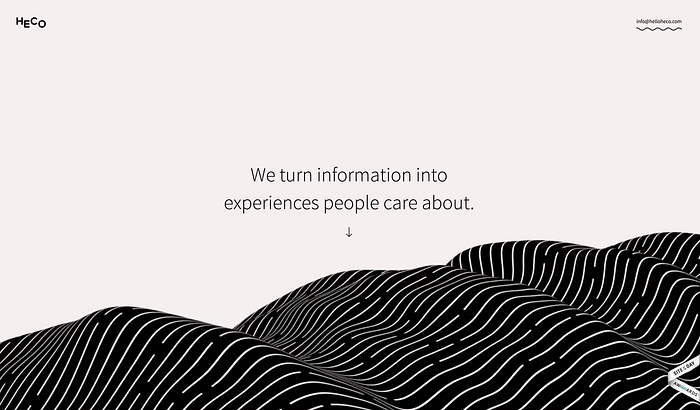
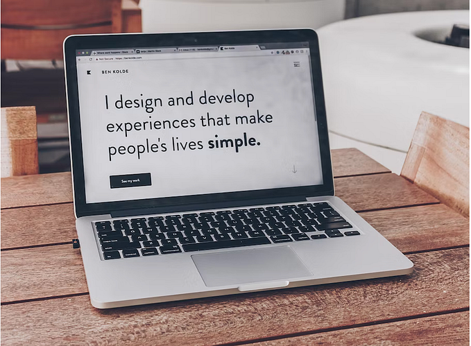
1.1. Summarize what your company does, try to fit it in a tagline if you are new or not popular. Try to fit honest and authentic words in those lines. Don’t start with ‘The’ or ‘Welcome’.
Example:

1.2. Customers like to figure out what your company does. They also visit the About Us section of your website to understand the company’s purpose and mission and decide whether to trust the Organization. You need to group all corporate information in one distinct area. If your company is new, it will definitely increase the credibility of your business.
Example:

2. Talk to your customer, Answer their Questions
People visits your website with a goal in their mind. They want to accomplish something and maybe they will buy what you are offering. Sometimes businesses fail to make sales via their website because they already failed to provide the information their customer are looking for.
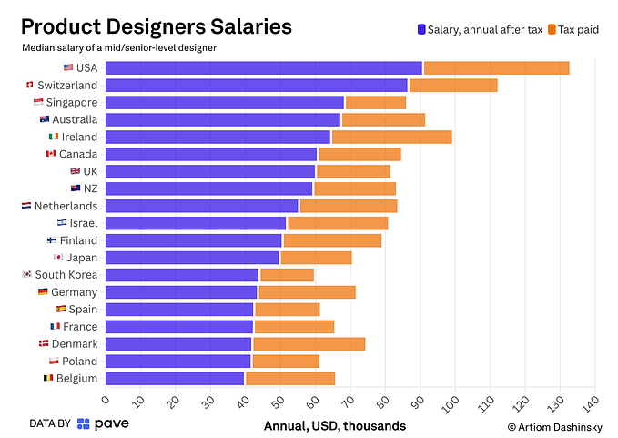
2.1. Price is the most specific piece of information customers use to understand the nature of an offering, and not providing it properly makes people feel lost and reduces their understanding of a product line.
Example:

2.2. Help your customers to find what they need, good interface design will catch the users’ attention but Some websites use the most bizarre font styles and sizes that make reading a pain.
Example:

2.3. Your website navigation should be seamless. If text is used as navigation, it needs to be concise. Visual metaphors should not be re-invented. If hyperlinks are used, then they should stand out from the body of the text. Users should be able to find their way around easily.
Example:

3. Use visual design to enhance the experience
Designers! Stop using useless hi-res stock photography. If your customer isn’t able to relate themselves with the image, the purpose of putting “beautiful” images will backfire. Use images or videos of real people dealing with the context which your business offers.
3.1. Animations are awesome and a powerful medium to delight the customer, Especially when used appropriately. If it’s repetitive on your website or distracts the user from the actual content it gets on your customer’s nerves. Too much delight becomes too bad for business.
Example:

3.2. Design for friendly screen resolution. I am quite sure all of us accidentally at least once stumbled upon a website where you have to scroll horizontally. Good designers will develop websites that fit on most screen sizes. Use Analytic services like Google Analytics, Mixpanel or Clevertap, who provides you information about what monitor resolution your customers are using. These are useful information you should know before initiating your next revamp.
Example:


3.3. Selective attention is very powerful, and Web users have learned to stop paying attention to any ads that get in the way of their goal-driven navigation. Don’t show any designs that look like advertisements. Don’t show any pop-up windows before they have even fully scanned the website. Don’t promote your products in a banner as soon as the user lands on your website.
Example:

4. Prioritize the content
Your website is made with 90% typography and 10% images (including icons). That is why magazine or brochure design has a heavy influence on the website. But sometimes designers forget to design with the word, instead, they start with graphic-heavy designs with no goals to accomplish.
4.1. Write for online, not magazine. People read in first a horizontal movement, usually across the upper part of the content area. Use proper headline and sub-headline to help them to scan the area. If they find value in the content they definitely will read it in the Z-Pattern. At first, visitors look through the heading moving from left to right, then look at the lower left part and repeat left to right eye movement. To help them to read it without any struggle, you should use bulleted lists, highlighted keywords, use short paragraphs and Never ever use jargon-filled language. Read more about it here.

4.2. Designers, you must learn how to Write. Your design reflects a powerful statement of your research and the content in your design must reflect your problem-solving skills and the way you tell a story. Try to understand the essence of what you’re trying to achieve. Understand the problem statement. Try to empathize with the customers, figure what message you should convey. Then put all the pieces pointed in the same general direction. Communicating with your customer is more important than anything.
Here are few more things you should keep in mind:

- Understand the people you are designing for. What MailChimp has done for user personas, is one of my favorite. Make decisions based on who your customers are and implement them in your web interface.
- Be very consistent with visuals. People expects similar actions to be done identically after doing something in a certain way. For the same reason HackerNews or Reddit uses similar approach to links on all the pages.
- If the user performs some action always provide feedback about success or error. Nudge them with an confirmation message before performing a negative action.
- If you are selling a product try to keep in mind the Jacob’s Law. Jakob’s Law of the Web User Experience states that “users spend most of their time on other websites.” This means that they form their expectations for your site based on what’s commonly done on most other sites. If your Website’s interaction deviate too much , your site will be harder to use.
If you are a designer who is working this way, share the link below, share your ideas, share what you’re doing. If you are a website owner tell me what you want and how it will work for you.
Like this story? Click the heart ♡ below. It helps others see the story, and will tell me to write more of it!
You can also follow me on Twitter,🙂 where I share a variety of good information. Don’t forget to Bookmark it 🔖 for future reference.


