
Hands-on with Adobe XD
Toolbox Spotlight
Way back in 1985, Apple invested $2.5 million in Adobe, and Adobe helped make the Mac a real machine and the choice for creatives before next becoming available for Windows. Many of us then grew up with Adobe tools such as Photoshop and Illustrator, with jobs focused on the creation of icons, logos, and web designs. Fast forward to the present day though, and designers are no longer reduced to merely pushing pixels around a screen. As Justin Baker put it:
“Designers solve problems, they don’t push pixels.”
The value of design became recognised in the boardroom, empowering designers to define entire products, and create experiences that may not even have user interfaces. This meant the visual aspects of design were no longer enough to create ideal user experiences. The change in role of the designer brought with it an influx of new design tools (there’s over 30 in Toolbox) that move beyond pixels to focus on idea iteration and real problem solving.
Adobe’s own tool for today’s digital designer is Adobe XD, augmenting their existing products (Photoshop/Illustrator) with the ability to prototype, design, share, and collaborate.
Contents
XD is already different from everything Adobe has ever done before: it’s free, built in public, and has an open API for developers to build new features right on top of it. With that in mind, this is a hands-on guide for how you can put XD to good use as a UX/UI designer. Here’s what we’ll cover:
1. Why we needed new tools: The progression from print to the screen design, and why we saw an explosion of new tools.2. Low to Mid-fi Prototyping Tips with XD: How XD helps us prototype in low to mid-fidelity, and tips and tricks to get you started.3. Collaboration and Handoff: A look into working as a team with XD.4. Moving to High Fidelity: A look into XD's Prototyping mode, and how it works with more interactive tools such as ProtoPie.5. Prototypr Opinion: Our verdict, and what to expect next from Adobe XD.
We’ll not only take a look at the different features available, but show why and how they’re useful to the changing role of the designer today.

[Part 1] Why we need new tools
It’s well known that Adobe has a range of tools available in their Creative Cloud for different purposes. Photoshop and Illustrator have always been popular tools for graphic designers, especially when their role focused predominantly around print.
With the arrival of apps and the web, however, the same tools used for print were naturally adopted to design for digital environments. It wasn’t unusual to see web layouts designed in Photoshop and handed over to a developer to be coded. Whilst this worked to a certain extent, these tools were never actually built for screen design.

The digital medium is a completely different one to print. The web is:
- Interactive: there are interactive touch points that users can press
- Dynamic: elements can move and animate depending on interactions
- Stateful: an interface can contain different states depending on the data provided
- Responsive: the size of elements can change depending on screen or window size
Therefore, unlike print, pixel-perfect mockups can’t really exist. Layouts can completely change in response to user interactions, or depending on the device being used. Whilst Photoshop is still great for photo editing and print, it’s clear that a different type of tool is needed when designing for the screen, and for the UX design process in general.
Different tools for different needs
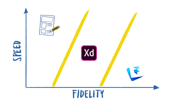
Today’s designers not only create mockups but also focus on testing and iterating on designs to ensure the right problem is being solved. Therefore, prototyping becomes an essential part of a designer’s workflow, with multiple versions of a solution produced, at different levels of fidelity in order to guide the direction of the product.
Failing fast and early is therefore beneficial, and generating feedback often through low-fidelity prototyping saves a lot of rework time. After paper and pencil, XD is a great tool for this:
Low-fidelity (lo-fi) prototyping is a quick and easy way to translate high-level design concepts into tangible and testable artifacts. ~ Nick Babich
Speed is key when prototyping, as we’re looking to explore multiple ideas quickly to find out what works best. Unlike other Adobe tools, XD has been built around this very purpose, enabling you to design and test multiple ideas as fast as possible. XD doesn’t replace Photoshop or Illustrator, but solves different needs. Features and integrations tailored specifically for prototyping, collaboration, and user testing are at the forefront.
Building the right features
Furthermore, every feature in XD has been built from the ground up with the feedback of their users through a program called Adobe Uservoice. Uservoice provides a way for the XD team to collect feedback and ideas from active users, ensuring only the most useful ones are added to the core product:

For features that aren’t included, XD has recently opened up an API to enable 3rd party developers to build their own plugins for custom needs:
Now we’ve looked at why and how XD is being made, let’s explore how the features and integrations available make our jobs as UX designers easier.

[Part 2] Low to Mid-fi Prototyping Tips with XD
When prototyping, you don’t need photo editing features, or even advanced animation. Early on, it’s perfectly fine to create something rough that may not even look the best. The aim of your low-fidelity prototype is to ensure your design works well — it’s not about how pretty your interface looks.

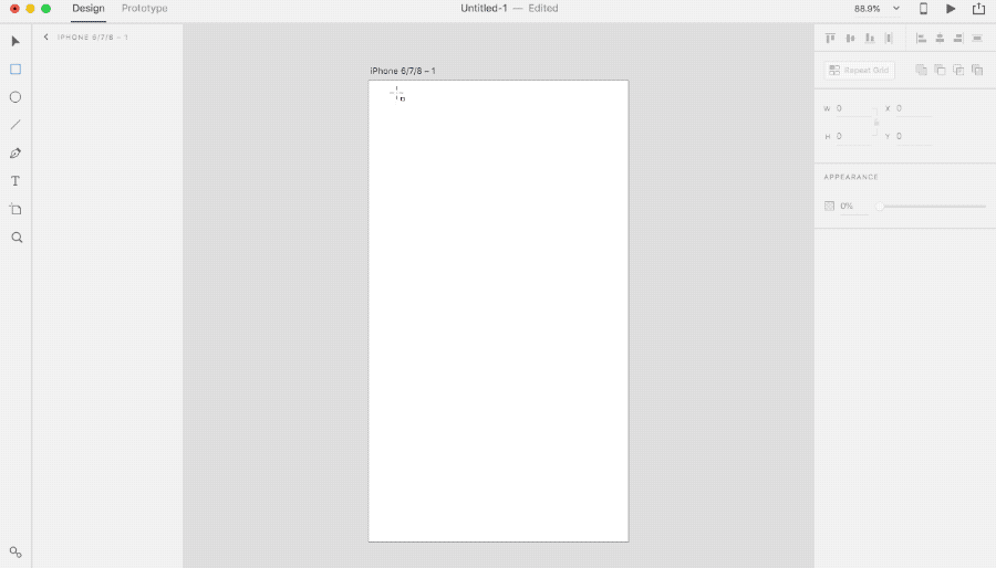
XD has been built for this process, coming only with the essential tools needed for screen design. Compared to Photoshop, the interface is less cluttered, making it simpler to create what you want, quickly. Access basic shapes, text, and artboards form the left menu. Find alignment, borders, and more features such as ‘Repeat Grid’ on the right.
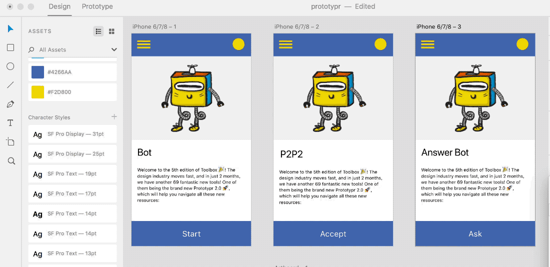
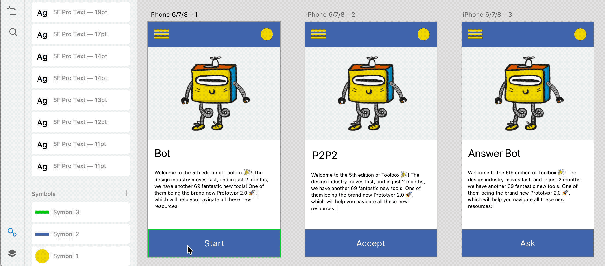
These simple tools alone are enough for iterating on early stage wireframes, they enable you to put together a rough screen in seconds:
Whilst using simple shapes are great a way to get started, there are more ways that XD that can help you move even faster. Following are 4 methods that you can use prototype in low to mid-fidelity, showing how the XD is tailored to help you:

1. 🎨 Switch color palettes to grayscale
Color plays an important role in your product for a number of reasons: you can use color to draw a user’s attention to a particular element on a screen, make your product more recognisable, add extra meaning, and much more.
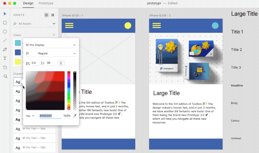
Despite their usefulness though, colors can be distracting for low-fidelity prototypes. When the purpose is to gain feedback on something functional, there’s a danger that you’ll get suggestions on the look of your app. That’s not the type of feedback you need, so here’s how you can use XD’s color panel feature to quickly switch your design to grayscale:
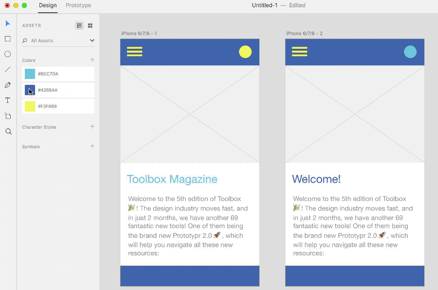
Setting up your color panel
1. Click the assets icon in the bottom left to show the color panel2. Add colors simply by selecting any colored element in your prototype, and clicking the plus icon next to ‘colors’3. Repeat this with a few colors from your design to build up a neat color pallette.
Switching to grayscale
1. Simply right click on any color in the panel, and change the Hex value.2. This updates every element with that colour, for every screen of your prototype.
This is not only useful for low-fidelity prototyping, but also very useful when experimenting with different palettes in high-fidelity prototypes too. Either way, this will let you play with color at any stage — because who doesn’t like to experiment!
2. ⚛️ Reuse and update common elements with ‘Symbols’
It’s often necessary to make changes to elements that appear numerous times in different screens of your prototype. For instance, you might have 10 screens, and a common icon appearing on each. In XD, you can update that element on every single screen at once, using using symbols.
Symbols enable you to save design elements such as icons or buttons, and then reuse them anywhere in your prototypes. Whenever you make changes to your symbol element going forward, every single screen and element that uses that symbol updates automatically:
Going a bit further, Adobe more introduced ‘Swap Symbols’ this summer 2018, make Symbols even more powerful. With Swap Symbols, you can replace any symbol used in your prototypes with a new one. This is a really powerful prototyping feature — just by dragging and dropping a new symbol over an existing one, all instances of it are updated across your entire project. Here’s an example of replacing one button symbol with another:
3.1 📱Make use of the UI Kits
Another way to speed up your design process is to make use of the various UI Kits available in XD. In most apps or websites these days, there are guidelines and layouts recommended for creating experiences on a given platform. For instance, iOS mobile apps have a range of native elements such as:
- Bars: Navigation, search, status, tab and tool bars.
- Views: Alerts, maps, pages, popovers, tables, and more.
- Controls: Buttons, labels, pickers, switches, sliders, and more.

Using the UI Kits provided in XD can help you create accurate designs possibly faster than sketching. It’s as quick as opening up a UI Kit, selecting an artboard with the controls you need, and then copy-pasting it (along with elements within it) into your own project.
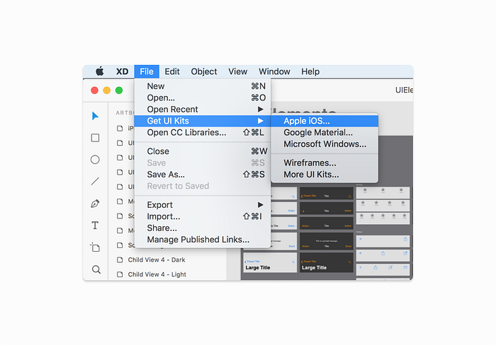
There are a range of UI Kits too — from Apple iOS to Google’s Material Design. All of them are accessible right from the File Menu.
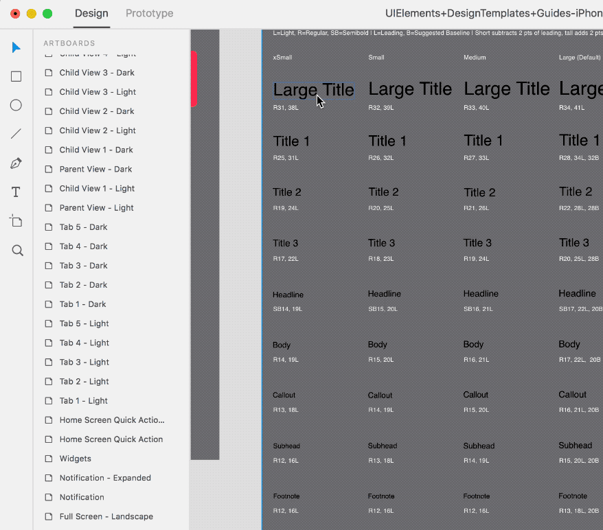
UI Kits aren’t only good for native elements, but they also speed up font styling. Here’s an example with the Apple UI Kit:
3.2 👌 Using Character Styles from UI Kits
UI Kits often come with a range of font guides, which we can use to keep our own designs consistent, accessible and fast to update without much effort. XD also has a ‘Character Styles’ panel, which becomes very powerful when used in combination with a UI Kit. Here’s how to do it:
Copying Character Styles1. Open the UI Kit and select a set of fonts you’d like to use2. Copy and paste them to your own project3. Next, with the fonts still selected, click the plus icon in the Character Styles panel to add all of them to your Character Styles panel
Here’s an animated gif to demonstrate:
As you can see, all the chosen fonts from the UI Kit are added to the Character Style Panel on the left of your own project. This is great for reuse, but it’s also very powerful.
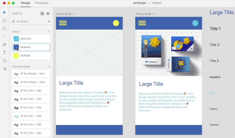
For instance, if we were to now update a Character Style, it would also update everywhere in our design. Here’s an example of changing the text color of a Character Style:
To go a step further, you may have noticed above that we’ve updated our text color with one from our Colors panel. Therefore, the text now updates with changes from the Colors panel. You can see this handy trick below (watch the ‘Large Title’ header change with the color palette). 👇
4. 🔁 Repeat Grid
Repeat Grid is another unique feature of XD that takes the pain out of repetitive tasks, speeding up your workflow.
Many layouts can contain a set of repeating data — for example, your prototype may contain a list view of friends, or phone book of contacts. Instead of editing each individual list element in isolation, the Repeat Grid feature enables you to duplicate elements just by clicking and dragging:


Furthermore, if you then make adjustments to an element, those changes get applied to every grid element. To find out more about how to use Repeat Grid, refer to this excellent guide from Elaine Chao:
Now we’ve highlighted some tips on how XD can help you prototype quickly at different stages of your design process, we’ll next look at how XD supports team collaboration:
[Part 3] Collaboration and Handoff
An essential part of design is also collaboration — this can be within product teams, with outside stakeholders, and also between design and development. Essentially, everyone wants to build the best possible product and create the best outcomes:
- Support teams want to help people solve problems.
- Sales and marketing want to create a great brand and generate revenue.
- Development want to build a performant and useful app.
- Design wants to create an amazing experience.
With all these different pressures and goals, today’s design tools require efficient collaboration features to help teams stay aligned, and ensure the right product and features are made.
Adobe didn’t used to have any obvious products that enable this, so here are ways that XD makes a difference for today’s product teams:
1. Exporting Design Specs for your team
Gone are the days of writing design specs by hand to pass over to developers. With XD, specs can be produced automatically in just 1 click:


Once a designer hits publish (as shown above), a developer can then access specs right from their browser. They can grab all sorts of design information to be used in their own code — from colors and typography to image dimensions and padding measurements.
Additionally, every time you update your prototypes, simply publishing new design specs makes them live and accessible by your entire team. Stakeholders can then add comments to specs, and any queries can be resolved quickly. Find out more about Adobe XD Design Specs in this great post from Nick Babich:
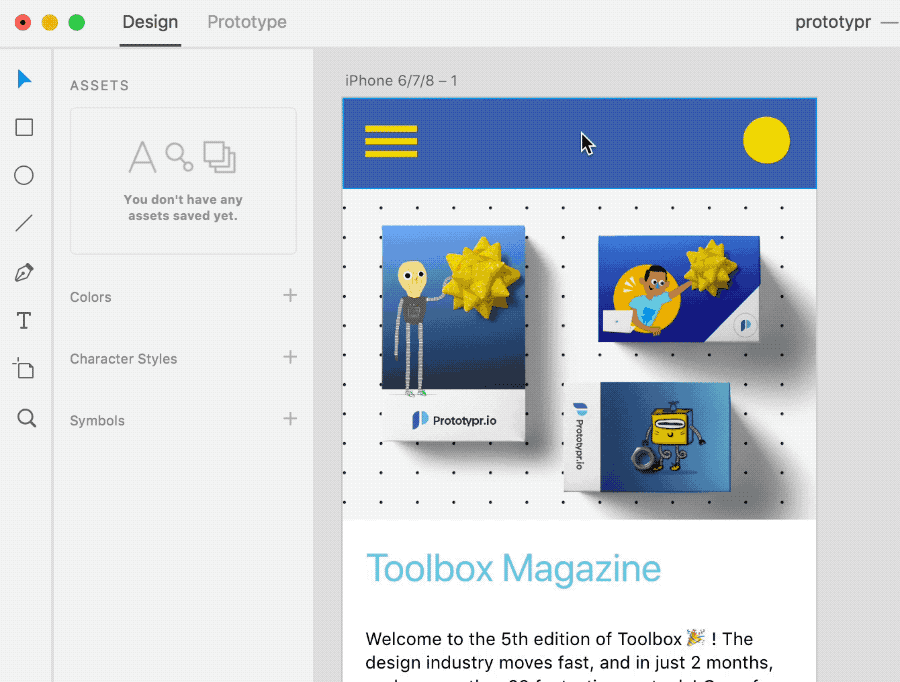
2. Collaborate and comment on prototypes
Another great way to bring your team into the design process is to publish your prototypes so they can be accessed publicly in the browser. Doing so brings numerous advantages:
- Those with access can add pinned comments and discuss parts of the design.
- The design team can reply, or mark the issue as resolved.
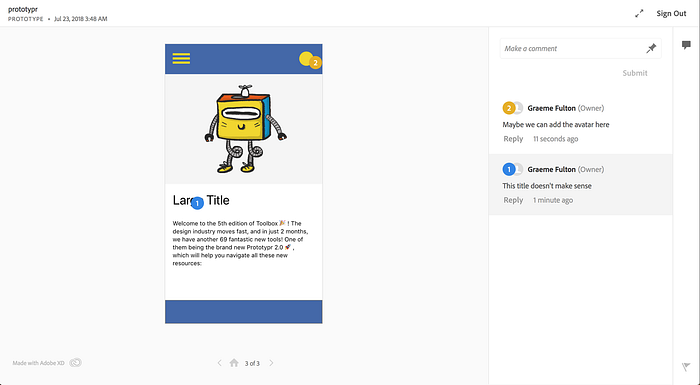
Publishing prototypes for anyone to access in their browser can act as single source of truth for how a product should look and work. Since these are live artefacts, your team can stay up to date and in the loop with changes. There’s literally no extra work to do to make this possible other than hitting publish:
3. Keep teams in sync with live documentation
Prototypes can also be embedded within websites and any platform supporting iFrames (e.g. WordPress, Squarespace). Simply click share, grab the embed code, and paste it in your page:

This is particularly useful for documentation — instead of using static images, you can embed a live prototype that updates with your changes.

[Part 4] Moving to higher fidelity
As outlined in section 2, XD is great across a range of fidelities depending how you use it. From low to mid-fidelity, you can create whatever you need really quickly.
However, as your prototypes progress with each level of fidelity, it eventually becomes necessary to gain feedback on more intricate aspects of your product. In XD, you can go beyond static screens by creating click-through prototypes using Prototyping mode. Then, through integrations with tools such as ProtoPie, you can create very high-fidelity prototypes. Here’s an overview of both these approaches to moving your designs to a higher fidelity:
XD Prototyping Mode
XD’s prototyping mode is great for creating basic click-through prototypes, with simple transitions and easing effects between screens. Simply click and drag the handles from an element on one artboard to another to hook them together, along with a preset animation:


In play mode, you can then see and record how your prototype works. Whilst this is effective for making your app seem realistic, it becomes limited when it’s necessary to experiment with motion and animate individual elements. This is where the Adobe XD plugins and integrations come in useful. Take the ProtoPie integration for example:
🥧 XD + ProtoPie

Where XD is limited, 3rd party plugins enable you to take your prototypes further. For example, the ProtoPie plugin enables you create even more realistic prototypes from your original XD screens. Essentially, ProtoPie empowers designers to build highly interactive prototypes, deploy them on any device, whilst also utilizing device motion sensors that aren’t available when using XD.
After importing your designs from XD, you’ll be able to interact with the different layers to make them highly interactive in ProtoPie. Furthermore, if you make changes to your imported XD prototype, those alterations can be synced back to ProtoPie, ensuring a smooth prototyping workflow:


ProtoPie isn’t the only option for creating interactions either — XD also integrates with Kite Compositor, another tool useful for high-fidelity prototyping:
Our Opinion
Overall, XD proves to be a solid all-round design tool, and well tailored for today’s UX design workflow. There’s not a steep learning curve, and the free starter plan makes it accessible to everyone. The free plan is however limited in terms of active shared prototypes and design specs, but that won’t stop you from using any of the features:

As well as all the benefits outlined throughout, one of the most powerful advantages of Adobe XD that, for us, sets it apart from many competitors is it’s performance. Whether you work with 1 artboard, or 1,000, the performance remains exactly the same:

Even with multiple projects open, with many nested symbols, there’s little noticeable change in speed. XD can also a great choice if your team uses both Mac and Windows, as it works natively with top performance on both operating systems.
XD is catching up
In spite of these benefits it should be noted that Adobe XD only came out of beta a year ago, and as such has to contend with a marketplace of more mature tool offerings. Some of these tools had their debut 8 years ago now, ushering in a new way for working in UI design. That paradigm was quickly adopted by design teams, and plugin ecosystems have grown up around them.
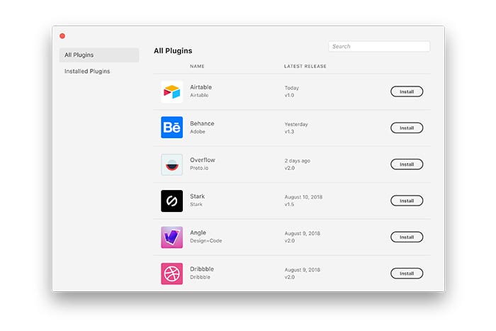
However, XD really is catching up. Adobe recently opened their own developer platform to allow anyone to extend XD with new tools, commands and panels. There are already plugins in development from the likes of Dribbble, Trello, Airtable, UserTesting, and more:
- Stark — design and build products that are accessible, ethical, and inclusive.
- UI Faces by Mighty Alex— Avatars for design mockups.
- Overflow — design, present, and share beautiful user flow diagrams that tell a story.
- Iconscout — High-quality Icons, illustrations, and stock photos in one place.
You can find the full list in this article:
Join us for more
We’re excited how the design tool space is evolving and aim to bring more tutorials on some of the above-mentioned plugins, as well as guides on other prototyping tools from our prototyping toolbox.
To get updates and more fresh content, sign up below 👇

