Grids, guides and groups, the 3 Gs of modern UI design tools
Designing design tools
I have never imagined how hard it is to make a design tool before trying to make one.
The most important lesson I learned is so incredibly simple that it’s very easy to miss…
Design is not about freedom. It’s about working within carefully crafted constraints.
We start a new design with an infinite canvas: a nearly limitless amount of screen space, millions of colours to choose from, hundreds of thousands of fonts, billions of photos, any combination of characters within the Unicode table…
The possibilities are endless (bullshit).
In fact we almost immediately see a set of constraints enforced by the platform, medium or even modern design trends. We do not choose random fonts, but rather carefully selected combinations. We don’t have infinite canvases, we have certain screens to adapt to. We have a narrow set of base colours. We have a layout system instead of a randomly positioned mess…
Designers have been using layouts and grids for ages. Most books, websites and apps you see use some kind of a grid or modular system.
UI design apps help us define layouts by providing a variety of tools including grids and guides.

Grids are often represented by square modules, which are handy for designing basic UI elements. More complex layouts could be set with static guides or additional tools like Sketch’s Layout grid.
And, please, don’t forget the beloved pixel grid that helped us craft pixel-perfect images before Apple decided to mess things up with downsampling.
While snapping to the pixel grid is usually set independently, it may be seen as a tiny 1✕1 pt grid that works with other constraints and helps you create more accurate designs.
For years the good old 8-point grid system served us well.
The 8-point module is small and flexible enough (some design systems use 4-point submodules) for most needs. It works fine for screen resolutions like 1920✕1080 on the desktop or 320✕480 on mobile, but not newer devices like Apple’s iPhone 6s (375✕667 points). Screen resolutions like this simply do not fit the 8-point grid.
We may try a few tricks like realigning the grid or only using a portion of the screen (368✕664 in our case), but that’s not really solving the problem.

Here come soft grids. They’re life savers for crafting modern interfaces and make built-in grids of our favourite UI design apps obsolete. You either have to stick to static modules or use less-than-elegant solutions of coloured boxes.
Being able to create dynamic, adaptable interfaces is a serious challenge for existing design tools, most of which have been stuck in the past.
Newcomers, like Subform, help creating flexible grids and tables, but that comes at a cost of a steep learning curve and requires a different mindset. You would no longer have to think in terms of pixels and margins, but instead design structures and relations. And that’s still a better solution than spending hours designing with a calculator in hand.
Now let’s return to guides.
Prior to working with a fully fledged design system you’ll likely have to do some basic work with WYSIWYG pixel pushing. This often implies moving, resizing and adjusting multiple shapes and is often done with guides.

Guides help shaping complex layouts, perform quick measures or align multiple shapes along the same axis. But creating and managing them takes time, so using guides for basic tasks like aligning two figures is not the best idea.
Smart guides to the rescue!
Unlike static guides, smart (or dynamic) guides are only visible while you’re moving or resizing objects. So, instead of center-aligning two rectangles with a static guide and a calculator you simply drag one of them and the guides let you know when the shapes are centred.
Their use is not limited to aligning: modern smart guides help you understand object dimensions, measure distances or equally distribute groups of objects.
While feeling natural and fluid the smart guides are quite tricky to implement: you have to deal with performance issues, parasite snapping and so on. No wonder lots of WYSIWYG editors only implement side and center shape snapping.
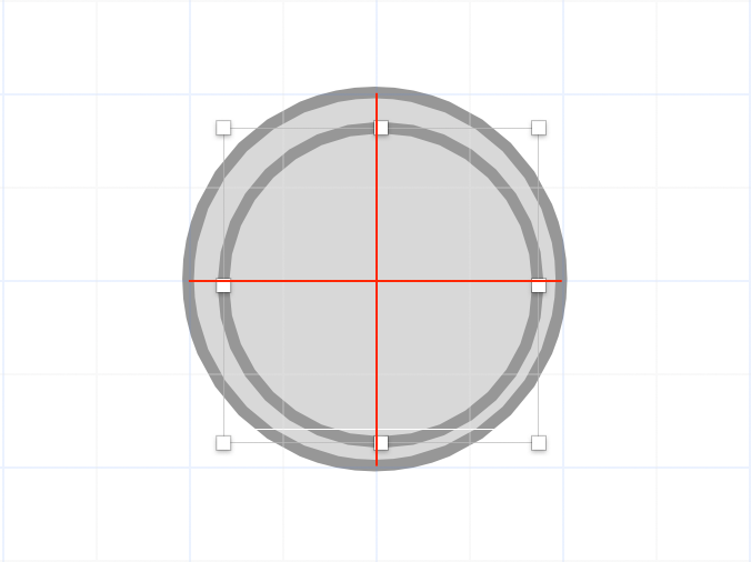
The same guidelines that help us design pixel-perfect UIs may also create confusion.
In this example smart guides clearly indicate both circles are centred while it’s obviously untrue: you cannot center circles with even and odd radius while sticking to pixel grid.
As you have seen, working with just a single shape might be tricky, but what if we select multiple objects?

That seems natural, in UI design even a simple button is a combination of two objects: a line of text and a rounded rectangle.
Having to move these two objects separately would be rather resource consuming and we’re talking about a very basic UI design element.
So, does multiple object selection solve the problem?
Not really. Modern UI designs may have thousands of independent shapes and manually selecting them could be extremely time consuming.
So, why not just combine multiple objects in groups?
Sounds great, let’s do this! Moving objects has become much easier.
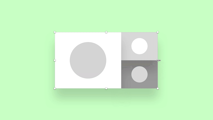
But now we have even more problems: we cannot resize groups.
Well, technically we can, but the end result is likely to be very different from what we have expected:
In most interfaces objects within groups are not just randomly positioned boxes, paragraphs and curves, they have certain meaning. And this meaning cannot be easily guessed by a machine.
Developers have been using constraint-based layouts for quite a while, yet most UI design tools inherited this logic just a few years ago.
You (or a machine) set constraints within a group, combine groups, set their relative constraints and voilà, your mockups now look fine in a wide range of screen resolutions.
But during this process groups have become much more than easily accessible object selections. They define their content behaviour and appearance.
In some cases you may even override a certain object’s content or appearance. These “groups on steroids” are often referred to as symbols or smart objects.

During the evolution of design apps many tools have lost their original meaning: grids are becoming obsolete, static guides are merely helpful and groups have turned into monstrous constructions we could not have imagined just a few years ago.
The more powerful and complex our designs become, the more challenges arise at the background level.
Each design constraint increases the chances of a conflict: having too many shapes may trick smart guides, smart guides will conflict with guides and flexible, adaptive layouts would very likely conflict with all of the above, including the pixel grid.
For design tool creators managing this is like building a house of cards while constantly replacing random cards with new ones. And this is just the beginning…
P.S.: thanks to Alex Bourt for helping me finish this article.

