Graphic Design Basics: Core Principles for Visual Design
I'll try to cover some basic core principles, not all of them but some more important ones
Symmetry/Asymmetry
One of the designers most basic visual tool the distinction between symmetry and asymmetry so first we go discuss symmetry
Symmetry: Many natural organisms are symmetrical. Symmetrical layouts are inherently stable and balanced and that’s why designers, for centuries, towards created layouts. So in the symmetrical design, it should be able to draw a line top to bottom and its same on either side or I could draw a line through the centre and it’s same above below.
Asymmetry: Asymmetry in design is really distributing element so that moving them around until they really do feel balanced so, that really is a matter somewhat of intuitive perception Nature’s full of asymmetry. When we use the term dynamic or dynamic asymmetry, what we really referring to is the design that really moves changes, design and which the viewer's eye is actively moved and through a design

Scale
What does designer mean they took about scale?
The scale is relative an element will seem larger or smaller depending on its context. How big is the object in relation to other objects? Scale conveys meaning

Here, large objects appear to be closer and small objects appear to be farther away.
Scale relationships can be conceptual A large elemnet might be more important scale is used to reperesnet precise difference and quantity .
A scale is an important tool in graphics design because it can often energize the design by changing what we expect. So make your headline a little bit bigger make your text little bit smaller and you might have more attention and more interest between those elements
Framing
Graphics design is an art of framing
When creating a layout designer bring attention to images and text with margins, borders, and cropping. Even photograph is really an act farming We use the camera to focus on point of interests
Margins and bleeds affect how an image occupies space
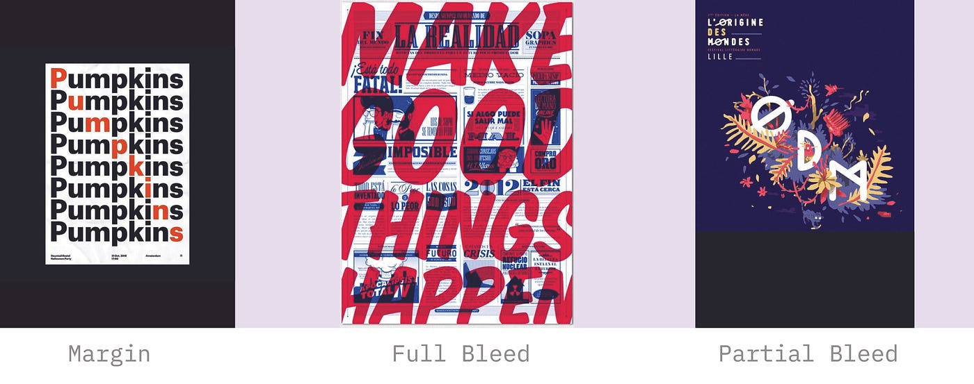
So think of a margin as a kind of protective border around the picture. It's a border that lets us see that picture as an object. It draws attention just by being empty A bleed is opposite A bleed goes right off the edges of the page and bring us more inside the picture Designer also use partial bleed where the some of the pictures go off the edge, but there is some way down over, left over that's really user its create space for text or caption
Cropping a photograph or making its bleed change its impact so framing its a part of graphics design. We crop a photograph, We place an image in space, We put a border around a text or around the picture
Hierarchy
The visual hierarchy gives order to information. Its allow to reader navigate complex content or to get a big idea quickly.
it is already a great experience hierarchy as a system where you only add signal you need them So express hierarchy in a surprising way not just in an obvious way
Girds
Girds are powerful to layout
They give structure to the page and they increase the efficiency of the design process. The basic gird has vertical columns and horizontal rows.
Designer use grids to generate pattern and shape the field of the grid can provide the basic structure for page layouts. A typography gird has more than just a column and row

It also has margins and gutters. As margin is the space around the edge of the layout and gutter are the space between block and content.
why are grids so important in layout design?
The Grids help the designer place in the size of the element and it also helpful for consistency over many pages

