Google Translate Application — Redesign ( iOS Application )
There was an incident involving the Malaysian Defense Ministry, who decided to use Google Translate to produce an English version of its official website. The English version of the website was soon taken down after several blatant mistakes went viral on Twitter and Facebook causing quite a bit of embarrassment. Among the more amusing mistranslations were details regarding the staff’s “ethical” dress code. For example, that women in the ministry should not wear “revealing clothes” was translated as “clothes that poke the eye,” a literal translation of the Malay phrase “pakaian yang menjolok mata.” But the most damaging translation error was the following sentence regarding the ministry’s history: “After the withdrawal of British army, the Malaysian Government take drastic measures to increase the level of any national security threat.”
The case study surrounds the redesign of a google translation app. We have several design thinking processes and a large number of UX laws based on which we can rethink the User flow and structuring of the application. For this case study, I have decided to follow the Double Diamond Strategy which removes bias from the stratification process and it is extremely helpful for a designer to focus too closely on a particular product or idea rather than keep our focus wide and our eyes open to ideas.

The use of this strategy will be done through several stages of the design thinking process. The design thinking process is the group of systematic methodologies that builds the ideation of the design concept for any application ensuring a seamless user experience journey for the user. We initially have several stages in this but I have briefly prioritized methods for my case study and grouped it under the category of the above-mentioned model.

Discover
- Competitor Analysis
- User Reviews
- Content Survey
Define
- Problem Statement
- Solution Statement
- The tone of the application
Develop
- Wireframes and Prototypes
Deliver
- High definition designs
- Workable prototype link
- Medium and Behance articles
Competitor Analysis
In this method, I have listed down the top 3 competitors for the Google Translation app and tried to analyze why are they doing better in the market or at least have that potential to function better for users.
We can always define the parameters based on which the competitor apps are doing by bifurcating their strengths and weaknesses.


After looking at several application reviews and several articles about why you should not use the Google Translator app and links that showed few better alternatives to this app helped me to conclude some of the major problems that were being repeatedly highlighted everywhere.
FYI, there are a lot more flaws one can come up with when it comes to design research but we as product designer, always have defined time constraints and really need to prioritize what is the need of that precious hour which can eventually make our stakeholders happy and achieve their confidence that the product is on the way for good . Hence, I have highlighted the top problems from the application and focused only on these problems and cut down the wide eyes of the designer ( that is what I am getting trained at currently ! )
Prioritize your problems, you cannot solve everything in one go.
Functional Cons
- Not ideal for confidential document translation — The application is free and cannot be relied upon when it comes to highly confidential document translation as it is a free translation platform.
- No accuracy guarantee — There is no way to report the error within the platform or some kind of guarantee to check if your translation is accurate concerning the source language literal meaning.
- Relying on back translation — Back translations are not a full-proof way to check the accuracy of the translation. In case the initial translations are wrong, does it helps the user by restoring them for future use?
- Not an ideal time saver — Interpreters cannot sit in a meeting and type everything they hear in the meeting and how hassle will it be if they try to communicate with multilingual clients. Also, there is no option to record any communication which they can check on later to run through the translation.
- Long Turnaround time — When it comes to long passages or voice messages to be translated, the translation time goes long and there is no way the user can analyze that as there is no showcase of the processing within the application except it directly jumps to the result page with or without accurate result.Want to reiterate, speak the whole thing again, please!


Problem: Communicating with the multilingual community is a priority when people travel outside their country for business or touring purposes, that is when they rely on translator application, however, google translator application is not yet far fetched about the translation quality. Hence people rely more on a professional translator when it comes to critical business communication. Adding to that time is a common constraint while traveling, not everyone has that much bandwidth to enter into the application and search through multiple options for quick translation for some kind of urgent information from a local passerby.
Solution: Provide a system to correct or report grammatical and translational errors to make the machine fluent in both the target and the source language. Adding to that, a more seamless flow within the application to enrich the user experience and save the user’s time who is trying to find a quick literal translation to phrase or words.
Tone: I need a translator app that provides me with high stake translation which saves my time from hunting down a literal meaning to an alien language word or phrases. Saves me money and time from hiring a professional translator.
Revised Flow
To suggest some defined design iterations I defined four major modules in the application and made them the major highlights within the application.
- Type Input
- Voice Input
- Camera Input
- Meet Input ( Additional Functionality Suggestion )
Type Input Flow
What I did I refer to before looking at current design?
- Human Interface Guidelines by Apple for iOS App on Navigation, Visual Designing and design parameters for each UI Components.
- A lot of Medium articles and research work on human touch space.
- Case studies on redesigning a home page for iOS Application.
What did I notice?
- Way too much clustering of icons that are doing the major navigations within the app.
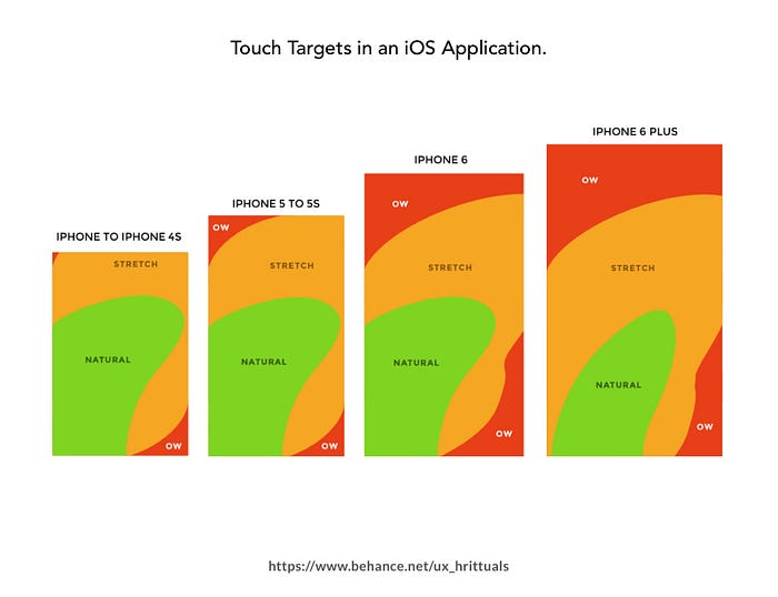
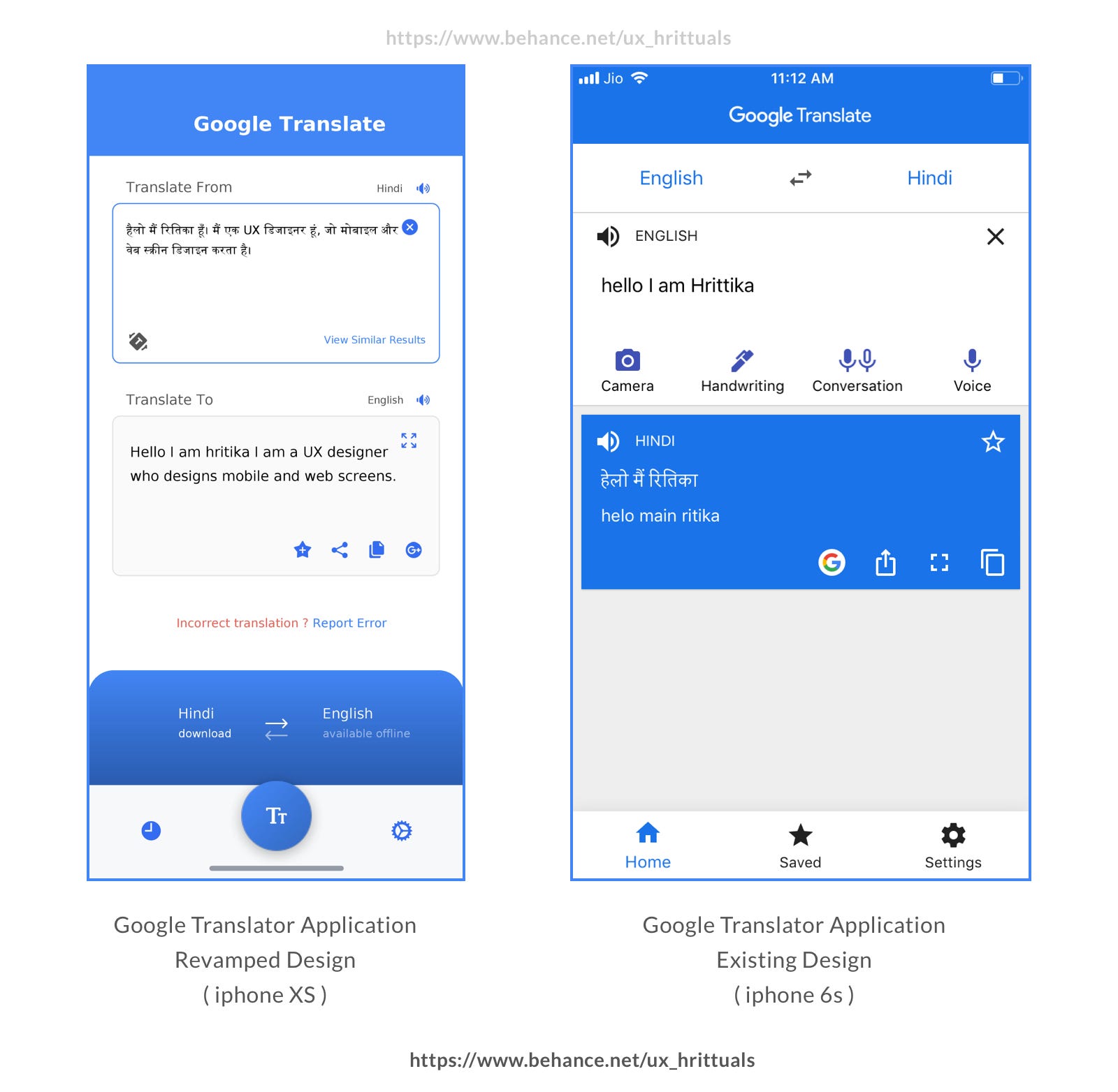
- When the user comes to the application, the language selection is the first thing a user will do which are placed at the top of the screen and slightly away from the human touch comfort zone.
- Few mismatches with color Gradients when it comes to icons within the application.
- Found difficulty in navigation from a text input to voice input and so forth.

What did I improvise and achieve through this?
( refer to final design flow at the bottom of this section to look at the below-mentioned changes )
- Easy Navigation — I have removed the four modules from the main focus of user input and enabled the selection through a one-tap button
- Icon sets and color — I have improvised the color grades of icons and made them of primary color with defined iOS glyph icon sets, the colors have been shifted to the primary blue color of google.
- Easy Selection — I have brought the selection of the language to the bottom section of the app, giving the user an easy and comfortable way to select the language.
- Removed Home Icon — I have removed the home icon, as the selection of language input goes generic at the bottom and hence the user is not needed to navigate to the home screen, every time he feels to change the input type.
- Added Report Error Section — Given the user a way to report grammatical and translational errors, so that the database could be enriched more in both source and the target languages at one time for better translation results.
Voice Input Flow
What I did I refer to before looking at current design?
- Voice User Interface Design Guidelines by Google Designers
- A lot of Medium articles and research work on voice user interfaces.
- Case studies on designing voice user interface for iOS Application.
- Usability heuristics for Voice Interfaces by Neilsen
- Voice interface technology and architecture.
What did I notice?
- Not enough communicative, while the application is processing or listening to data.
- Higher chances of error and less control of user on the voice interface.
- Color mismatch and red highlight representing some kind of error happening while the user is trying to speak something.
- It does not wait for the user to take a pause or add up thinking while he or she is speaking to the application which can be a tiresome process to speak continuously without a break in case it is a long conversation or phrase.

What did I improvise and achieve through this?
( refer to final design flow at the bottom of this section to look at the below-mentioned changes )
- Added application response — If the user is aware of what exact processes are going on while the machine is trying to listen and interpret the text while helping the user is not conducting any further action before the whole processing is actuate
- More power to the user — Emphasized on the tap gesture that will control the user to speak and see the translation based on his speed of speaking and also giving some time to the machine to process the whole set.
- Removed color variation — Removed the color variation and added animation to the microphone icon which will depict its current action along with text, easy for the user to understand as well.
- Unified Design — The language selection process, generic navigation, and bottom bar continue to remain consistent here without asking the user to go to some other view to select the language to change.
Meet Input Flow ( newly added feature suggestion )
This is complete new ideation which is currently not a part of the application flow but could be added as a new feature to the application to enhance the functionality of the application. The whole idea was drawn out after analyzing the problem statement and doing competitive analysis and learning about voice user interface designing.

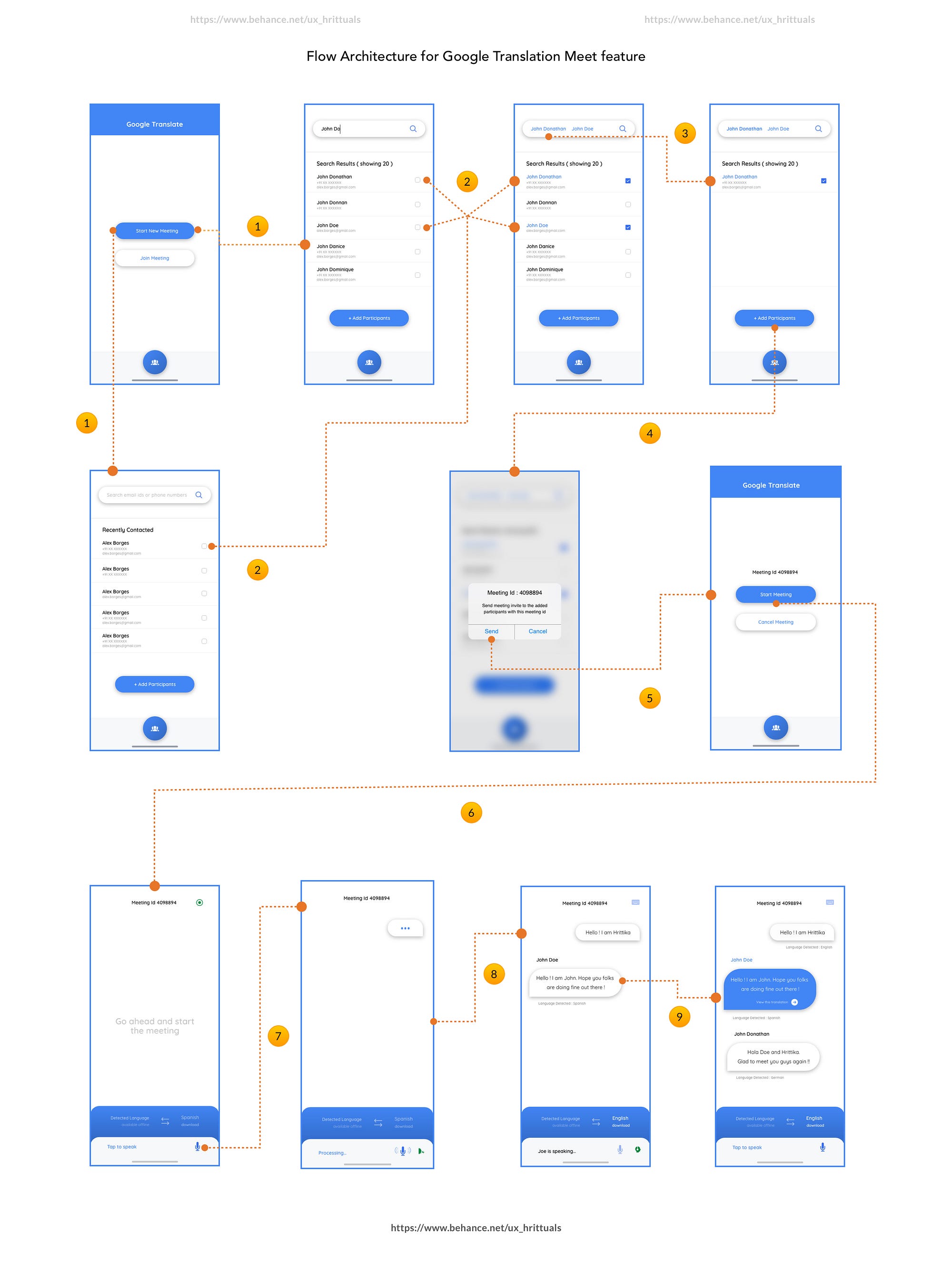
Add on feature for Google Translation Meet Flow
- User can easily communicate with more than one members of the chat room who speak multiple languages at one point in time.
- Restricting only one member to speak at a time that will allow the easy translation by the app.
- A seamless flow for the user to understand multiple languages, adding to the part that the user can save each translation from the chat application, in case he finds it useful for future use.
- Users can view the detected languages which means he or she will have an idea of dialects of other members in the chat.
- Live translation happens as the user enters the input either through or optional keypad option.
Final Design Set and Ideation Process Sneak Peeks

Meeting Flow for Google Translation App
https://www.youtube.com/watch?v=ksty1rxPmWQ
Voice Input for Google Translation App
Text Input Flow for Google Translator App
https://www.youtube.com/watch?v=68GmmvuqEFA
Thanks for patiently reading through. Now pretty please hit a clap if you liked the read. Also, don’t forget to comment on what you liked and did not like about the content !!
sources for this article :
1. https://www.languageconnections.com/blog/the-pros-cons-of-google-translate/
2. https://www.languageinsight.com/blog/2019/google-translate-avoid-using-it/
3. https://www.translateplus.com/blog/machine-vs-human-translation-pros-cons-use/

