Member-only story
Google and the Resurgence of Italian Design
Forget minimalism. Welcome to the era of expression.

Once upon a time, we had products that were colorful, in shapes that were quirky, whimsical, and expressive. Interesting! And then, almost every tech product became white, silver, gray, black, flat, square, round, and minimalist. Boring.
But there are hints that this is changing. And one of the leaders of this change is, somewhat improbably, Google.
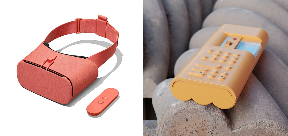
Anybody who’s been paying attention knows that Google has been pretty serious about hardware for a while, and at least as serious about doing quality design in hardware, software, and overall experiences. What fascinates me is the unexpectedly expressive direction the company has taken with its design language.


Google’s emerging design language (obviously still a work in progress) is reminiscent of the Italian branch of industrial design, which we haven’t seen much of in the last two or three decades. Instead, the German branch has dominated. It’s characterized by clean geometric shapes (cubes, cylinders), white and black glossy colors, and smooth unadorned surfaces. Think Bauhaus and — especially — Braun.
It’s a cliché at this point to draw parallels between Braun and Apple’s design languages. But nevertheless, aside from its own diversion into the more expressive realm of Italian-inspired design in the 2000s (original iMac, toilet-seat-shaped original iBook, etc.), Apple has hugely influenced other tech companies to follow the minimalist, German-flavored tradition.
This isn’t a knock against the Braun style — there are many beautiful products that have sprung from that well. It’s just that diversity is the spice of life, and tech products have become too much of a monoculture, stylistically. My former employer, frog design, helped set that minimalist course by creating Apple’s original “Snow White” design language back in the ’80s. So perhaps it’s only…
