Good Night Out: Tackling Harassment in Vancouver Nightlife
A case study in developing a cohesive UI identity for a first-of-a-kind mobile app

Team
UI: Nicole (Neeko) Colada, Vivian Lin
UX: Kevin Tam, Ali Saai
Role
UI Designer, Product Owner (Scrum Methodology)
Task
Working with UX designers, create an engaging mobile app for Good Night Out (GNO), an independent worldwide campaign that works with clubs, bars, pubs and venues to deal with, tackle and prevent harassment on nights out. Specifically, working with the Vancouver chapter to create a mobile app that helps users look through GNO certified and Non-GNO certified venues, to review and/or audit their experience while there, and/or make informed decisions on where to go for their night out.
This case study is UI focused; to learn more about the UX process, research and in depth findings, please refer to the case studies below:
Kevin: Project Link
Ali:
Neeko: Project Link
Project
Tools
Pencil sketching, Adobe Photoshop, Adobe Illustrator, Adobe InDesign, Sketch, InVision, Keynote
Overview
- Brief
- Primary Research
- Secondary Research
- Research Synthesis
- Ideation
- Visual Identity
- Outcome
Brief
The Problem
Harassment and sexual assault is prevalent in nightlife all around the world. Vancouver’s nightlife scene, abundant with nightclubs, dance clubs, bars and pubs, is rampant with stories of sexual assault and harassment — these stories and instances of harassment are becoming more and more normalized as part of the ‘night out experience’.
The Opportunity
Good Night Out (GNO) is an independent worldwide campaign that works with clubs, bars, pubs and venues to deal with, tackle and prevent harassment on nights out.
Participating spaces agree to display the GNO pledge on posters, which state:
We want you to have a good night out. If something or someone makes you feel uncomfortable, no matter how minor it may seem, you can report it to any member of staff and they will work with you to make sure it doesn’t have to ruin your night.
They also agree to get staff trained in the GNO approach, which can include specialist workshops direct from their pool of independent organizers.
Working with UX designers and North America’s first GNO chapter outside of England, the opportunity was to design a first-of-its-kind mobile app that would tackle harassment through a community based storytelling review platform. As well, become or light a fire to a movement or cultural shift for people to understand the extent of sexual assault’s role in cultural norms of our nightlife experience.
Key Functionality
- Go Explore — Explore and locate GNO certified and non GNO certified venues on a map via geotags
- Write Review — Review a venue based on a rating scale, and share their good/bad experiences with others
- Write Audit — Ability to audit a venue based on a rating scale where GNO pulls their data from
Target Audience
- Age: 19–35
- Female, LGBTQ, marginalized groups
- Interested in and wanting to see change in Vancouver nightlife
- Keywords: likes to have fun, energetic, social, loves life, empathetic
Primary Research
With my own firsthand experience in Vancouver nightlife as a young female, and in addition to casual conversations with family and friends, I already had assumptions and ideas of where the project could go. However, there were questions that I wanted answers to, and feelings that I feel should be explored and dissected for the art direction later on.
Some initial questions that arose included:
- Why are we creating this app? What is the exact why that we need in order to validate its existence?
- What is the app’s purpose — what is the minimum viable product needed to fulfill its core goal?
- What is the mood we want to evoke through this app?
- How can we tackle such a large and systemic issue that is so prevalent and engrained in current social and cultural norms?
20 Second Gut Test
With these questions in mind, Neeko and I conducted a 20 Second Gut Test with our two clients and founders of the GNO Vancouver chapter in our kick-off meeting. It was important to see if both their visions and goals for the project were aligned, and to help clarify the preferences, specifically aesthetic preferences later on in the project.
By showing 20 slides of varying websites (chosen for specific visual elements such as typography, colour and composition) for 20 seconds each, we were able to gage a ‘gut reaction’ to liking or disliking a certain website based on a quick 1–5 rating scale (1 being dislike and 5 being like).


We were ecstatic to see that their aesthetic preferences and visions were very similar, both in their rationale for picking a certain website and/or discarding it.
From the compiled sets of top websites, we quickly concluded there were a few key features or considerations we could take forward, iterate and test with users:
- Conveying a sense of integration, particularly seen with a minimal navigation bar that seemingly is part of a big hero image.
- Faded/transparent images that reflect almost a nostalgic feeling, a passing of light.
- Large images, less words. Language should be concise and impactful, sending a clear message quickly and efficiently.
- Adding a layer of fun to a topic that can become quite political and dark, and be engaging through thoughtful illustrations, not scare tactics.
- A sense of movement — nightlife is never still and thus, should be reflected in the app.
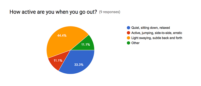
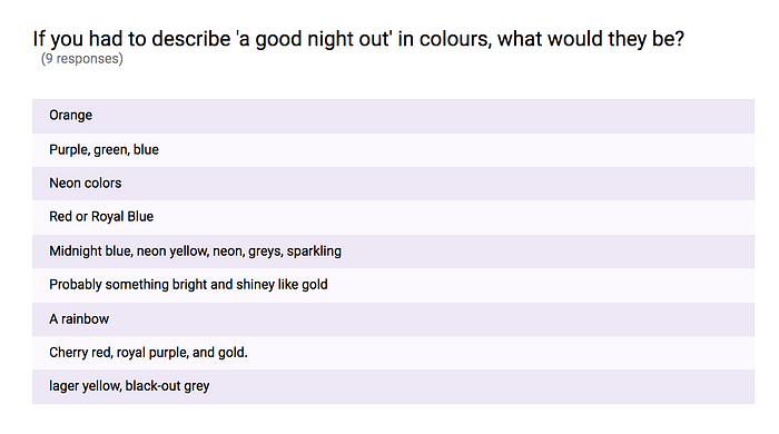
Surveys
While our UX counterparts worked on interviewing potential users of the app around their experiences in Vancouver nightlife, Neeko and I began working on an online survey to send out. The survey was heavily geared towards helping us bring forward more abstract compilations of feelings, colours, shapes and movement — tailoring a visual language that we can use to explore in our moodboards.
Our questions were intentionally direct and often focused around word associations, to really push the user into thinking critically and creatively. Some findings included:
Secondary Research
With a better understanding of what possible users are looking for/want to feel, we began gathering pictures for possible art directions using varying keywords.
Keywords: confetti, fun, party, night, light, city, transparent, faded, maps, explore, fresh, playful etc.
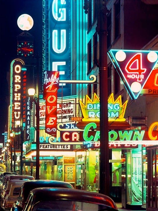
While researching, pictures of neon lights began appearing which in turn, got us thinking: what is it about neon lights? Why are they synonymous to nightlife?
Neon Signage: A History of Vancouver Nightlife
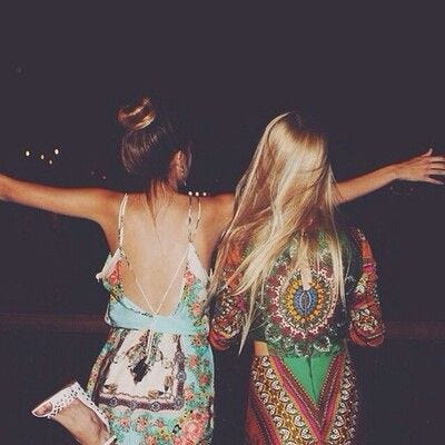
Imagine that you’re going out with a good group of friends — you’re walking down the streets, laughing, smiling, looking up at the buildings all around you.
There’s lights everywhere, and as you walk into the club, the light buzz of neon becomes almost an amalgamation of all your feelings. A light buzzing, a subtle sway — euphoria.
Neon lights (in Vancouver’s history) is what makes Granville street distinctive, but also, a reminder of Vancouver’s history in nightlife, culture and the arts. We often forget that neon lights were even a thing for Vancouver; with the remaining lights that still exist within the city, it becomes a symbol of Vancouver’s arts and culture that we can hold onto — something we thought we could bring forward as an ode and a nod to to the future.
However, neon lights are also often perceived as ‘retro’ and a ‘relic of the past’; so how can we utilize neon in our design, to effectively communicate the rich history Vancouver has built, but also, be aligned with today’s idea of contemporary nightlife?
Research Synthesis
Taking in both UX and UI surveys, interviews and secondary research, we were able to arrange and condense our findings into an affinity diagram.

After sorting our clusters, we had four key findings:
- Women often dismiss reporting incidents. Many women felt that many incidents were too ‘minor’ to report, and didn’t want to bother staff for something that had become so normalized.
- Staff makes a difference. Many people often were intimidated by staff members, or felt that they didn’t care — and if they didn’t care, what was the point of asking for help?
- Women are more aware of their surroundings and are willing to help. Many female interviewees reported that if they saw another woman in distress, they would pull them away or use other tactics to rescue them for an uncomfortable situation.
- We are creatures of habit. Even if we’ve had a bad experience at a certain venue, we often find ourselves returning due to external reasons (e.g. a certain DJ is playing).

With these key findings, Neeko and I were also able to create our own UI focused affinity diagram, helping us form two possible art directions. By doing this, we were able to succinctly organize and form our design rationales for later on, as well as open up new keywords to explore.
The two directions that were resulted were very much so on opposite ends of the spectrum:
- The first direction revolved around the idea of having fun. There’s a sense of playfulness, of flashing lights and high energy.
- The second was more on the idea of a slow, light swaying — a nostalgic feelings, a reverie.
Ideation
Moodboard
Moving forward, we decided it was best if we both tried our hands at creating one moodboard for each direction.


As I began creating the moodboards however, I began changing and integrating certain elements with the different directions.
Moodboard A, Nostalgic Nights, was a play on the second direction, focusing on nostalgia through faded/muted colour palettes and washed out photos. I wanted to convey a sense of after-hours euphoria, the idea of the night ending, but the happy memories still continuing.
With Moodboard B, Sunday Funday, I wanted to create a visual contrast to Nostalgic Nights, by heavily focusing on confetti being a symbol for fun. Bright colours dominated the moodboard to showcase the playfulness and create a sense of celebration.

While the two moodboards each evoked the sensations and feelings I wanted, I challenged myself to create a more integrated moodboard that would be both fun and celebratory, nostalgic and dream-like. The above was aptly named Sunday Reverie and became the basis for my style tile.
Style Tile
To communicate the two proposed art directions for GNO, Neeko and I created one style tile each. While Neeko worked on a darker, neon inspired style tile that focused on the idea of ‘being in the moment, in the present’, I worked on the idea of the morning after — Sunday Reverie.
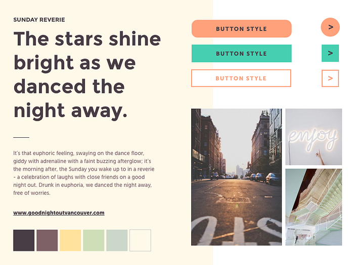
Sunday Reverie was about the euphoric feeling, the swaying on the dance floor, the giddiness that comes with the adrenaline rush and the faint buzzing afterglow. It’s the epitome of the morning after, the Sunday you wake up to in a reverie — a celebration of laughs with close friends on a good night out.
Faded, light images were chosen to convey that and the pastel colour palette was infused to reflect the sparkles of the morning light and memories of neon lights.
As expected, our clients wanted the best of both worlds — the idea of of a darker palette, accented with pastel neons, but still retaining that nostalgic feel.
Visual Identity
Style Guide
Thus, we created a new style tile and a style guide, aptly named Dusk Till Dawn. This new art direction is a summation of a good experience of a night out; a good night doesn’t end at the venue, but rather, it continues with the memories retained.
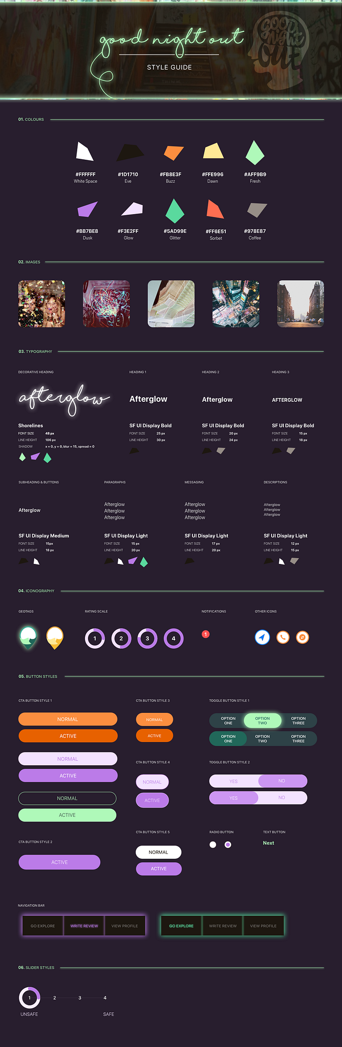
To ensure that the darker background and images retain the qualities of ‘fun’ and ‘celebratory’, we brought forth the idea of using confetti.
Aside from the colours itself, we decided to use the geometric confetti shapes as a visual element that can be used throughout the app, as both a decorative element and a functional one. This adds a level of complexity but also, uniqueness to an app that could very much well be focused on the darker aspect of emotions. In addition, it becomes a motif for ‘a night out’ — each night out is uniquely different and never the same, and we wanted to showcase that through a bit of flair.
The decorative header typeface, Shorelines, was carefully chosen for its legibility but also its shape. Adding an a shadow effect in Sketch, we were able to emulate neon lights, creating a visual hierarchy amidst a dark background. We then chose SF UI Display as the font pairing, to retain legibility but also, strike the perfect balance between modern and nostalgia.
Another important thing to note was our choice of our main call to action (CTA) button colour — orange. With the rest of the colour palette being relatively similar in tone, we felt that orange would be the right colour to emphasize a call to action and stand out. Orange was also a relatively neutral colour in comparison with red or green — which people could mistake for good or bad.
Geotags
With certification being an important aspect of the whole design and its purpose, we began to seek out ways to represent geotags in a different way — we needed to users to easily recognize the geotags as something being uniquely GNO, but also, see the difference in which venues were GNO certified and which venues weren’t.


Using a template, we each sketched out various shapes and forms, playing with the idea of confetti, the idea of movement and the idea of infusing neon tubing into the icon itself.
Rating Scale & Sliders
One of the hardest hurdles we overcame, was creating a rating scale and accompanying slider. The rating system, heavily used throughout the app, had to be easily recognizable but also tie in with the brand’s celebratory side.
Orange was already heavily used as a CTA button, and with the mint glowing green becoming GNO’s main brand colour, we decided to use purple — a neutral colour that also spoke to the LGBTQ community.
Through continuous testing, we decided to keep the rating scale in a circular form as it was something people were already used to and accustomed to.
Outcome
The outcome is a click-through prototype that culminates countless hours of research, iterations and testing. The GNO prototype evokes the fun, but also, brings forth a serious issue through the building of a community.
I was in charge of creating the Onboarding, Explore and Profile screens for the app. Below are the onboarding screens; we wanted to ensure that users were properly introduced the unique geotags and rating system before using the app, to make sure that they have the best possible experience. The confetti shapes were used in the screens as both a visual background element and as a fun progress bar, but also, to set up expectations for the its usage later on in the app.


The Explore section’s focus was on the map and certifications. Thus, I made the map darker, to allow the geotags to shine bright but also, reflect the nightlife, the environment/setting the app would be used in.


Lastly, the Profile screens showcased various links to other parts of the app.
The first part shows the reviews the user has written, with the ratings given. A prompt is given via CTA button to write more reviews.
Following the review section, the user can see an audit section; this gives users a choice to go back and reflect on their reviews, before focusing their efforts on finishing the longer audit form. Users can save and continue their progress.
Another aspect of the profile page, was to have a section for messages. This gives GNO a chance to thank their users, but also, send gifts or rewards for completion of reviews/audits and encourages users to continue doing them and creating a large and useful database of venue information.
Overall, with Neeko’s prototypes, we were able to create a visually pleasing mobile app that flowed smoothly and easily fit in with the user’s night out experience (where they would use it etc.)
Conclusion
Infusing a sense of fun and celebration within an app focused on tackling harassment was indeed a challenge — but very rewarding.
Our clients were pleased with the results, and have asked us to continue working with them to further develop the app with App Dev students. Stay tuned for more details!

