
Golden Ratio : What It Is And Why Should You Use It In Design
What is all the fuss about the famous golden ratio? Why is it that whenever you lookup for Golden Ratio, all you find is an image that looks like one above. Why are structures or patterns in golden ratio perceived to be aesthetically pleasing? Is there something more to golden ratio than we know of? If you also share this intrigue, let us break it down and try to understand what golden ratio is and why should it be of an importance to us as designers?
What is Golden Ratio?
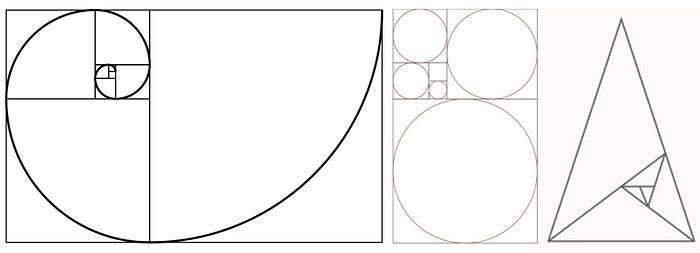
Mathematically speaking, two quantities are in the Golden Ratio if their ratio is the same as the ratio of their sum to the larger of the two quantities. Referring the image below, a/b is the golden ratio.

What is the value and how was it deduced?
That’s correct! 1.618, mathematically irrational number is interestingly considered to be the golden ratio, golden mean, divine proportion and many other names that golden ratio is associated with. What is more interesting than the value is the discovery of the value.
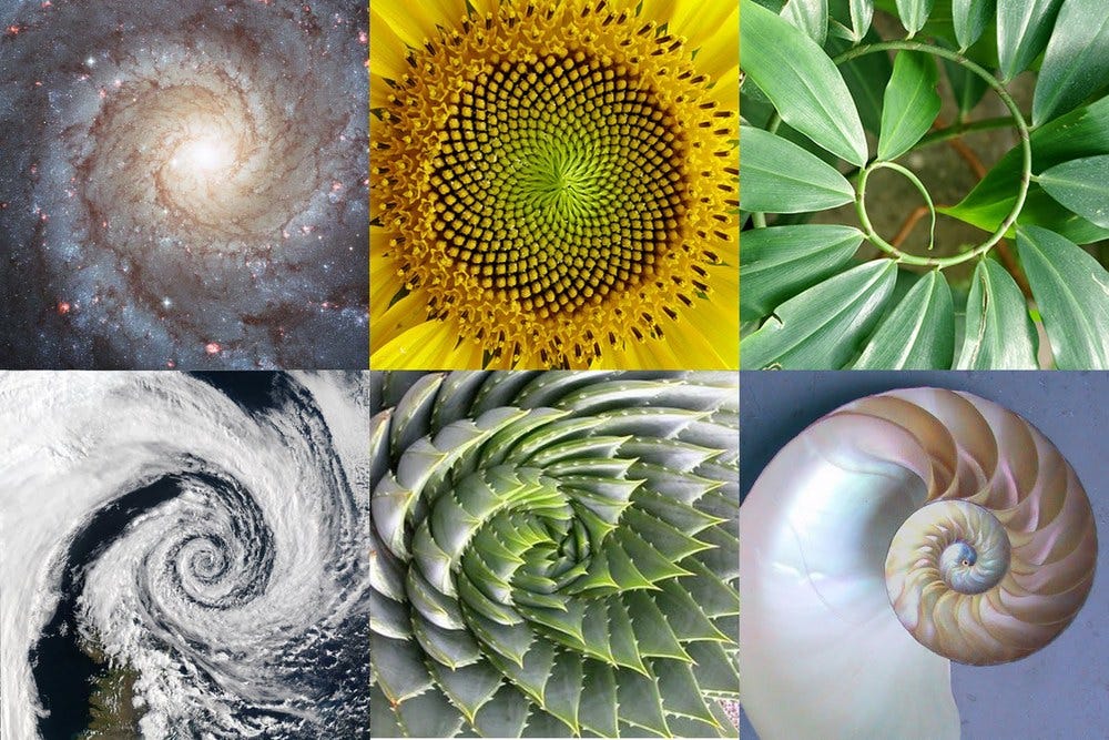
Centuries back, genius minds started observing patterns in the beautiful nature around themselves; From the leaf arrangement in plants, to the pattern of the florets of a flower, the bracts of a pinecone, or the scales of a pineapple; everything had the same pattern. And the arrangement goes 1, 2, 3, 5, 8,13, 21, 34 and so on. Voila! The Fibonacci. When you start calculating ratio of fibonacci number with its previous fibonacci number, we end up with something like 1.61803… an irrational number rounded up to 3 decimal places 1.618 which is the golden ratio we read about.
What was naturally pleasing to the eyes, this number was then used in creating proportions for architectures, paintings, sculptures, photography, design etc.

Golden Ratio and Designers
Golden Ratio finds huge application in print design like : posters, marketing materials, visiting cards etc. This discussion revolves more around the how can we use golden ratio effectively in our work as user interface designers. Lets find out.
1. Golden Shapes for use
The most used golden shapes in design are Golden Rectangles, Golden Circles, Golden Spiral and Golden Triangles. Many a times, these are used in combination to create mesmerising design compositions. If you are a complete beginner, I urge you to go through tutorials online to understand how to create the golden shapes.
2. Setting Layout dimensions with Golden Ratio
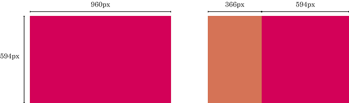
Layout in web or graphic design is used to arrange visual elements on a page. It involves organising the art composition to achieve specific communication objectives. Golden Ratio can be used here to define the widths of panels, sidebars or even height of the views. For example, layout of width 960px. Dividing this by 1.618 approximately gives us 594px (593.325..) which can very well be defined as the height of your view. Two separate sections can also be made of sizes 594px and 366px(960–594) which can form two sections page layout. We can go further dividing the space in golden mean to achieve more grids.
Defining the height of any view is very prominent in Graphic design as compared to Web design since content is the factor that decides the height of the page in web design.
3. Defining spacing between content using Golden Ratio
Many a times, we go by standard padding and margin to define the gutters and spacing between the content blocks irrespective of what the layout sizes are. Management of these positive spaces or negative spaces often make or break the final result. However, one can make use of golden rectangles to ensure that the inter-layout spaces are proportional and calculated.
“Tip : Use larger squares like unit 8 and 13 to define layouts. Use smaller squares of unit 1, 2 or 3 to define gutters and content spacing”
4. Using Golden Ratio in Typography
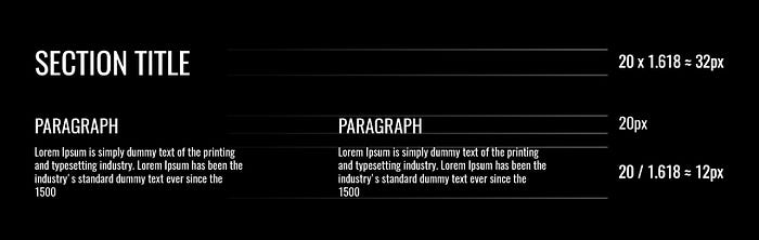
If you have a hard time figuring out the sizes of different text hierarchies in your design composition, you can use golden ratio as a guide to determine the best size for each of them. Let us say body text is 10px. Multiplying it by 1.618 you have 16.18. The heading text size can be 16px. If you have a title of size 24px and are wondering what is the best size for body text, that’s correct! Divide it by 1.618, which comes 14.83 which you can round up to 15px or 14px. Here you go! Using golden ratio simplifies the decision in determining the sizes for text hierarchy.
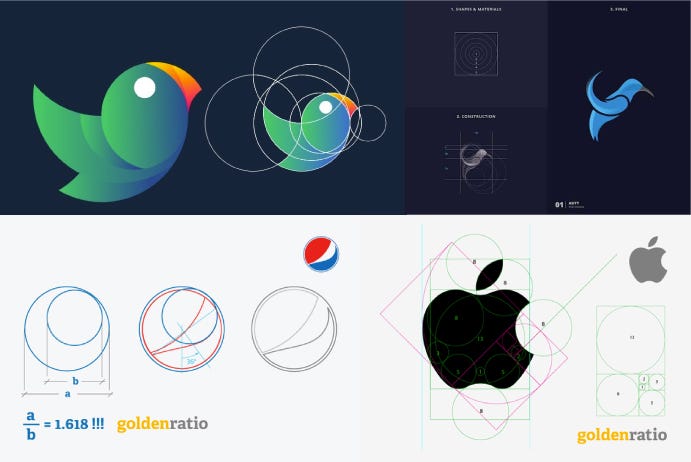
5. Icon/Logo design using Golden Ratio
Golden Shapes like triangles, squares, circles and spirals are widely used while designing an icon or logo. Proper use of the golden shapes can harness a proper balance and can turn a good design to a great one. We will not get into a lot of details of this section since this entirely is a larger section in its own. However, below are some examples of using golden ratio in icons and logos.
Conclusion
Mathematically golden ratio is an irrational number, which means we can never achieve it perfectly in design; a debate going on forever.
Takeaway for designers is, use of golden ratio is not something that will make or break your designs. Not every design composition can be derived using golden ratio. If needed, it must be used as a guide to create proportions in our design. Use of golden ratio in design needs a lot of understanding and practice to perfect it. Golden Ratio is thus one more useful tool that should be there in designer’s toolbox.
“Use of golden ratio in artistic composition brings in a natural balance and visual harmony”
However, since these are the patterns that exist in very nature around us, use of golden ratio in artistic composition brings in a natural balance and visual harmony, thereby giving an undeniable aesthetic appeal.
There is a lot that to Golden ratio and cannot be put together in 5–6 minute read. Do let me know what you think about the golden ratio and how you use it while designing for digital and print. Let us together make the Golden Ratio easy to understand and effective to use.
Thank you for reading. Claps to appreciate!

