Member-only story
Getting it right: why infographics are not the same as data visualizations
A rundown on the key differences and ideas for when to use each
Both infographics and data visualizations are tools used to visually represent data. Oftentimes, I’ve heard people (understandably) mix the two terms up. Some people talk about making graphs and charts visually appealing and call it an “infographic.” Others will put together a subjective visual with only key information and call it a “data visualization.”
So here’s the difference.
Infographics tell a premeditated story to guide the audience to conclusions (subjective). Data visualizations let the audience draw their own conclusions (objective).
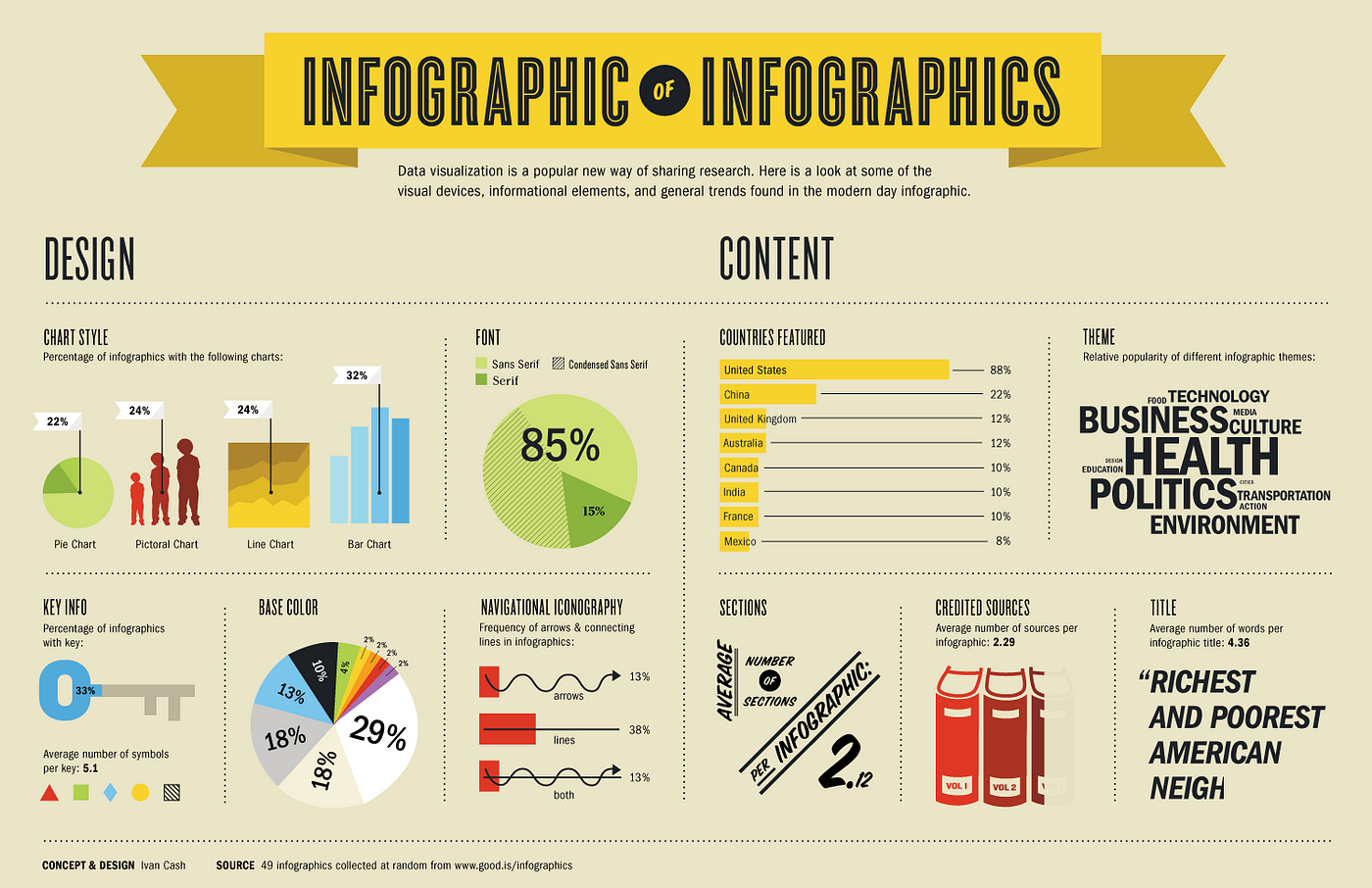
Infographics
Infographics are visual representations of facts, events or numbers that reflect patterns and align to a story. Infographics are:
- Best for telling a premeditated story and offer subjectivity
- Best for guiding the audience to conclusions and point out relationships
- Created manually for one specific dataset
Data visualizations
Data visualizations are visual representation of data abstracted into a schematic form so that the audience can more easily process the information and get a clear idea about the data at a glance. Data visualizations are:
- Best for allowing the audience to draw their own conclusions, and offer objectivity
- Ideal for understanding data at a glance
- Automatically generated for arbitrary datasets
An infographic can contain data visualizations but not the other way around.
When should I use what?
Picking the right choice will help you get across your message or information…