Punctuation in Design: Design Implication of Full Stop in Headers.
Ever had trouble with choosing to use a full stop at the end of a copy (or header) in your design?
As small, and seemingly insignificant, as they may be, Full Stops (.) have a profound impact on our conversations and the way readers perceive our messages. There are many studies backed by science, carried out to measure the effect of punctuation in textual conversations. Here’s one article I found that guilt-tripped me — “…ending a text with full stop makes you a monster”. Like, really?! Anyway, that’s a story for another day.
What even tripped me more was Google Search’s definition of ‘Full Stop’
Full stop: used to suggest that there is nothing more to say on a topic.
Full stops are an integral part of written communication, and they add meaning to it. Imagine you read this article without one full stop. You’d probably sound like R2D2 (Oh, I dare you to listen to this). But jokes apart, it is nearly impossible for you to understand long texts that have many sentences without full stops separating them. There is no overemphasizing its power. However, it gets a bit tricky when it comes to short sentences, phrases, captions and copies. Full stops may literally represent the end of a sentence, or a grammatical pause. In UX writing (which is where I am going with all these), they represent a ‘mic drop’ for headers, and you had better dropped the mic when you use them.
In design, the use of full stops in headers is almost always intentional. The way they are used can either enhance or mar the UX of your application or product, making them a powerful element in your design. They have as much significance as other design elements like drop shadows, rounded edges and gradients, and thus should not be underestimated.
So, how best to use them in design? And, when is it not a blunder?
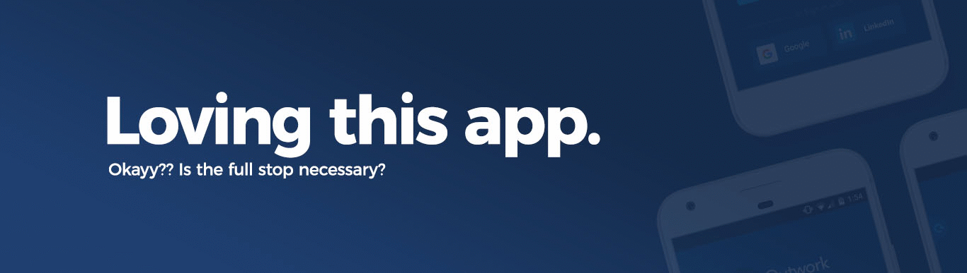
- With strong, short phrases and statements: See how Apple intentionally used full stops on headers in their landing page for the iPhone X.


Imagine these phrases without the full stops. It may not hurt, but you’ll notice the difference.
- For clarity, precision and emphasis: Compare these two screenshots from Etch’s site.

Notice the difference? Believe me, it’s not only the bold text that does the job.
- Sometimes, to separate words distinctively: Again, for emphasis, you may use full stops instead of commas to separate words distinctively. See how InVision (my favorite app, of course) used it.

In InVision’s case, each of the words (or phrase) meant something powerful, hence, the separation using full stops.
- Other times, it’s just brand guidelines: Some brands insist on using full stops with their headers or copies, as part of their design guidelines regardless of whether it’s just a word, phrase or sentence. You may take a cue from there.


In conclusion, full stops are not just dots. They have meaning, they have purpose, and they are powerful, enough to help in delivering messages in small bits, deliberately.
Use full stops wisely.
Drops mic.

