FTUE (First Time User Experience) to Rule The World

Lets face it, at some point of time, you’ve found yourself ‘lost’ inside a complicated application which has a crappy FTUE (first time user experience). FTUE is the way the user interacts with the app and the app interacts with the user for the first time. It could be right when you’ve registered to a service or have freshly installed an app. Music apps like Spotify provide a great FTUE since it asks for your music preferences and shows you content related to your selection. I’ve created a UI for an app inspired by that concept. ( FTUE could mean a lot of different things based on what kind of relationship the app wants to have with the user, I’ll explain later what this means )
Don’t Overdo The First Impression
A lot of designers and developers know the importance of a first impression, but how much is too much? There is a thin line between ‘impressing the user’ and ‘teasing him, only to later let him down’. I’ve taken an example of a mistake I made with one of my designs, down below :

Now, I’ve used a combination of bright, almost pastel colors for the gradients, to represent each category. However, as I move to the next step in that app, I’ve started using pictures and a constant gradient overlay all throughout. I tried to gain attention from the user on the first page, but lost his attention straight after.
Try to go from a decent User Experience to a more interesting one, rather than the other way around. You should opt for an approach where you make a good first impression and slowly keep increasing the level of interest the user has in your application/website. This definitely improves user retention and actually gives you a solid set of loyal users over time.
It’s Not Only About Fancy Onboarding
I could ask you to follow me on Medium, but would you actually follow me if you find my profile doesn’t appeal to you. A Similar concept has crawled up into the UX design world, where designers concentrate on explaining what their app or service is all about, but attractive onboarding illustrations ( like the one below ) will only familiarize and not help kickstart the user’s understanding of the app’s function.
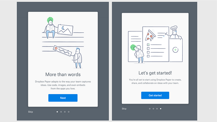
Interesting illustrations, but unless you read the ‘fine print’ , you wont understand what the illustrations are trying to tell you. Its always better to be somewhat discrete with the user, as to what you have to offer to them as a service or app. I personally like Dropbox Carousel’s onboarding screens :

Finding harmony between fancy illustrations/animations and being straightforward with explaining functionality is tricky, but really worth the work.
Bribing the Users
Stop with the all the rants against companies bribing it’s customers to gain their trust. It works! Everybody loves free stuff. If you feel giving out free in app purchases to the users, to make them like your service more, then go ahead and do it. You see a lot of games following this very practice. When the user first signs up for the game, he/she gets free coins or whatever the currency may be. The very first tutorial awards the player with ‘materials’ and/or ‘weapons’ to build the player’s interest. Heck! I remember getting free 100GB of Google Drive space for 2 years when I bought an HTC smartphone a year back. That actually got me using Google Drive more. I am living proof that free stuff means better user retention.
Decide What Relationship You Want the User to Have With The App
Every application comes in handy to it’s users at different points of time and for different reasons. For a business, an app like Instagram might be a tool to sell his goods or services online, since that’s the case, a photo sharing app becomes a business tool. Instagram actually gives a neat set of tools for businesses like analytical information and way to promote a post. So clearly putting down the possible relationships a user can form with the app really helps the app to have a wider user base across a wider demographic.
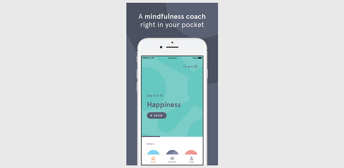
Here’s a cool example. Headspace acts as your meditation coach which is helping you learn and be better at guided meditation. ( I know because I use this app myself ) It clears out what relationship it is establishing with you as a user and what it seeks to accomplish, a great approach to user
These were my Mantras for a killer FTUE. If you liked this writeup, then FOLLOW ME and maybe even DONATE! so that I keep on writing :)
This story is published in Noteworthy, where 10,000+ readers come every day to learn about the people & ideas shaping the products we love.
Follow our publication to see more product & design stories featured by the Journal team.