Sketch & Figma Tutorial
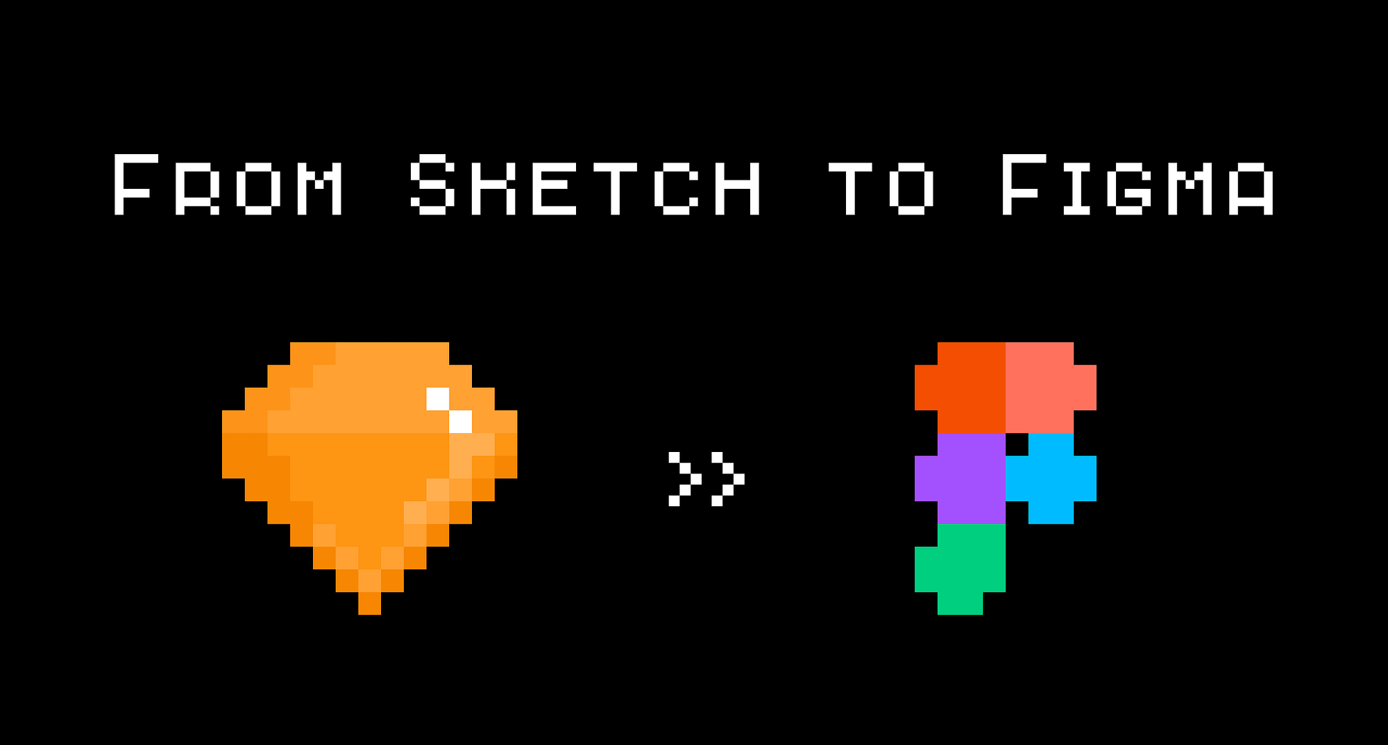
From Sketch To Figma
Tips and tricks on transferring a design kit from Sketch to Figma.
This guide is made due to a loud trend among product teams and designers, a transition from Sketch to Figma.
In this article, I want to highlight the common pitfalls and uncover several tips on how to seamlessly transfer your precious design assets from one excellent design tool to another.
This article is brought to you by Frames X Design.
Explore the largest design system in the world and level up your design toolkit!
This article is brought to you by Buninux.com 🤘
Check out the latest project I’ve been working on, called Slice — it’s a super cool and useful design system for Sketch and Figma.
Why these tools? 🛠️
Sketch and Figma are great for creating UI and organizing components libraries. Both tools have parallel functionality, yet they use a different approach to perform operations on canvas objects and styles.
Both have earned design community respect, and follow a similar feature roadmap, with each of tools having its lacks and power features.
The most crucial part — is that Sketch and Figma invest enormous efforts to cover the needs of modern designers by providing a better environment for digital asset creation and management.
Why do you need to Switch? 🤷♂️
You may want to perform the switch for several different reasons:
- You are looking for real-time collaboration features, which still can not be found in Sketch.
- You are curious and want to get used to Figma without losing your precious brand assets.
- You have to work directly with both tools. Something can be better done in Sketch and something in Figma.
How to do it the right way? 👨🔬
Figma provides the best import for Sketch documents among its other competitors from Studio, Adobe XD or Framer, converting Symbols into Components while saving the connection between the parent and child instances, making the shift of high-scaled files actually possible.
However, the transition requires you to know some of the fundamental distinctions of each application. So we will discuss them as well as tricks to overcome the pain points and switch as sleek as possible.
So let’s start!
Guide notes
- 💅 Styles before components.
- 📝 Components checklist.
- 🔗 Relinking styles.
- 💭 Conclusion.
1. Styles before components
To avoid the typical mistake and save yourself from hours of hunting down duplicated colors and text props, we will first recreate the heart of each kit — Layer and Text styles.
Step 1.
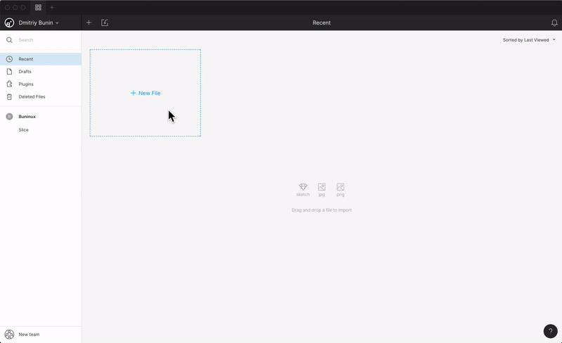
Open Figma, and import the document containing all of your brand assets.
Step 2.
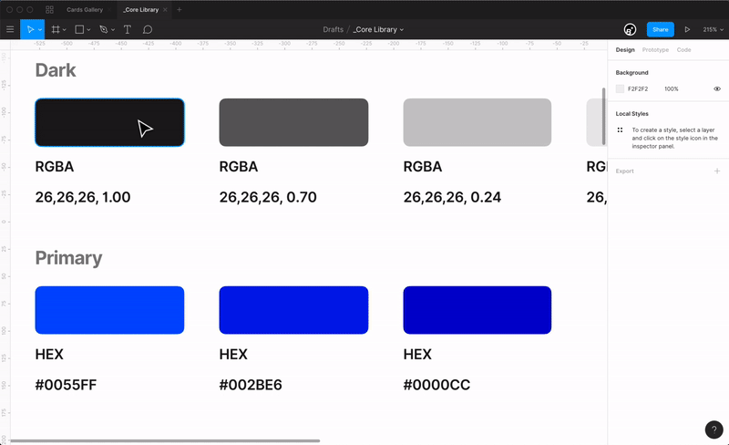
Create Layer styles based on the imported properties.
Figma does not convert the styles, so you will need to recreate them manually. The overall flow of creating Layer and Text styles is the same as in Sketch. You simply use the forward slash / in the names to group styles in a right-aligned popover panel which makes them accessible through the documents.
Step 3.
Create Text styles.
In Figma, you don’t have to create additional styles for color or alignment. Colors can be applied to Text Styles, and alignment can be adjusted right inside the instance, so don’t bother yourself duplicating the styles.

Note: While using Figma in the browser, you will not be able to use locally installed fonts. So be sure to download and install the Font Helper in order to make them available.
Step 4.
Compare the resulted style panels while getting used to a new look of your tools. Make sure everything is in its place and nicely arranged. 👌

Pro-Tip
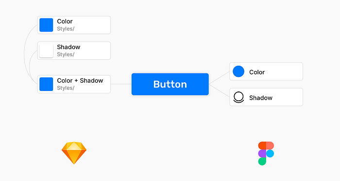
Properties in Figma, such as Color, Shadow, etc., can be applied separately to a single layer, without the need of combining them into a new style. This feature keeps your style guide cleaner, leaving all unnecessary style combinations in Sketch.
Here’s a quick example. See how both tools handle a simple task of creating a button with a shadow using a single layer:
If you don’t have the time to recreate all those styles, we have prepared this Style Guide to give your project a start and help better understand the main distinctions between Sketch and Figma file organization.
👉 Get Slice Design Kit
2. Components checklist.
After the styles, let’s proceed with the rest of the project.
Locate the converted master components and make the following steps to ensure your building blocks are entirely functional.
Remove unused components (ex-symbols)
While using Sketch, you can end up making symbols to define a border-radius or a specific geometry for your components, and usually, are called Shape or Material symbols.
In Figma, you don’t need them. Instead, you are free to control the radius of any component or instance right in place. So be sure to remove all unused elements and rename Symbols page to Components to not confuse.

Update constrains
Constraints in Figma work a little differently, so to bring back the familiar behavior, you will first need to get used to the Frame concept.
I highly recommend you check out the official blog and learn more on that topic to properly update your components or even improve their behavior.
Update background-color
You can notice that some components look different from what they do look in Sketch. It mostly happens because Figma containers have no white background by default. Instead, Figma will translate the background color of the imported artboard/symbol as a bottom color of the Frame.
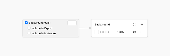
To make your designs look as same awesome as in Sketch, be sure, to adjust the Figma canvas color (Yes, it’s adjustable!), or the component frames itself.
Update component names
Names in Sketch may contain . or _ symbols, which are often used to prioritize list items and place a particular component/style at the top of the menu.
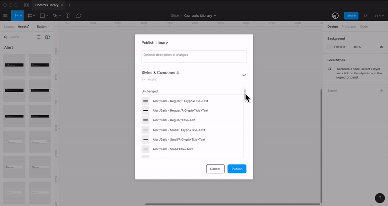
Figma also uses these symbols, but instead, for excluding components from the Library, which means that elements containing these prefixes will not be available from other documents. To solve it, and ensure your assets are accessible to everyone. Use cmd+r to invoke the Rename menu and quickly change names by removing unnecessary punctuation.
You can also enable a component that is not included, by scrolling down the Publish Library window and right-click on the item to add it.
Pro Tip: To get more confident with Figma components, you will need to learn the basics of assembling them without imported assets. And to get used quickly you can check this mini-tutorial — Working with Figma Button Components. 😉
3. Relinking styles
After you have brought assets to a decent look, it’s time to relink them with styles. To make this task as convenient as possible, you will need to perform a sequence of actions for selecting similar layers and linking them with styles.
Figma provides a native solution for this use-case. To access it, open the Edit menu and choose one of the Select all with the Same commands to bind your selection with a corresponding style.
You can also use a recently released plugin — Similayer, which can provide a wider set of commands to hunt down the needed layers. 🕵
And it’s done. Make sure all your master components have styles attached and double-check the transitioned document before showing it to the public. Now you can go and try out your new t̶o̶y̶s̶ tools and tell about that on Twitter. 😌
Conclusion
The transition from one design space to another is not that great achievement, and only requires the right composition and a bit of manual work on reconfiguring the assets.
It’s nice to watch software rivalry as a product designer. But the game of tools is a constantly shifting space. And, I believe that many of those who have switched to Figma may come back to Sketch once again. Mainly because the job does not require a designer to master a particular tool; instead, the designer only needs to effectively use one or another its functionality depending on the situation and task.
And, to better facilitate the tasks of modern designers in this constantly-changing world. We with my friends Roman Banks and Todor Iliev have developed Slice — a Modular Design System which combines the functionality and power of both Sketch and Figma. Check it out.👇
Before you leave:
- Download Style Guide to get your project started.
- Check out more awesome UI resources.
- Find me on Twitter and Dribbble.

