
From Design To iOS7 Prototype
Last weekend, I participated in the AngelHack Hong Kong with a team of engineers. It was a fantastic experience. After much discussion, we came up with the idea to build a simple, location-based chat app called Ripple.

The Problem To Solve
When we sat together that day, we came accross a pretty daunting experience in sharing our workflow and ideas to each other. I never worked with most of the engineers there before. There was no easy way to quickly set up a group chat. We had to rely on one of the messaging tools: Facebook, Skype or WhatsApp. Ultimately, we chose Facebook. The horrible experience started with having to find each other’s Facebook and set up a group chat. That endeavour itself required a lot of communication in real life. After about 5 minutes of browsing the site prolonged by another 5 minutes of multi-tasking and lag in communication, we were set. That’s 9 minutes 55 seconds too much.
Alternatively, we could have used Skype, but nobody in Hong Kong uses it, and WhatsApp, while being hugely popular in HK, requires that you share your phone number or email. People have trouble typing an email address. They also hesitate to share their phone number with people they’ve just met. And all of those tools had one problem in common: they require a long signup process for any new user to the platform. If you’re not already on the network, you don’t feel compelled to signup in the midst of a spontaneous conversation.
So we set out to create the shortest signup and the simplest chatting experience. Our goal was to allow any person to chat with people nearby in less than 5 seconds after they download the App.
Designing For iOS7
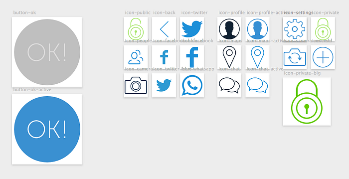
This was my first time designing for iOS7. But I quickly picked up the style since it’s all focused on naked colors, beautiful icons and typography. The first thing I did was to select the blue color for Ripple. Then, as I wanted to add some depth and play with color combinations, I simply downloaded a few backgrounds and blurred them to see how they would harmonize with the blue. For the font, I settled on Museo Sans. As for the icons, I thought PixelLove was fitting for the iOS7 design language.

It’s been almost a year that I’ve been using Sketch now and I’m happy to say that it has cut my design execution in half, allowing me to spend more time on animations and the functional aspects. I’ve also had more time to spend on actual engineering lately (which I’ll share soon enough). I’ve been using Artboards increasingly for its useful presets for iOS screens and icons. The Sketch Mirror feature allowed me to quickly view my designs on my iPhone and swipe through screens (Artboards).
The Signup Screen
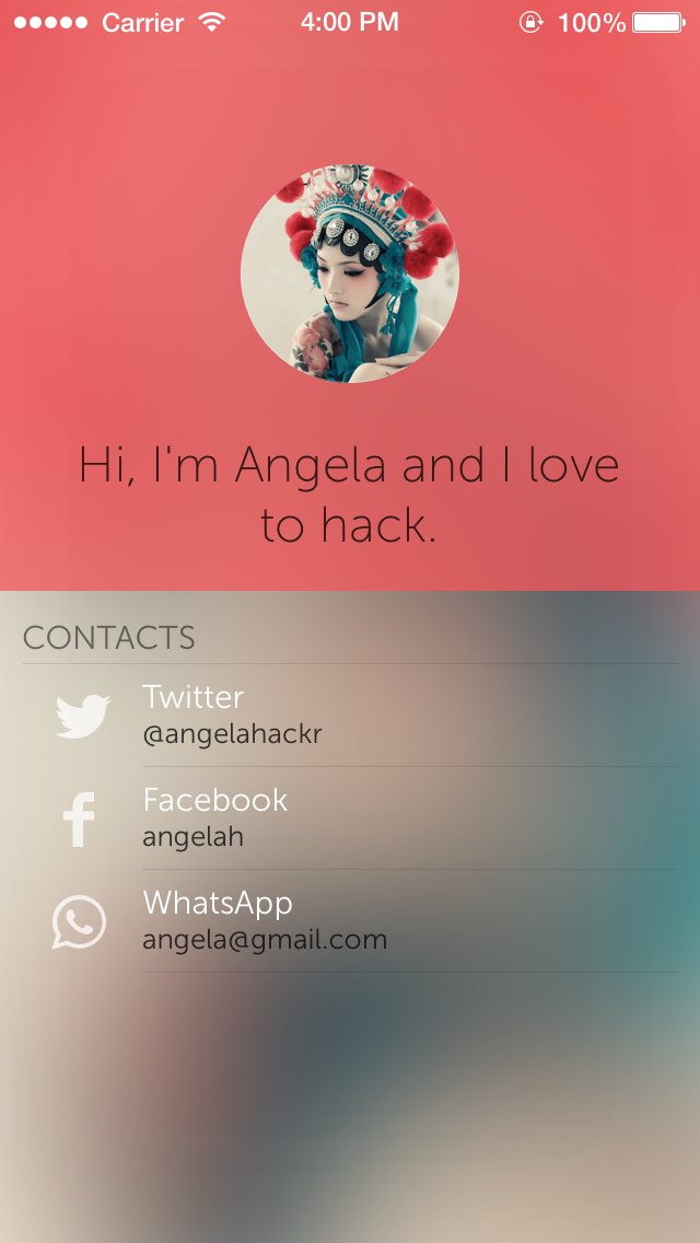
I wanted to create the shortest signup process. For simplicity’s sake, the only info needed was the screen name. But just having names doesn’t create the most interesting conversations. That’s when I took inspiration from the iOS7's camera feature. I noticed that when you switch between the photo formats, the camera’s image dynamically blurs. That sense of depth and directness was something I wanted to emphasize in my design. The result is a signup screen with a live front-camera photo with the background being the blurred version of that photo. The keyboard would be open immediately and would be focused on the screen name. That was it.

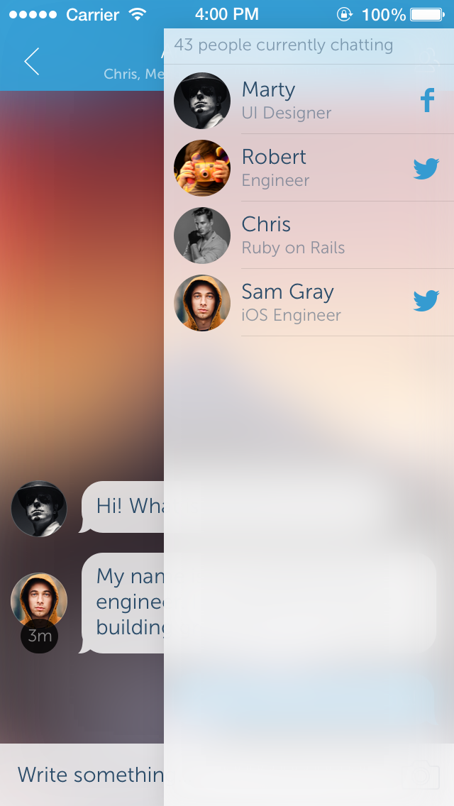
The Chatroom
As soon as you open the App, you are greeted with a list of Chatrooms that have been created by people near you. Like this, you don’t have to worry whether or not others have added you. It’s like Airdrop, but for a one-to-many connection. As a sidenote, we discussed that could potentially use Airdrop’s technology to quickly invite people in.

For the chatroom itself, I was inspired by iMessage for its parallax and springing effect. It’s fun. I adapted the concept and added the photos, which immediately made the Chatroom more interesting. Additionally, I added the list of people active with their Facebook/Twitter contacts.
The Flinto Prototype
I must have told 10 people at the Hackathon about Flinto. They were all impressed. The end result truly feels like a native App. As I designed new screens, I quickly uploaded them to Flinto and created the interactions. That was hugely helpful to the engineers who could test the flow on their phone as they were designed. From there, the adaptation to the real App was smooth and easy to compare to the design.

Here is the Flinto Prototype. Open from your iPhone 5/s for an optimal experience.
The iOS7 App
Luckily, I found an iOS engineer that loved pushing the envelope. I loved asking “could we do this, could we do that??” and I loved hearing “yes, yes and yes”. That’s always a good sign.
Then, I was pleasantly surprised to hear that he used Storyboard in his workflow. Most iOS engineers that I’ve talked to don’t want to touch Storyboard at all. Having an engineer that welcomes of use of Storyboard opens up collaborations between designers and developers since Storyboard is simple enough for designers to adventure in. This would be equivalent to have designers do the HTML/CSS instead of the developer.

In the end, we managed to implement the most challenging screens: Signup and Chatroom. We used libraries from Cocoapods for the blurred live camera image and for the springing parallax effect. As for the Backend, we set up Parse. Unfortunately, due to lack of time, we didn’t connect the real data to the demo App that would be presented to the Judges.
We Didn’t Win
We didn’t pocket the first prize at the AppHack. We were however selected as one of the Top 9 among 26 teams. Considering that we never worked with each other before and that we had spent 5 hours to agree on the concept, we did okay. Every idea is stupid and has been done before, I thought. It’s the execution that counts.
This is a triumph for our team. Many got excited on the Signup screen and commented on the ease of use of the design. Some people in the audience even asked when the App would be launched. That’s the reaction I was seeking. I design products for people to use.
We’ll keep simplifying. With the right collaboration, there is no reason why a simple App can’t be executed in a day.
Special thanks to AngelHack’s co-founder Greg Gopman for hosting the event, to the Judges for their invaluable advices and to team Ripple.
UPDATE: Following a discussion about the use of female models in my mockups, I have decided to update the avatars. I have the utmost respect for women and I apologize if I offended anyone. Please do let me know if any of my mockups give the wrong impressions so I can learn to fix it.

