Framer X: Using local JSON data to populate design components
For this tutorial, we are going to create our own variant of the stack tool to produce a repeating list of cards (like the app store homepage…) populated with data held in a local JSON file. This is actually a snippet used in a live project to stress test content but the card design has been changed to replicate the app store.

It might be a good idea to grab the files at the end of the article and have a play around first and then try to rebuild this project by following along.
Let’s get started
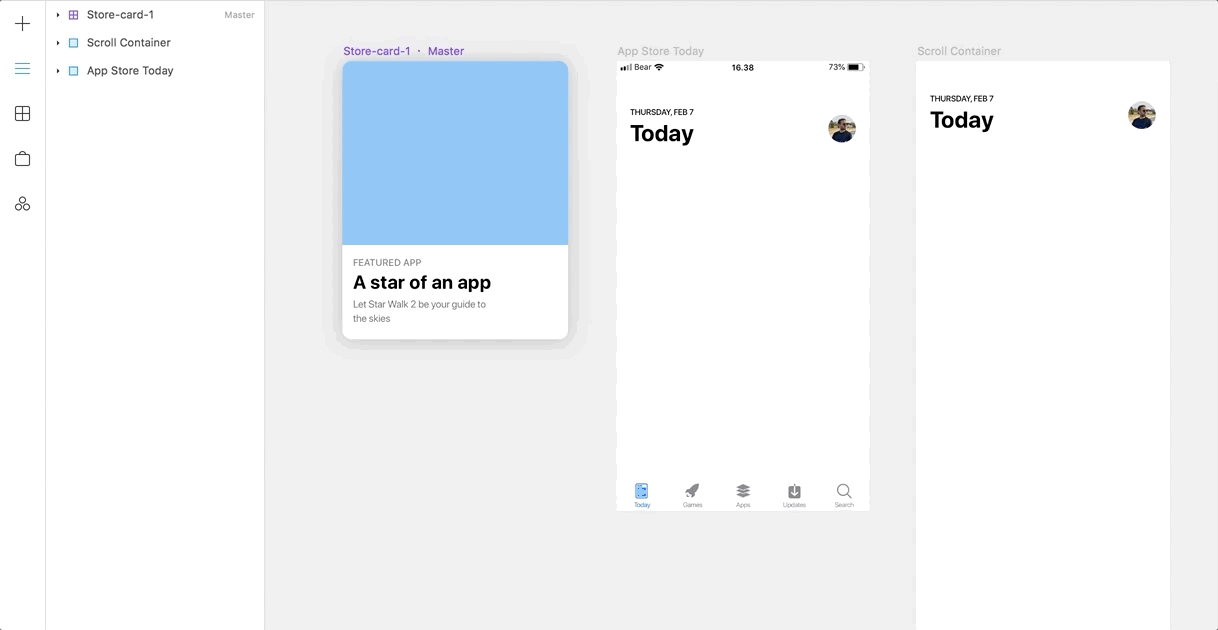
First, we need to set up our canvas with some design components. Start by creating a single frame for the device we will display the feed on, let’s call that frame “App Store Today” and set it up with the dimensions of an iPhone 8, add a second frame for display our list view with the same dimensions and call that “Scroll Container”. Finally, add a scroll component onto the App Store Today screen and link that to the scroll container, your canvas should now look a bit like this:

Now let’s create a card component, here I’ve just replicated one of the app store cards, but feel free to create your own. For this tutorial as long as you have an image, a title and subtitle were good to go.

Name your cards content like the example below. So your title text box is called “cardTitle”, your subtitle text box is called “cardSubTitle” and your image is called “image”. Doing this means we can replace these elements with data from our JSON feed when we move on to the code section of this tutorial.

Make sure you turn this new card into a design component by right-clicking on it and selecting “create component”:

Now we have our card and our canvas set up let’s move on to code.
Coding time
Create a code component and call it Card_stack:

Now delete all of the code in your new code component and add these lines:
import * as React from "react";
import { Store_card_1 } from "./canvas";
import { Stack, PropertyControls, ControlType } from "framer";Here we’re adding the card we created from the canvas with the line import { Store_card_1 } from “./canvas”; and we’re adding the stack component from framer with this import { Stack, PropertyControls, ControlType } from “framer”;
Next, let’s create a simple JSON, create a new file in visual studio and call it “appList.json”. Populate this with entries that match the below:
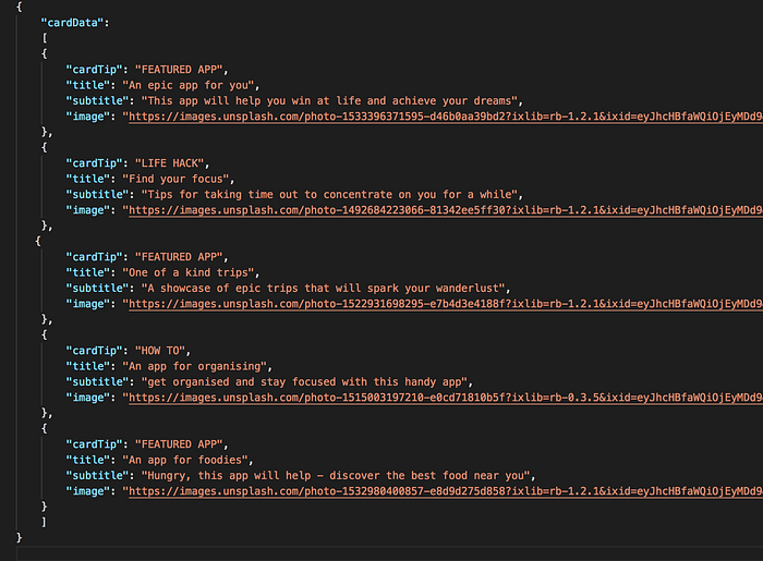
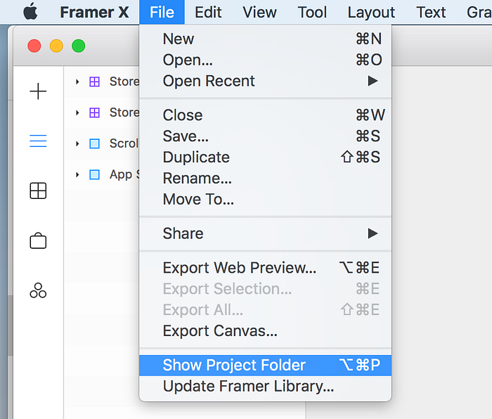
Save this JSON file within the code folder of your Framer X project file, to see this file in finder you can click on File, Show Project Folder within Framer.
Now we need to import this JSON into our Card_List component so below the other imports in “Card_List.tsx” add this line:
import { cardData } from "./appList.json";This means we can access the JSON data in our code component!
Now we need to set up some very basic styles, here I’m adding some for our stack and one for our card:
const stackStyle: React.CSSProperties = {
    background: "rgba(255,255,255,1)",
    marginLeft:"20px",
};const cardStyle: React.CSSProperties = {
    maxWidth: "335px",
};
This just gives the stack component a white background and sets a margin of 20px to centre our cards in the canvas frame, (I’m pretty sure there is a better way to centre using the stack controls but this is my quick fix 🤭). The style for the card component just gives it a maxWidth to stop it responding, totally unnecessary if you want to create a responsive card component…
Next lets set up the basic properties under the code you just created:
//props
interface Props {
    width: number;
    height: number;
    gap: number;
}
Let’s get our new Card_Stack component started and give it some default properties:
export class Card_Stack extends React.Component<Props> {
    static defaultProps = {
    width: 375,
    height: 500,
    gap: 24//The rest of the tutorial code will now go into this space};
So the defaults here give our “Card_Stack” component a default width of 375, a height of 500(fairly arbitrary) and a gap between each card of 24. Next, we will add a property control to dynamically change the padding (gap) between our cards, new code highlighted in bold:
export class Card_Stack extends React.Component<Props> {
    static defaultProps = {
    width: 375,
    height: 500,
    gap: 24//The rest of the tutorial code will now go into this space//prop for framers interfacestatic propertyControls: PropertyControls = {
    gap: {
        type: ControlType.Number,
        title: "Padding",
        min: 0,
        Step: 1
        },
    }
};
👆This adds a control into framers property panel which we’ve named “gap” with a user-friendly title of “Padding” that will allow is to change the padding between each card in our stack without digging back into the code component!
We’ve set this up with a minimum value of 0 and a step change of 1, you can also add a max value if you wanted to restrict the padding to a range. This could be handy for restricting control of the padding between two values and only let a designer change the padding by 2 pixels at a time e.g.
min: 24,
max: 48,
Step: 2
Now let’s move on to rendering our new component onto the canvas, new code highlighted in bold:
export class Card_Stack extends React.Component<Props> {
    static defaultProps = {
    width: 375,
    height: 500,
    gap: 24//The rest of the tutorial code will now go into this space//prop for framers interfacestatic propertyControls: PropertyControls = {
    gap: {
        type: ControlType.Number,
        title: "Padding",
        min: 0,
        Step: 1
        },
    }render() {
    const { width, height } = this.props;
    return (
      <Stack
        style={stackStyle}
        width={width}
        height={height}
        gap={this.props.gap}
        distribution="start"
        direction="vertical"
        >{cardData.map(data => (
        <Store_card_1
        style={cardStyle}
        width="100%"
        cardTip={data.cardTip}
        cardTitle={data.title}
        cardSubTitle={data.subtitle}
        image={data.image}
        />
    ))}
      </Stack>
    );
  }
};
To break this down the first thing we add is our <Stack> </Stack> component and pass the default properties to it, including the gap control we set up earlier.
Then within that stack, we map the JSON data to our <Store_card_1/> component so we can now match up the card text fields with the line of data in the JSON and loop through it to create multiple instances of the card. For an example look at the line: cardTitle={data.title} if you remember we named our text field “cardTitle” and within the JSON we created a field called “title”.
That’s it for the code component, make sure you save this out and head back to Framer, if you need to copy and paste the full code is here:
import * as React from "react";
import { Store_card_1 } from "./canvas";
import { Stack, PropertyControls, ControlType } from "framer";
import { cardData } from "./appList.json";const stackStyle: React.CSSProperties = {
background: "rgba(255,255,255,1)",
marginLeft:"20px",
};const cardStyle: React.CSSProperties = {
maxWidth: "335px",
};//props
interface Props {
width: number;
height: number;
gap: number;
}export class Card_Stack extends React.Component<Props> {
static defaultProps = {
width: 375,
height: 500,
gap: 24//prop for framers interfacestatic propertyControls: PropertyControls = {
gap: {
type: ControlType.Number,
title: "Padding",
min: 0,
Step: 1
},
}render() {
const { width, height } = this.props;
return (
<Stack
style={stackStyle}
width={width}
height={height}
gap={this.props.gap}
distribution="start"
direction="vertical"
>{cardData.map(data => (
<Store_card_1
style={cardStyle}
width="100%"
cardTip={data.cardTip}
cardTitle={data.title}
cardSubTitle={data.subtitle}
image={data.image}
/>
))}
</Stack>
);
}
};
Back to Framer
Now we can add our new “Card_Stack” component to the “Scroll Container” frame on our canvas:
That’s it! just change the height of the scroll container frame to match the number of cards in the container, here it’s roughly “2390” and you should see all of the cards appear. Now run your prototype from the “App store today” frame and you should be able to scroll through the list of cards populated by your JSON data 👏.
You can grab the tutorial file here
Any problems let me know and I’ll try to help!
In the next article, I’ll show you how to combine Conditional rendering and data from our JSON to create a feed of different cards that render based on a tag in the JSON, just like Apple's app store homepage.
Thanks 👋

