Framer X: Conditional rendering for design & code components
This tutorial will show you how to conditionally render the state of a component onto Framer’s canvas, based on the option you choose within a selection box that we will add to Framers property interface👇.

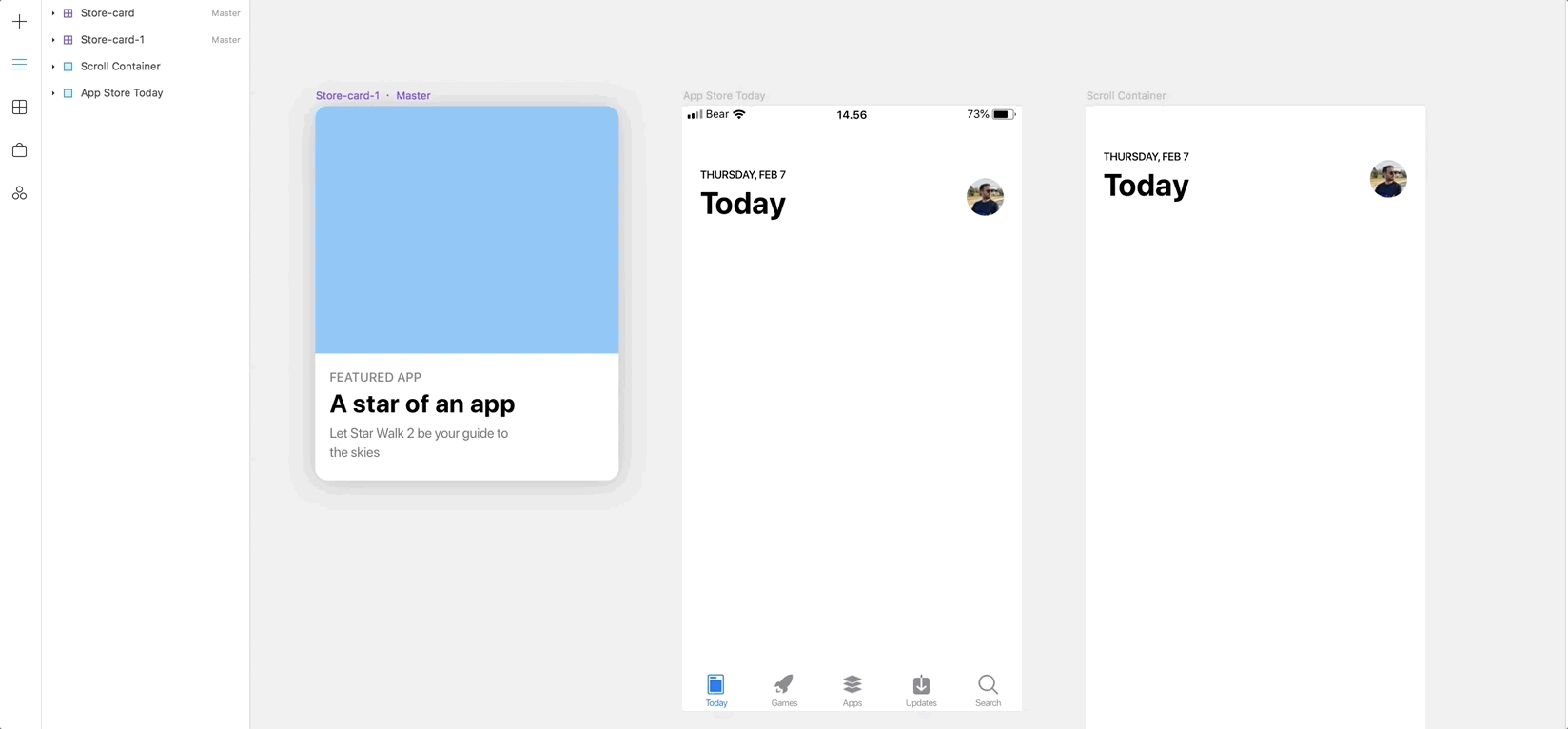
👆Pretty cool right, this is super flexible, but the implementation here is as simple as possible.
There’s an example file at the end, so if you feel confident just grab that, pull it apart and find out how it works for yourself, if not read on.
Let's get started
Firstly lets set up our design components, for this, we will create a few variants of simple app navigation header. As long as it looks a bit like the ones below we’re all good.

Name your new design components “App_Header” and “App_Header_Close” and turn both of these into design components by right-clicking and selecting “Create Component”.

Perfect, now we have our design components ready to go.
Coding time
A note before we start, I’m a designer, not a developer so don't expect perfect code, luckily this one is fairly simple!
Lets set up our code component, tap the components tab in Framer x and then tap “New”. Make sure “from Code” is selected and let's call our component “App_Header_Code” 👇

Hit “Create and Edit” Now if you have visual studio code installed (if not grab it here ) framer should launch your new code component inside the editor, the first thing to do is delete all of the code in that file.
Now type in the first few lines of code as shown below:
import * as React from "react";
import { PropertyControls, ControlType } from "framer";
import { App_Header, App_Header_Close } from "./canvas";
👆one thing you may not have seen before here is the “import from canvas”, this allows us to use design components “App_Header” and “App_Header_Close” from our canvas and manipulate them with code 🤓.
Next lets set up some props
// Define type of propertyinterface Props {
    status: string;
    width: number;
    height: number;
}
This just sets up the props we need, the status is a string and the width and height are numbers.
Now let's set up our component:
export class App_Header_Code extends React.Component<Props> {//BETWEEN THESE CURLY BRACKETS IS WHERE WE PUT THE REST OF THE CODE IN THIS TUTORIAL!}
If you named your component anything different than “App_Header_Code” then make sure you include the correct name in the export class.
Next set up the default properties for our code component:
export class App_Header_Code extends React.Component<Props> {// Set the default properties for out component
    static defaultProps = {
        status: "back & close",
        width: 375,
        height: 64,
    }
}
These defaults will help us to load the first state of the component which we’ve called “back & close” and give us a default width “375” and height “64” when you add the component to the framer canvas. This width and height should match the design component you created earlier so make sure you include the correct values that match your design component.
Now, lets set up the properties panel within Framers interface that will give gives us the drop down selection box to pick the type of component we want to display.

export class App_Header_Code extends React.Component<Props> {// Set the default properties for out component
    static defaultProps = {
        status: "back & close",
        width: 375,
        height: 64,
    }// Setting up our property panel within framers interfacestatic propertyControls: PropertyControls = {
    status: {
              type: ControlType.Enum,
              options: ["back & close", "close"],
              optionTitles: ["Back & Close", "Close"],
              title: "Header Type"
            },
    }
}
There’s a lot of available property controls, this excellent article by Steve Ruiz will give you a good rundown of some of the other available properties. Here we're using the ControlType “Enum” - sounds complex but it’s just a selection box that allows you to select a single option, which we define in “options:”.
We then create user-friendly titles for those options “optionTitles:” that will appear within the selection box in framers interface, finally give the control a “title:” so you can identify the property control.
The last thing we need to add is the code to conditionally render the correct component based on your selection within Framers properties panel.
We can use an if statement within the render portion of our react component that picks up the option from our property control “if(this.props.status == “close”) { //do this } ”.
export class App_Header_Code extends React.Component<Props> {// Set the default properties for out component
    static defaultProps = {
        status: "back & close",
        width: 375,
        height: 64,
    }// Setting up our property panel within framers interfacestatic propertyControls: PropertyControls = {
    status: {
              type: ControlType.Enum,
              options: ["back & close", "close"],
              optionTitles: ["Back & Close", "Close"],
              title: "Header Type"
            },
    }//This is how we conditionally render the component
render() {
   if(this.props.status == “close”)
    {
      return ( < App_Header_Close /> );    } else if(this.props.status == “back & close”)      return (< App_Header />);
    }
}
So what is the code snippet above doing? The if statement is checking the selected option of the property control, if the option = “close” then render our component < App_Header_Close /> else if the option = “back & close” then render our other component < App_Header />.
Now save your file and head back to Framer X.
Let's drag our new code component to the canvas.

Whoooop! If everything worked out you should now have your header component on the canvas and be able to select the state of that component in Framers property panel.
Any questions or problems just ask and I’ll try my best to help!
You can download an example project file here, just in case you get stuck.
Finally, this is possibly completely useless in a production environment, but it hopefully gives you a little insight into the potential for Framer X going forward…
Thanks! 👋


