
Font Night at the Apollo, Part II: Favorite Display Fonts, Winter 2017
The one where all the fonts are display
To read Part One of this series (about my favorite body fonts) click here. To not read it, click virtually anywhere else.
Moving on from last week’s article and into more ornamental territory, in today’s article I’d like to present my favorite display typefaces.
Unlike body text typefaces (of which I have about a million favorites), I don’t really have a lot of favorite display typefaces. I have about six and I keep reusing them, to save on download bandwidth → electricity → fossil fuel and consequently save the planet from global warming like a boss.
Ready? Here we go!
Frontage
Frontage is, for me, the Bariol of display fonts, as in I’d totally have sex with it if there was a way. Maybe there is. I’ll have to think about it.

Frontage is a layered typeface system with five layers that you can use either on their own or in combination with each other to achieve the effect you want. Usually, this effect will be reminiscent of a cafe in Côte d’Azur or some other faded-seaside-glamour resort in the Mediterranean.
If there’s anything wrong with Frontage, it’s that it strongly suggests a specific mood. Essentially, this typeface is typecast. Of course, this is a limitation of most display typefaces: they have to be very characterful to be eye-catching.
Essentially, this typeface is typecast
Oh, there also a condensed version of Frontage which also looks amazing.


Get Frontage @ Creative Market or myfonts.com
Get Frontage Condensed @ myfonts.com
Get a free weight of Frontage @ type.is
More info about Frontage: all-caps, not expensive but also not free (with the exception of the free weight I have linked to above)
Cassanets Plus
Cassanets Plus is made by atipo foundry, the same studio that made Bariol and so many other gorgeous fonts. Readers of the first part of this series may remember my love — nay, fascination — nay, tempestuous mega-kinky love affair with Bariol but now I have to admit that I could see myself being the poolboy to Cassanets’ mature older lady too.
I promise that this is the last time I speak about fonts in a sexual way.
Cassanets exudes Art Deco mood. In fact, the typeface is subtitled “contemporary Art Deco”.
The typeface has some awesome ligatures and alternate styles. Like Frontage, it is also an all-caps typeface. Here is a sample from the Cassanets website
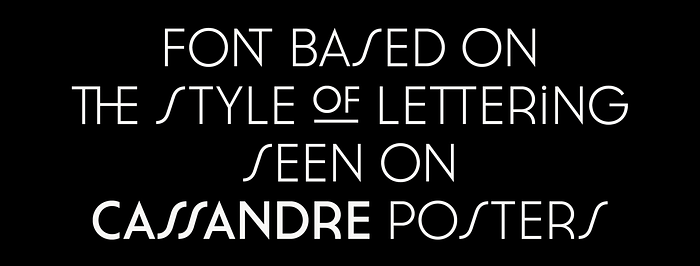
You can get its regular weight for free by sharing on social media. The complete family costs a super-affordable pay-what-you-want. I paid five bucks. Don’t be me.
Oh, also: that typeface on this article’s header illustration? Cassanets Plus.
Get Cassanets Plus @ atipo foundry
Bebas Neue
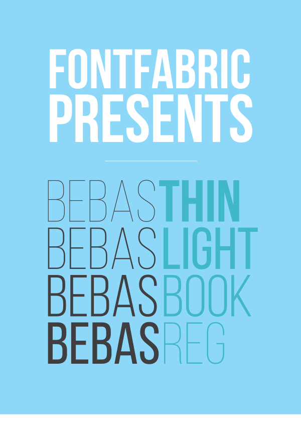
Bebas Neue is the least distinctive of the display fonts presented in this article. That’s not necessarily a bad thing — it can easily work in many different contexts without you having to try too hard to squeeze it in.
If you held a gun to my head and forced me to describe what mood it represents, I’d say “kinda sorta futuristic but not too much. Please don’t shoot me. Prrrrrrrrrrrr”. That last word is the sound of me shitting my pants.
Like almost all of the fonts in this article, Bebas Neue is an all-caps font. It comes in five different weights and you can see every one of them below. Credit to FontFabric for creating the graphic.
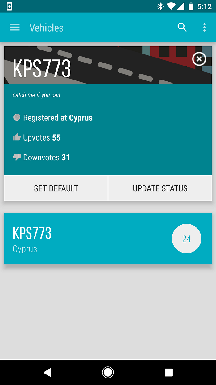
I used Bebas Neue in Karkoona, our license plate-based messaging app. The font really reminded me of the font used in license plates in Cyprus at the time so I went with it:
Get Bebas Neue @ fontsquirrel
Ailerons
Not to be confused with Aileron (itself a fine sans-serif), Ailerons is an all-caps typeface inspired by aircraft models from the 40s, according to its designer. I don’t know exactly what that means but I do know that the following design from its specimen looks freaking amazing

inspired by aircraft models from the 40s
Used correctly, Ailerons can be breathtaking. I suggest you don’t overdo it, though, since it suffers from some minor intelligibility problems. The “R”, especially, looks a lot like an “A”, although when both are used in your text, you can’t really confuse them. Small sizes are also pretty hard to parse, as you can probably tell from the specimen.
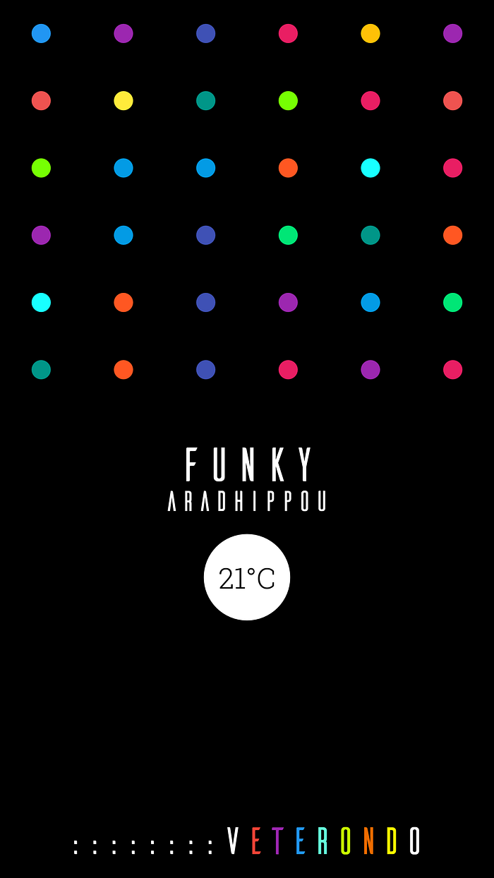
Despite that, I used Ailerons in not one but two of my apps, Looxie and Veterondo. In both of them, it is used judiciously but effectively.
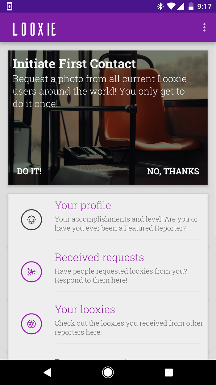
Just a note: Ailerons can be downloaded for free for personal use. If you want to use it commercially, you have to contact the designer and request a license. When I contacted Adilson to ask about my use case, he got back to me super-fast.
Get Ailerons @ Behance
Cool Britannia
You want whimsy? Well, then you want Cool Brittania!
Perfect for
- gluten- & lactose-free, vegan, halal and kosher quinoa and tofu cookies packaging
- beard and mustache oil bottles
- the sign for that cool new place downtown that you found out about first before anyone else, a fact that you now rub in everyone’s faces like you just confirmed String Theory, you fucking hipster
you can’t go wrong with it if you’re targeting a… specific demographic (ie. fucking hipsters).
Unlike the rest of the fonts I have mentioned previously, this display font also includes lower case characters, in addition to caps.

Forget my rant about hipsters. In reality, it is a lovely font that will give you gorgeous results with very little effort. Of course, like most other fonts in this article, it is highly distinctive so you can forget about using it for the title credits of a violent first person shooter set in Greenwich Village in the year 2049, after hipsters have brought about the end of civilization.
Because seriously — fuck hipsters.
Get Cool Brittania @ Creative Market
Bonus Display Font: Funkydori
Funkydori is a display/script hybrid. As the name suggests, it is very funky. If you’re going for a 70s vibe you’ve found your font. Since this article is getting too long already, I’ll just leave you with this
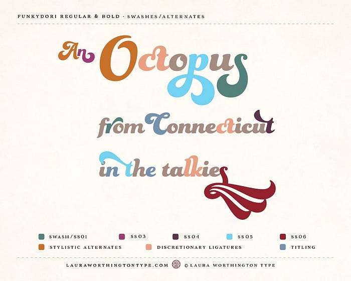
I’ve only used it for Looxie’s logo (and the cover for an album I wrote, which I’m too ashamed to post) and it worked perfectly
Get Funkydori @ Creative Market
And that’s it for our show
We’re done… for now.
Disclaimer: I am not affiliated with any of the typefaces’ creators and I do not collect any royalties for suggesting them, you scoundrel. I just love these fonts.
If you think that this article was helpful, please tap the “clap” icon at least 23 times. 50, preferably. Also share with others.
I love you with all my heart.

