Fixed it — LinkedIn Profile
Linkedin has been a very helpfull tool when it comes to create a professional network. It’s a very easy and intuitive platform.
Whenever somebody asks me for advice on how to enter the professional market (designer or not) I always recommend a LinkedIn Profile - among other things. It kinda puts your name on the list, I think. And not just for others to find you, but to make it easier to gather your professional information and share it whenever you have the need to.
The problem
I have a little-tiny-problem with the layout of the user profile page of Linkedin. As a designer I want to share my portfolio, either my website or platforms like dribbble and behance. But I think this also applies for any other user, because you can always want to share your twitter, gitHub, Medium..
Anyway, on LinkedIn, the information I’m talking about is shown on the right column of a user’s Profile page:

When you click Show more — in this case Exibir mais — you get the Contact and Personal Informations of the user like portfolio profiles, websites, and e-mail:
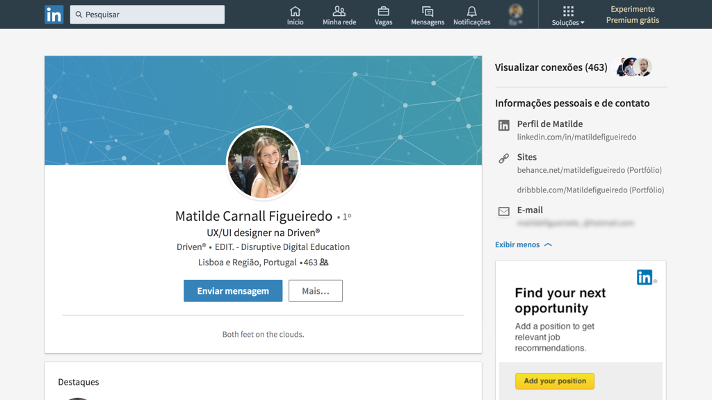
I think I’ve only noticed this content part waaay way later than I’d like to admit. I remember filling my Personal Info, but I never noticed where it was hidden. And I know why. All my information is in the left main column. And if you look closer, the right column doesn’t have that many more information about you. It’s more an advertising place. You have Ads, People Also Viewed, Courses on LinkedIn Learning (aka Ads), and some more Ads down below.
As a designer, more than a CV or my LinkedIn Profile, I like to show my work. The path I’ve been taking, my evolution, and the obstacles I’ve had to get through, to become the designer I am today.
Solution
So, it wouldn’t be a Fixed it if I didn’t show a solution that would work for me. And because I like simple solutions, I think that by simply re-placing the Info to the main column could solve a lot of the focus problem. And, of course, the Logos of the platforms.

So, what do you think?
Do you have the same (or a similar) problem? Would this change your entire life?
Feel free to drop any thought you have about it :)

