Member-only story

Creating components with automated sizing behavior saves a lot of time during the process. They also let us think more like a developer that has to implement the real application. That is why it is essential to master Constraints and Auto Layout in Figma.
In this article, I would like to present you not only the features but also samples — how components benefit from sizing behaviors. Let’s begin with Constraints.
Constraints
With Constraints, you may build components that adapt size and position to their environment (frame). Use it every time when you need to prepare designs that have to be resized for multiple platforms or breakpoints (responsive websites) and share the same UI elements.
Thanks to constraints, Figma knows how to modify the size and position of the specific element when its frame is resized.
You may choose multiple options when working with Constraints. The object may stick to the Left, Right, Left and Right, Top, Bottom, Top, and Bottom. If may be positioned in the Center, or even scale proportionally to the frame size changes.
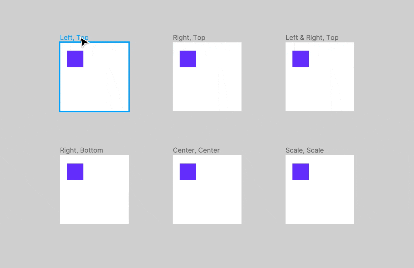
Now, let’s some examples of real components made with various constraints properties.
Button Groups
Buttons inside the group should stretch their size to the needed with, but text or icons inside should remain centered. Thanks to constraints, it is easy to achieve it.

Inputs
TextFields and Dropdowns should stretch to fill their container space. However area for the text should be aligned to the Left & Right. For Dropdowns, the little chevron on the right should always stick to this side.


