Event Finding App — A UX Case Study

Introduction
For a fresher in college, they have many orientation programs and events going on during the start of the college like participation in different club activities related to sports, art, dance, volunteers, etc. Being in a new place, most students don’t know the locations of the venue where they are provided to go. This makes the students quite frustrated and sometimes make them not to attend the event. This UX Case study is to make that search easier and fun experience for events going on during the orientation days of the college.
Problem Statement
To design experience for the college students to find events and orientation programs going on near them and a visual system to access it.
I have divided the types of events into the following:
- Main Orientation Program
- Sports
- Music
- Visual Arts
- Social Groups
- Volunteering Events
Planning of the design process
My design process starts in the following–
- Listing out the types of potential users in different scenarios.
- Problems faced by them — Their pain points while looking for activities in their college.
- Storyboard — To generate empathy with the users
- Information Architecture
- Wireframes
- High Fidelity design
Potential Users
The proposed problem has two types of users –
Type 1
A student who is sitting a night before the event day trying to plan his/her next day and check out the events going to happen.
Type 2
A student who is on the campus trying to search for any event of his/her interest happening near by.
Pain Points
The pain points that I realized faced by a fresher in a college are:
- Students as fresher don’t know the location of the venue where the event is about to happen. They find it difficult to get to the venue.
- There are many important things discussed in an Orientation Program like the grading system of college, placement records, etc. which the students find it difficult to have a record of it and have a look at it later on.
- As there are many events goings on hosted by so many clubs in the college, students find it difficult to decide which one will be beneficial for them.
- Sometimes, because of any reason, they forget or miss the event that they have planned to attend.
- Entry to the event venue is time-consuming — To find the registration number of the student in the participant list.
Solution (Ideation)
I took one pain point from the above list and jotted it down on a sticky note. Then I sat down and did brainstorming to form ideas on how can I solve these pain points of the user. I came up with the following solutions for each:
- A student can use Google Maps by clicking on the “Get Direction” button to navigate to their venue.
- A Download button on the detail section of the Event which will make the user download all the necessary information discussed in the orientation program or any event in the form of a pdf file to have a look at it later on.
- If a student is interested to attend an event, he/she might click on the “Interested” Button. The results of the number of clicks will get add up which will later be displayed to students as how many percentages of students are interested to go — helping them to decide.
- An option to set a reminder on the event that they are interested to go. Also, there can be a separate list of “interested events” that the user might have clicked. — Allowing to set a reminder on Google Calendar.
- Showing a QR-Code in the app created uniquely for each student to get scanned and allow entry.
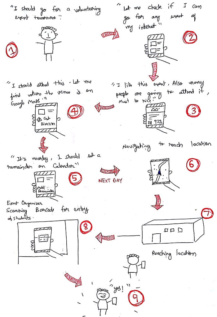
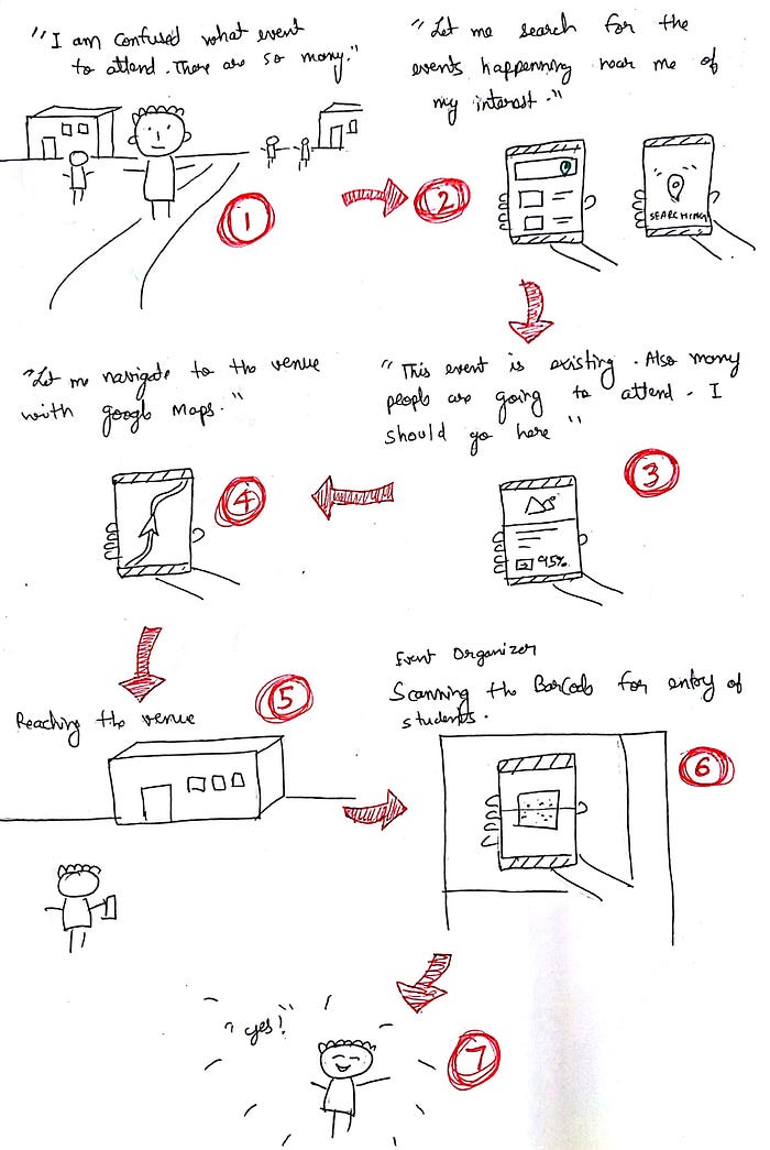
Storyboards
I sketched out storyboards for two types of users to empathize with them and understand how the navigation could go. This was beneficial to create an Information Architecture and Wireframes.
Type 1 — User sitting a day before deciding
Type 2 — User searching for events near them
Information Architecture
After a careful analysis on the storyboard, I iterated many information architectures on how the navigation should go which would allow their tasks to be done in fewer efforts and I came up with this final IA –

Wireframes
Taking into consideration the navigation, I jotted down the elements required to be on a single screen and iterated to arrange them keeping in minds the pain points of the users. After many changes, I came up with this final wireframe. Although, during the High-fidelity design, I made some slight changes each I felt would work better.

High Fidelity Design
I designed all the High-Fidelity design of the app on Abode XD by referring to the wireframes I created. This is the final solution to the problem statement proposed -


Thanks for reading ❤️
This was my attempt to solve a user problem faced by college students as freshers. This UX case study helps me to showcase my design process and how I approach to solve a problem.
Don’t forget to give 50 claps 👏
This would motivate me to write more content and case studies. Thanks 😊
For any discussion, do connect with me and send a hello at LinkedIn | Dribbble | Instagram.

