Ethics in Product Design
What was the last thing you designed? Do you think it was ethically correct? Let’s just think about it for a moment before we move on to the main topic.
We design apps for dating, shopping, doing sports, messaging and many other things. They all became an inseparable part of our life.
So…
We should be designing products that meet the following criteria:

If you use Netflix and Booking.com, you can probably relate to what I’m about to say.
Is Netflix an ethical product?
In principle — yes. If you look closer though, you can see some disturbing pattern which heavily influences our lives. Are you familiar with the “Next episode” button? It comes along with a feature of autoplay. It seems like a great idea, doesn’t it? Remember when back in the days you had to play the next episode by yourself or simply wait? That was a great time to get some food, pee or check if your car is still in the garage. Right now, there is no such opportunity and we can spend hours and hours watching one series without even noticing it. Suddenly it’s 3 a.m. and you go like: “Shiiit, it happened again. It’s all about continuous experience and Netflix making you watch more of their content.
What about Booking.com?
Don’t get me wrong, this is one of the best travel apps I used and I use it all the time. If you get a closer look you may see the following:
“Only 2 of those prices left on our site”
“See our last available rooms”
“In high demand”
“Great Value Today”
“Booked 27 times in the last 24 hours”

What Booking.com does is creating a constant feeling of missing opportunity. There are so many things suggesting to us that if we don’t book it right now, we may not be able to do it at all!
As far as I learned from one of their UX Designers, all this data is real but attacking users with that all the time is highly questionable from an ethical point of view.
What are Dark Patterns?
There is a chance you didn’t hear about them so far, but you encountered them at least once or twice in your life. It includes intentional misleading, abusing helpless or elderly people or taking advantage of the user being in a rush or not paying too much attention to his actions.
The term “Dark Patterns” was introduced by Harry Brignull:
“a user interface that has been carefully crafted to trick users into doing things, such as buying insurance with their purchase or signing up for recurring bills.”
It’s all about:
- signing up for a newsletter we don’t want to sing up to,
- accepting something we would never accept e.g. subscription,
- forced up-selling or service prolong,
- friend’s spam — inviting your contacts or sending them spam messages by mistake.
Let’s have a look at some examples of dark patterns.
Friend’s spam on LinkedIn

LinkedIn constantly bothers us with a great opportunity to invite all people from your email contact list to LinkedIn.
“Nooo, I will just pay a full price for that”

Paying the full price doesn’t go along with our nature. Who would do that if there is a discount available? Of course, if you want a discount, you need to create an account and sign up for their newsletter.
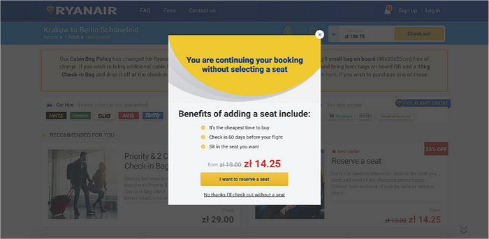
Ryanair — how dark can it be?
Ryanair is just a classic example of all kinds of dark patterns. Of course, everyone would like to reserve a seat, can’t argue with that. What is not clear in this message is that picking a random seat will cost you nothing whereas picking it by yourself will cost you some money.
Adding extra items to your basket without your clear consent
This is probably illegal at the moment so you shouldn’t see too much of this dark pattern nowadays. It’s all about putting some extra products, services or subscriptions into your cart without you noticing it. Sneaky, right?

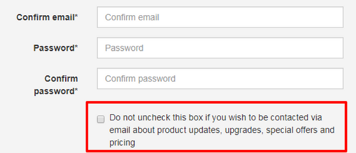
Don’t check this box if you don’t want to uncheck it
Making a message as unclear as possible. In the first second it feels like if we don’t check this box, we won’t be getting any emails from them, right? Well, nope. That’s exactly the opposite.
White Lies
Let’s just say White Lies are somewhere between creating good user experience and dark patterns. It’s a way of meeting business goals while still providing value to your users.

Why do we use it?
- to make users feel they’re in control,
- to hide some defects,
- to test MVP,
- to fake personalization,
- placebo effect.
What kind of White Lies do we encounter daily? Plenty! It starts from increasing waiting time when you order UberEATS just so it can be shrunk at some point and make you feel better.
How often do you swipe down to update your Gmail inbox? Quite a lot, right? Even if it’s fully synchronized and you will get an email as soon as it arrives, you somehow feel better when you get to do it, right ;)?
The list goes on and on but the most important takeaway is: