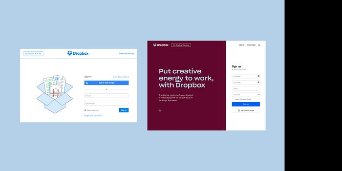
Dropbox ReBrand for Positioning
With ingredients of Google and Apple, and growing spices of inVision, Axure, Craft and Box, the cloud industry is a muddled soup of confusion. Out of this recipe comes a rebrand by Dropbox with a compelling approach to identity. Defining a niche in an overcrowded market, Dropbox targets creative collaboration. Along the way, they might just be leading a UX revolution.
Last year we witnessed a fairly vocal reaction by the design community when Instagram went live with a complete rebrand of their app. The opinions were mostly shock and confusion. Yet, by the next quarter, the move was recognized as a winning effort, a thoughtful and modern approach, championing the user experience through smart branding.
“A living workspace that brings teams and ideas together”

Moving away from the individual and focused more on teams, the branding picks up on the nature of those who use Dropbox the most... diversity. Dropbox’s greatest feature has always been the ease in which you can share documents with team members across the office, across town, and all over the world. The increasing diversity of users is the driving theme in this rebrand in everything from their tone to the beautifully designed illustrations and bold color pallet.
Acknowledging whom your users are, listening to how they work, how they use your product… is a company doing User Experience right. Taking this knowledge and applying it towards Design Thinking and Business strategy is a company that is one with its’ Chi — a fluid, evolving ecosystem that celebrates what makes us unique by bringing us together.
I expect this move to have a positive influence to the company as a whole. Kudos to dropbox for the inspiration.

