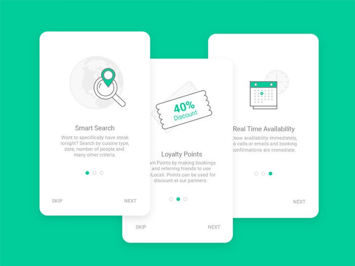
Does your app really need on-boarding screens?
The on-boarding experience is very important in every application, as it sets the first impressions and lets your users know what to expect.

Some apps have dedicated on-boarding screens. Some let you skip them and some don’t. Some apps are only accessible with an account and when you open them you are presented with a log-in screen. Some leave this as an option and let you log-in later by experiencing the app first, to see if it’s really for you, and some don’t. So which is the right approach for your app?
There are pros and cons to each approach. Having all of your users logged in makes it easier to develop and design for, but would sacrifice the on-boarding experience by forcing them to log-in or register. We have all at some point skipped a tutorial just to be faced with an interface that we don’t know what to do with. So do we want the users to have the option to skip the tutorial?
The answer is: it depends. It depends not on what is best for business or on which is easiest to develop and maintain. It depends on how you want the users to feel. A big part of designing any interface is designing the feelings that you want people to have while using your design.
If you are working on an application that handles sensitive information about your users, like a health application, then it’s a good idea to let the users know that their information is in safe hands. Maybe a dedicated page the first time they open the app to let them know about the encryption and main privacy points.
If you are working on a game, then forget about all on-boarding and let the users jump right in. The best tutorial in any game is when it’s integrated into the game. The first few levels of the game could be specifically designed to get the users familiar with the controls. Portal is an excellent example of this. The whole game is basically tutorials for you to learn what you can do as each level gets more complicated.
If you are pushing an update with a new feature that users might otherwise miss, then it might be a good idea to let the users know about it after they update. Though, it’d be best to show it after they’ve used your app for maybe a minute. If you show it right when they open the app, they might want to dismiss it since it might feel a bit interruptive. But again, if you think the new feature changes the behavior of the app and they need to be made aware of it right away, then it’s best to interrupt them to prime them for the new interface so they don’t get a shock by seeing a lot of change.
So ask yourself this: how do you want your users to feel?
One of my goals for 2018 is to write 50 articles on Medium and this is 1 of 50. I hope I can keep up with the goal and counting on your feedback to help me get better at it. ❤️

