Designing Weather Up
When David Barnard wrote me an email asking me if I wanted to work with him on his apps at Contrast it didn’t take me long to accept. Most of the freelance work I do these days are relatively short commissioned projects like branding and app icon work with a few exceptions of a novelty UI here and there.
It has been a long time since I last worked on a big interface project that wasn’t one of our own games at Northplay. Why?
Well, I think I have largely fallen out of love with contemporary ui design for apps. I fled to games because I felt like I was designing the same interface over and over again. Here was this opportunity to return to app design and put out the sort of work that I think is fun. David & Lukas are incredibly talented and the design work already done by Will and Tim was a solid foundation to innovate upon. Weather Up (previously Weather Atlas) just released and so I can now talk about some of the things I’m most proud of.
The Card-Based Interface
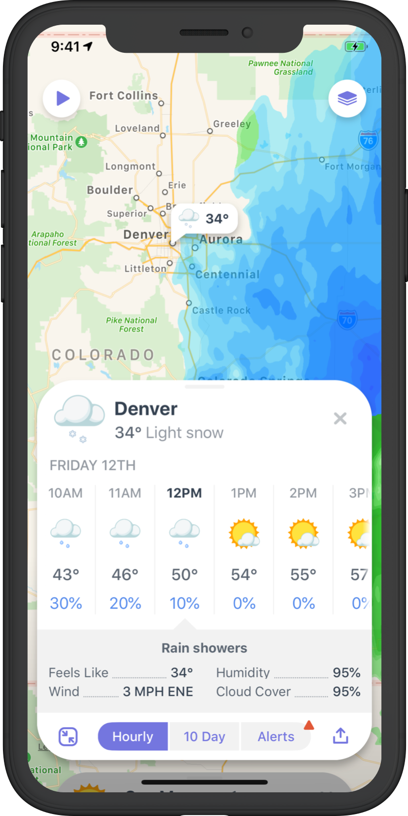
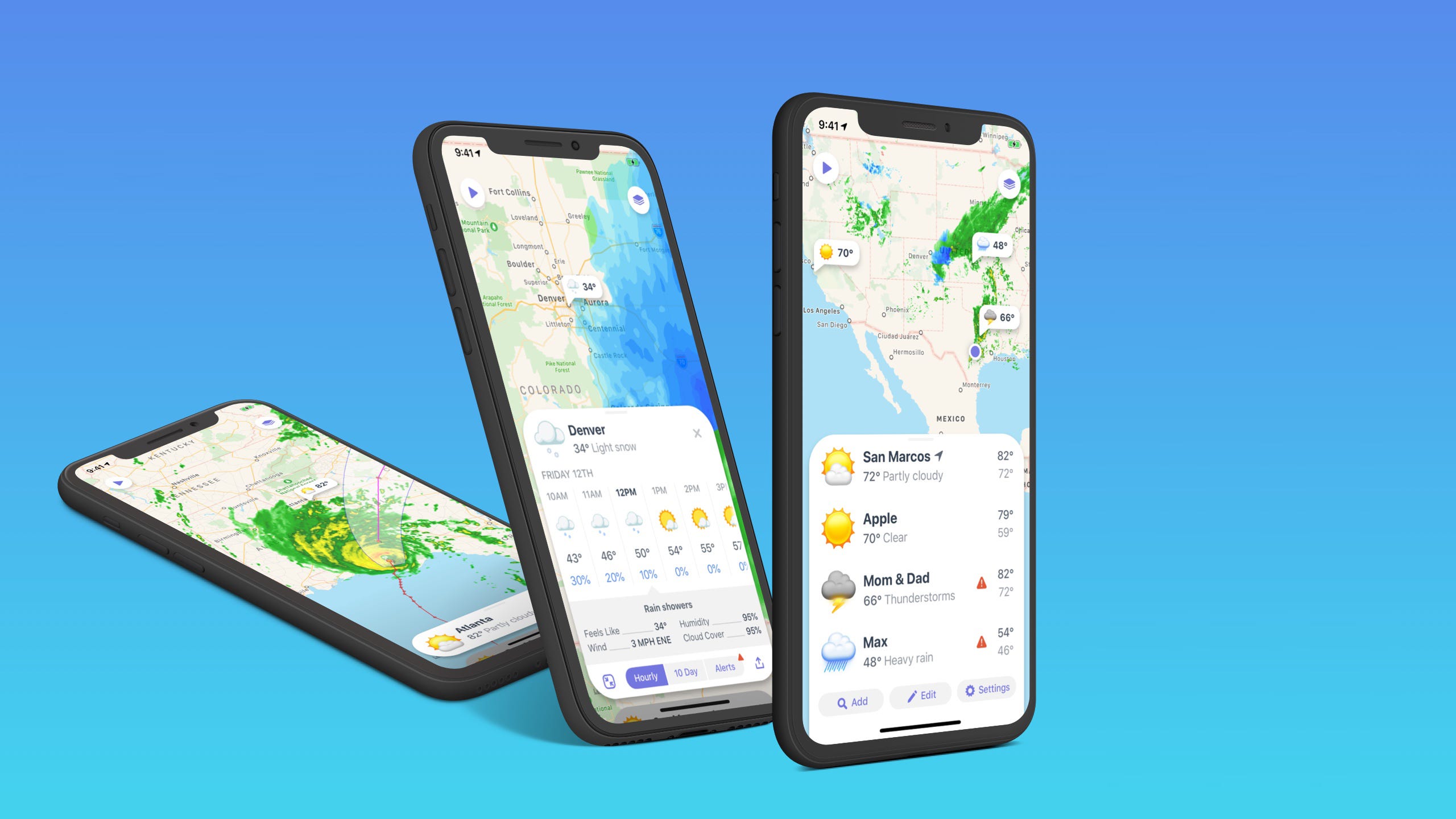
There’s a lot of new stuff in Weather Up, but the biggest interaction change is the introduction of a card-based interface. Weather up is an app that is all about maps. The entire interface rests on a map that beautifully displays weather data overlaid. The interface then provides contextual information for that location and so it made sense to develop that analogy even further. Taking inspiration from the rounded corners of the X-style iPhones we came up with this idea of sliding cards around on top of the map. Cards in interfaces isn’t a new idea, but I don’t think I have seen an app take it as far as we did in Weather Up and it’s the perfect use-case for it.


The card-based interface not only accentuated the idea of floating contextual information on top of a map, but it also made the whole interface feel more tactile and malleable. The map is ever present, always underneath the cards and the cards themselves can be manipulated into several different states.
This card-based interface was applied everywhere in the app and the entire structure was reshaped with this new paradigm in mind. It allowed us to rethink a lot of the patterns and flows in the app. As with the introduction of all new patterns, we hit roadblocks and usability issues and had to rethink how users interacted with the cards and what cards where available from where.
The final product is quite sleek and Lukas made it all come alive wonderfully. Tapping in and out of cards or placing pins to evoke new cards is seamless and zooms the map around to give you the best contextual information possible.

I’m really proud of both the visuals and how it looks on the new rounded cornered devices from Apple— but also the interactions itself. Once you try it, it just makes a lot of sense for this app.
A new emoji-inspired Weather Icon Set
To go with this new look, I also got to design an entire new weather icon set as the default that we’d ship with the app. Icons are massively important in an app of this type where they need to serve as a strong visual anchor and convey a lot of information. For those of you who know my work, you know that icons are pretty much my favourite thing to design and so when it came to creating this 54 (!) piece icon set I was just absolutely immersed in the process.

We spend a lot of time defining the look, and then even more time dialing in the various components that would make up the set. We wanted a colourful, friendly and fun set that felt inspired by emoji. Weather Up has a bunch of other sets that you can customise the app with, but this set was to be the default one so there was a lot of pressure to get the execution just right.

Deep diving into the many explorations could be a study in and by itself and we would continue to iterate on the set right up until release. I’m really proud of how these turned out and I think they add a lot of character to the app. Together with the other fantastic sets designed by Will it really gives the user something fun to look at.

Alternative App Icons
Allowing this type of customizations doesn’t only extend to the icons inside the app. We also shipped a range of alternative app icons that you can choose from. I have been in love with this type of user-driven expression for many years now so I’m really happy about the selection of App Icons we included in the app.

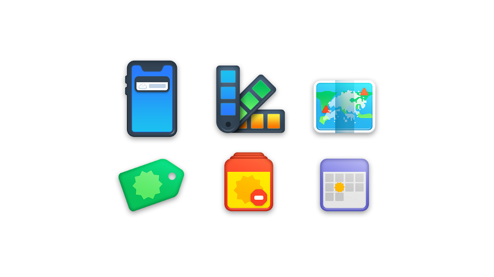
There’s a lot of other design that went into Weather Up. Custom little icons for the onboarding. Little glyphs for manipulating the cards. So many fun little details.


Do the work you want to see in the world
Working with someone as talented, caring and opinionated as David has been amazing. He has allowed me to create the kind of design that I love seeing in the world: Design that is fun, colourful and isn’t afraid to try out new things. Lukas brought everything to life and survived me and David’s constant back and forth on the smallest details. There’s a lot of weather apps out there (I should know, I’ve made a few)— but In Weather Up, I believe we have created a unique experience that is both beautiful and meaningful.
___
Michael is a Danish designer, entrepreneur & keynote speaker. He runs entertainment development studio Northplay, Pixelresort and design resource platform Apply Pixels.


