Designing the Avatar: All you need to know
Diving into the Userpic: different events, states, actions, color choices — best practices for UI design. And we’ll show everything with lots of examples for your inspiration.
👋 Heya, Roman’s here.
I am a UI designer converted into an online entrepreneur (without a precise aim to become so). In 2018 I started creating UI kits for Figma releasing Setproduct. This website’s mission is to help designers, developers, and companies to save money and time on a design by releasing their products much faster.
I’ve been in the graphic design realm for more than 20 years. In recent years I dedicated almost every day of my life browsing tens of thousands of individual components, screens, different websites, and applications, studying their structure, layouts, and color solutions. My aim is to create a comprehensive UI guide on designing apps and their components, templates, etc.
So far, this guide is a work-in-progress. Unfortunately, it is not always possible to put on paper everything you’ve learned. So, hopefully, you guys will also make your contribution to the release of this guide. Therefore, share your thoughts. I am always open to a dialogue.
🗣 I have to write more!
🗣 I have to write more!
🗣 I have to write more!
Get ready to explore the states, styles, sizes, usage, and templates in our journey of designing the Avatars.
👇 Here we go!
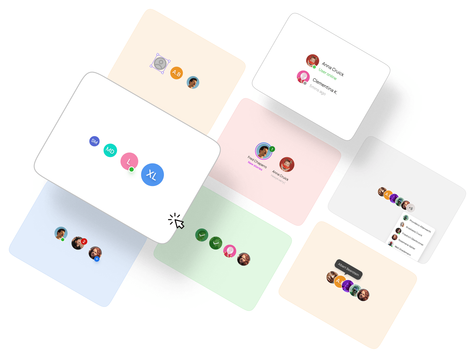
Avatar UI design exploration
Avatar (also known as Userpic) is a component through which the user identifies himself or herself.
What an Avatar can contain
Here are the following types of content that can be used for Avatar:
- Blank (aka empty state)
- Initials
- User’s photo or image.

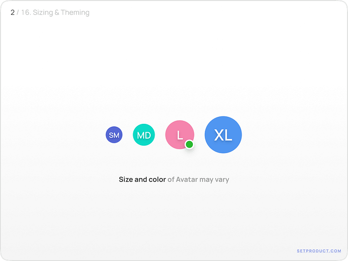
Color & Size
Depending on the situation, you can use a variety of options for the color and sizes:
- For better recognition, the color palette can be diversified;
- Headers, Appbars, etc. are the main targets for Avatars with 24–40dp width;
- 40–48dp Avatars are commonly utilized in content blocks or lists;
- If you want to use Avatars in templates, such as Profile, Settings, etc., then you should use 56+dp.
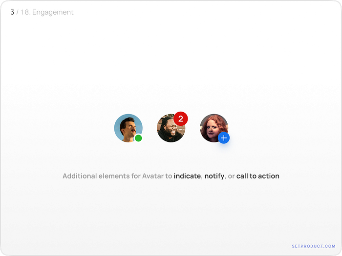
Events & Informing
When we want to inform about something or demonstrate the call to action via Userpic, we can use extra components for this:
- The indicators that show if the user is online or offline
- Information by notifications and visual feedback with a numbered label
- The extra icon can be shown for the user to make an action
Status of a User
The most common practice of showing the status of a user is to place a colored indicator at the bottom right corner of a Userpic.
- The green color indicates online status, gray — offline
- The filled shape is used for online status, empty shape — for offline (alternative choice)

Notification labels
Depending on what priorities you have and in order to catch the user’s attention, the labels of the avatar can be modified.
- For the indication of a high priority, solid and bright colors can be used
- For other situations, go with smooth or light background

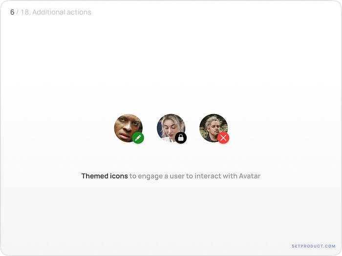
Action to call
When Avatar is clicked, it is a common practice to use components like rounded buttons or side-nested icons to show that the upcoming action will take place.
- Change the icon to the result that corresponds user’s expectation
- Usage of colors should be reasonable and need to emphasize the meaning of the event or action
Text-containing avatars
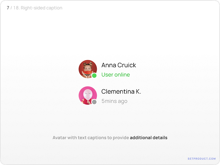
Sided text
When additional information needs to be added, the secondary titles can be used along with Avatar. This feature is used pretty commonly in app bars, lists, tables, and so on.
- Larger titles are used to indicate the name of a persona
- Subtitles for additional details are optional (for instance: status, occupation, last visit, the number of followers, and so on)
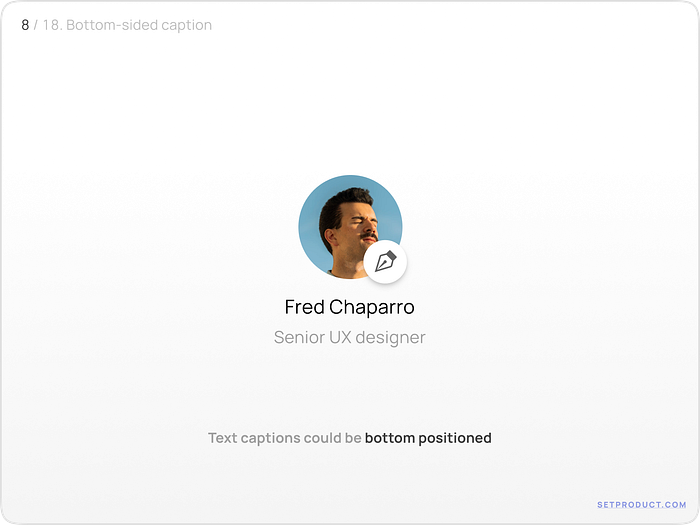
Bottom text
When it comes to templates, a larger Avatar can be utilized with the text placed at the bottom. This is a common pattern for in-app sections, such as Social, Profile, Settings, etc.
User Experience patterns of Avatars
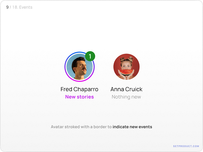
Events
To further indicate the events of new users, a border may be added around Avatar. You can also add a counter with a badge, which will also have a powerful design impact.
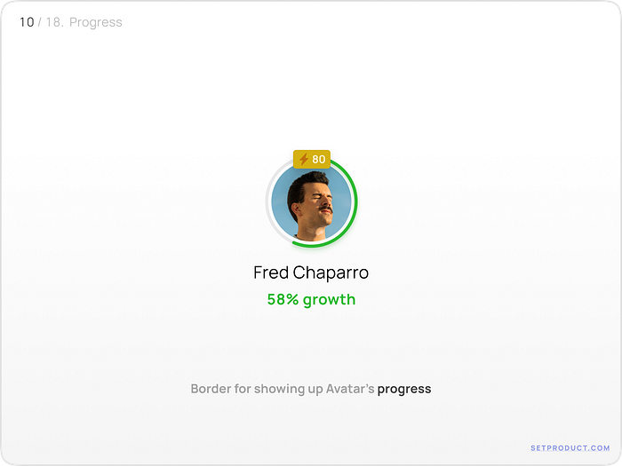
Progress
The use of a stroke, which serves as an indicator of Avatar’s achievements, remains quite popular and convenient.
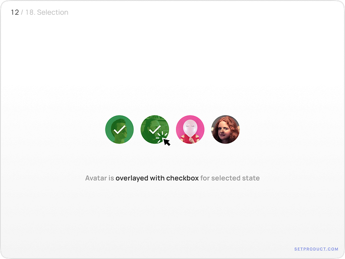
Selection
With the selected state, one of the most reliable confirmation methods for the user is a combination of a confirmation icon and a stroke.
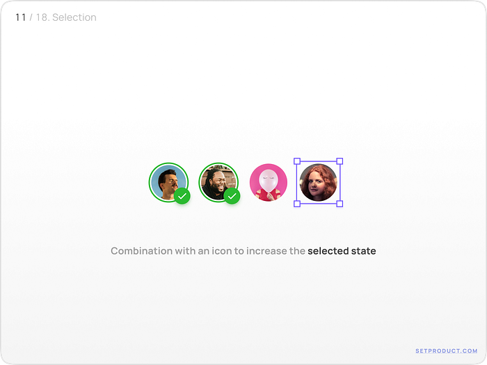
Here is how the typical variant of a Selected state looks like:
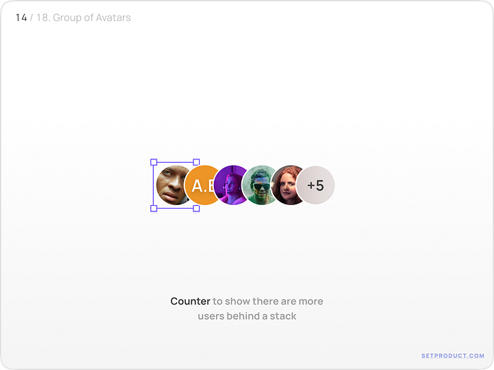
The group of Avatars
With a Button
At the point when Avatars are grouped, a CTA button can be a solid choice for letting the user know about a certain action from him.
For example, the “Plus” button takes us to a series of interaction-related options (Adding, Editing, Sorting, etc.) that can be performed to a grouped Avatars.

With a Badge
A numeric badge is a great solution to indicate the number of users remaining in the queue.
Badge with onhovered state
One of the most common patterns for a badge when it is onhovered is the expansion of users’ additional info.

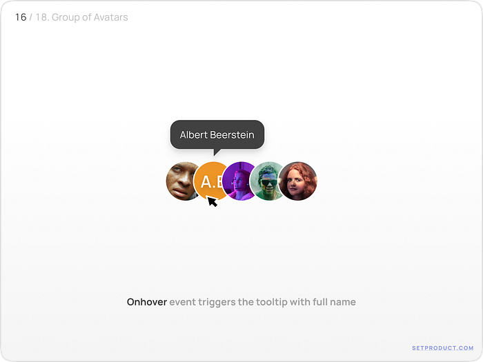
Avatar with onhovered state
When the avatar in the stacked group is onhovered, the great way to show the full name of the user is by using a Tooltip component.
Templates
The most popular option for using avatars in applications or websites is to embed a small Userpic in the Header or larger options in the Profile / Settings sections. Thus, the user can make edit actions to the picture.


Related links
- Avatars in Eclipse UI kit (Figma)
- Avatars in Full iOS kit (Figma)
- Avatars in Neolex UI kit (Figma)
- Avatars in Xela design system (Figma)
And that’s it. Hopefully, from now on you know how to design better Avatars.
In case you search the Avatar cards that are used in this guide — feel free to ⚡Duplicate for Figma.
I hope that my research was helpful and your UX for apps will be improved. In the next chapter, we will be talking about Accordions. So, stay tuned!
Have I missed anything? If so, please let me know and contact me at kamushken@gmail.com

