Designing for iOS 13
Optimisation for Dark mode
Apple has announced that they will support Dark mode in iOS 13 too after launched it in Mac OS. For us, as designers, this a huge challenge. With the Dark Theme brought to the OS level, apps will need to support dark UIs without breaking anything of the experience.

Pros
- Conserves energy: In products that require efficiency (such as devices with OLED screens), conserve battery life by reducing the use of light pixels.
- Enhance accessibility: Accommodate regular dark theme users (such as those with low vision), by meeting accessibility color contrast standards.
- Reduce eye strain. Even though it’s true in a traditional sense, white elements on a dark backgrounded interface are not the ideal way of highlighting content. That much contrast increases eye strain and is not necessary for elements to stand out.
Challenges
When starting with this we faced a few challenges:
Brand identity is not affected by the theme change
To retain brand identity, brand colours can be used at full saturation in a dark theme, although application should be limited to one or two branded elements, such as a logo or a branded button. By using branded colours sparingly, the elements remain prominent in the hierarchy.
Desaturated colours should still be used in the rest of a dark theme UI.
Visual hierarchy of the components is consistent across themes
Similar to light theme design, when it comes to creating dark theme UI it’s essential to create hierarchy and emphasise important elements in your layout.
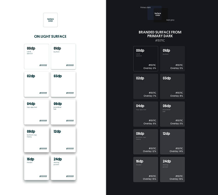
In light mode, we use shadows to express elevation. The higher surface gets, the wider a shadow it casts. The same approach wouldn’t work in a dark theme — it’s hard to see a shadow against a dark background. It’s better to illuminate the surface of each level.
In dark themes built with Material, elevated surfaces and components are coloured using overlays. The higher a surface’s elevation, the lighter that surface becomes.
Depth: At higher levels of elevation, components express depth by displaying lighter surface colours

UI elements meet the accessibility standards
A dark theme should avoid using saturated colours, as they don’t pass WCAG’s accessibility standard of at least 4.5:1 for body text against dark surfaces. Saturated colours also produce optical vibrations against a dark background, which can induce eye strain.
- Contrast: Dark surfaces and 100% white body text have a contrast level of at least 15.8:1
- Desaturation: Primary colours are desaturated so they pass the Web Content Accessibility Guidelines’ (WCAG) AA standard of at least 4.5:1 (when used with body text) at all elevation levels
- Limited color: Large surfaces use a dark surface color, with limited color accents (light, desaturated and bright, saturated colours)
Lighter fonts for a bolder look
Due to our eyes’ perception of light and dark, white text on a darker background will always look bolder than its counterpart. This means that sometimes you must have background specific font weights in your design.

