DARK MODE — HUMAN INTERFACE GUIDELINES
Designing a Dark Mode for your iOS app — The Ultimate Guide!
In this ultimate guide, I’m going to explain the step by step process of designing a Dark Mode to your iOS app. I will be redesigning WhatsApp. This is based on the Human Interface Guidelines by Apple.
Now before we get started, I’d like to do a super small plug to one of my highly requested courses!
It’s Free! The Mega Product Design Course for Beginners!
If you’re looking to drastically upskill and change your career trajectory for the better, make sure to check out my Mega Product Design Course for beginners on my YouTube Channel.
I’ve had the good fortune of working with some of the biggest companies and startups and have learned a lot through that. And I share all the knowledge with you all for free on my YouTube Channel.
I cover everything from the core foundations of Product Design, UX Design and so much more. Get to see and learn what it takes to be a skillful product designer which can get you any opportunity you want.

Anyway, let’s get into the article!
At the WWDC 2019 conference, Apple announced all the new features coming to iOS 13. Out of all the super exciting features, the announcement about Dark Mode excited me the most. For those of you who follow me on social media, you might know that I am a hardcore fan of Dark Mode. I just love it!
With iOS 13, people can choose to adopt a dark system-wide appearance. This basically means that when dark mode is turned on, all the apps on the iPhone will have a dark appearance.
Hence, as designers and developers, it's extremely important to design and implement Dark Mode for your apps.
Apple has released the Human Interface Guidelines for designing Dark Mode to your apps. However, the guidelines are super short, unlike Google’s Material Design Guidelines. So the only place to learn more about the guidelines is the talk given by Mike Stern. He is the Design Evangelism Manager at Apple. Anyway, you can definitely watch the 30-minute long video. But I plan to make your life a lot easier with a step by step process.
I also have a super quick 2 part Instagram series on it if you want to brush through the fundamentals of Dark Mode.

You can also check out my full-fledged Tutorial on YouTube as well!

I will be covering only the design aspect and not the development aspect. In order to understand the development aspect of Dark Mode, you can check out this video by Apple.
I also released a full-fledged article on designing Dark Theme for Android. If you have an Android app as well, definitely do consider checking that out!
Alright, assuming that you now have a design system ready let’s get started!
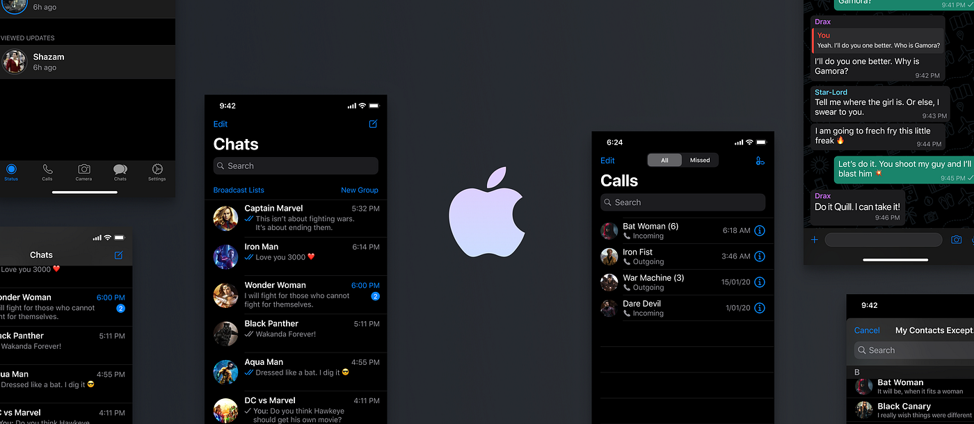
For the purpose of explaining the guidelines better, i’ll take WhatsApp as an example. At the time of writing this article, Dark Mode for Whatsapp does not exist. Hence, I think it will be a good idea to explain the Dark Mode guidelines for iOS.
Disclaimer
There is no hard and fast rule that you need to follow the guidelines provided by Apple. These are just guidelines, hence you are allowed to have a custom Dark Mode for your app 🤙.
Btw, I am a huge fan of superheroes. So I decided to jazz things up a bit with that theme. I hope you guys enjoy it 🤩.
Elevation
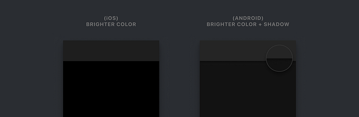
Unlike Google where elevation is based on the difference in color and drop shadows, Apple treats elevation only in terms of color.
The guidelines provide 4 colors that can be used to show an elevation. They are called ‘system background colors’.
The iOS 13 UI Kit is available only for Adobe XD and Sketch. However, if you want a UI kit for Figma, you can get it on Apply Pixels.
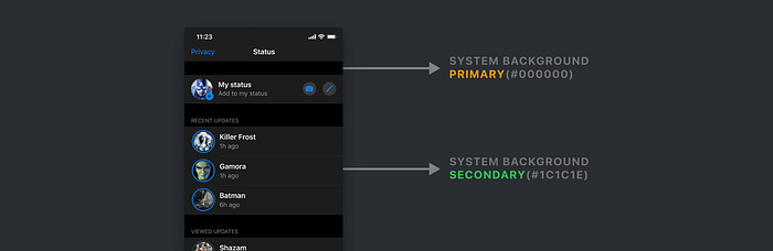
System Background Colors
As per the guidelines, the background always has a pure black of #000000. Google, on the other hand, prefers a dark grey with a value of #121212.
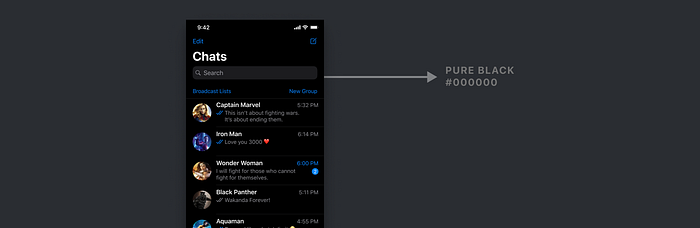
Apple calls this background surface as System Background. And there are 3 levels of system backgrounds namely Primary, Secondary and Tertiary. Each of these has a different color which is provided in the iOS 13 UI Kit. These are applied to elements that either give a feeling of being higher in elevation or those that differentiate (or group) content.
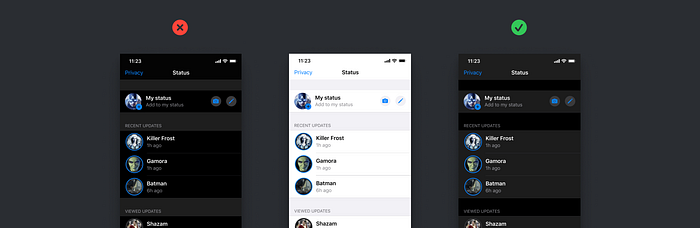
One thing to note is that the colors in Dark Mode are not inverted from Light Mode. A separate set of colors have to be assigned to all the elements.
As you can see below, the pure white color in light mode does not get converted into pure black in dark mode. Refrain from inverting the colors in Dark Mode.
Sounds good man! Btw, is there anything I need to discuss with the developers who will be implementing Dark Mode for my app. Anything I need to let them know in advance?
Sure. Let’s talk about Semantic colors!
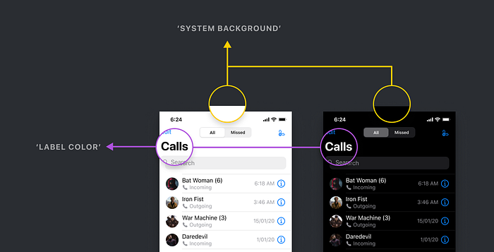
Semantic Colors
I know. I know. It sounds like an advanced term. But the concept of semantic colors is super simple.
Let’s take an example of the Base element that we previously talked about. In Light Mode, the color is pure white #FFFFFF. But in Dark Mode, the color is pure black #000000.
Now the hard way to implement this is to hard-code it. This basically means that you need to assign 2 colors for each and every element on your screen. Each and every element! It’s gonna be a total nightmare.
So what’s the solution?
This is where Semantic colors come to the rescue. Instead of giving each element a color, you can give it a semantic color that has both the colors for either of the modes.
Umm… What? What the hell are you saying?
What I am trying to say is that, if you assign a semantic color, for example, ‘SystemBackground’ or ‘LabelColor’ or ‘FillColor’” to each of the elements, the OS will know what color to show automatically based on the mode.
You don’t have to tell it to show white color in light mode and black color in dark mode.
Oh!!! Now I get it. But wait! What if I want to show a custom color to an element in Dark Mode?
Sure, you can easily do that. You can assign a custom color for each of the modes. So for example, if you don’t want the base to be pure black but a dark grey instead, you can easily assign a custom color in your code.
And voila! So that’s all you need to know about having a healthy conversation with your developer.
Alright! So what’s next?
Fill Colors and Grey Colors
The guidelines provide 4 fill colors (also grey in color) and 6 additional grey colors to choose from. They are ideally used for all elements on the interface such as glyphs (icons), UI controls and more.
So what’s the difference between fill and grey colors?
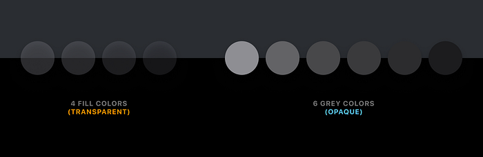
Fill colors have a certain level of transparency, while grey colors are fully opaque. So ideally you can either use only fill colors or grey colors, or a mix of them. You can obviously choose to pick your own custom grey colors if you wish to.
Let me give you a very small example of how you can use them in your UI.
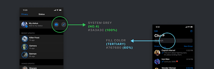
In the above image, you can see that for the camera and pen icon touch target, I have used a grey color. And for the search bar, I have used a fill color.
So Chethan, do these colors have to be used this way?
Nope. As I mentioned before, you can use all the 10 colors (4 fill + 6 greys) anyway that you wish to.
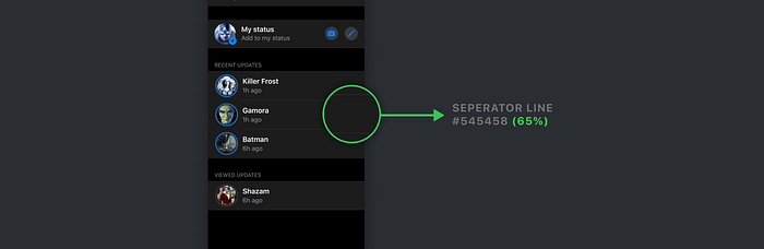
Separator Colors
The guidelines provide us with 2 variants for separator lines. They are also called dividers in general. One is opaque and the other is transparent.

Feel free to use either of them. It’s better to use the opaque variant. But there is no hard and fast rule.
Label Colors
They are used strictly for texts and there are 4 colors that are based on the visual hierarchy. The texts are categorized into Primary, Secondary, Tertiary and Quarternary.
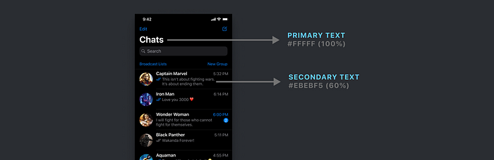
Tertiary label color is used for placeholder texts such as search bars. Quarternary label color is used for disabled texts.
Psst. However, there is a slight deviation. If you look at the UI Kit, the Search Bar placeholder text uses the Secondary label color instead of the Tertiary label color 🤫.
Tint Colors
Apple provides 9 different tint colors that can be used throughout the app. They can be used for texts or icons or shapes. Here is a small visualization of Whatsapp’s interface if they used colors other than blue.
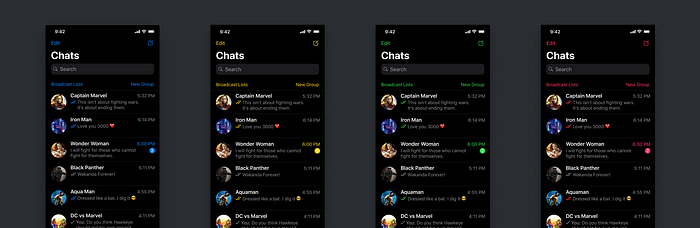
However, these 9 colors are slightly different for light mode and dark mode. If you choose to use these system tint colors, the app will automatically change the light mode tint color to the dark mode tint color.
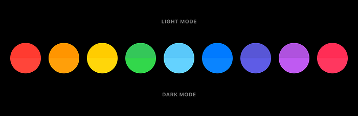
The difference is almost not noticeable, but Apple has still created 2 variations for each tint color.
So should I pick only from these 9 colors or can I pick my own colors?
Of course, you can. I’ll get to that part in a minute, but there is an advantage of using the system tint colors.
What is it?
When someone turns on the Increase Contrast switch in the Accessibility settings, the tint colors become a bit brighter. This leads to increased contrast.

Hence, if you try to use your own custom tint color you might have to configure the increased contrast tint color on your own.
Picking your own Tint Color
It's quite obvious that you can pick your own tint colors. But there are few things to note if you choose to do that.
- Try to pick a color (same RGB value) that works well in both light mode and dark mode.
- Or you can choose to pick 2 different colors, one for light mode and other for dark mode.
Irrespective of what colors you pick, the colors need to pass the accessibility contrast ratio test for both the modes.
The colors need to pass a minimum contrast ratio of 4.5:1
Here are 3 tools that you can use for quickly checking the color contrast. Do let me know if you use any other tools apart from these.
So let me take an example to illustrate.
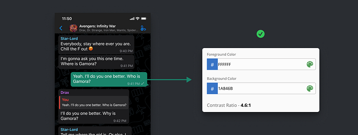
As you can see, the colors used here pass the contrast ratio test of 4.5:1. The ratio of these 2 colors is 4.6:1.
Let’s take another example.
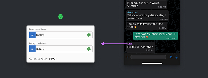
In this example, the contrast ratio is 5.57:1 which also passes the contrast ratio test.
Now let’s take an example where we have 2 different colors for the same element.
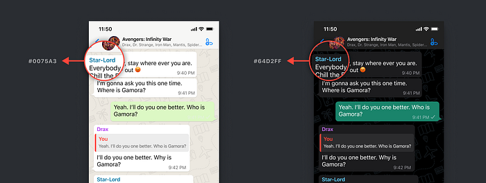
As you can see above, the same text has 2 different colors for both light and dark mode.
The reason is that, sometimes it’s hard to pick the same color that passes the contrast ratio test in both the modes. Hence you can pick 2 different colors for both the modes.
Alright man, is that all or are there more guidelines? Btw, what about the blurry background that we see all over iOS? I forgot what they were called. What’s the deal with that?
Yes. They are called Materials. Let’s get into that.
Materials
Any element that has properties which blurs the content below it is called Material.
What does that mean in design language?
It’s simple!
If any element has both — transparency and the ‘background blur’ effect applied to it, then it becomes a material.
So where and how do we use it?
The guidelines provide us with 4 materials to choose from. However, there is a secret 5th material, that the guidelines do not consider as a Material, but is technically a Material.
Let’s see these Materials in action.
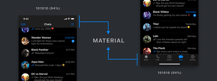
Let’s start with the Top Navigation Bar and the Bottom Tab Bar. While the guidelines do not consider these as materials, they clearly behave as Materials.
Make sure you use the exact same components from the UI Kit for these 2 bars. There is a background blur value applied to these components.
Now you might not see the blur on the content behind the bars because the transparency value is very high (94%). But it gives a very subtle effect.
Quick question? Do these bars have to be materials? Can I make them fully opaque with 100% opacity?
Yes. Of course. Let me show you an example.
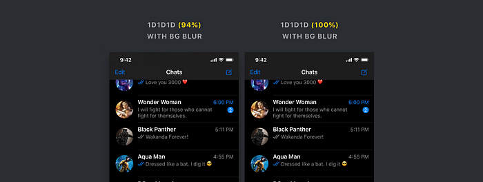
Both of the Nav Bars have a background blur applied to it. The one on the left is not fully opaque. But as you can see, there is hardly any difference. Also, the content below is not being blurred.
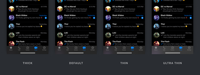
Now let's see these with a proper material.

As you can see there are 4 variants. You can choose whichever you wish to. But do remember that it's recommended to use the exact components from the UI kit as they have all the values for blur and opacity defined.
Let’s look at the materials on the bottom Tab Bar.
They look beautiful 🤩. Don’t they?
Btw, Materials are also used for components such as notifications and modals. Here is an example of Materials used in Modals.

We are almost there! Just one last thing and then it’s a wrap!
Controls
For elements such as segmented controls (Tabs), sliders, search bars, switches, try using the components from the UI kit.
Of course, you can definitely, use own colors, but why waste time making them from scratch.
Always remember that the more work for you — the more work for the developer.
And… That’s a wrap!
So that is pretty much everything you need to know about designing Dark Mode for your iOS app. Feel free to reach out to me anytime if you need any clarification or get stuck anywhere. You can send me a message on any social media platform. I will be more than happy to help you out 😁.
Resources
🔥 2 Free months of Skillshare Premium!
If you want to learn to build a fully functional website from scratch without using a single line of code in Webflow, make sure to check out my Mega Webflow Course for Beginners! You can find the course on Skillshare
Register with my link and get 2 free months of Skillshare Premium and watch it for free.

Thanks for reading!
To stay up to date with what I’m doing, check out my buy me a coffee profile, where you can also show your support for my work.

